
Walk into any modern home, boutique hotel, or trendy café these days, and you'll likely notice something special about the walls, facades, or accent pieces—they're not just surfaces, but stories. MCM flexible stone has quietly revolutionized how we think about building materials, blending durability with a softness that feels almost alive. And among its many iterations, the woven series stands out as a favorite for designers and homeowners alike. But here's the thing: choosing the right woven MCM flexible stone often starts with a photo. Not just any photo, but a "real photo"—one that captures the texture, color, and soul of the material. Today, let's dive into how to read these woven real photos like a pro, so you can turn pixels into a space that feels uniquely yours.
First, let's talk about why these photos aren't just pretty pictures. MCM flexible stone, by its nature, is a chameleon. It's lightweight yet tough, flexible yet structured, and its woven patterns? They're a dance of threads, shadows, and light. A catalog image might show a flat swatch, but a real photo—taken in natural light, up close, or in situ—tells you how that weave will behave in your space. Will the threads catch the morning sun and glow? Will the texture soften a stark room, or add edge to a minimalist design? These are the questions real photos answer. They bridge the gap between "this looks nice online" and "this will make my living room feel like a cozy retreat."
Take, for example, a woven MCM panel in weaving (khaki) . A basic product shot might make it look like a muted, one-note fabric. But a real photo? It'll show the way the khaki threads interlace—some lighter, some deeper, creating a subtle gradient that mimics the warmth of sun-baked earth. You'll notice tiny variations in the weave, the way light hits the raised threads and casts soft shadows, making the surface feel less like a wall and more like a piece of textile art. That's the magic of real photos: they don't just show the material—they let you *feel* it, even through a screen.
Texture is the heart of woven MCM flexible stone, and real photos are your Rosetta Stone for understanding it. Let's start with the basics: thread density . Look closely at a woven real photo—are the threads packed tightly, or is there space between them? A tight weave (think of a fine linen) will feel sleek and modern, perfect for a high-end restaurant or a home office where you want sophistication without fuss. A looser weave, with visible gaps between threads, leans into a more organic, bohemian vibe—ideal for a sunroom or a boutique with a laid-back aesthetic.
Then there's thread thickness . Thicker threads create a bolder, more tactile texture. In a real photo, you'll see them cast deeper shadows, adding dimension to the panel. Imagine running your hand over it—you'd feel those raised threads, like a gentle embossment. Thinner threads, on the other hand, create a softer, almost silken effect. They catch light differently, too—more of a sheen than a shadow. A real photo will highlight this: hold it up to a screen, and you can almost trace the path of each thread with your eye.
And don't sleep on weave pattern . Herringbone, basketweave, plain weave—each tells a different story. A basketweave pattern, with its crisscrossing threads, feels rustic and inviting, like a well-loved blanket. A plain weave, with threads running straight over-under, is clean and versatile, pairing well with both modern and traditional styles. Real photos zoom in on these patterns, letting you see how the threads interact. For instance, a thread -detailed real photo might reveal that what looks like a simple stripe from afar is actually a complex interplay of thick and thin threads, adding depth you wouldn't notice in a flat image.
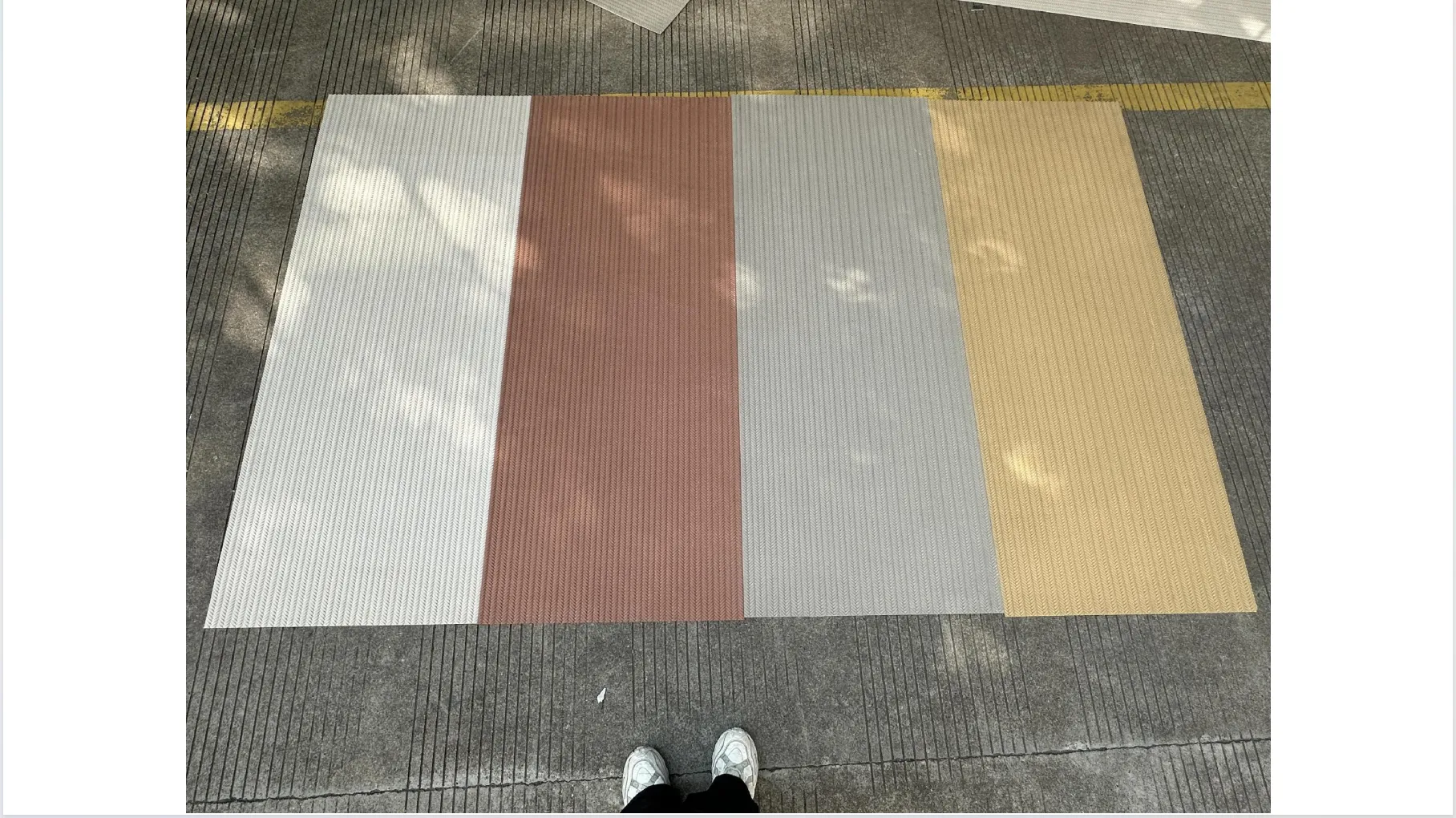
Color is where woven MCM flexible stone truly shines, and real photos are your best tool for gauging how a shade will behave in your space. Let's break down some fan favorites and what their real photos reveal:
| Color Variant | What the Real Photo Shows | Mood It Creates |
|---|---|---|
| weaving (khaki) | Subtle gradient of warm beiges and soft browns; threads catch light to look "sunlit" | Earthy, grounded, like a cabin in the woods |
| travertine (starry blue) | Deep blue base with flecks of silver (the "stars") that sparkle in direct light | Celestial, calming, perfect for a bedroom or home theater |
| weaving (jacinth) | Vibrant terracotta with orange undertones; threads have a slight sheen, adding warmth | Energetic, bold, ideal for an accent wall in a dining room |
| weaving (grey) | Soft, cool grey with hints of blue; weave pattern is more visible due to neutral base | Modern, serene, pairs beautifully with fair-faced concrete |
Notice how the real photo adds layers to the color? Take travertine (starry blue) : a catalog might call it "dark blue with silver accents," but a real photo shows how those "stars" aren't just static—they shift when the light changes. At noon, they're bright pinpricks; at dusk, they soften into a gentle glow. That's the difference between knowing a color and experiencing it. Similarly, weaving (khaki) in a real photo won't look flat—you'll see how some threads are a warmer khaki, others a cooler beige, creating a dynamic, lived-in feel that a solid color swatch can't capture.
Woven MCM flexible stone rarely stands alone—and thank goodness for that. Its texture and color make it a team player, complementing other materials in ways that elevate the entire space. Real photos are goldmines for spotting these pairings, because they show the woven stone in context, not isolation.
Let's start with wood grain board . A real photo of woven MCM (say, in weaving grey) paired with wood grain board will make you want to reach through the screen. The smooth, linear grain of the wood balances the textured weave of the stone, creating a harmony of "soft" and "hard." The photo might show a kitchen backsplash: woven MCM on the upper wall, wood grain board on the lower cabinets. You can see how the warm tones of the wood bring out the subtle brown undertones in the grey weave, making the space feel cohesive, not cluttered.
Then there's fair-faced concrete —the ultimate modernist's dream. A real photo of woven MCM (weaving jacinth, perhaps) next to fair-faced concrete is a study in contrast. The concrete's cool, industrial vibe is softened by the woven stone's warmth, while the stone's texture adds depth to the concrete's smoothness. Look closely at the photo, and you'll notice how the jacinth's bold color pops against the concrete's neutral backdrop, turning a plain wall into a focal point without feeling overwhelming.
Even natural stone gets in on the action. Imagine a real photo of travertine (starry blue) woven panels next to a lime stone (beige) accent. The travertine's blue depth and starry flecks contrast beautifully with the limestone's soft, porous surface, creating a space that feels both grounded and ethereal—like a cave under a night sky. The photo will show how the two stones reflect light differently: the woven travertine shimmers, while the limestone absorbs, creating a rhythm that draws the eye around the room.
Okay, so you've found a woven MCM flexible stone real photo that catches your eye—now what? Here are some pro tips to make sure it's the right fit for your space:
Let's wrap up with a quick story to bring this all together. Last year, I worked with a client—let's call her Mia—who wanted to redo her home office. She'd fallen in love with a woven MCM flexible stone photo online: weaving (khaki) with a basketweave pattern. The catalog image was nice, but the real photo? It showed the panel in a sunlit room, paired with a wood grain board desk and a potted fiddle-leaf fig. Mia immediately said, "That's it—that's the feeling I want."
When the panels arrived, she was nervous—would they live up to the photo? But when we installed them, she gasped. The khaki threads, which looked uniform in the catalog, had the same warm gradient as the real photo. The basketweave pattern, which had seemed simple online, added just enough texture to keep the walls from feeling flat. And when the afternoon sun hit the threads? They glowed, just like in the photo, making the office feel less like a workspace and more like a retreat. "I didn't just buy a wall panel," she said. "I bought that feeling—the one from the photo."
At the end of the day, interpreting woven real photos of MCM flexible stone is equal parts art and science. It's about looking for texture, color depth, and context—and then asking yourself: "Does this make me feel something?" Because great design isn't just about materials; it's about how those materials make you *live*. So the next time you're scrolling through real photos of woven MCM flexible stone, take your time. Zoom in. Imagine it in your space. And when you find one that makes you smile, or sigh, or think, "Yes—that's home"? That's the one.
After all, MCM flexible stone's woven series isn't just a building material. It's a way to weave your own story into the walls of your space. And the real photo? It's the first chapter.
Recommend Products


