
Design is more than just aesthetics—it's about creating spaces that tell a story, evoke emotion, and feel uniquely yours. And at the heart of that story? Materials. They're the words that build the narrative, and few materials speak as warmly and versatilely as bamboo mat board. With its roots in nature and its eyes on modern innovation, this material blends the organic charm of bamboo with the practicality of a durable, adaptable board. What truly sets it apart, though, is its color palette—a spectrum that ranges from sunlit neutrals to earthy depths, ensuring there's a shade to match every vision. Let's dive into the world of bamboo mat board colors and discover how to make them work for your next project.
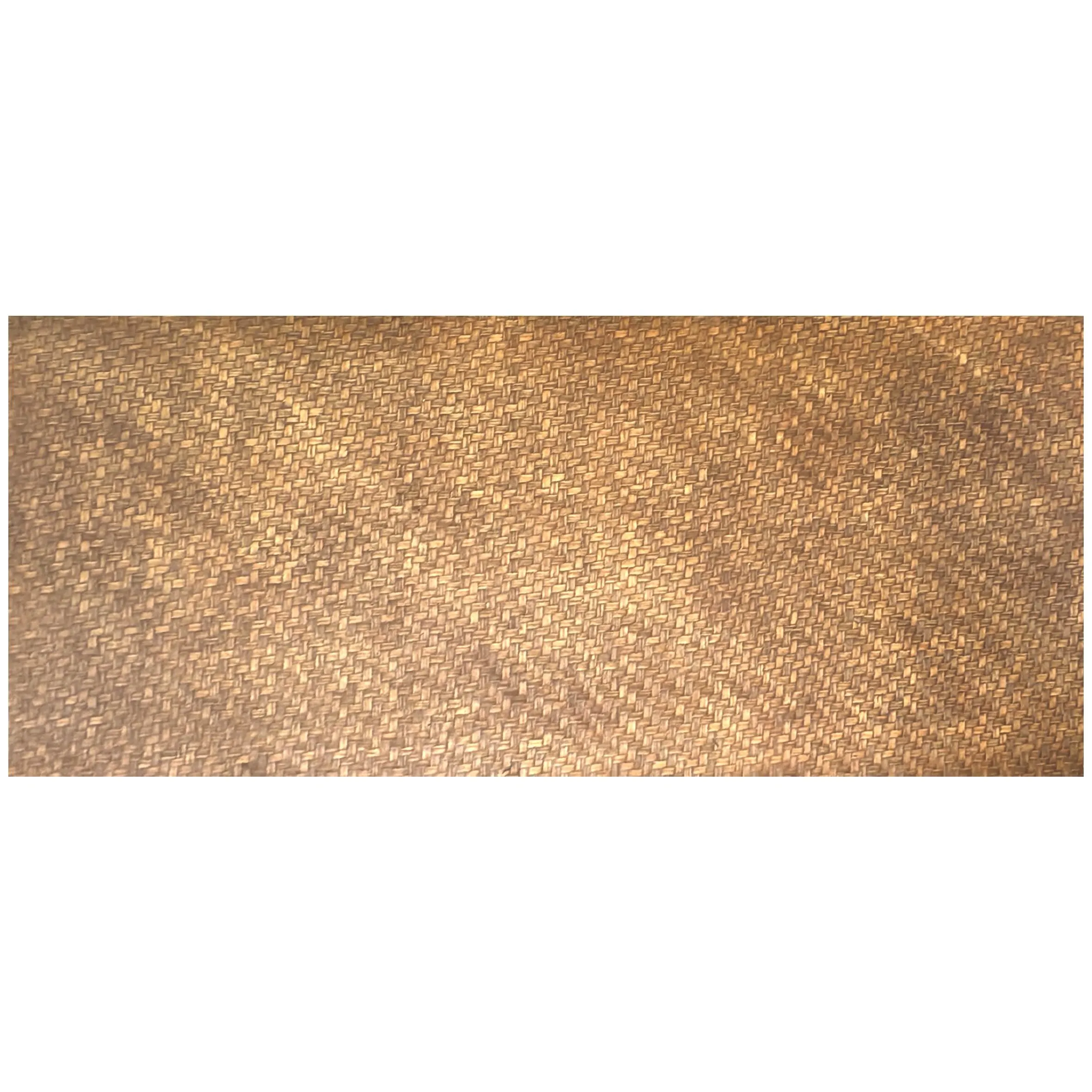
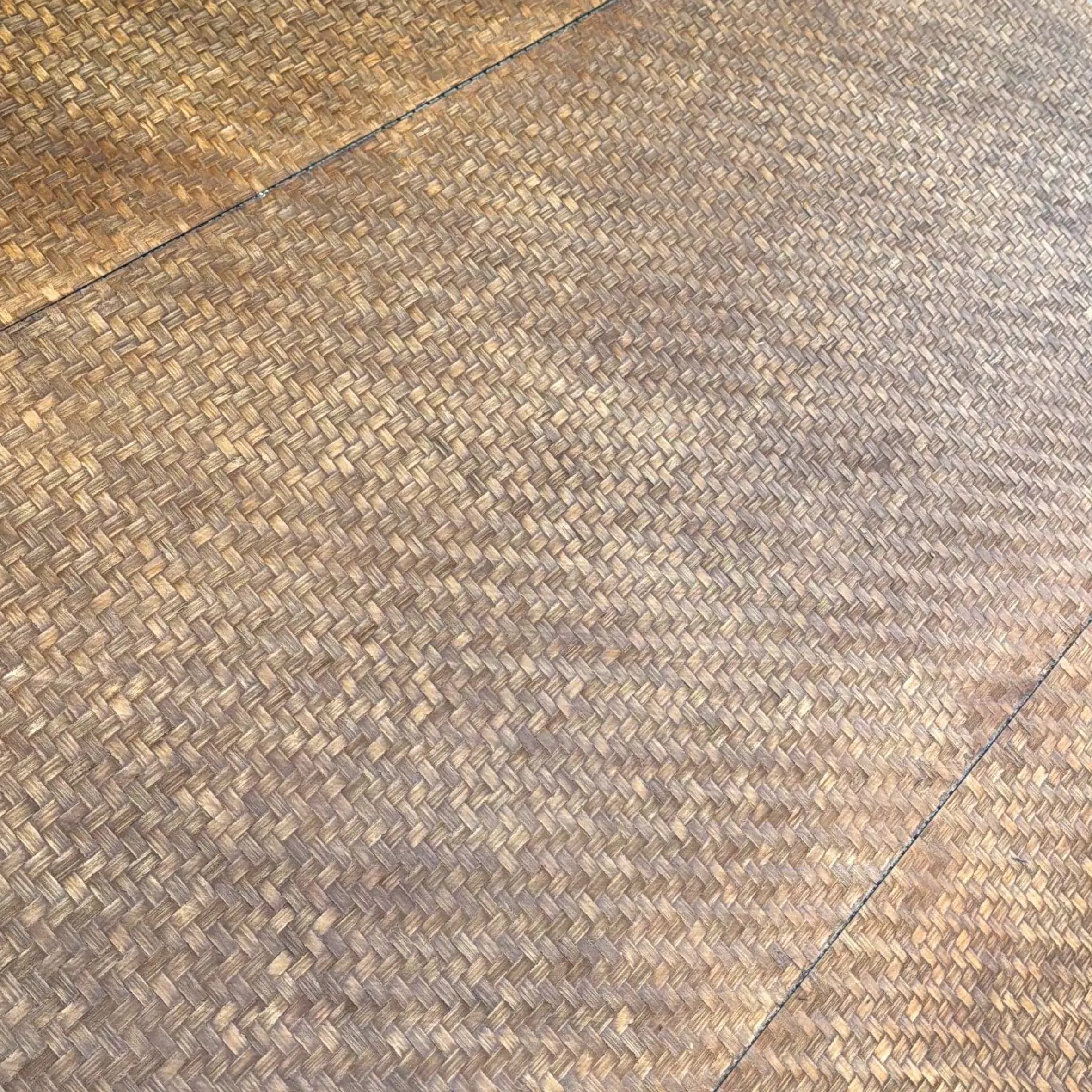
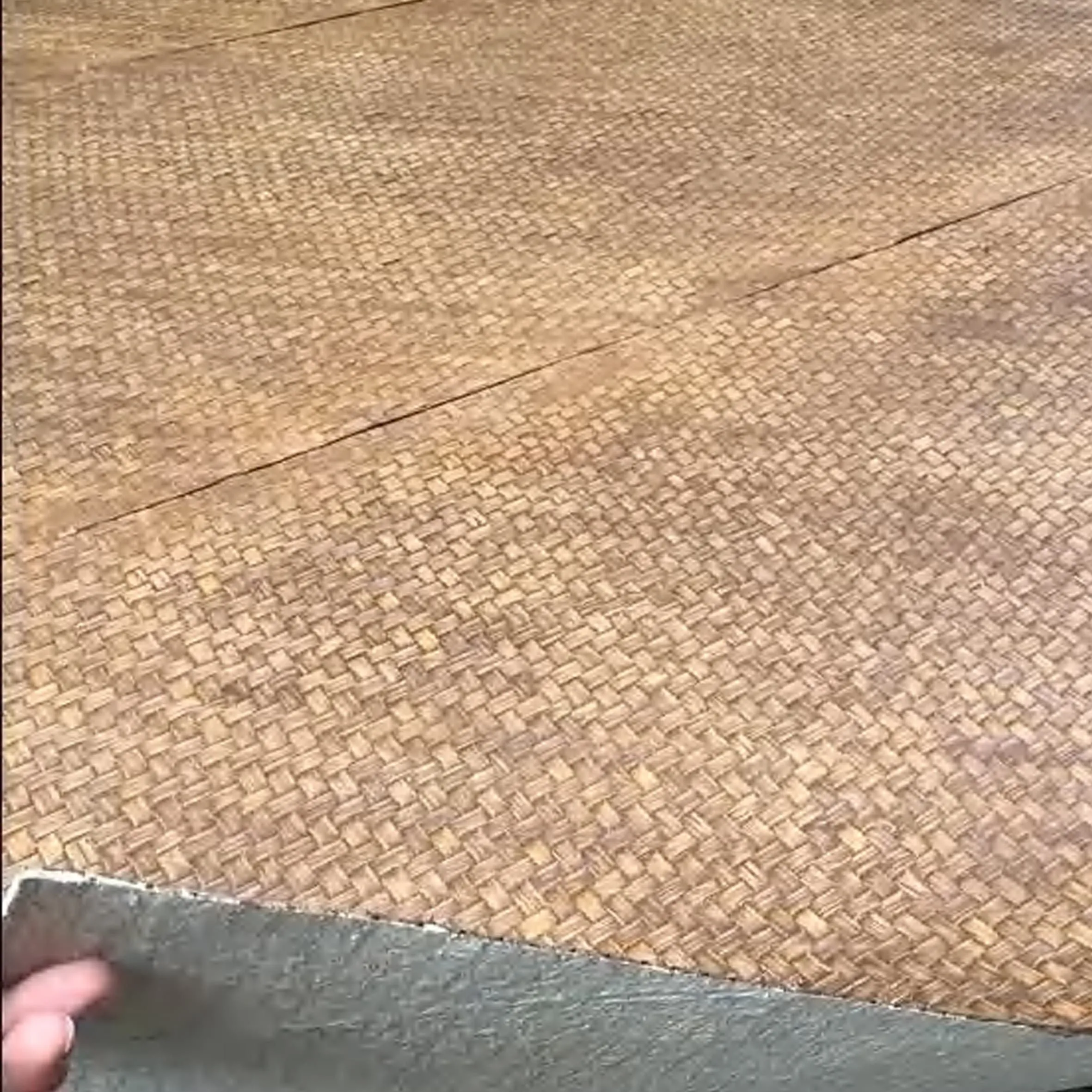
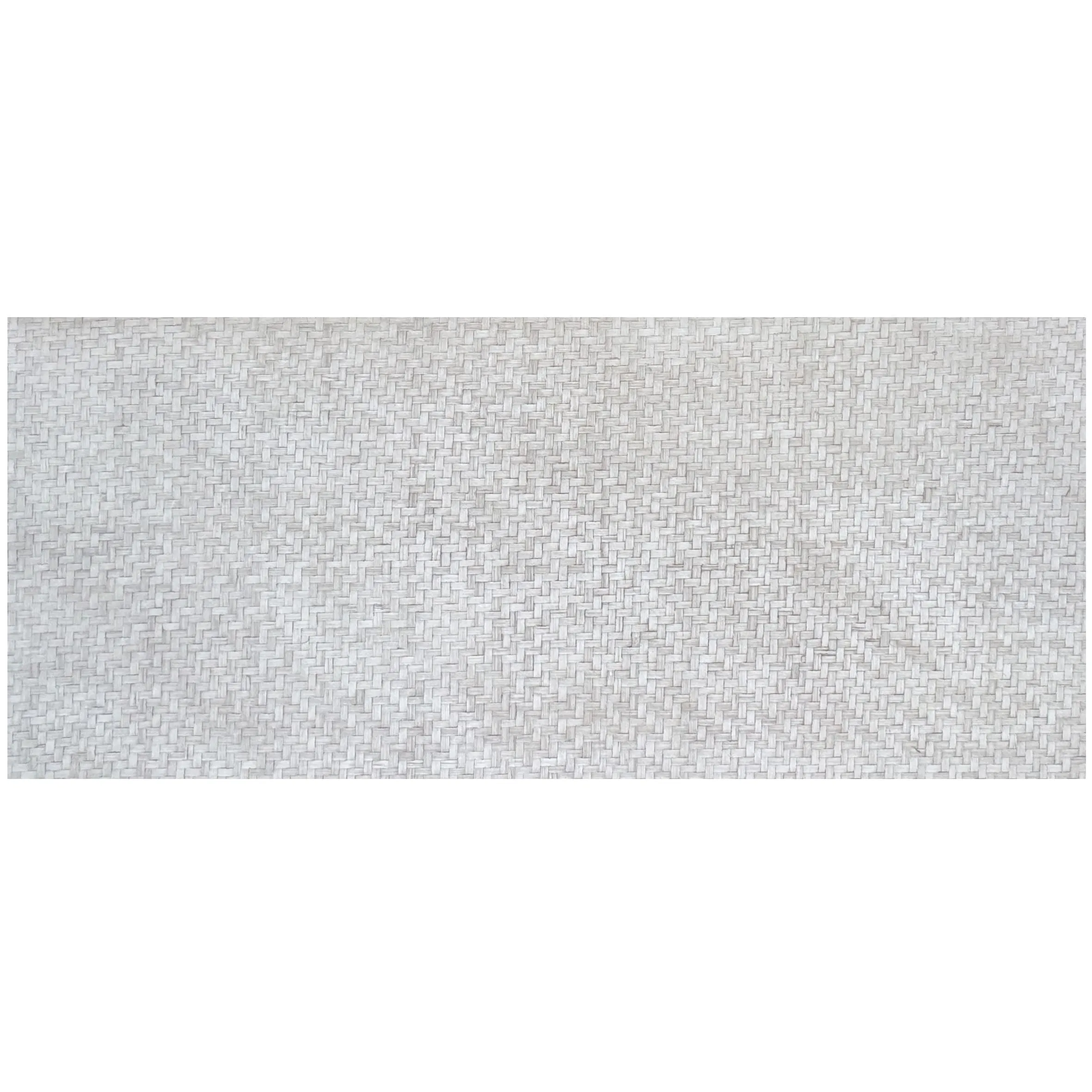
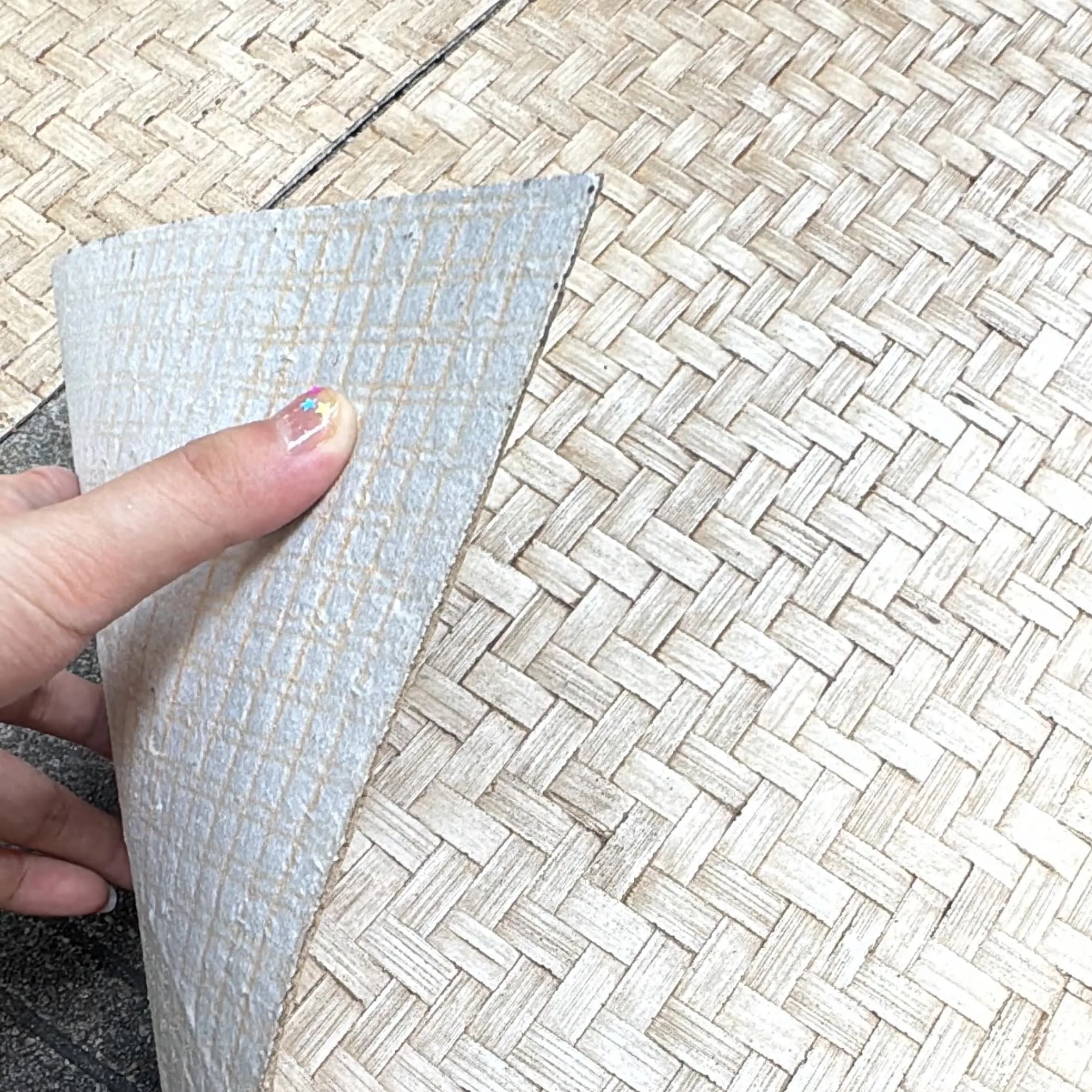
Before we explore colors, let's talk about why bamboo mat board has become a go-to for designers and homeowners alike. First, there's its sustainability story: bamboo grows faster than most hardwoods, requiring minimal water and no pesticides, making it a choice that aligns with eco-conscious design. Then there's its durability—resistant to warping, moisture, and everyday wear, it holds up in high-traffic areas like kitchens and hallways. But perhaps its most alluring quality is its texture: the woven mat pattern, inspired by traditional bamboo weaving techniques, adds subtle visual interest without overwhelming a space. It's a material that feels both handcrafted and refined, making it perfect for everything from accent walls to custom furniture.
And then there are the colors. Unlike plain wood panels that often stick to a narrow range, bamboo mat board comes in hues that cater to diverse tastes—whether you crave the calm of natural tones or the drama of bold accents. Let's break them down, starting with the classics: natural bamboo shades that honor the material's origins.
These colors let bamboo's inherent beauty shine, capturing the essence of the plant in its most authentic form. They're versatile, easy to pair, and perfect for spaces where you want to keep things grounded and natural.
Light Blonde is bamboo mat board at its brightest—think pale straw with golden undertones, like sunlight filtering through a bamboo grove. It's airy, open, and instantly expands a room, making it ideal for small spaces or rooms with limited natural light. Picture a bathroom clad in Light Blonde panels: paired with white subway tiles and a glass shower, it feels spa-like, as if you're stepping into a bamboo forest at dawn. The color reflects light, reducing the need for harsh overhead lighting, and its softness balances the coolness of fixtures like chrome faucets or fair-faced concrete sinks. It's also a chameleon in terms of style—equally at home in a minimalist apartment (with sleek black furniture) or a beach house (paired with rattan and linen).
Warm Amber takes Light Blonde up a notch, adding depth with honey and caramel undertones. It's the color of bamboo that's been kissed by the sun, with a richness that feels lived-in and welcoming. A kitchen backsplash in Warm Amber instantly becomes the heart of the home: against white cabinetry and brass hardware, it adds warmth without clashing, turning morning coffee prep into a cozy ritual. I've seen this color work wonders in home offices, too—its amber tones reduce eye strain from screens, creating a workspace that feels both productive and relaxing. Pair it with weaving (khaki) cushions on a desk chair, and suddenly the room feels like a blend of modern efficiency and cabin-like comfort.
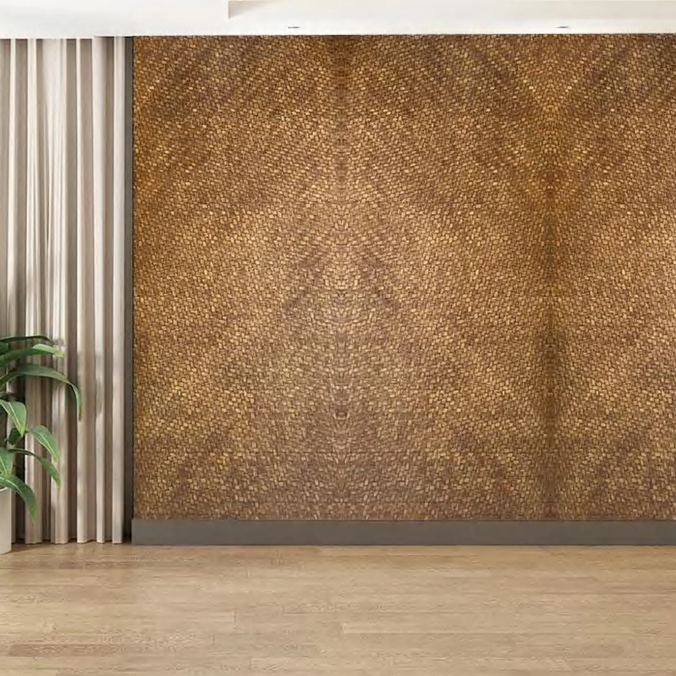
For those who love depth, Rich Chestnut is the way to go. This hue is deep, moody, and full of character—think dark chocolate with subtle red undertones, like bamboo that's aged gracefully over time. It's bold but not brash, making it perfect for accent walls or statement furniture. Imagine a living room with a Rich Chestnut feature wall behind a leather sofa: the contrast between the warm wood and cool leather creates a sophisticated, inviting space. It also pairs surprisingly well with industrial elements—try it with rust board granite countertops in a kitchen, and you'll get a look that's equal parts rustic and modern. Pro tip: Use Rich Chestnut sparingly in small rooms (say, a bookshelf instead of an entire wall) to avoid overwhelming the space.
If natural bamboo tones feel too light, earthy hues offer a connection to the outdoors with a bit more complexity. These colors draw inspiration from soil, stone, and clay, making them ideal for spaces where you want to evoke a sense of calm and rootedness.
Earthy Beige is a love letter to natural stone—specifically, travertine (beige)—but with bamboo's warmth. It's a soft, muted neutral that sits between sand and oatmeal, with a hint of green that keeps it from feeling flat. This color is a designer's secret weapon because it works with almost everything. In a bohemian bedroom, layer it with macramé wall hangings and terracotta pots; in a Scandinavian dining room, pair it with light wood floors and black pendant lights. What I adore most about Earthy Beige is how it blurs the line between indoors and outdoors. A sunroom clad in this color, with large windows overlooking a garden, feels like an extension of the landscape—calm, serene, and full of life.
Khaki Weave takes inspiration from the texture of weaving (khaki) textiles, resulting in a muted green-brown tone that's incredibly versatile. It's not quite olive, not quite taupe—just a soft, earthy hue that feels grounded. This color shines in spaces where relaxation is key, like a home yoga studio or a reading nook. Floor-to-ceiling Khaki Weave panels, paired with a plush cream rug and floor cushions in complementary tones, create a space that feels like a retreat from the chaos of daily life. The woven texture of the board adds depth, making the room feel layered without being cluttered. It also plays well with natural materials like jute and rattan, enhancing that organic, handcrafted vibe.

With so many options, it can help to see how these colors stack up in terms of use cases and pairings. Here's a quick guide to help you choose:
| Color | Undertones | Best For | Complementary Materials |
|---|---|---|---|
| Light Blonde | Golden, sunlit | Small spaces, minimalist designs, bathrooms | Fair-faced concrete, white marble, chrome fixtures |
| Warm Amber | Honey, caramel | Kitchens, home offices, rustic spaces | Weaving (khaki) textiles, brass hardware, oak floors |
| Rich Chestnut | Chocolate, red | Accent walls, industrial-chic rooms, statement furniture | Rust board granite, black leather, metal accents |
| Earthy Beige | Green, sand | Bohemian spaces, sunrooms, neutral backdrops | Travertine (beige), terracotta, jute rugs |
| Khaki Weave | Green-brown, muted | Yoga studios, reading nooks, tropical-inspired rooms | Rattan furniture, potted plants, linen cushions |
Always test bamboo mat board samples in the actual space where they'll be used. Colors can shift dramatically depending on lighting—what looks like warm amber in natural sunlight might read as more orange under LED bulbs, or cooler in a room with north-facing windows. Take samples home, tape them to the wall, and check them morning, noon, and night before making a decision. It's a small step that can save you from color regret!
Now that you know the colors, let's talk about how to pair them with popular design styles. After all, the best color choice depends on the mood and aesthetic you're trying to create.
Think clean lines, neutral palettes, and "less is more." Light Blonde or Earthy Beige bamboo mat board works here, paired with fair-faced concrete floors and black metal accents. Keep the texture subtle (stick to matte finishes) and use the board for a single accent wall or a sleek shelving unit. The goal is calm, clutter-free, and quietly sophisticated.
Warmth and charm are key here. Go for Warm Amber or Rich Chestnut, and pair them with wood grain board furniture, woven (khaki) textiles, and vintage-inspired hardware. A kitchen island clad in Warm Amber bamboo mat board, with open shelving and a farmhouse sink, feels like it's been part of the home for decades. Add some mason jars and a few potted herbs, and you've got that cozy, lived-in vibe.
Bring the outdoors in with Khaki Weave or Earthy Beige. These colors pair beautifully with lush green plants, rattan furniture, and natural fiber rugs. Imagine a bedroom with Khaki Weave walls, a four-poster bed draped in white linen, and palm leaf prints—suddenly, you're on a beach vacation, no passport required. Add touches of blue (think throw pillows or artwork) to mimic the ocean, and you've got tropical paradise at home.
While color gets all the attention, texture and finish play a huge role in how bamboo mat board looks and feels. The woven mat pattern is a given, but you can choose from different finishes to enhance or soften the color:
Pro tip: Mix finishes for depth. For example, use a matte Light Blonde on the walls and a semi-gloss Warm Amber on a statement bookshelf—the contrast in sheen adds visual interest without clashing.
Choosing a bamboo mat board color isn't just about picking a hue you like—it's about how that hue makes you feel, how it works with your space, and how it tells your story. Whether you opt for the sunlit brightness of Light Blonde, the grounded warmth of Khaki Weave, or the depth of Rich Chestnut, remember that this material is more than just a surface—it's a partner in creating spaces that feel uniquely yours. So take your time, test samples, and don't be afraid to mix and match. After all, the best designs are the ones that feel true to you. With bamboo mat board, the possibilities are endless—and the results? Always warm, always welcoming, and always full of character.
Recommend Products


