
Walk into a retail space, and before you've even glanced at the products on display, the environment has already started speaking to you. The way light filters through windows, the layout of aisles, the textures underfoot—every element is a thread in the story a brand wants to tell. In this narrative, materials are the unsung heroes. They don't just fill space; they evoke emotion, signal value, and create memories. And in the world of high-impact retail design, few materials command attention quite like Granite Portoro . With its dramatic black base and swirling gold veins, it's more than a stone—it's a statement. Let's dive into why this natural wonder is becoming a go-to choice for brands looking to elevate their retail presence, and how it harmonizes with complementary materials like Marble Veil White , Fair-Faced Concrete , and Wood Grain Board to craft unforgettable spaces.
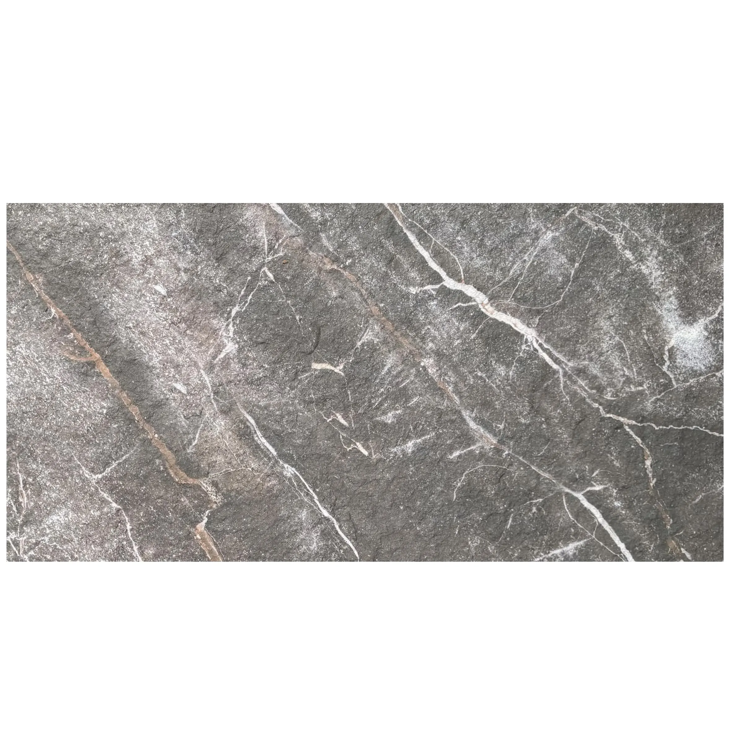
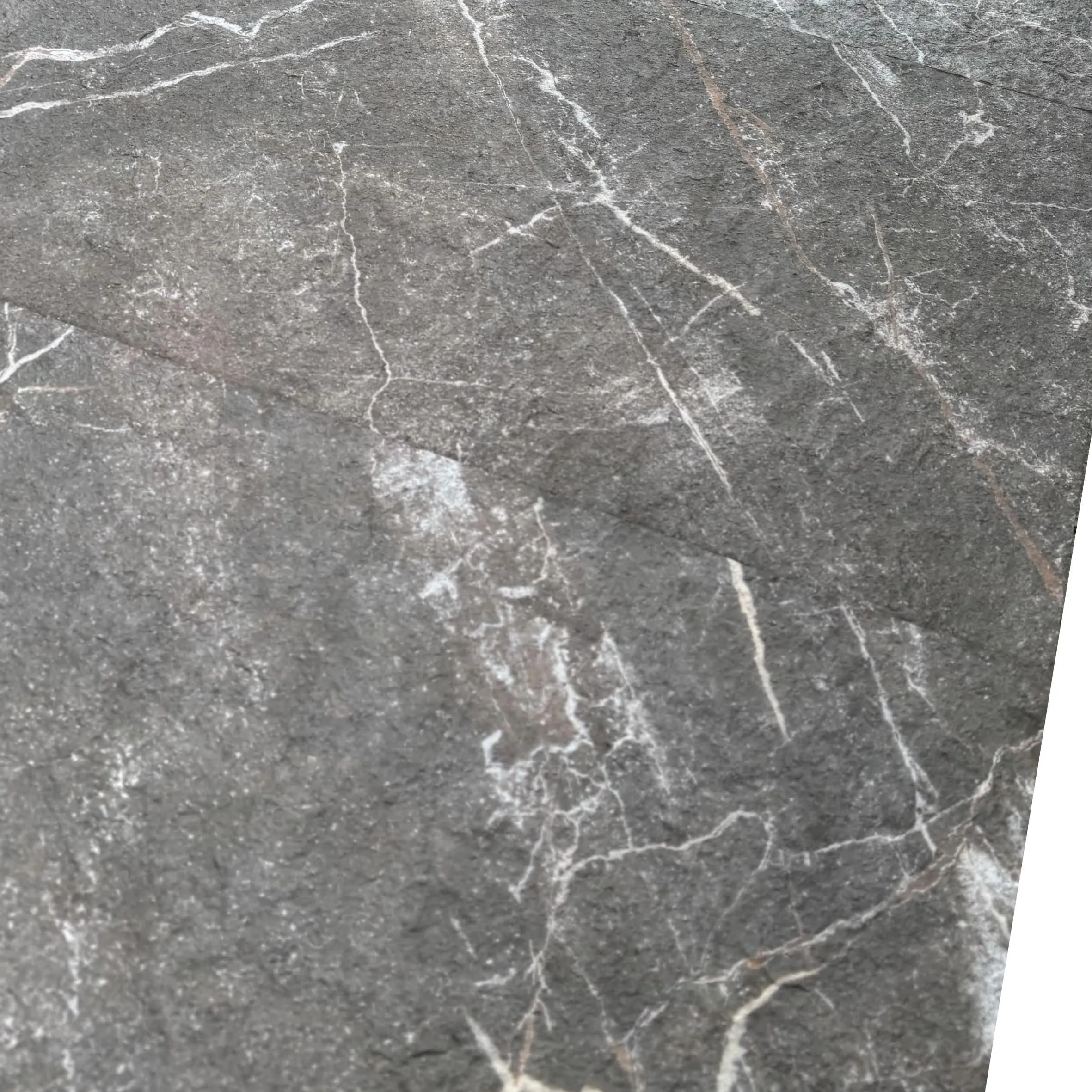
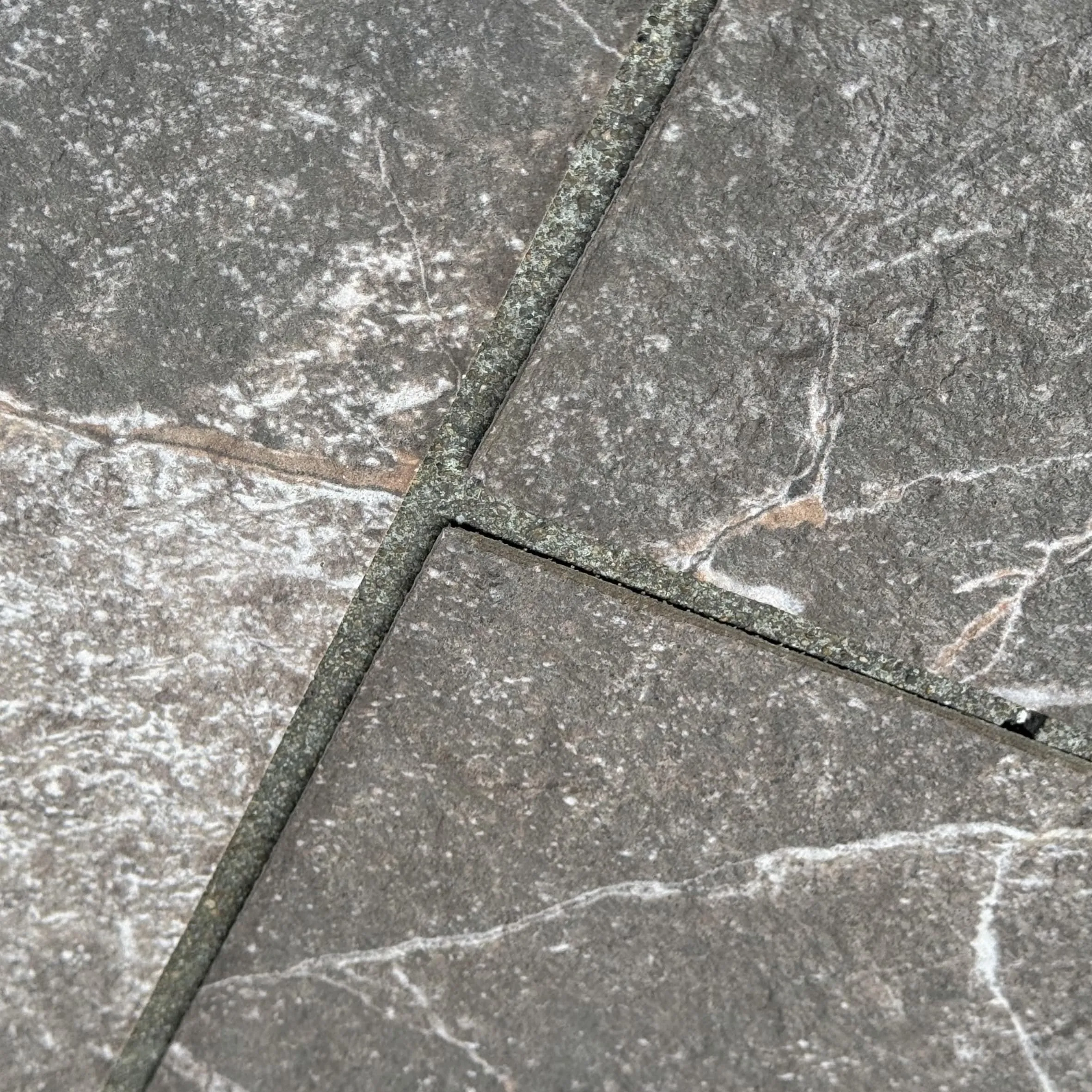
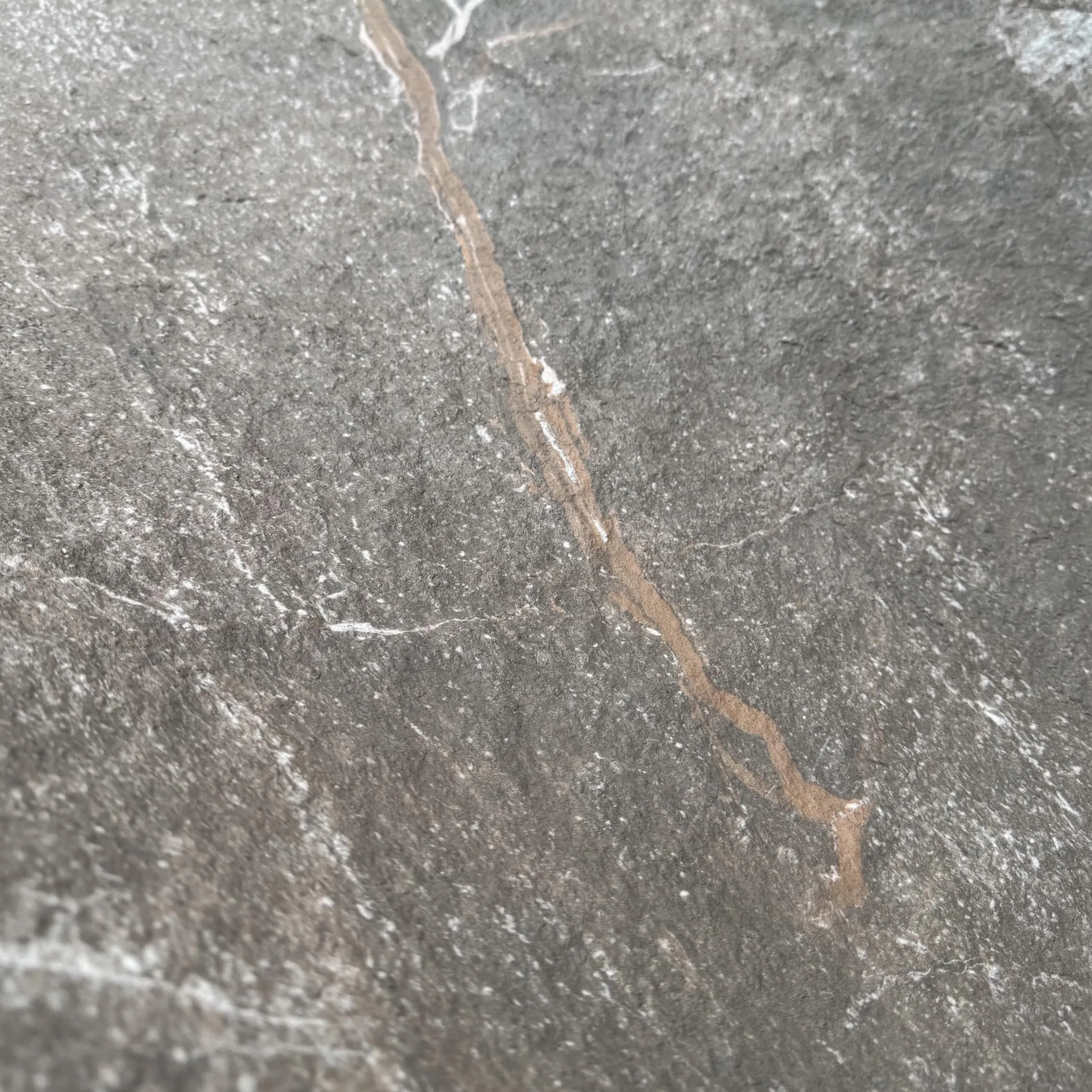
First things first: Let's get to know the star of the show. Granite Portoro isn't your average countertop material. Hailing from quarries that have supplied stone for centuries (though its modern popularity in retail is a newer trend), it's a type of granite known for its striking contrast. Picture a deep, inky black background—so dark it almost feels velvety—interrupted by bold, irregular veins of gold. Not the brash, shiny gold of a trophy, but a warm, earthy gold that looks like liquid sunlight frozen in stone. The veins vary from thin, wispy threads to thicker, more dramatic streaks, making every slab one-of-a-kind. Run your hand over it, and you'll notice a texture that's smooth yet subtly granular—polished enough to feel refined, but with enough grip to avoid that slippery, sterile vibe some stones can have.
What sets Granite Portoro apart from other dark granites? It's all in the veins. Unlike, say, Black Galaxy granite (which has tiny gold flecks), Portoro's veins are bold and dynamic—they draw the eye, create movement, and add a sense of luxury without feeling ostentatious. It's the kind of stone that looks just as good under bright retail spotlights as it does in softer, ambient lighting. And because it's natural granite, it's tough as nails—scratch-resistant, heat-resistant, and built to stand up to the chaos of daily foot traffic, spilled lattes, and the occasional rogue shopping bag. In short, it's a material with personality: bold, durable, and unapologetically premium.
So, why are designers and brand managers across industries—from luxury fashion to gourmet food—reaching for Granite Portoro? Let's break it down.
In retail, perception is everything. A brand that wants to position itself as high-end doesn't just need great products—it needs a space that feels worth investing in. Granite Portoro delivers that instantly. Its black-and-gold palette is inherently associated with luxury (think tuxedos, old-world libraries, high-end watches), but it's not stuck in the past. The stone's modern, bold pattern feels fresh, making it perfect for brands that want to blend heritage with contemporary edge. Imagine a boutique selling artisanal leather goods: A checkout counter clad in Granite Portoro immediately signals that the products inside are crafted with care—because the space itself is.
Retail spaces take a beating. From customers dragging suitcases over floors to employees wiping down counters a dozen times a day, materials need to keep up. Granite Portoro is up to the task. As a granite, it's one of the hardest natural stones available, ranking 6-7 on the Mohs scale (for context, marble is a 3-4, making it much softer). That means it resists scratches, stains, and heat—no need to panic if a barista spills hot coffee on a Portoro counter, or a shopper's heel scuffs the floor. Unlike some luxury materials that require constant coddling, Portoro is low-maintenance, which is a huge win for busy retail teams.
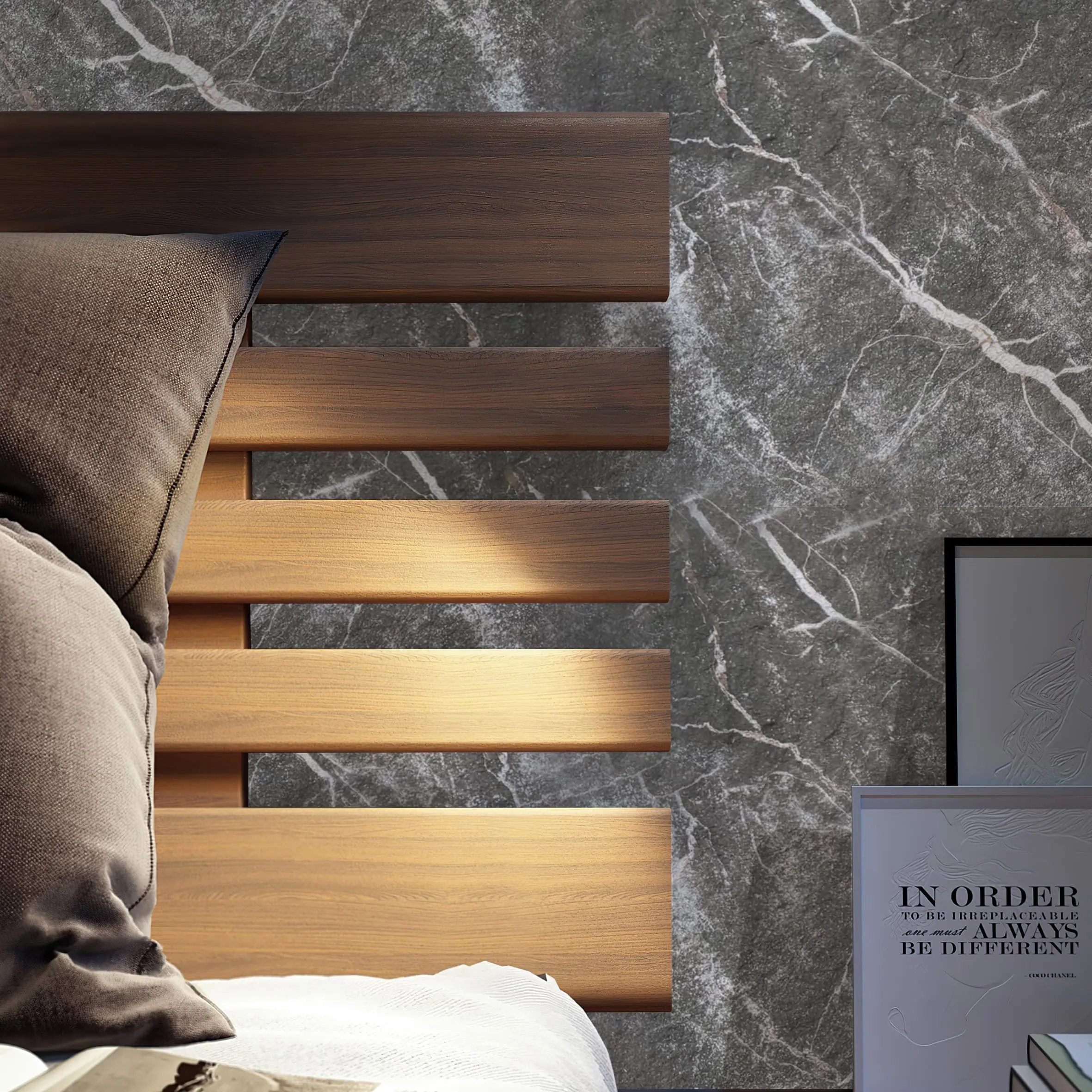
Great retail design isn't about one material stealing the show—it's about a symphony of textures and tones. Granite Portoro is surprisingly versatile, pairing beautifully with lighter, softer materials to balance its boldness. For example, pairing it with Marble Veil White (a creamy, subtly veined marble) creates a classic black-and-white contrast that feels elegant without being harsh. Or mix it with Wood Grain Board —the warmth of wood softens Portoro's drama, adding a cozy, inviting layer (perfect for a café or home goods store). Even industrial materials like Fair-Faced Concrete work: the concrete's raw, minimalist vibe grounds Portoro's opulence, creating a space that feels modern and approachable.
Retail spaces are long-term investments. A storefront or interior renovation can cost hundreds of thousands of dollars, so brands need materials that won't look dated in five years. Granite Portoro has staying power. Unlike trendy colors or patterns that fade with time, its timeless black-and-gold palette is always in style. Plus, because it's so durable, it won't chip, stain, or lose its luster—meaning the space will look just as impressive on day 1,000 as it did on opening day. For brands building a legacy, that consistency is priceless.
Granite Portoro isn't a one-trick pony. Its versatility means it can shine in almost every corner of a retail space. Here are some of the most impactful applications:
A Granite Portoro storefront is like a billboard for your brand. Imagine a boutique on a busy street: the stone's dark surface absorbs light during the day, making the gold veins pop, while at night, under spotlights, it glows, drawing passersby in. It's bold enough to stand out in a crowded cityscape but refined enough not to feel gaudy.
High-traffic areas need durable flooring, but that doesn't mean they can't be beautiful. Polished Granite Portoro floors add a touch of luxury to entryways or main aisles. Pair with lighter materials like Marble Veil White tiles in a checkerboard pattern for a classic look, or use large slabs for a seamless, modern feel.
The checkout counter is where customers make their final impression of your brand. A Granite Portoro countertop feels substantial and luxurious, turning a quick transaction into a moment of elegance. It's also practical: heat-resistant for coffee shops, stain-resistant for food retailers, and easy to clean for high-volume stores.
Want to create a focal point? A Granite Portoro accent wall behind a display of your best products instantly draws the eye. It works especially well in minimalist spaces, where the stone's pattern adds visual interest without cluttering the design. Pair it with Ando Cement (Light Grey) walls nearby for a sleek, modern contrast—the cement's muted tone lets the Portoro's veins take center stage.
Even the most stunning material needs support. Granite Portoro is bold, so pairing it with the right companions is key to creating a space that feels balanced, not overwhelming. Here are a few materials that play particularly well with it:
If Granite Portoro is the "drama," Marble Veil White is the "calm." This creamy white marble with soft grey veins is the perfect counterpoint to Portoro's boldness. Together, they create a timeless black-and-white palette that feels sophisticated and balanced. Think: a luxury skincare store with Marble Veil White shelves and a Granite Portoro accent wall—the white makes products pop, while the Portoro adds depth.
Granite Portoro's sleekness can sometimes feel a bit "cold," so adding warmth is key. Wood Grain Board —with its natural texture and earthy tones—softens the stone's edge, making the space feel inviting. A café with Granite Portoro tabletops and Wood Grain Board paneling on the walls? It's the perfect mix of luxury and coziness, telling customers, "We care about quality, and we want you to stay awhile."
For brands with a modern, edgy vibe, Fair-Faced Concrete is a great match. Its raw, unpolished surface and neutral grey tone complement Granite Portoro's boldness without competing. A tech store, for example, could use Fair-Faced Concrete walls with Granite Portoro display pedestals—creating a space that feels innovative and premium, with just the right amount of industrial cool.
| Material | Aesthetic Vibe | Durability | Best For |
|---|---|---|---|
| Granite Portoro | Bold, luxurious, black with gold veins | Exceptional (scratch, heat, stain-resistant) | Storefronts, countertops, accent walls |
| Marble Veil White | Soft, elegant, white with grey veins | Moderate (prone to etching, needs sealing) | Shelving, flooring, backsplashes |
| Fair-Faced Concrete | Raw, industrial, neutral grey | High (durable, low-maintenance) | Walls, flooring, display bases |
Still not convinced? Let's look at a few hypothetical (but realistic) examples of how Granite Portoro transforms retail spaces.
Lumière, a high-end fashion brand specializing in evening wear, wanted a store that felt as glamorous as its dresses. The design team opted for a Granite Portoro storefront with large, floor-to-ceiling windows. During the day, the stone's gold veins catch the sunlight, creating a warm glow that invites passersby. Inside, the flooring is a mix of Marble Veil White tiles and Granite Portoro inlays, guiding customers toward the fitting rooms. The checkout area features a massive Granite Portoro counter with a polished finish, paired with Wood Grain Board cabinets for a touch of warmth. The result? A space that feels luxurious but not intimidating—exactly what Lumière's customers want.
Terra & Bean, a café chain known for its small-batch, sustainable coffee, wanted to balance luxury with approachability. Their flagship store uses Granite Portoro for the bar top, where baristas craft lattes and pour-overs. The stone's durability stands up to daily spills, while its black-and-gold pattern adds a touch of elegance to the casual space. The walls are clad in Fair-Faced Concrete , and the seating area features Wood Grain Board tables and banquettes. The contrast between the bold Portoro, industrial concrete, and warm wood creates a space that feels both premium and cozy—perfect for lingering over a cup of coffee.
TechHaven sells high-end headphones, speakers, and gadgets, and their brand is all about innovation and quality. Their store uses Granite Portoro for display pedestals, where products like wireless earbuds and smartwatches are showcased. The pedestals sit against walls of Ando Cement (Light Grey) , creating a sleek, modern backdrop that makes the tech products pop. The flooring is polished concrete, but a Granite Portoro accent wall behind the main display adds visual interest. The message? "Our products are built to last—just like this space."
Granite Portoro is amazing, but it's not for every brand or budget. Here are a few things to keep in mind if you're considering it for your retail space:
Natural stone isn't cheap, and Granite Portoro is no exception. Its rarity (especially high-quality slabs with bold veins) means it costs more than, say, standard granite or concrete. But remember: it's a long-term investment. The stone's durability and timelessness mean you won't need to replace it anytime soon, making the upfront cost worth it for brands prioritizing quality.
Granite is heavy, and cutting it to size requires specialized tools and expertise. Don't skimp on installation—hire a team experienced with natural stone. Improper installation can lead to cracks, uneven surfaces, or water damage down the line.
While Granite Portoro is low-maintenance, it's not entirely "set it and forget it." To keep it looking its best, seal it once a year (to prevent stains) and wipe up spills promptly (especially acidic liquids like lemon juice or vinegar, which can etch the surface over time). A quick sweep and damp mop are usually all it takes for daily cleaning.
Every slab of Granite Portoro is unique, so embrace the variation! Work with your supplier to select slabs that have the vein pattern you love, and plan your design around the stone's natural beauty. Trying to force a uniform look will only take away from what makes Portoro special.
At the end of the day, retail design is about storytelling. Every material choice is a sentence in the story of who your brand is, what it values, and why customers should care. Granite Portoro isn't just a pretty stone—it's a powerful narrative tool. It says, "We're bold. We're premium. We're here to last." Whether paired with Marble Veil White for classic elegance, Wood Grain Board for warmth, or Fair-Faced Concrete for industrial edge, it adapts to your brand's unique voice, making it a versatile choice for retailers looking to make an impact.
So, if you're designing a retail space that needs to stand out, evoke emotion, and tell a story of quality, don't sleep on Granite Portoro. It's more than a material—it's a partner in building a brand that customers will remember, and return to, for years to come.
Recommend Products


