
Exploring the power of visual storytelling in construction and design decisions
Walk into any design studio or meet with a homeowner planning a renovation, and you'll likely encounter the same dilemma: a table covered in small stone samples, glossy brochures with generic stock photos, and a client squinting, trying to imagine how that 4x4 inch piece of lime stone beige will look stretched across their entire kitchen backsplash. It's a scenario that plays out daily in the construction and design world—and it's one that often leads to doubt, delays, and even costly mistakes.
For decades, the industry has relied on physical samples and printed materials to showcase building materials. But here's the truth: a tiny chunk of lime stone or a heavily edited brochure image can only tell part of the story. Clients aren't just buying a material—they're investing in a vision for their space. And visions, by nature, are big, dynamic, and deeply personal. How can a small sample capture the way light dances off fair-faced concrete at sunset? Or the subtle variations in texture that make travertine (starry blue) feel like a night sky brought indoors? It can't. And that gap between what clients see in a sample and what they hope to see in their space is where confidence wavers.
Let's break it down: when someone is choosing materials for a building—whether it's a commercial lobby, a home renovation, or a hospitality space—they're not just selecting colors and textures. They're making decisions that will shape how the space feels for years to come. A restaurant owner might dream of a warm, inviting atmosphere; a tech startup might want sleek, modern fair-faced concrete walls that signal innovation. These emotional and functional goals are hard to map onto a small sample of mcm flexible stone or a blurry brochure image of travertine (starry blue).
Research backs this up. Studies on consumer behavior in design show that contextual visualization —seeing a material in a real-world setting—boosts decision confidence by up to 65%. Why? Because humans are visual creatures. We process images 60,000 times faster than text, and we rely on visual cues to assess whether something "fits" our vision. When a client holds a lime stone beige sample, they might think, "This is nice, but will it look washed out in my living room with north-facing windows?" When they see a real photo of that same lime stone beige installed in a similar room, lit by natural light, with furniture and decor around it, that doubt fades. They can see it working. And when they can see it, they can believe in it.
To understand why real photos are a game-changer, let's first look at the tools designers and suppliers have historically used—and where they fall short. Here's a closer look at the most common methods:
| Method | How It Works | Key Limitations |
|---|---|---|
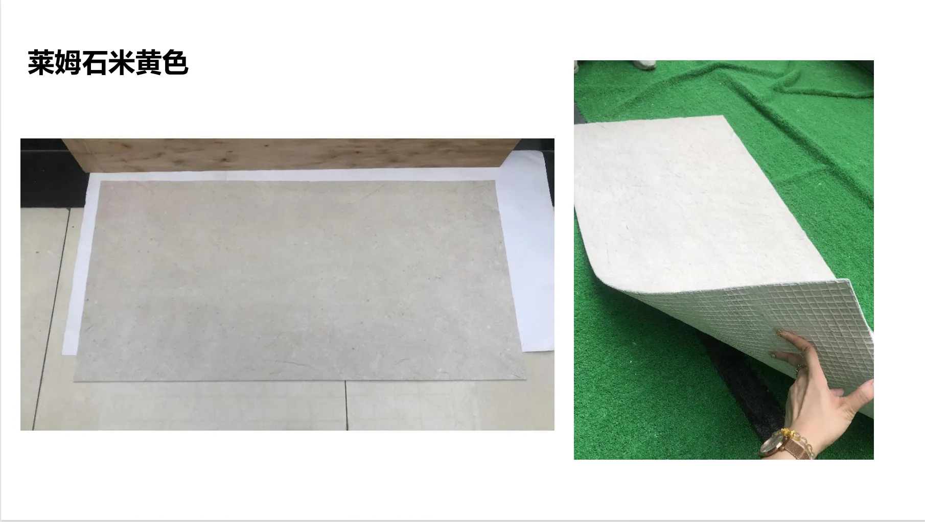
| Physical Samples | Small, 2-4 inch squares of the material (e.g., lime stone beige, travertine). | No context (size, lighting, surrounding elements); texture feels flat; color can look different in bulk. |
| Brochures/Catalogs | Printed images of materials in idealized settings. | Colors often oversaturated; lighting is artificial; no sense of scale or texture depth. |
| 3D Renderings | Digital models of spaces with materials applied. | Can feel "fake" or overly perfect; doesn't capture real-world imperfections (e.g., natural veining in travertine). |
Take mcm flexible stone, for example—a lightweight, adaptable material that's gaining popularity for its ability to conform to curved surfaces. A small sample might feel rigid and unimpressive, but a real photo of it wrapping around a curved wall in a hotel lobby? That tells the story of its flexibility and beauty. Similarly, fair-faced concrete is prized for its raw, industrial charm, but a brochure image might make it look cold and sterile. A real photo, taken at golden hour with sunlight highlighting its subtle texture? That shows warmth and character.
Real photos aren't just pretty pictures—they're trust-building tools. They take the abstract (a material name, a sample) and make it concrete (literally, in the case of lime stone beige). Here's how they do it:
Imagine trying to choose a shirt without seeing it on a person—you'd have no idea how it fits, how the fabric drapes, or how the color looks against skin. Materials are the same. A photo of travertine (starry blue) installed in a bathroom, paired with white fixtures and warm lighting, tells a client more than a sample ever could. They can see how the "starry" patterns (tiny, iridescent flecks) catch the light when the shower is on, or how the blue tones complement the space's overall mood. Context turns a material into a design element , not just a product.
For lime stone beige, context is everything. A sample might read as "plain" or "boring," but a real photo of it as a kitchen backsplash, with wooden cabinets and brass hardware, reveals its versatility—it's a neutral that lets other elements shine, but it has enough texture (subtle fossilized patterns, a matte finish) to add depth. Clients don't just see a stone; they see their morning coffee on the counter, the way sunlight hits the wall at 8 a.m., and how easy it will be to keep clean. That's the power of context.
Texture is what makes a space feel tactile and alive. Fair-faced concrete, for instance, has a rough, almost organic texture that's impossible to fully appreciate from a smooth sample. A real photo, taken up close, shows the tiny air bubbles, the slight variations in finish, and how it feels under light—matte in shadow, slightly reflective in sun. Clients run their fingers over samples, but a photo lets them "feel" the texture with their eyes, imagining how it would feel to lean against a wall made of it or run a hand along a countertop.
Mcm flexible stone, with its thin, bendable composition, is another texture star. A photo of it applied to a curved retail display wall shows how it wraps seamlessly, no cracks or gaps, highlighting its practicality and aesthetic appeal. A sample might feel flimsy, but a photo of it in use proves its durability and design potential.
Color is the biggest source of client anxiety. "Will this lime stone beige look pink in my living room?" "Is travertine (starry blue) too dark for a small bathroom?" Samples and brochures often fail here—fluorescent lights in a showroom can wash out colors, and printing processes can distort hues. Real photos, taken in natural and artificial light, show color as it actually appears in real spaces. A series of photos (daytime, evening, with warm/cool lighting) for lime stone beige or travertine (starry blue) gives clients confidence that the color won't surprise them post-installation.
Many materials have "selling points" that samples bury. Take mcm flexible stone's lightweight nature—how do you show that with a sample? You can't. But a photo of installers easily lifting a large panel onto a second-story wall tells the story: it's easy to transport, quick to install, and reduces labor costs. For travertine (starry blue), the "starry" effect is a unique selling point; a close-up photo of those flecks sparkling in light turns a generic stone into a conversation piece.
Numbers and theories are great, but real-world examples hit harder. Let's look at two scenarios where real photos turned hesitant clients into confident decision-makers:
Maria, a first-time restaurant owner, was redesigning her space—a cozy Italian bistro in downtown Portland. She wanted walls that felt warm and rustic but not outdated. Her designer suggested lime stone beige, but Maria was skeptical. "It looks like a boring tan," she said, holding the sample. "I need something that feels like Tuscany, not a doctor's office."
The designer pulled up a folder of real photos: lime stone beige walls in a similar bistro, paired with reclaimed wood tables, string lights, and terracotta accents. One photo, taken at dusk, showed the stone glowing softly under warm pendant lights, the subtle fossil patterns adding texture without overwhelming the space. "That's it," Maria said immediately. "I can see the whole restaurant now." The photos didn't just sell the stone—they sold her vision. Six months later, she reported that customers often commented on the "charming, earthy walls."
A tech company was renovating their headquarters and wanted a "raw, innovative" aesthetic. Their contractor recommended fair-faced concrete, but the team was worried it would feel cold and industrial. "We don't want our employees to feel like they're working in a warehouse," the CEO said.
The contractor shared real photos of fair-faced concrete walls in other tech offices: paired with living plants, colorful art, and soft seating, the concrete looked modern and warm, not sterile. One photo showed a conference room with concrete walls and a large window; the natural light softened the texture, making the space feel open and creative. The team approved the material on the spot. Post-renovation, employee surveys noted the "inviting, dynamic atmosphere" as a highlight.
When clients feel confident in their material choices, everyone wins. Projects move faster—no endless back-and-forth over samples or last-minute changes. Returns and rework drop, saving time and money. And perhaps most importantly, clients feel heard and valued; they trust that their designer or supplier understands their vision because they've been shown, not just told, how materials will work.
For suppliers and designers, real photos are a marketing tool that speaks for itself. A portfolio of projects featuring mcm flexible stone, travertine (starry blue), or lime stone beige—with high-quality, unedited photos—attracts clients who want transparency and reliability. In an industry where trust is everything, real photos are proof that you deliver what you promise.
Real photos are just the beginning. As technology evolves, we're seeing 360-degree tours of spaces with materials installed, virtual reality tools that let clients "walk through" a room before construction, and even AI-driven apps that let you upload a photo of your space and "try on" materials like lime stone beige or travertine (starry blue). But even with these advances, the core principle remains: clients need to see materials in a way that feels real. Photos will always be the foundation of that.
Recommend Products


