
Navigating the vintage silver, gold, and black options to bring your design dreams to life
Let's start with a scenario we've all lived through, whether we're homeowners, designers, or just someone who cares about making a space feel "right." Imagine walking into a room where the walls, floors, and fixtures all seem to click—like a song where every note harmonizes. That feeling? It's often rooted in the materials chosen, and more specifically, their colors. When it comes to statement materials like boulder slab, the color you pick isn't just a design choice; it's a mood-setter, a style-definer, and a decision that will shape how you (and everyone else) experiences the space for years to come.
If you've found yourself drawn to boulder slab—maybe you've heard about its durability, its unique texture, or how it can elevate everything from a kitchen backsplash to a commercial lobby—you've probably also stared at a swatch book wondering: vintage silver, vintage gold, vintage black… how do I choose? It's not just about picking a "pretty" color. It's about understanding how that color will interact with light, with your existing decor, with the purpose of the room, and even with the passage of time. Because the best design choices aren't just visually appealing—they're intentional.
In this guide, we're diving deep into the world of boulder slab colors, with a focus on the beloved vintage trio: boulder slab (vintage silver) , boulder slab (vintage gold) , and boulder slab (vintage black) . We'll break down what makes each color unique, how to match them to your project's aesthetic, and why considering factors like lighting and context can turn a "good" choice into a "perfect" one. Whether you're designing a cozy home office, a sleek restaurant, or a welcoming outdoor patio, by the end, you'll feel confident in selecting a boulder slab color that doesn't just fit your vision—it amplifies it.
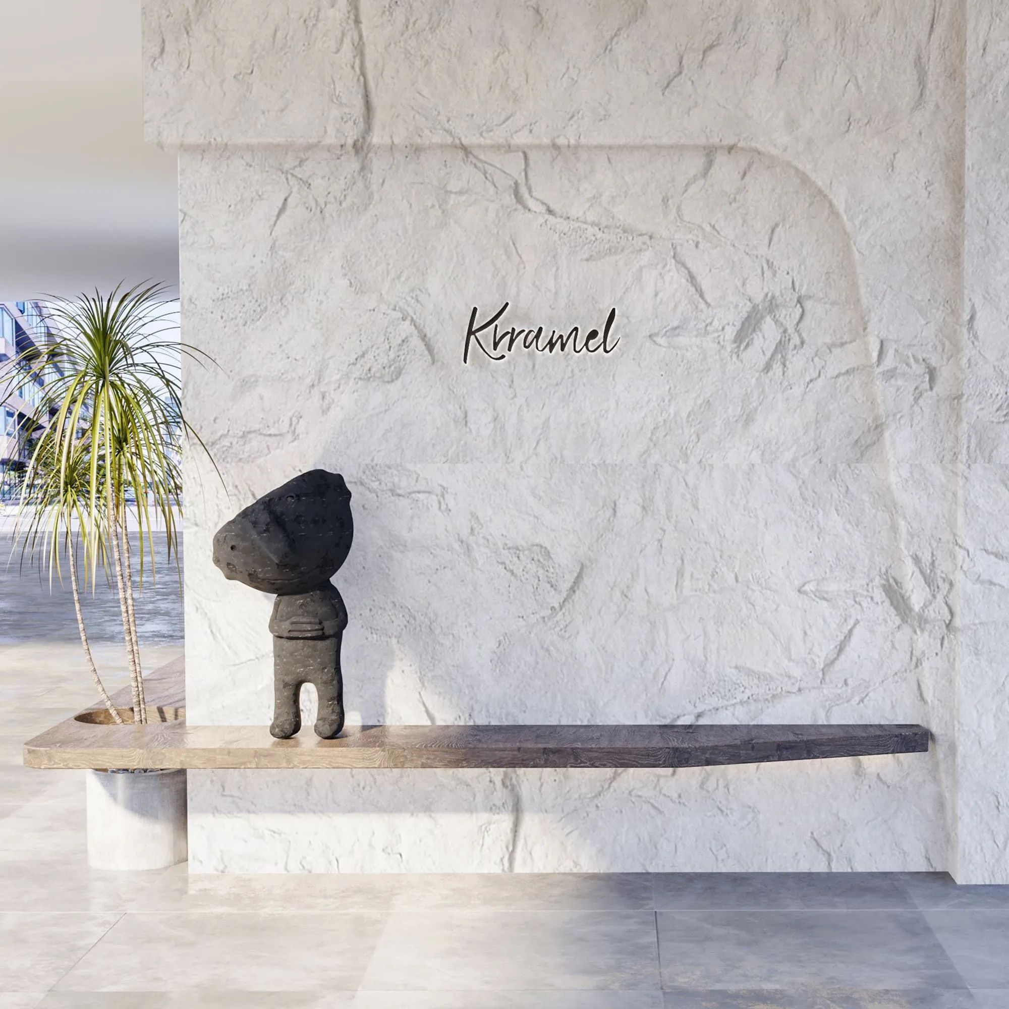
Before we get into the colors, let's make sure we're all on the same page about the star of the show: boulder slab. If you're new to the term, you might be picturing a giant, heavy rock slab—and while the name "boulder" evokes that rugged, natural feel, modern boulder slab is a far cry from hauling a chunk of mountain into your living room. Instead, think of it as a thoughtfully engineered material that blends the best of nature and technology. It's part of the broader family of modified composite materials (MCM), which are known for being lightweight, durable, and surprisingly versatile. Unlike traditional stone slabs that can be brittle or heavy, boulder slab offers the texture and depth of natural stone with the practicality of a composite—meaning it's easier to install, less likely to crack, and often more affordable, too.
But what really sets boulder slab apart is its character . Run your hand over it, and you'll notice subtle variations in texture—tiny pits, gentle ridges, a finish that feels both organic and refined. It's not a "perfect" material, and that's the point. Those imperfections give it warmth, making it feel less like a cold, industrial product and more like something that has a story. And when paired with the right color? That story becomes the backbone of your space's aesthetic.
Now, why focus on the "vintage" color variants? Because in a world of bright whites and stark grays, these hues offer something different: depth. Vintage silver, vintage gold, and vintage black aren't just flat colors—they have undertones, nuances, and a muted richness that feels intentional. They're not trying to be flashy; they're trying to be timeless . Think of them as the design equivalent of a well-worn leather jacket or a vintage watch—they age gracefully, growing more charming as they pick up subtle patinas over time. For anyone who wants their space to feel curated rather than "trendy," these colors are a goldmine (pun intended).
Picking a boulder slab color isn't about falling in love with a swatch at first sight (though that can happen!). It's about asking the right questions. Let's walk through the key factors that should guide your choice—because the more you consider, the more confident you'll be that your decision will stand the test of time.
Lighting can turn a color from "meh" to "magic" or vice versa—and it's often the most overlooked factor. Let's say you fall head over heels for vintage gold in the store, where it's bathed in warm, overhead lights. Bring it home to a room with north-facing windows (which let in cool, blue-tinged light), and suddenly that gold might look brassy or flat. Or maybe you love vintage silver in a dimly lit showroom, but install it in a sun-drenched kitchen, and its metallic undertones become overpowering.
The fix? Test your swatches in the actual space at different times of day. Morning light is soft and golden; afternoon light is brighter and bluer; evening light (especially with artificial bulbs) can be warm (incandescent) or cool (LED). Notice how the color shifts. Vintage silver, for example, tends to glow in soft, indirect light but can look stark under harsh, direct sun. Vintage gold warms up a room with cool lighting but might feel too intense in a space already flooded with warm tones. Vintage black, surprisingly versatile, can absorb light (making a room feel cozier) or reflect it (if paired with glossy surfaces), depending on the finish.
Your boulder slab doesn't exist in a vacuum—it has neighbors: your walls, floors, furniture, even the art on the walls. Choosing a color that plays well with these neighbors is key to a cohesive look. Let's say your space is already filled with warm woods, earthy textiles, and cream walls. Throwing in vintage black might create a jarring contrast (unless that's the look you want!). On the other hand, vintage gold would complement those warm tones, adding a layer of luxury without clashing.
Or maybe you're working with a minimalist palette: white walls, gray sofas, black accents. Vintage silver here would blend seamlessly, adding a modern edge without overwhelming the space. The goal isn't to match everything perfectly—it's to create a dialogue. Ask: Does this color complement the existing tones, or does it fight with them? Sometimes contrast is good (a vintage black accent wall in an all-white room can be stunning), but it needs to be purposeful.
A home theater and a children's playroom have very different jobs—and their materials should reflect that. The color of your boulder slab should align with how the space will be used. Let's break it down:
At the end of the day, you're the one who has to live with (or work in) this space—so your personal style should never take a backseat. Are you drawn to modern, industrial designs? Vintage silver, with its cool, metallic finish, might speak to you. Do you prefer warm, bohemian vibes? Vintage gold could be your soulmate. Love the drama of a moody, minimalist space? Vintage black might feel like home.
Don't be afraid to lean into what makes you happy—even if it's not the "trendy" choice. Trends come and go, but a space that feels true to your style will always feel welcoming. That said, it's also worth considering if your style might evolve. If you tend to redecorate every few years, a more neutral option like vintage silver might offer more flexibility. If you're in it for the long haul, a bold choice like vintage black could be a lifelong companion.
We've all seen spaces that felt "so 2010" a few years later—bright accent walls, overly glossy finishes, colors that screamed for attention but quickly lost their appeal. The best color choices are ones that age like fine wine, growing more charming as the years pass. So how do the vintage boulder slab colors stack up here?
Vintage silver, gold, and black all have one thing in common: they're muted . Unlike a bright chrome or a shiny brass, these vintage hues have a worn-in quality from the start—like they've already stood the test of time. That means they're less likely to feel dated as trends shift. Think about it: when was the last time a classic black leather sofa went out of style? Or a silver watch? These colors are anchors—they provide a stable base that can adapt to changing decor, new art, or even a fresh coat of wall paint down the line.
Now that we've covered the "why" behind color choice, let's get up close and personal with the "what." Each of these vintage boulder slab colors has its own personality, its own strengths, and its own ideal "scenes." Let's break them down, one by one.
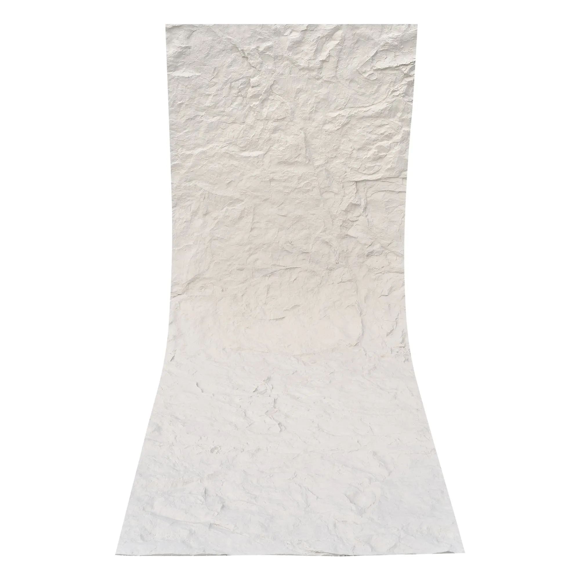
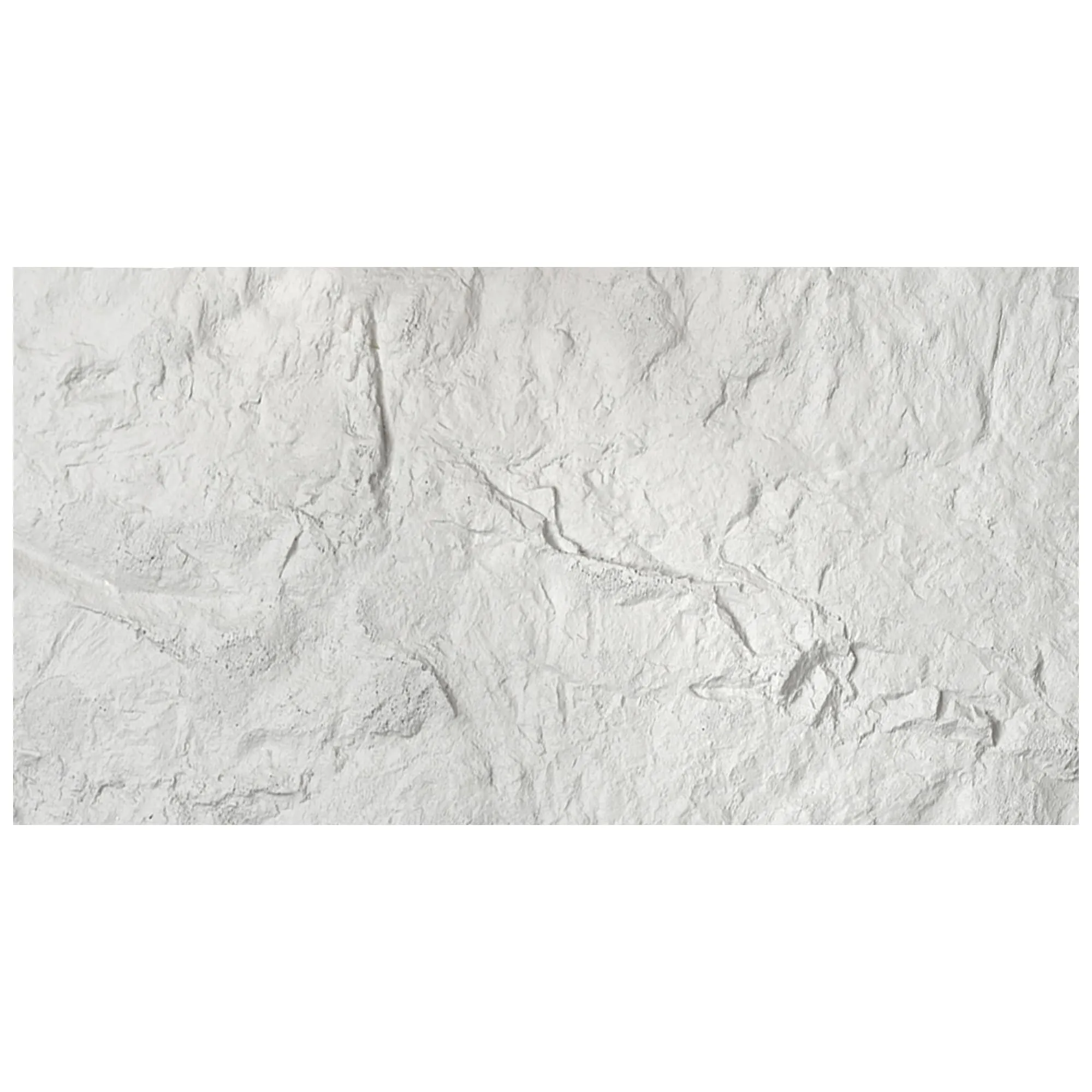
Vintage silver isn't your average "gray." It's a color with depth—a soft, muted metallic that sits somewhere between silver and light graphite. Run your eye across it, and you'll notice subtle undertones of blue or green, depending on the light—never enough to feel "colorful," but enough to keep it from feeling flat. It has a industrial-chic vibe, but not in a cold, factory-like way; more like a repurposed warehouse that's been turned into a cozy loft. Think exposed brick, leather furniture, and warm wood accents—that's the world where vintage silver thrives.
What makes vintage silver so versatile? It's a neutral, but not a boring one. It can act as a backdrop, letting other elements (bold art, vibrant textiles) take center stage, or it can be the star, especially when paired with other neutrals. Imagine a kitchen with vintage silver boulder slab countertops: paired with white cabinetry and black hardware, it feels modern and sleek. Swap the white for warm wood, and suddenly it's rustic-modern, with just the right amount of edge.
Best for: Modern homes, industrial-inspired spaces, home offices, commercial lobbies, and any area where you want to add a touch of sophistication without warmth. It's also a great choice if you're unsure about committing to a bold color—vintage silver plays well with just about everything.
If vintage silver is the calm, collected friend, vintage gold is the one who walks into a room and immediately makes everyone feel at ease. It's warm, but not overwhelming—think of the color of honey in a glass jar, or the soft glow of a brass lamp in the evening. Unlike bright, "blingy" golds that can feel gaudy, vintage gold has a patinaed finish, like it's been loved for years. It has undertones of amber and copper, which give it a richness that feels organic, not synthetic.
Vintage gold is all about creating warmth. In a room with cool-toned walls (think light grays or blues), it adds a pop of coziness that prevents the space from feeling sterile. In a room with warm walls (beige, terracotta), it amplifies that comfort, making the space feel like a hug. It's also surprisingly versatile across styles: it works in bohemian spaces (paired with macramé and plants), traditional spaces (with antiques and rich fabrics), and even modern spaces (as a counterpoint to clean lines and sharp angles).
Best for: Living rooms, bedrooms, dining rooms, and spaces where you want to encourage connection and relaxation. It's also a smart choice for spaces with limited natural light—its warm undertones can make even a dark corner feel brighter and more inviting.
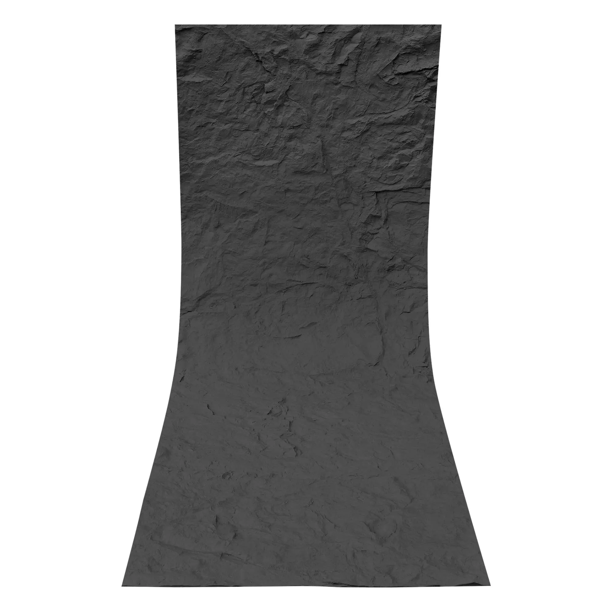
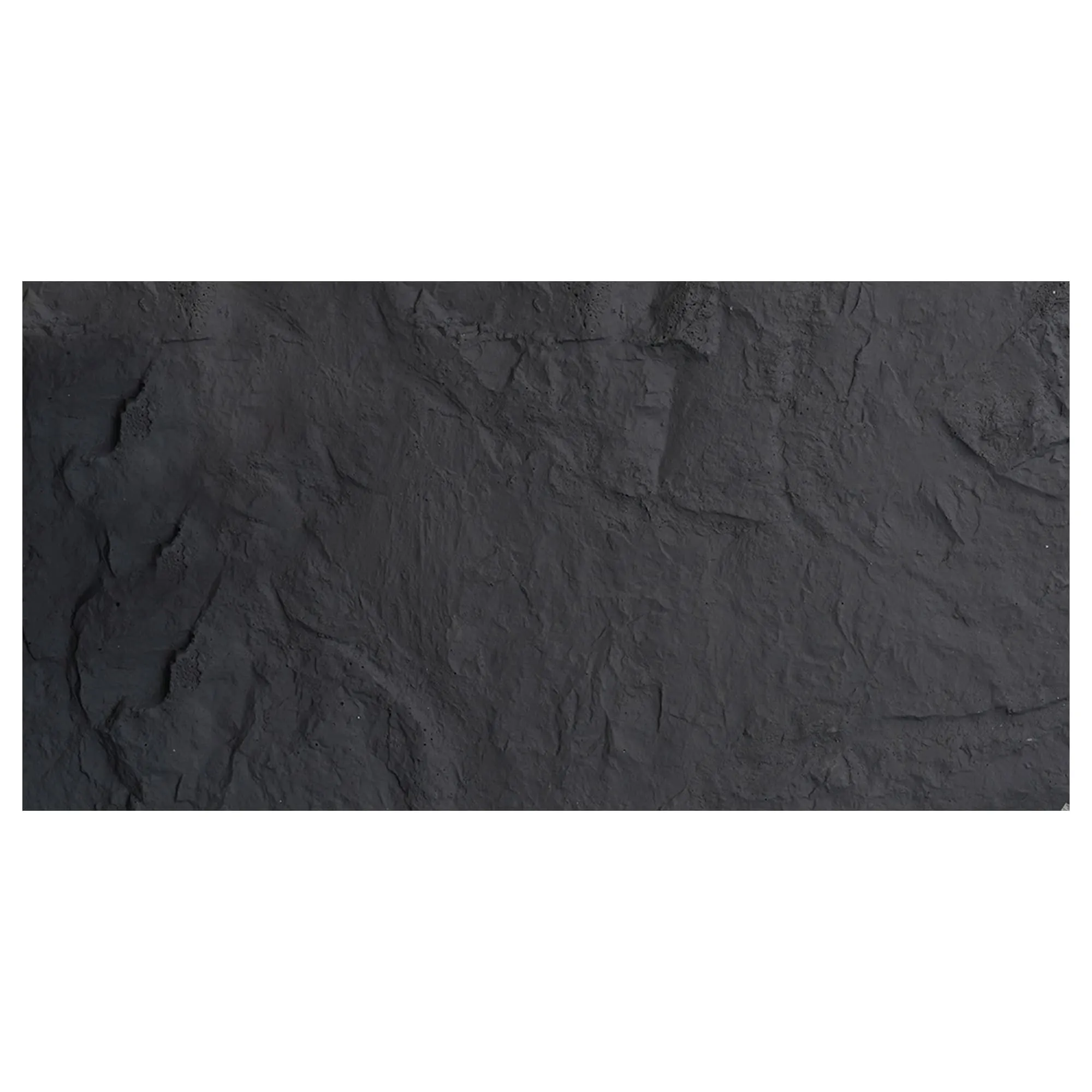
Vintage black is the rebel with a cause—and that cause is making a statement. But don't mistake it for a harsh, flat black. This is a black with texture: tiny variations in tone, subtle sheen in certain lights, a depth that makes it feel more like a "living" color than a void. It's the kind of black that doesn't suck the light out of a room; instead, it frames it, creating contrast that makes other elements (light fixtures, art, even people!) stand out.
Vintage black is all about drama, but it's also surprisingly versatile. In a minimalist space, it can be a bold accent (think a vintage black boulder slab backsplash in an all-white kitchen) that adds edge without clutter. In a maximalist space, it can ground the chaos, providing a stable base for patterns and colors to play. It's also a color that feels luxurious—there's a reason high-end restaurants and boutique hotels love black accents. It signals sophistication, attention to detail, and a willingness to take risks.
Best for: Statement walls, entryways, dining rooms, home theaters, and commercial spaces (like restaurants or boutiques) where ambiance is key. It's also a great choice for outdoor spaces, like a patio bar or outdoor kitchen—black absorbs heat, which can be a plus in cooler climates, and it hides dirt and weathering better than lighter colors.
Theory is great, but let's get practical. Let's walk through a few common project types and see how each vintage color might shine. Because the best way to understand which color is right for you is to imagine it in your own space.
You're redesigning your kitchen, and you want it to feel sleek, modern, and functional—with just enough personality to avoid feeling like a hospital. The cabinets are flat-panel, in a soft white, and the floors are warm medium-toned wood. You're torn between a backsplash that makes a statement but doesn't clash.
Vintage silver would be a standout here. Its cool, industrial vibe plays perfectly with the white cabinets, while the wood floors add warmth to balance the coolness. Add black hardware and stainless steel appliances, and you've got a cohesive, modern look that feels intentional. Bonus: vintage silver is easy to clean, which is a must in a kitchen.
Vintage gold could work too, but you'd need to be careful with the rest of the palette. Swap the black hardware for brass, and maybe add warm-toned textiles (a mustard rug, terracotta dish towels) to keep the gold from feeling out of place. It would add warmth, but might feel less "modern" and more "eclectic."
Vintage black would be bold—maybe too bold for a small kitchen, but perfect for a larger space. Imagine a full backsplash in vintage black boulder slab, paired with open shelving and white dishes: it's dramatic, but the white and wood keep it from feeling heavy.
You're opening a restaurant that serves farm-to-table cuisine—think warm lighting, wooden tables, and a menu that feels like a hug. The space has high ceilings, exposed beams, and large windows that let in soft natural light. You want the bar front to be a focal point, something that draws people in and sets the tone.
Vintage gold is a no-brainer here. Its warm, inviting hue would complement the wooden tables and exposed beams, creating a cozy, upscale vibe that feels approachable. Imagine the bar lit by pendant lights: the vintage gold would glow, making the space feel intimate and special. Pair it with greenery (think hanging plants) and warm-toned bar stools, and you've got a space that feels both luxurious and down-to-earth.
Vintage black could work if you're going for a more sophisticated, moody vibe (think a wine bar or a steakhouse). It would add drama, especially when paired with gold accents (light fixtures, barware). But it might feel too formal for a farm-to-table spot that's meant to feel "homey."
Vintage silver would feel more modern—maybe better suited for a sleek, urban restaurant than a cozy farm-to-table spot. It could work with the right accents (warm wood, soft lighting), but it might take more effort to keep the space from feeling too cool.
You've got a backyard patio that's finally ready for an upgrade. You want it to be a space where you can host summer barbecues, fall bonfires, and winter hot cocoa nights. The space has a covered pergola, string lights, and a mix of seating (a dining set, a lounge area with a fire pit). You're considering boulder slab for the patio flooring or an accent wall around the fire pit.
Vintage black is a practical, stylish choice here. It hides dirt, leaves, and spills (hello, barbecue sauce!), and it absorbs heat, which can keep the patio a bit warmer on cool evenings. Paired with the warm glow of string lights and the orange flames of the fire pit, it creates a cozy, inviting atmosphere. It also works with any outdoor decor—whether you prefer bright cushions or neutral textiles.
Vintage silver would add a modern edge to the patio, especially when paired with black outdoor furniture and green plants. It reflects light, which can make the space feel brighter during the day—great if your patio is shaded. Just be mindful of footprints: lighter colors can show dirt more easily, so you might need to sweep more often.
Vintage gold is a wildcard here, but it could work in a patio with lots of warm wood (think a wooden pergola, teak furniture). It would add a touch of luxury, making the space feel like a resort oasis. However, it might fade over time if exposed to harsh sunlight, so it's best for covered patios or areas with partial shade.
Still on the fence? Let's put all this information into a handy table to help you compare the three vintage boulder slab colors at a glance.
| Color | Aesthetic Vibe | Best For | Complementary Colors | Lighting Tips | Maintenance Notes |
|---|---|---|---|---|---|
| Boulder Slab (Vintage Silver) | Cool, modern, industrial-chic; subtle metallic undertones. | Modern homes, home offices, commercial lobbies, kitchens. | White, black, warm wood, navy, soft gray. | Thrives in bright, natural light; avoid harsh, cool LED lighting (can make it feel blue). | Moderate maintenance; shows dust but hides scuffs well. |
| Boulder Slab (Vintage Gold) | Warm, inviting, luxurious; amber/copper undertones. | Living rooms, bedrooms, dining rooms, cozy restaurants. | Beige, terracotta, olive green, warm wood, cream. | Glows in soft, warm light (incandescent or warm LED); can feel brassy in cool, harsh light. | Requires regular dusting; fingerprints may show on high-touch surfaces. |
| Boulder Slab (Vintage Black) | Bold, dramatic, timeless; rich, textured finish. | Statement walls, entryways, home theaters, outdoor patios. | White, gold, silver, emerald green, warm wood. | Works in both bright and dim light; adds depth in low-light spaces. | Low maintenance; hides dirt, scuffs, and spills well. |
At the end of the day, choosing a boulder slab color is a balance between practicality and intuition. We've covered the factors to consider—lighting, existing decor, project purpose, personal style—but there's one more element that can't be measured: how the color makes you feel. When you stand in front of a swatch of vintage gold, do you smile? Does vintage silver make you imagine hosting friends in your new kitchen? Does vintage black make you feel bold and excited about the possibilities?
Here's a little secret: the "perfect" color is the one that aligns with both your head and your heart. It should check the practical boxes (durable, works with your space, fits your lifestyle) and also make you feel proud every time you walk into the room. And if you're still unsure? Order samples. Tape them to the wall, live with them for a week, see how they look in the morning, at noon, and in the evening. Notice how they make you feel when you're tired, when you're happy, when you're just passing through. The right color will start to feel like a natural part of the space—and that's when you'll know.
Whether you choose vintage silver, vintage gold, vintage black, or even plain old boulder slab in its natural state, remember this: great design is about more than just materials. It's about creating spaces that tell your story, that make you feel at home, and that grow with you over time. And with boulder slab—durable, beautiful, and full of character—you're already off to a great start.
So go ahead: pick the color that speaks to you. Your space (and your future self) will thank you.
Recommend Products


