
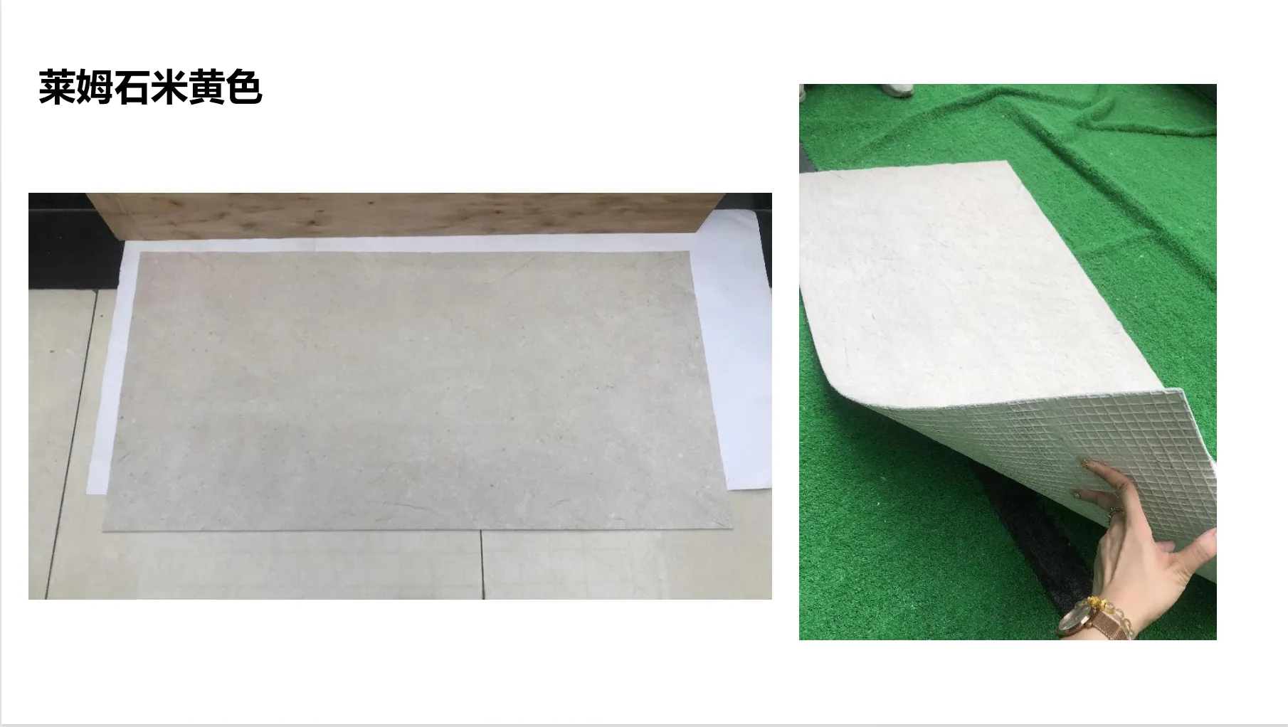
There's something almost poetic about lime stone (beige). It's not just a building material—it's a storyteller. Its soft, sunlit beige hues carry the warmth of aged walls, its subtle veining whispers tales of geological time, and its matte finish feels like a gentle invitation to reach out and touch. When we photograph lime stone (beige), we're not just capturing an image; we're trying to bottle that essence—the quiet grandeur of a material that has adorned everything from ancient villas to modern minimalists' dream homes. But here's the challenge: editing those photos without stripping away the very soul that makes the stone special. Over-sharpen the edges, and you lose its softness. Crank up the saturation, and that delicate beige turns artificial, like a cheap paint swatch. So how do we edit with intention, enhancing the stone's natural beauty rather than overshadowing it? Let's dive in.
Before we even open an editing tool, we need to pause and really see lime stone (beige). Unlike glossy marble or bold granite, its charm lies in subtlety. Run your hand over a slab, and you'll notice the texture isn't uniform—it has tiny pits and pores, like the skin of a well-loved book. Its color isn't a flat "beige" either; it shifts between warm ivory, soft sand, and hints of pale gold, depending on the light. Then there are the veins: thin, wispy lines of slightly darker beige or gray, never too loud, always just enough to add depth without dominating. These are the elements that make lime stone (beige) feel "real"—and they're exactly what we need to protect during editing.
Think of it this way: if you've ever walked into a room clad in lime stone (beige), you'll know it doesn't shout. It breathes. It creates a mood—calm, grounded, timeless. Our photos should do the same. A poorly edited image might make the stone look cold or plastic, robbing viewers of that visceral reaction: "This feels like home." So authenticity here isn't just about "accuracy"—it's about emotional truth. We need to edit in a way that makes someone looking at the photo think, "Yes, that's exactly what lime stone (beige) feels like."
Editing lime stone (beige) photos is a bit like tending to a garden: you prune the weeds, but you don't uproot the flowers. Here are the guiding principles to keep in mind:
Lime stone (beige)'s texture is its fingerprint. Those tiny pores, the slight unevenness in its surface—they're not flaws. They're what make it feel tactile, like a material that's lived. When editing, resist the urge to "smooth" everything out with heavy retouching tools. A little grain is good; it adds character. If the photo was taken in soft natural light, the texture might already be beautifully captured—your job is just to make sure it doesn't get lost in the shuffle.
Lime stone (beige) gets its warmth from undertones of yellow and gold, balanced by soft grays. When editing, avoid pushing the color temperature too far into cool blues (it'll make the stone look clinical) or oversaturating the yellows (it'll veer into "fake tan" territory). The goal? To keep that "sunlight on stone" vibe. Imagine standing in a sunlit courtyard—how does the lime stone (beige) glow there? That's the color you want to preserve.
Harsh shadows can turn lime stone (beige) into a splotchy mess; flat lighting washes out its depth. The sweet spot is gentle contrast—enough to make the veining pop, but not so much that the stone looks like it's under a spotlight. Think of it as mimicking the way light naturally falls on the stone: soft, diffused, and respectful of its matte finish.
Let's walk through the editing process with lime stone (beige) in mind. We'll use a hypothetical raw photo: slightly underexposed (common when shooting matte surfaces), with muted colors and a few minor distractions (a dust spot here, a wonky horizon there). Our goal? To fix the issues without losing the stone's essence.
Before clicking a single slider, take 30 seconds to feel the photo. Does the lime stone (beige) look like it did in person? Is the texture visible? Are the colors leaning too cool or too warm? Jot down notes: "Needs more brightness in the shadows," "Veins are too faint," "Beige feels flat." This keeps you focused on enhancing , not reinventing.
Lime stone (beige) often looks best in clean, balanced compositions. If the original photo is crooked (a common issue when shooting walls or slabs), straighten it using the grid tool—wonky lines distract from the stone's natural symmetry. When cropping, ask: "What's the star here?" If it's a full wall, leave space to show scale; if it's a close-up of veining, zoom in to highlight those details. Avoid tight crops that cut off the stone's edges abruptly—it should feel like part of a larger, living space.
Matte surfaces like lime stone (beige) can eat up light, so underexposed photos are par for the course. Start with the exposure slider, but go slow—boosting it too much washes out texture. Aim for a histogram that's evenly distributed, with no clipping in the highlights (those bright spots that lose detail) or shadows (the dark areas that turn muddy). If the photo has harsh shadows (say, from a window), use the shadow slider to lift them slightly—this reveals texture without making the stone look flat. Highlights, on the other hand, should stay muted; lime stone (beige) rarely has shiny spots, so overexposing highlights will make it look artificial.
This is where lime stone (beige) truly comes alive. Use the texture or clarity slider (depending on your software) to boost the stone's surface details—but go incrementally . Start at +10, check, then +5 more if needed. The goal is to make the pores and slight ridges visible, not to create a "crunchy" effect. If you overdo it, the stone will look like sandpaper, not the smooth-yet-tactile material it is. For extra precision, use a radial filter to apply texture only to the stone itself, leaving surrounding areas (like wood floors or white walls) untouched.
Here's where many editors go wrong: chasing the "perfect" beige. But lime stone (beige) isn't perfect—it's authentic . Use the white balance tool to neutralize any color casts: if the stone looks pinkish (common under indoor lighting), warm it up slightly; if it's grayish (from cool window light), add a touch of yellow. Then, move to the HSL panel (Hue, Saturation, Luminance) to fine-tune:
For veining (those thin gray or darker beige lines), gently boost their saturation and lower their luminance—this makes them more defined without turning them into bold stripes.
Lime stone (beige) needs sharpening, but it's a delicate dance. Use the "masking" feature in your sharpening tool to apply it only to the stone's details (veins, pores) and not to smooth areas (like large swaths of uniform beige). A radius of 0.8-1.2 and amount of 30-50 is usually enough—anything higher and the stone starts to look gritty. If the photo has noise (grain from high ISO), apply noise reduction sparingly. Too much, and the texture turns mushy; too little, and the stone looks grainy. Zoom in to 100% and check—you should see texture, not speckles.
Take a step back. Compare the edited photo to the original (most software has a "before/after" toggle). Ask yourself: Does the lime stone (beige) still feel like lime stone (beige)? Can I imagine running my hand over it? If it looks "off"—too bright, too smooth, too colorful—dial back the sliders. Sometimes, the best edit is the one that feels invisible.
| Editing Step | Goal | Tool to Use | Common Pitfall to Avoid |
|---|---|---|---|
| Exposure | Lighten shadows without blowing out highlights | Shadows slider (+10 to +20) | Overexposing highlights (loses texture) |
| Texture | Enhance pores and surface detail | Texture/Clarity slider (+10 to +25) | Over-sharpening (stone looks like sandpaper) |
| Color | Warm, soft beige with natural undertones | HSL panel (lower beige saturation by 5-10) | Oversaturating yellow (beige turns orange) |
| Sharpening | Crisp veins, soft background | Masking tool (apply to veins only) | Sharpening smooth areas (creates gritty artifacts) |
Even seasoned editors can fall into traps when working with lime stone (beige). Here are the biggest offenders—and how to avoid them:
It's tempting to crank up the saturation to make the stone "pop," but lime stone (beige) isn't about popping—it's about blending . A saturated beige looks like it belongs on a neon sign, not a serene kitchen backsplash. Stick to subtle adjustments, and remember: the stone's beauty is in its understatement.
Dust spots? Fix them. A scratch? Clone it out. But don't go on a mission to "perfect" the stone. Those tiny pits, the slight variation in color—they're what make it real. A stone with zero flaws looks like a 3D render, not something quarried from the earth.
Lime stone (beige) rarely exists in a vacuum. If your photo includes wood grain board, for example, you need to edit it with the same care. Wood grain board has its own texture—warm, organic, with visible grain—and if you over-edit the lime stone (beige) while leaving the wood flat, the whole image feels unbalanced. Treat the stone and its companions as a team; each deserves respect for its unique traits.
Lime stone (beige) is a team player. It pairs beautifully with materials like fair-faced concrete, wood grain board, and even travertine (beige)—but each combo requires editing that respects both materials' authenticity. Let's break down a few common pairings:
Fair-faced concrete has a raw, industrial edge—cool gray, with visible formwork lines and tiny air bubbles. When editing a photo of these two together, keep the contrast between their textures: enhance the concrete's roughness (slightly more clarity) and let the lime stone (beige) stay soft. For colors, warm up the beige just a touch to balance the concrete's coolness—this creates harmony without making them clash.
Wood grain board adds warmth and organic movement, making lime stone (beige) feel cozier. When editing, boost the wood's saturation slightly (its natural browns and golds) to make the beige pop, but keep the lime stone (beige) muted—you want the eye to flow between the two, not fixate on one. Sharpen the wood's grain (it can handle more) but go easy on the stone—again, texture balance is key.
Travertine (beige) is like lime stone's cousin—similar in color, but with more pronounced, hole-like pores and thicker veining. When editing them side by side, avoid making them look identical. Keep the lime stone (beige)'s veining subtle and its texture smoother; let the travertine (beige) show off its bold pores and deeper lines. This way, you highlight their unique personalities while keeping the palette cohesive.
At the end of the day, editing lime stone (beige) photos is about more than numbers on a slider. It's about preserving that intangible quality that makes the stone feel alive. When you look at the final image, do you get a sense of its weight? Its warmth? The way it would feel under your palm on a sunny day? If yes, you've nailed it. If not, go back to the basics: texture, color, light. Remember, the best edits are the ones that make people say, "I need that in my home"—not because it looks perfect, but because it looks real .
Lime stone (beige) has been around for millennia, outlasting trends and fads. Our job as editors is to honor that legacy—to make sure that when someone sees our photos, they don't just see a stone. They see a story. And isn't that the point of great photography? To make the inanimate feel human.
Recommend Products


