
Design is all about balance—especially when it comes to color. Whether you're crafting a luxury hotel lobby, a modern restaurant, or a sleek residential space, choosing the right color combinations can make or break the mood. And if there's one material that demands attention in this process, it's Granite Portoro. With its deep, inky black base swirled with bold gold veining, it's a statement piece that can feel either timelessly elegant or overwhelming, depending on how you pair it. That's where COLORIA's custom MCM (Modified Composite Material) palettes come in. These innovative, flexible materials offer a world of possibilities to complement Granite Portoro's drama, turning a bold choice into a harmonious design. Let's dive into how to master this color match, with practical tips, product pairings, and real-world insights to guide you.
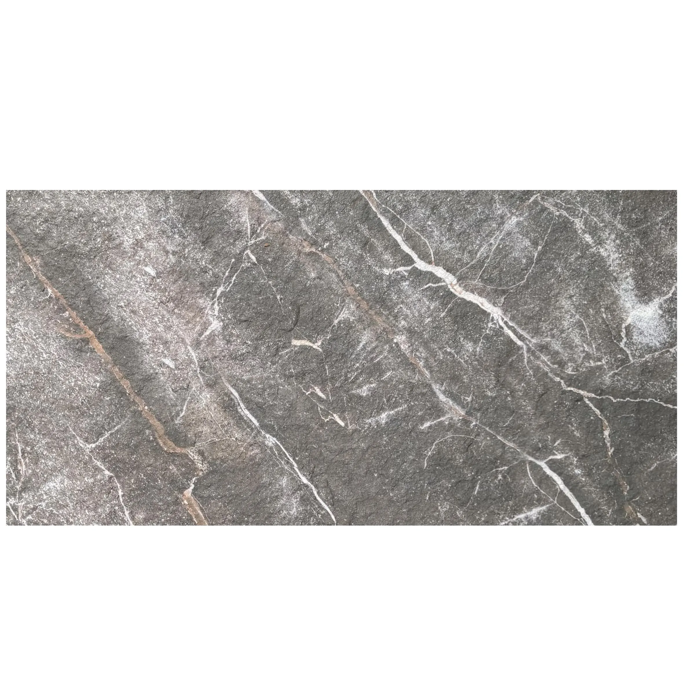
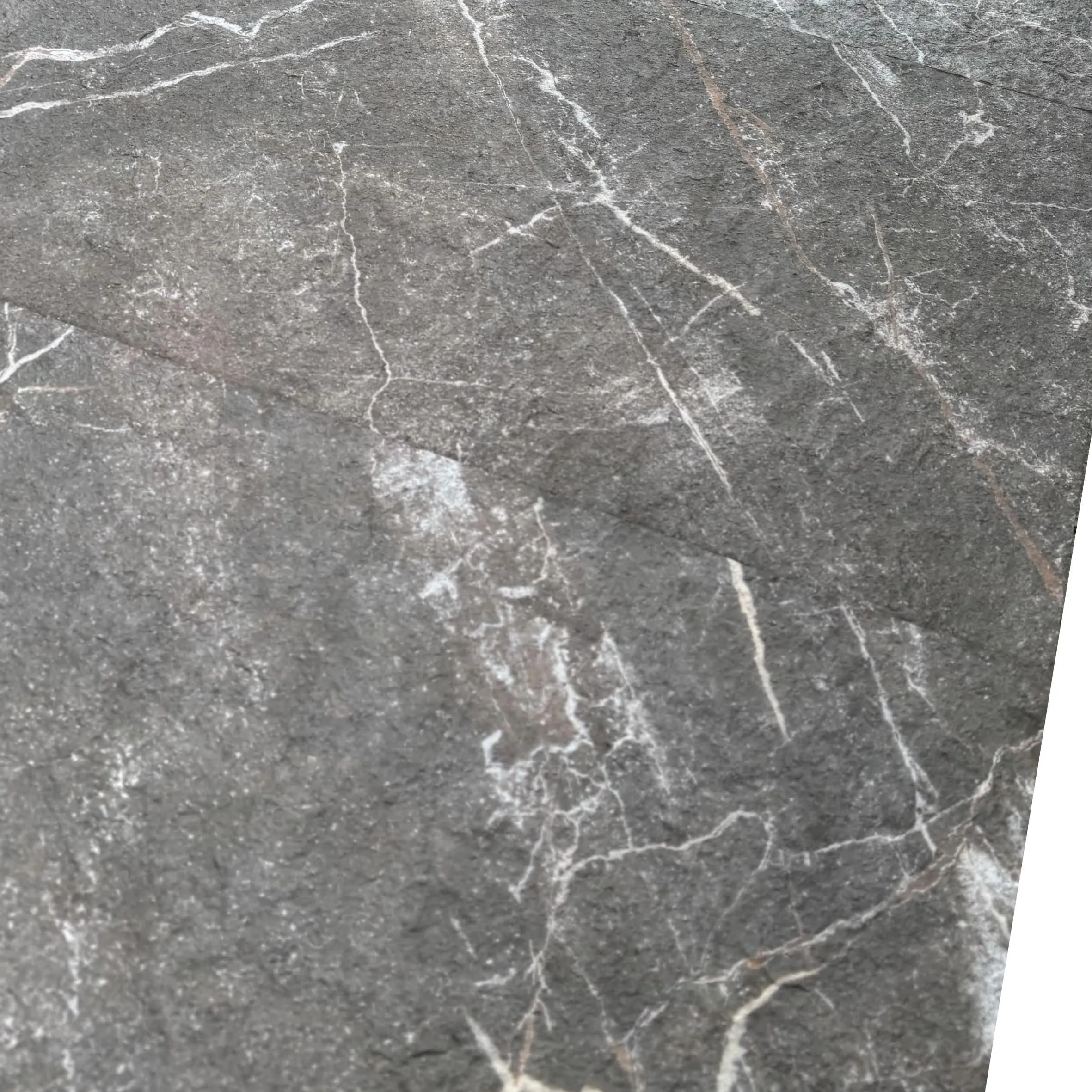
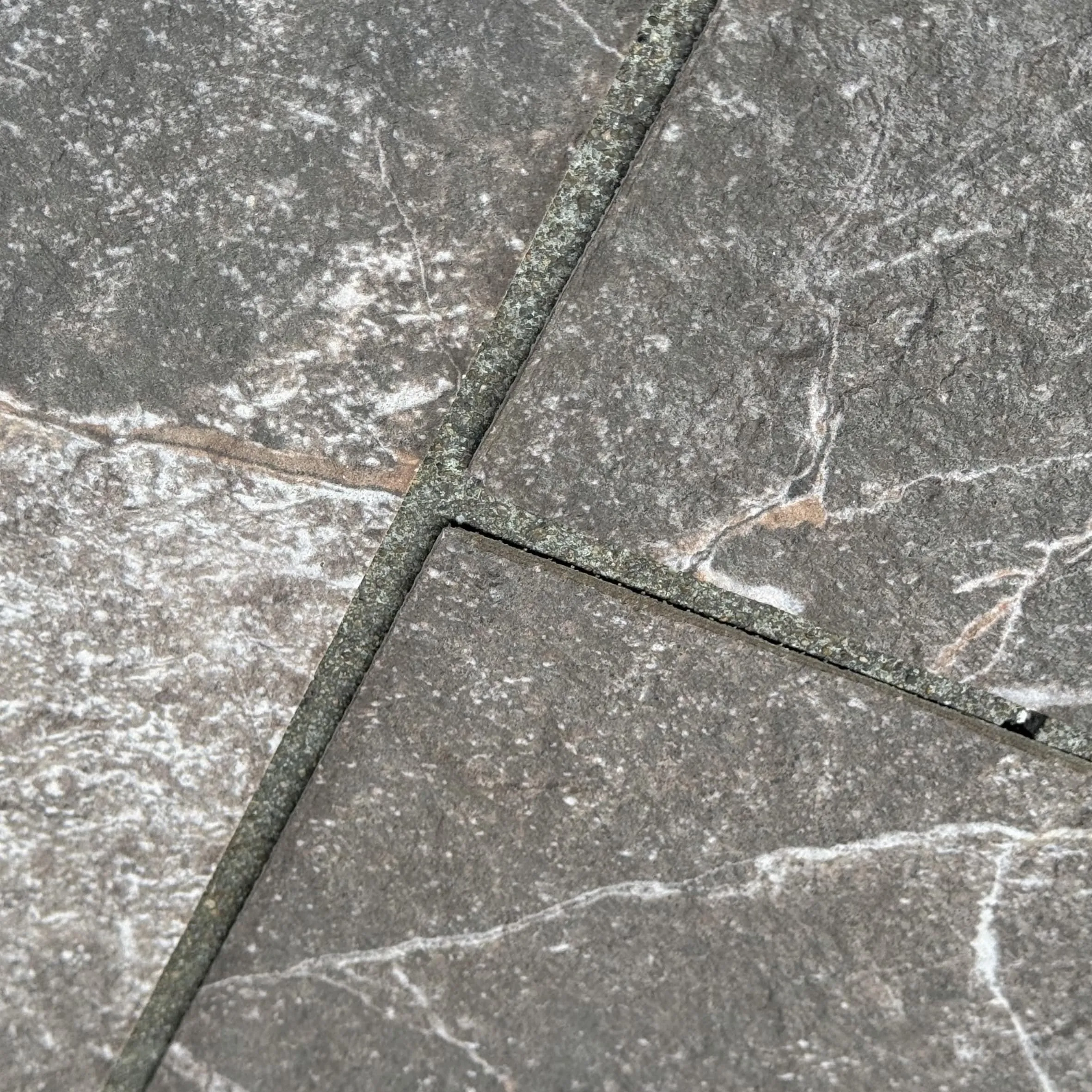
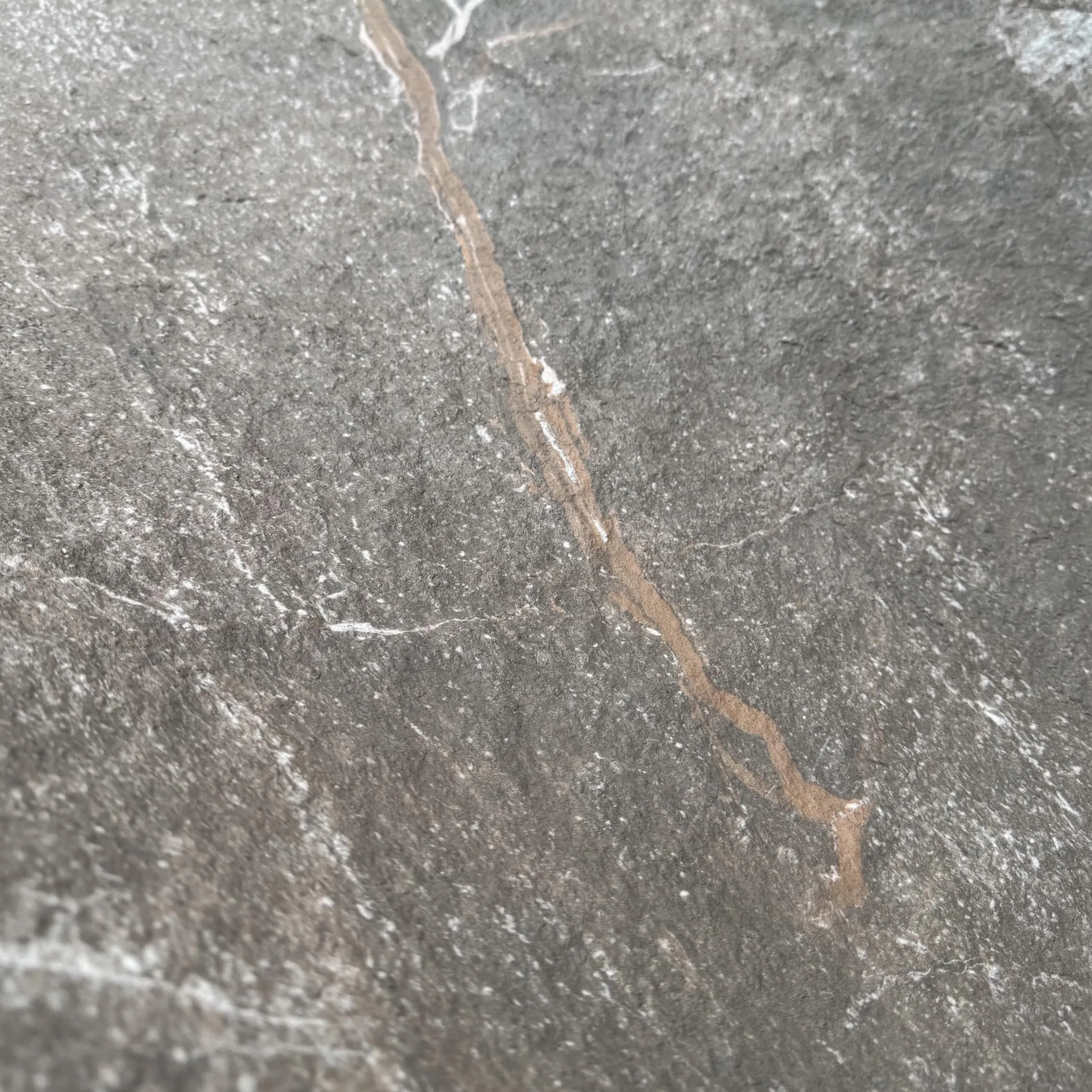
Before we start pairing, let's get to know our star: Granite Portoro. Originating from quarries in Italy, this natural stone is beloved for its striking contrast—think a night sky dusted with liquid gold. The black isn't just any black; it's a rich, velvety hue that absorbs light, making the gold veining pop like streaks of sunlight. This duality is what makes it so versatile: it can anchor a space with sophistication or add a touch of opulence, but it needs the right partners to shine without overshadowing the rest of the design.
Designers often struggle with Granite Portoro because its boldness can easily overpower softer materials. Pair it with the wrong shades, and the gold veining might clash, or the black might feel heavy. The key? Balance. We need colors and textures that either complement the gold (warmth, richness) or contrast with the black (coolness, lightness), while adding depth through texture—something COLORIA's MCM series excels at.
Color matching isn't just about picking pretty shades—it's about creating a story. Here are a few guiding principles to keep in mind when working with Granite Portoro:
Now, let's put these principles into action with COLORIA's standout MCM products.
COLORIA's lineup is designed with flexibility and creativity in mind, and several of their series are tailor-made to complement Granite Portoro's bold personality. Let's break down the best matches, why they work, and how to use them.
First up: travertine (starry blue) from COLORIA's travertine series. Imagine a deep, sky-like blue with subtle, starry flecks of lighter blue and gray—this isn't your average blue. It's cool, calm, and has just enough texture to play off Granite Portoro's smooth, veined surface.
Why it works: The cool blue in travertine (starry blue) contrasts beautifully with the warm gold in Granite Portoro. The black in Granite Portoro acts as a bridge, tying the two together—think of it as the night sky (blue) with stars (gold veining). This pairing feels modern and dynamic, perfect for spaces where you want to make a statement without clashing.
Scenario: A high-end cocktail bar
Picture a bar counter wrapped in Granite Portoro, its gold veins catching the light as patrons order drinks. Behind the bar, a feature wall clad in travertine (starry blue) MCM panels adds depth, with the blue tones mellowing the black and making the gold pop. The result? A space that feels luxurious but not overwhelming—like a sophisticated evening under the stars.
If you prefer a more understated approach, fair-faced concrete from COLORIA's concrete series is your go-to. With its raw, industrial vibe and soft gray tone, it's the ultimate neutral that lets Granite Portoro take the spotlight.
Why it works: Fair-faced concrete's matte, porous texture contrasts with Granite Portoro's polished finish, adding tactile interest. The gray hue is neutral enough to not compete with the black and gold, but it's not plain—subtle variations in tone give it character. This pairing is all about "less is more," ideal for minimalist or industrial-chic designs.
Pro tip: Use fair-faced concrete on large surfaces (floors, walls) and Granite Portoro as an accent (backsplash, columns). The concrete's lightness will prevent the space from feeling too dark, while the Granite Portoro adds luxury.
For designers who want to lean into the warmth of Granite Portoro's gold veins, the MCM big slab board series offers rich, earthy tones that complement rather than compete. Think warm beiges, terracottas, and soft browns—colors that feel grounded and inviting.
Why it works: The MCM big slab board series is all about scale and warmth. A slab in a soft claybank or beige tone will echo the gold in Granite Portoro, creating a cohesive, sunlit feel. For example, pairing Granite Portoro with the series' "linear travertine (claybank)" creates a palette that feels both luxurious and approachable—like a high-end villa in Tuscany, where old-world charm meets modern design.
Last but not least, MCM flexible stone is a wildcard that adds texture and adaptability. Available in a range of finishes, from rough-hewn to smooth, it's perfect for adding depth to Granite Portoro pairings.
Why it works: The flexibility of this material means you can use it in unconventional spaces—curved walls, ceilings, or even furniture. Choose a flexible stone in a light gray or beige, and its rough texture will contrast with Granite Portoro's polished surface, adding visual interest without overwhelming the eye. For example, using flexible stone on a ceiling above a Granite Portoro floor creates a dynamic play of textures that draws the eye up and down.
Pro Tip: Test with Samples First!
Lighting changes everything. A color that looks perfect in a catalog might feel off in your space's natural or artificial light. Always request physical samples of both Granite Portoro and your chosen COLORIA MCM panels, and test them together in the actual space at different times of day.
| COLORIA Product | Color Notes | Mood Created | Best Use Case |
|---|---|---|---|
| Travertine (Starry Blue) | Cool blue with starry flecks; matte finish | Modern, sophisticated, dynamic | Feature walls, bar backsplashes, accent panels |
| Fair-Faced Concrete | Soft gray, matte, industrial texture | Minimalist, calm, balanced | Floors, large walls, countertops (paired with Granite Portoro accents) |
| MCM Big Slab Board Series (Linear Travertine, Claybank) | Warm beige, smooth with subtle linear texture | Luxurious, inviting, sunlit | Wall cladding, fireplace surrounds, kitchen islands |
| MCM Flexible Stone (Light Gray Rough) | Light gray, rough-hewn texture | Tactile, organic, layered | Curved walls, ceilings, furniture accents |
Let's walk through two real-world examples to see how these pairings work in action.
A hotel wants to create a lobby that feels grand but not intimidating. The design team chooses Granite Portoro for the reception desk—a large, curved structure that greets guests. To balance its boldness, they line the adjacent walls with COLORIA's fair-faced concrete MCM panels. The concrete's soft gray tones and matte texture keep the space feeling open, while the Granite Portoro desk becomes the focal point. For a pop of color, they add accent columns clad in travertine (starry blue) , their cool blue hues complementing the desk's gold veins. The result? A lobby that feels luxurious, modern, and welcoming.
A homeowner dreams of a kitchen that's both functional and stylish. They opt for Granite Portoro countertops, drawn to their durability and drama. To avoid the space feeling too dark, they choose COLORIA's MCM big slab board series in linear travertine (claybank) for the backsplash. The warm beige of the travertine echoes the gold in the countertops, creating a cohesive look, while the series' large slabs mean fewer grout lines, adding to the sleek feel. For the island's sides, they use MCM flexible stone in light gray , its rough texture adding contrast to the polished countertops. The kitchen feels warm, sophisticated, and uniquely theirs.
COLORIA's "custom" in "custom MCM palettes" isn't just a buzzword—it's a promise. Here's how to tailor their products to your Granite Portoro project:
Granite Portoro is more than a material—it's a statement. And with COLORIA's custom MCM palettes, that statement doesn't have to stand alone. By understanding the principles of color matching, leveraging COLORIA's versatile products (like travertine (starry blue), fair-faced concrete, and the MCM big slab board series), and adding your own creative touches, you can create spaces that feel balanced, bold, and uniquely yours.
Remember, design is about storytelling. Granite Portoro writes the first chapter—COLORIA's MCM palettes help you write the rest. So go ahead, embrace the drama of that black and gold, and let your creativity (and COLORIA's materials) turn it into something unforgettable.
Recommend Products


