
Step into a boutique on a bustling street, and before you even glance at the products, your senses are already at work. The coolness of the floor underfoot, the way light dances off the walls, the subtle texture that invites your fingers to brush against it—these are the quiet details that shape how you feel about a brand. In retail design, materials are more than just building blocks; they are storytellers, weaving narratives of luxury, warmth, innovation, or tradition that linger in the minds of customers long after they've left. Among these materials, few carry the timeless charm and versatile elegance of Italian travertine. From the sun-drenched quarries of Tuscany to the sleek interiors of modern boutiques, this natural stone has evolved from a historical staple to a contemporary favorite, offering designers a canvas to craft spaces that are not just visually striking, but emotionally resonant.
In an era where customer experience reigns supreme, retailers are no longer competing solely on products—they're competing on memory. A well-designed space doesn't just sell; it creates moments that stick: the way a mother pauses to let her child run their hand over a textured wall, the way a couple lingers near a display bathed in the soft glow of travertine's natural veining, the way a solo shopper feels instantly at ease in a space that balances sophistication with warmth. Italian travertine, with its unique blend of organic texture, earthy tones, and adaptability, plays a starring role in this narrative. But it's not alone. When paired with complementary materials like fair-faced concrete, marble interstellar gray, or wood grain board, it transforms retail spaces into multisensory journeys that engage, delight, and leave a lasting impression.
This article explores the magic of Italian travertine in retail design, delving into its history, its diverse varieties (including the captivating starry green travertine), and how it harmonizes with other materials to create spaces that feel both curated and authentic. We'll examine the sensory impact of these materials, share insights from real-world design, and ultimately, uncover how the thoughtful use of stone, concrete, and wood can turn a simple store into a destination—one that customers return to not just for what they buy, but for how it makes them feel.
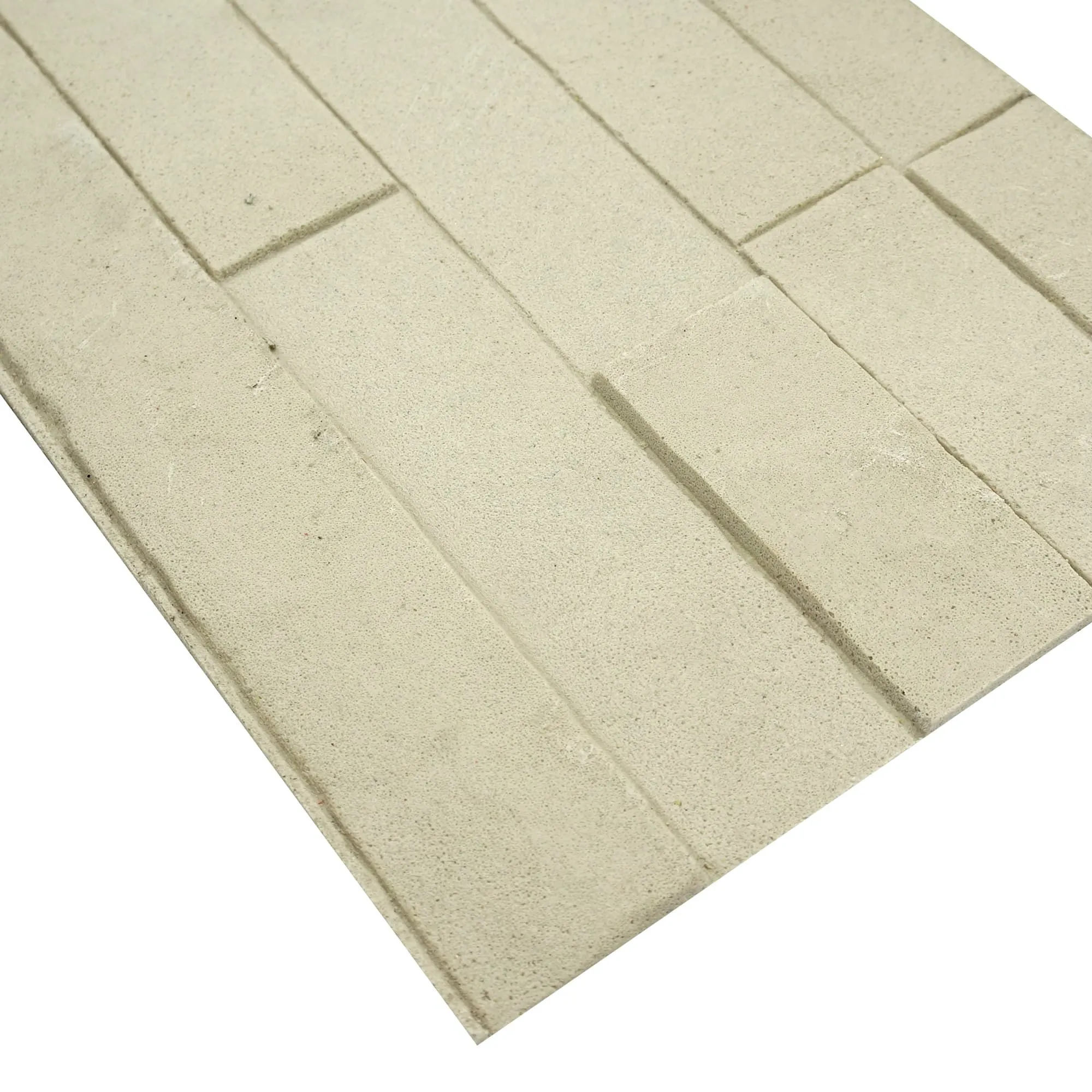
To understand the appeal of Italian travertine, we must first trace its roots. This sedimentary rock forms in hot springs and limestone caves, where mineral-rich water cools and deposits layers of calcium carbonate over millennia. The result is a stone with a porous, honeycombed structure—filled with tiny voids and channels that tell the story of its formation. It's this natural texture that sets travertine apart from smoother stones like marble or granite; it's not just a surface, but a landscape of peaks and valleys, each imperfection a mark of its uniqueness.
Italy, particularly the regions of Tuscany and Lazio, has been a hub for travertine extraction for centuries. The ancient Romans recognized its durability and beauty, using it to construct iconic structures like the Colosseum, the Pantheon, and the Trevi Fountain. Walk through these ruins today, and you can still see the warm, golden hues of travertine weathered by time, a testament to its longevity. This historical pedigree gives travertine a sense of gravitas—a connection to the past that feels both grounding and aspirational, qualities that resonate deeply in retail spaces seeking to build trust and heritage.
But Italian travertine is far from a relic of the past. Modern quarrying and finishing techniques have expanded its versatility, allowing designers to customize its appearance while preserving its natural character. From polished surfaces that reflect light like liquid gold to brushed finishes that enhance its tactile roughness, travertine adapts to a range of aesthetic visions. In retail design, this adaptability is key: a high-end fashion boutique might opt for honed travertine with subtle veining for a luxe, understated look, while a bohemian lifestyle store could embrace the stone's raw, porous texture to evoke a sense of earthiness and authenticity.
What truly makes travertine a standout, however, is its ability to interact with light. Unlike uniform synthetic materials, travertine's surface is a tapestry of light and shadow. Sunlight streaming through a storefront window will dance across its pitted surface, creating patterns that shift throughout the day. Artificial lighting, whether warm or cool, is softened by the stone's matte finish, casting a gentle glow that makes products feel more inviting. This play of light isn't just visually pleasing—it's psychological. Studies show that spaces with natural light and dynamic visual elements reduce stress and increase dwell time, two factors that directly impact sales and customer satisfaction.
While classic beige and golden travertine remain beloved for their warmth, the world of Italian travertine is far more varied than many realize. Designers today have access to a spectrum of colors, patterns, and finishes, each offering a distinct mood and aesthetic. Among these, the starry green travertine stands out as a particularly enchanting option for retailers looking to make a bold yet sophisticated statement.
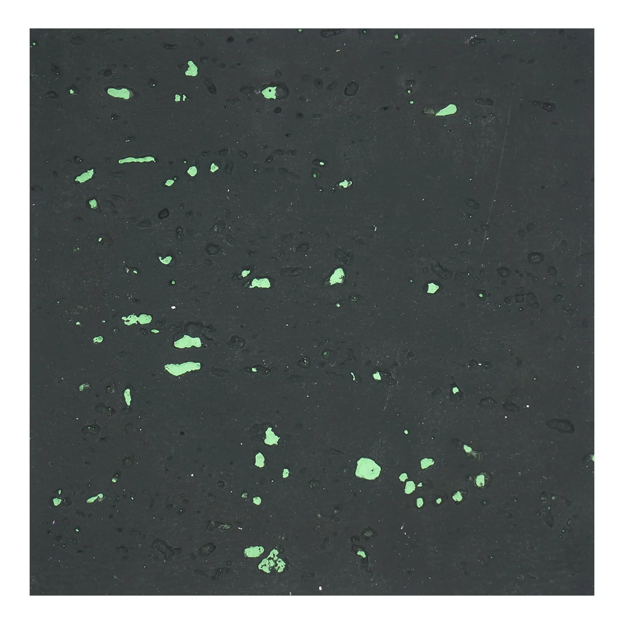
Starry green travertine, named for its deep, forest-like hue and the tiny, glittering mineral deposits that catch the light like stars, is a rare and striking variety. Mined in select quarries in northern Italy, this stone features a rich, emerald base interspersed with veins of cream, gold, and even hints of blue—colors that evoke the lushness of a moss-covered forest floor or the depth of a mountain lake. In retail design, it serves as a focal point: imagine a feature wall in a high-end jewelry store, where the stone's green tones complement the sparkle of diamonds, or a café where starry green travertine tabletops invite customers to linger, their eyes drawn to the stone's ever-changing patterns as light shifts. Unlike brighter greens, which can feel overwhelming, starry green travertine has a muted, earthy quality that balances drama with calm, making it versatile enough for both modern and traditional spaces.
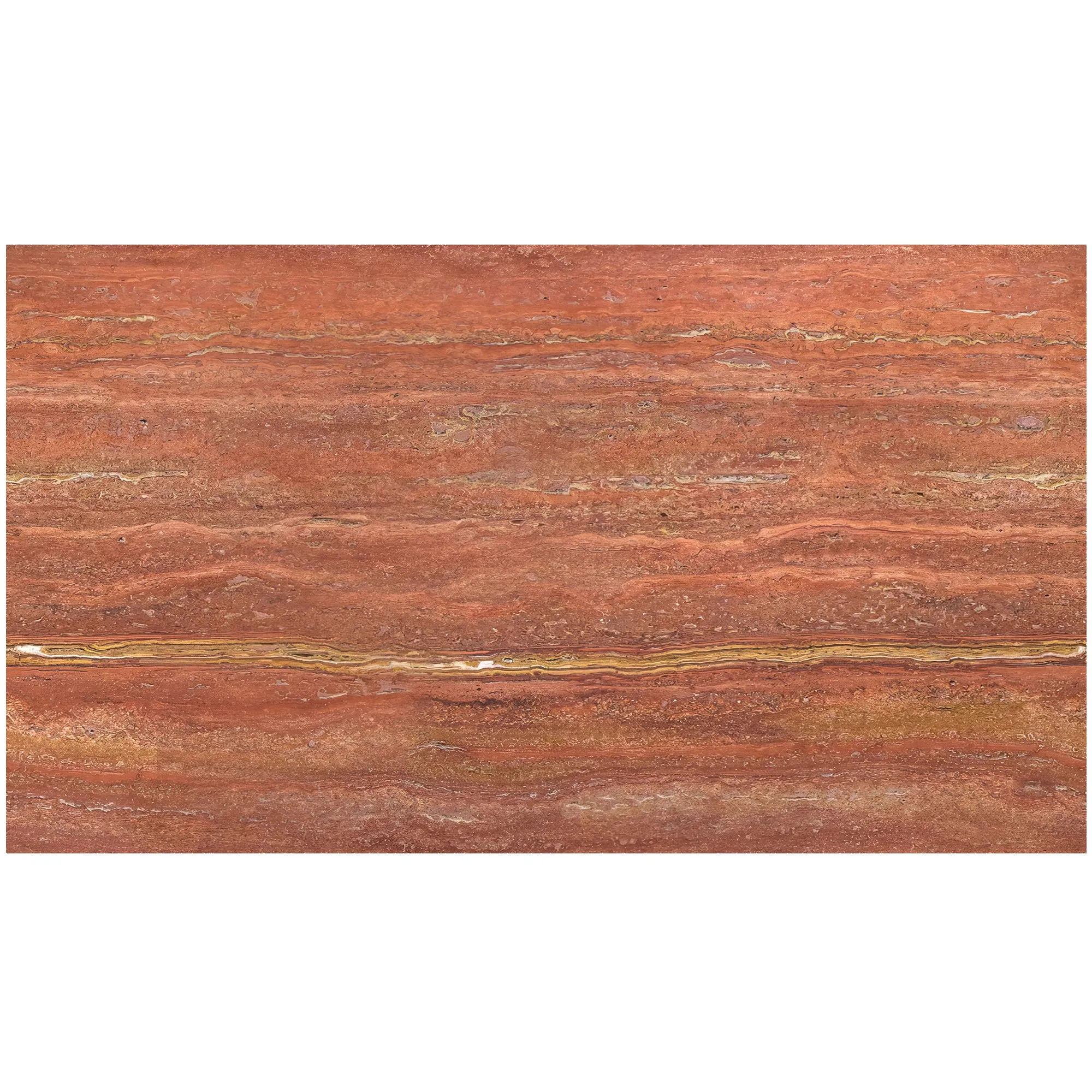
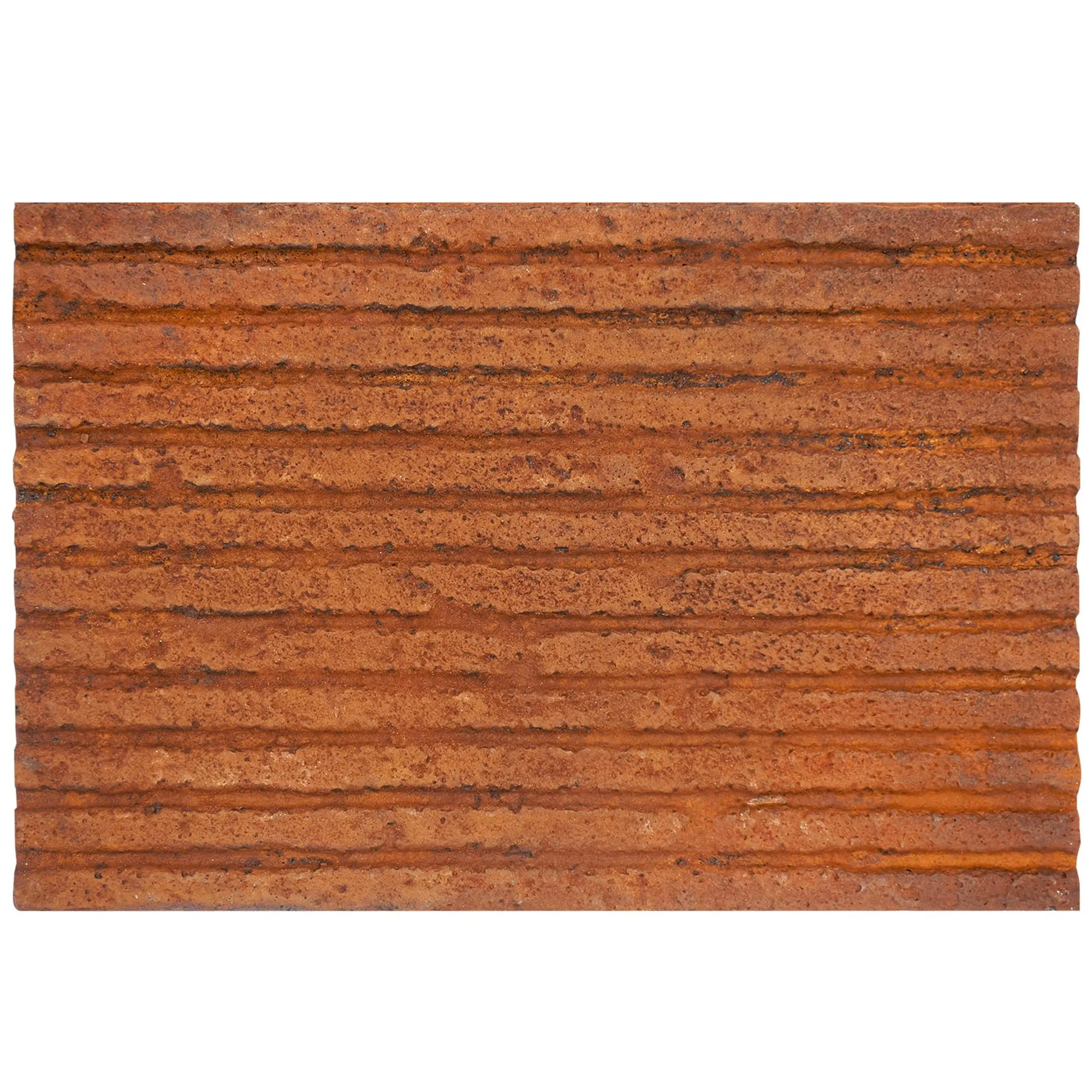
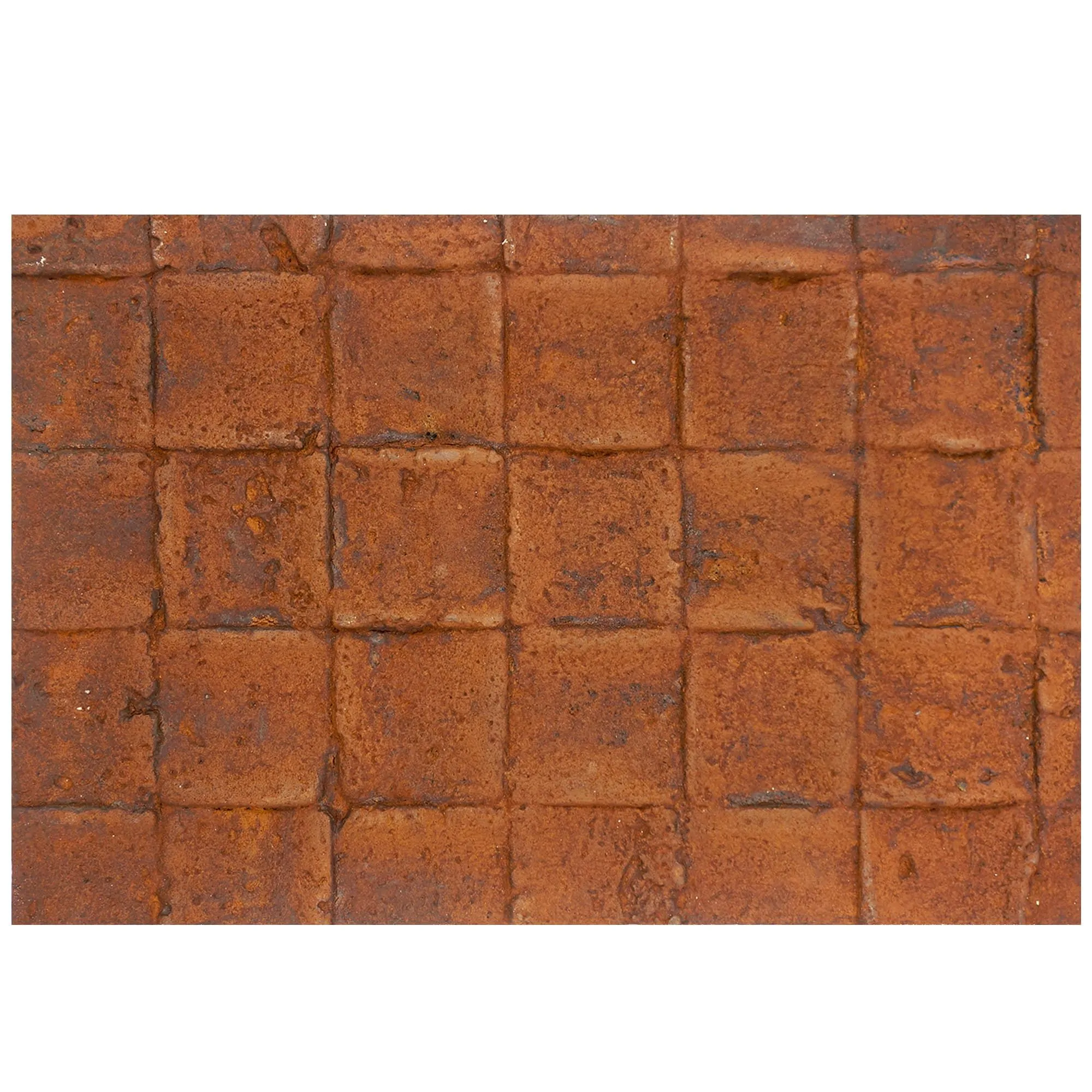
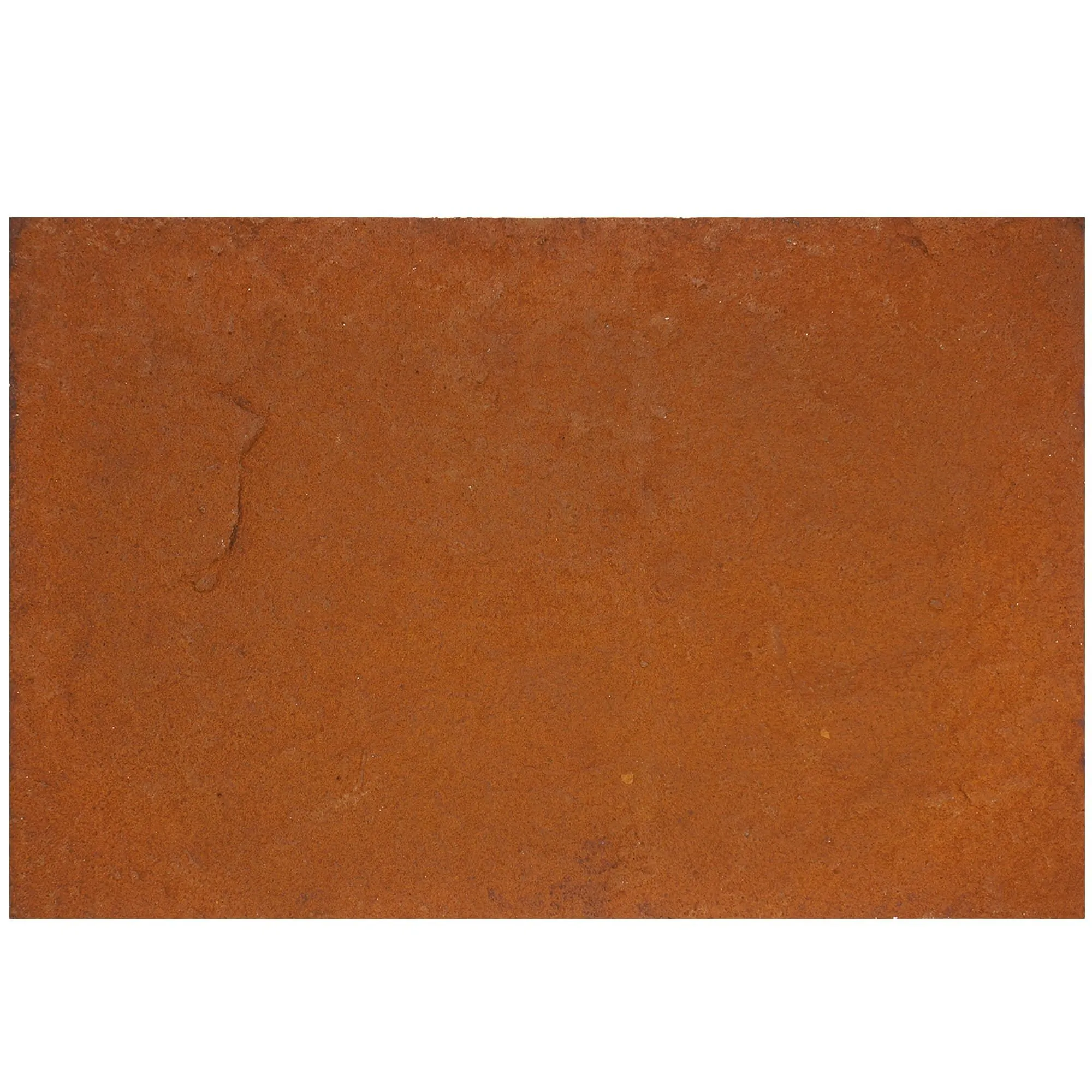
But starry green is just one of travertine's many faces. Travertine (vintage silver) offers a cool, industrial edge, with a silvery-gray base and subtle metallic flecks that pair beautifully with minimalist decor. Travertine (beige), the classic variety, remains a staple for its neutrality and warmth, acting as a blank canvas for bold accents or vibrant product displays. Travertine (starry red) and travertine (starry orange), with their fiery hues and sparkling inclusions, are perfect for brands aiming to convey energy and creativity—think a children's clothing store or a tech startup's pop-up shop. Each variety tells a different story, allowing retailers to align their material choices with their brand identity, whether that's luxury, playfulness, sustainability, or innovation.
Perhaps the most compelling aspect of travertine's diversity is its ability to bridge the gap between old and new. A boutique selling vintage clothing might use rough-hewn, unfinished travertine to evoke a sense of history, while a futuristic electronics store could opt for polished, book-matched travertine panels that create a seamless, almost otherworldly surface. In both cases, the stone's natural origin grounds the space, preventing it from feeling too sterile or contrived. It's this duality—timeless yet adaptable—that makes Italian travertine a favorite among designers who want to create spaces that feel both rooted in tradition and ahead of their time.
While Italian travertine is stunning on its own, its true magic shines when paired with other materials. Retail design is about balance—contrasting textures, complementary colors, and layers of visual interest—and travertine, with its warm, organic quality, serves as the perfect anchor for a range of companions. Let's explore how it harmonizes with three standout materials: fair-faced concrete, marble interstellar gray, and wood grain board.
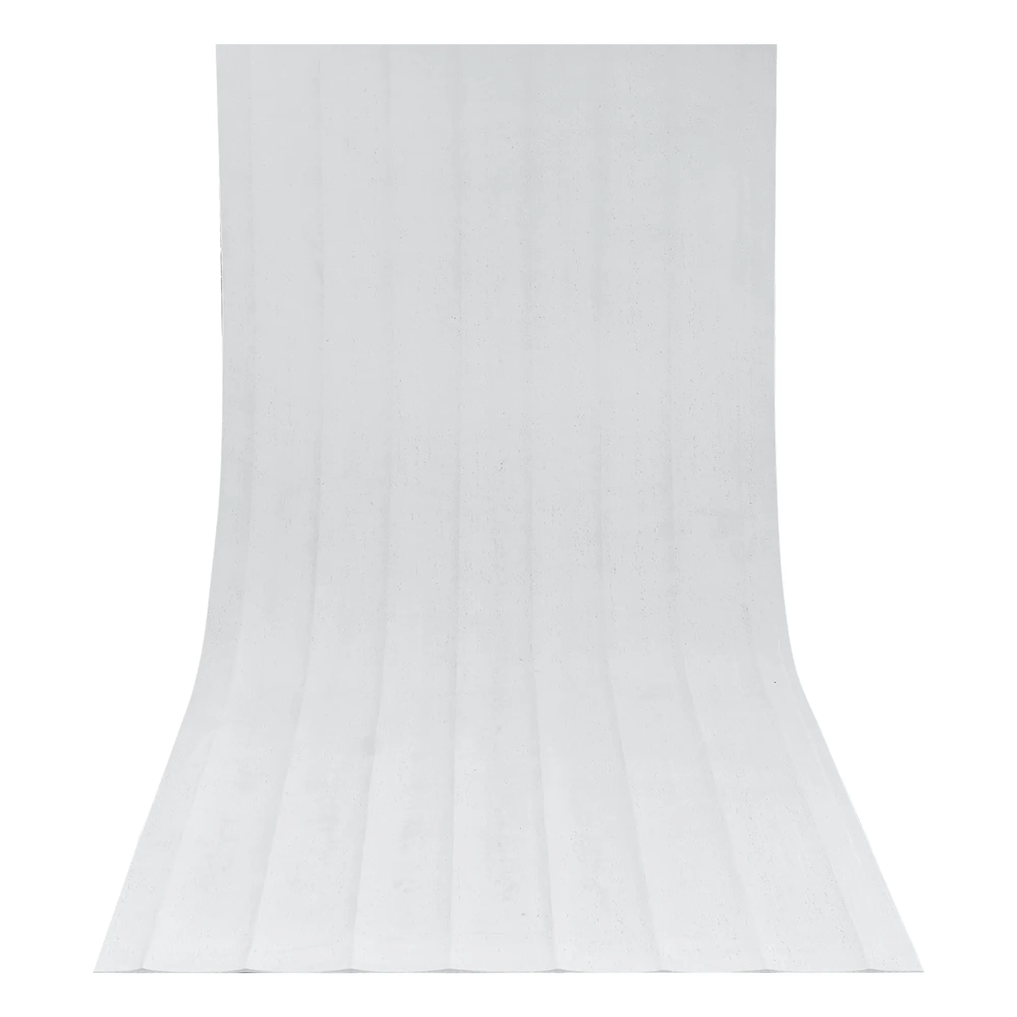
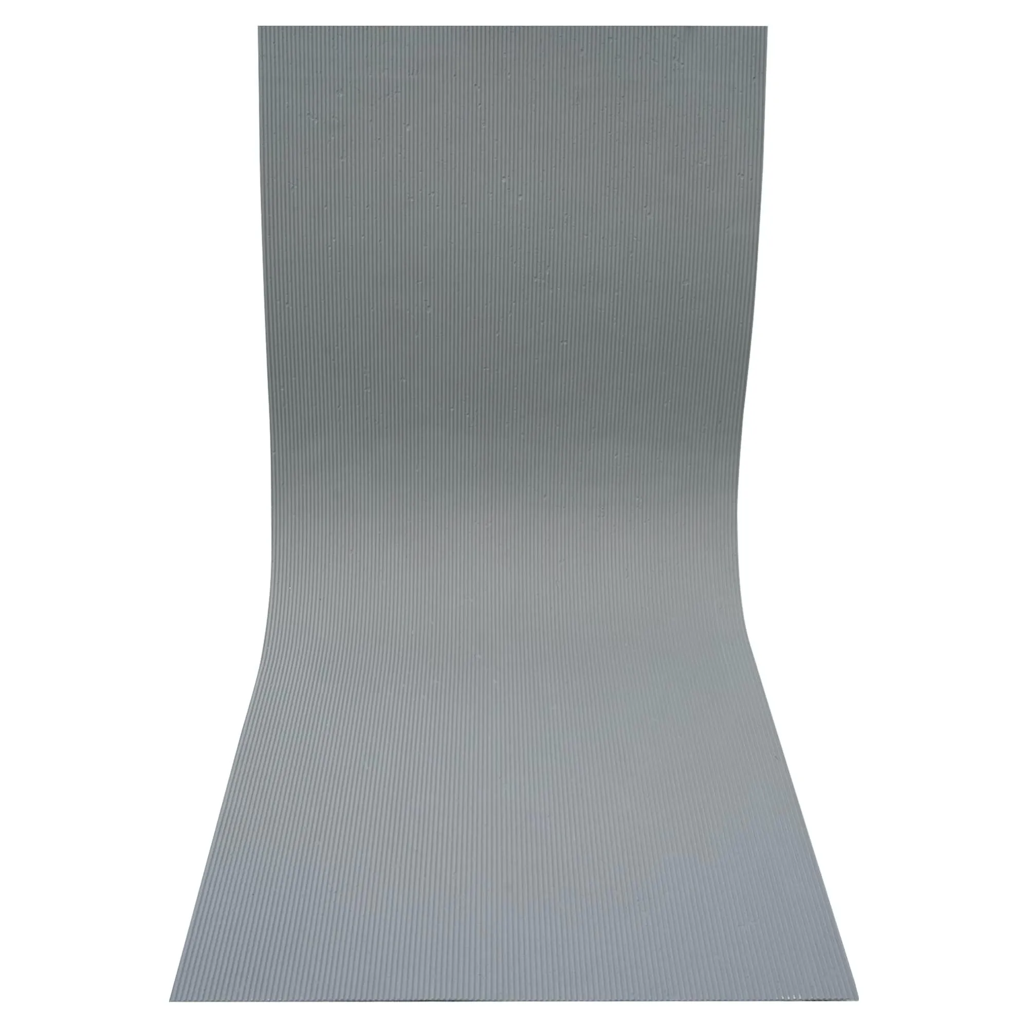
Fair-faced concrete—also known as "exposed concrete"—is celebrated for its raw, unadorned beauty. With its smooth, gray surface and subtle variations in texture (from the imprint of wooden forms to tiny air bubbles trapped during curing), it exudes an industrial, utilitarian charm. When paired with travertine, this contrast creates a space that feels both modern and grounded. Imagine a retail space where fair-faced concrete walls form a sleek, monochromatic backdrop, while travertine (beige) floors add warmth underfoot. The concrete's coolness tempers the travertine's warmth, creating a balanced palette that feels neither too cold nor too rustic. In a furniture store, this pairing might be used to highlight mid-century modern pieces: the concrete walls emphasizing clean lines, while the travertine floors add a touch of organic softness that makes the space feel livable, not just showroom-perfect.
The key to this pairing is texture contrast. Fair-faced concrete is typically smooth (though it can be textured for added interest), while travertine is porous and tactile. This interplay invites touch—customers might run their hand along a concrete wall, then brush a travertine display shelf, noticing the difference in feel. It's these small, sensory moments that make a space memorable. Additionally, both materials are highly durable, making them ideal for high-traffic retail environments. Concrete resists scratches and stains, while travertine, when sealed properly, can withstand years of foot traffic without losing its character. For brands aiming to convey authenticity and resilience—think outdoor gear stores or artisanal coffee shops—this combination is a match made in design heaven.
For retailers seeking to evoke luxury and sophistication, marble interstellar gray is a natural partner for travertine. This marble variety features a deep, stormy gray base swirled with veins of white, silver, and even hints of gold—patterns that resemble the night sky, hence its "interstellar" name. Unlike the warm, earthy tones of travertine, marble interstellar gray has a cool, ethereal quality, making it perfect for high-end fashion, jewelry, or cosmetics stores. When paired with travertine (beige) or travertine (vintage gold), it creates a palette of understated opulence: the marble's drama balanced by the travertine's warmth, the smoothness of the marble contrasting with the travertine's texture.
Consider a luxury perfume boutique: the walls are clad in marble interstellar gray panels, their reflective surface catching the light from crystal chandeliers and amplifying the space's grandeur. The sales counters, however, are crafted from honed travertine (vintage gold), their porous texture adding a tactile, human element that prevents the space from feeling too cold or intimidating. Customers lean on the travertine counters, their fingers tracing the stone's natural grooves, while their eyes are drawn to the marble walls, which frame the perfume bottles like works of art. This pairing of marble and travertine creates a sense of hierarchy—directing attention to key products while making the overall space feel approachable and inviting.
Marble interstellar gray also works beautifully with starry green travertine, for a more eclectic, nature-inspired luxury. Imagine a high-end home decor store where a starry green travertine feature wall serves as the backdrop for a marble interstellar gray fireplace surround. The green and gray tones mirror the colors of a misty forest at dusk, creating a mood of calm sophistication. This combination appeals to customers who value both luxury and sustainability, as both stones are natural, timeless, and sourced from responsible quarries. In an industry where "green luxury" is increasingly important, this pairing sends a powerful message: that opulence and respect for the environment can coexist.
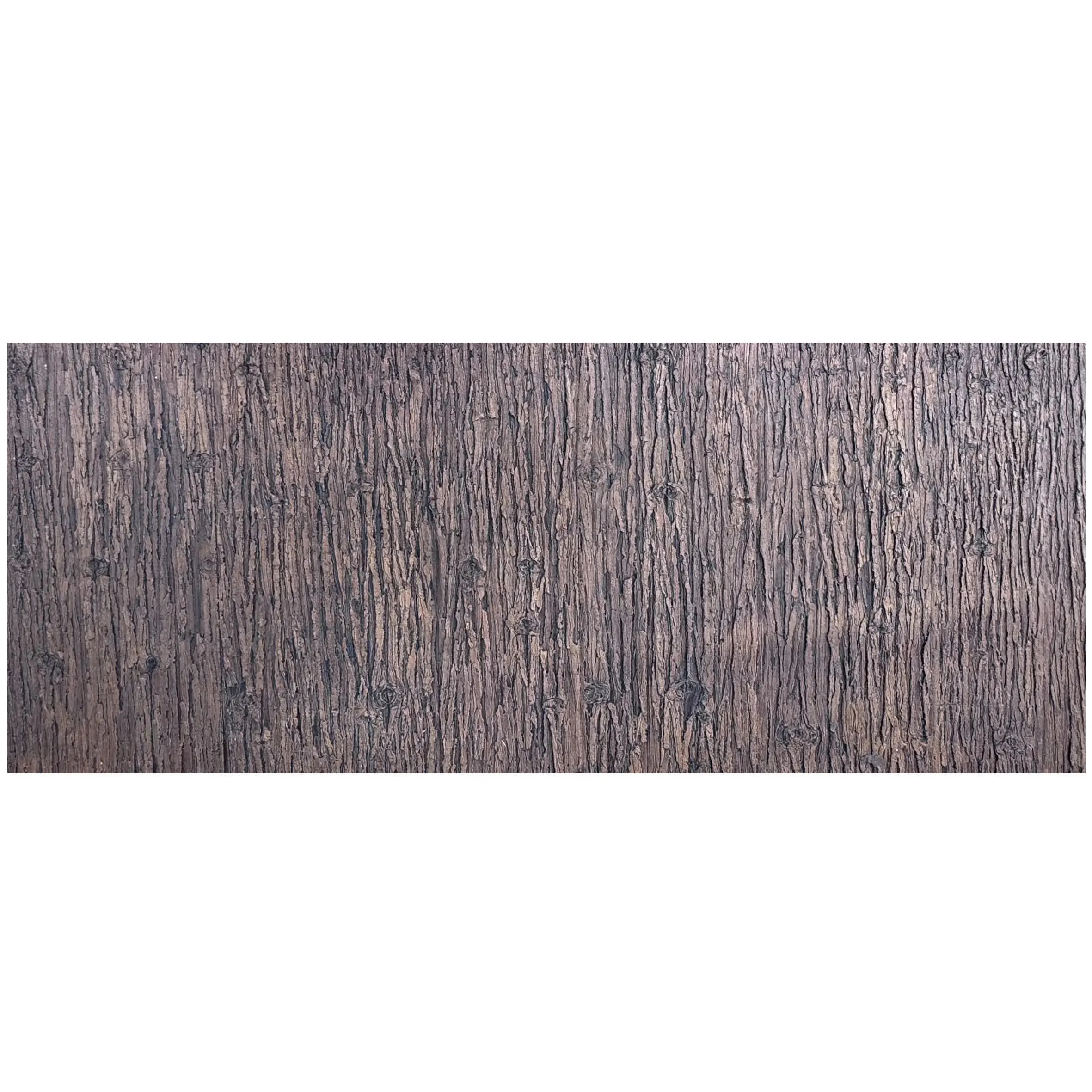
While concrete and marble add edge and elegance, wood grain board brings warmth and familiarity to retail spaces—a quality that is especially important for brands aiming to create a sense of community or home. Wood grain board, which mimics the look and texture of natural wood (often made from sustainable materials like bamboo or reclaimed timber), pairs beautifully with travertine, as both materials celebrate the beauty of natural imperfection. The travertine's porous stone and the wood's visible grain create a layered, tactile experience that feels cozy and inviting, making customers more likely to relax and explore.
A perfect example of this pairing is a lifestyle store selling home goods, where wood grain board shelves line the walls, their warm, honey tones complementing the travertine (beige) flooring. The shelves hold ceramic mugs, woven blankets, and potted plants, their organic shapes echoing the natural textures of the wood and stone. Near the checkout counter, a communal table made from thick wood grain board and topped with a slab of starry green travertine invites customers to sit, chat, and browse catalogs—a space designed not just for transactions, but for connection. Here, the wood adds softness, while the travertine adds durability; together, they create a space that feels like an extension of the customer's home, making them more likely to return.
Wood grain board also adds a sense of movement to retail spaces. Unlike the static patterns of stone or concrete, wood grain flows in organic lines—curving, swirling, and varying in density—creating visual interest that guides the eye through the store. When paired with travertine's more uniform texture, this movement prevents the space from feeling monotonous. For example, a clothing store might use vertical wood grain board panels on one wall to draw the eye upward, highlighting a display of hanging garments, while the adjacent wall is clad in horizontal travertine tiles, creating a sense of balance and rhythm. This interplay of direction and texture keeps customers engaged, encouraging them to explore every corner of the store.
| Material | Key Characteristics | Brand Personality Fit | Best Paired With |
|---|---|---|---|
| Italian Travertine (Starry Green) | Deep green base, glittering mineral inclusions, porous texture | Bold, sophisticated, nature-inspired | Marble Interstellar Gray, Wood Grain Board |
| Fair-Faced Concrete | Smooth gray surface, subtle texture from forms, industrial feel | Authentic, resilient, utilitarian | Travertine (Beige), Travertine (Vintage Silver) |
| Marble Interstellar Gray | Deep gray base, swirling white/silver veins, smooth finish | Luxurious, elegant, ethereal | Travertine (Vintage Gold), Travertine (Beige) |
| Wood Grain Board | Warm tones, visible grain patterns, sustainable | Inviting, communal, homey | Travertine (Starry Green), Travertine (Beige) |
In retail design, it's easy to focus solely on the visual—after all, we often judge a space within seconds of seeing it. But the most memorable spaces engage all the senses, creating a holistic experience that lingers in the mind. Italian travertine, fair-faced concrete, marble interstellar gray, and wood grain board excel in this regard, each offering unique sensory cues that shape how customers feel in a space. Let's explore how these materials impact touch, sight, and even sound, and why these sensory details are critical to creating memorable customer experiences.
Humans are tactile creatures; we learn about the world through touch, and textures have a profound impact on our emotions. Rough, porous surfaces like travertine can evoke a sense of grounding and authenticity, while smooth, cool surfaces like marble interstellar gray can feel luxurious and refined. In retail, inviting customers to touch materials—whether intentionally or inadvertently—creates a deeper connection to the space and the brand.
Take travertine, for example. Its porous, honeycombed surface is inherently tactile; even a quick brush of the hand reveals its texture—cool, slightly rough, with tiny indentations that catch the skin. For brands aiming to convey craftsmanship or sustainability, this texture is a powerful tool. A bakery might use travertine countertops, where customers can't help but rest their hands while waiting for their order, feeling the stone's natural warmth and associating it with the artisanal quality of the bread. Similarly, a skincare store could feature travertine display shelves, encouraging customers to touch the stone as they reach for products, reinforcing the brand's commitment to natural ingredients.
Wood grain board, with its smooth yet textured surface, offers a different tactile experience—warm, organic, and familiar. Running a hand along a wood grain board shelf feels like touching a piece of furniture from home, creating a sense of comfort and trust. Fair-faced concrete, on the other hand, has a cool, industrial texture—smooth but with subtle imperfections (like the faint imprint of wood grain from the forms used during casting) that add interest. A bookstore might use concrete floors and wood grain board shelves, creating a tactile journey: the cool concrete underfoot grounding customers, while the warm wood shelves invite them to linger and explore.
The key to leveraging touch in retail design is intentionality. Designers can create "tactile zones"—areas where materials are meant to be touched, like a travertine accent wall near the entrance or a wood grain board bench in the fitting room. These zones not only engage customers but also make the space feel more approachable and human, breaking down the barrier between "store" and "experience."
Lighting is perhaps the most important factor in showcasing materials, and Italian travertine, marble interstellar gray, and wood grain board each interact with light in unique ways, creating dynamic visual experiences that change throughout the day. Travertine, with its porous surface, diffuses light rather than reflecting it, creating a soft, warm glow that makes spaces feel inviting even in harsh overhead lighting. This quality is especially valuable in retail, where lighting can often be bright and clinical. A clothing store with travertine walls will feel cozier and more flattering than one with stark white walls, as the stone softens shadows and flatters skin tones—making customers more likely to feel confident in their purchases.
Marble interstellar gray, by contrast, is highly reflective, bouncing light around the space and creating a sense of openness and luxury. In a jewelry store, this reflective quality can make diamonds and gemstones sparkle even more brightly, as the marble walls act as mirrors, amplifying the light. For brands aiming to create a sense of drama, backlighting marble interstellar gray panels can make the stone's veins glow from within, turning a simple wall into a work of art. Imagine a high-end watch store where the feature wall is backlit marble interstellar gray, the stone's starry patterns mimicking the night sky, while the display cases are topped with travertine (vintage gold), their warm tones balancing the marble's coolness.
Wood grain board adds warmth to retail lighting, with its amber and honey tones softening cool LED lights and creating a more natural, sunlit feel. A café with wood grain board ceilings and travertine floors would feel bright and cheerful during the day, as sunlight filters through windows and reflects off the wood, while in the evening, warm pendant lights would enhance the wood's richness, making the space feel cozy and intimate. Color also plays a role: starry green travertine adds a pop of nature-inspired color, while travertine (beige) acts as a neutral backdrop, allowing product colors to stand out. By carefully selecting materials with complementary color palettes and light-reflecting properties, retailers can create visual hierarchies that guide customers through the store, highlighting key products and encouraging exploration.
While touch and sight are often the focus of retail design, sound is an equally important sensory element. A space that's too loud can feel chaotic and overwhelming, driving customers to leave quickly, while a space that's too quiet can feel sterile and unwelcoming. Natural materials like travertine, wood, and concrete excel at absorbing and diffusing sound, creating a balanced acoustic environment that feels peaceful and inviting.
Travertine, with its porous structure, is an excellent sound absorber. Unlike hard, smooth surfaces like glass or polished concrete, which reflect sound and create echoes, travertine's tiny pores trap sound waves, reducing noise levels and creating a more intimate atmosphere. This makes it ideal for busy retail spaces like department stores or shopping malls, where background noise can quickly become overwhelming. A cosmetics store with travertine walls and floors would feel calmer and more luxurious than one with tile floors, as the stone muffles the sound of footsteps and chatter, creating a serene environment where customers can focus on testing products.
Wood grain board also has natural sound-absorbing properties, thanks to its cellular structure. When used on ceilings or walls, it can help reduce reverberation, making conversations easier and background music sound clearer. A bookstore with wood grain board shelves and travertine floors would have a warm, hushed ambiance—perfect for customers looking to browse and read without distraction. Fair-faced concrete, while more reflective than travertine or wood, can be paired with fabric elements (like curtains or rugs) to balance acoustics, creating an industrial-chic space that feels energetic but not overwhelming.
For retailers, the goal is to create a soundscape that aligns with their brand identity. A trendy clothing store might embrace a slightly higher noise level—energetic music, chatter, and the rustle of hangers—to convey excitement, using travertine and wood to keep the sound from becoming harsh. A luxury spa retail space, by contrast, would prioritize quiet, using thick travertine walls and plush wood grain board paneling to create a sanctuary-like atmosphere, where the only sounds are soft music and the gentle murmur of staff and customers. In both cases, the materials play a crucial role in shaping the acoustic experience, ensuring that the space feels just right.
To truly understand the impact of Italian travertine and its complementary materials, let's step into the world of "Lumina & Co.," a fictional but realistic high-end accessories boutique located in the heart of a bustling city. Designed by award-winning firm Studio Materia, Lumina & Co. sought to create a space that felt both luxurious and approachable, reflecting the brand's ethos of "timeless elegance with a modern twist." The result is a 1,200-square-foot store that harmonizes travertine, marble interstellar gray, fair-faced concrete, and wood grain board to create a sensory journey that has customers returning again and again.
The entrance to Lumina & Co. sets the tone: a large, pivoting door made from reclaimed wood, its warm grain inviting customers to step inside. To the left of the door, a feature wall clad in starry green travertine immediately catches the eye—its deep green hue and sparkling mineral deposits creating a sense of drama and intrigue. The wall is subtly backlit, making the stone's veins glow softly, and a small, low bench made from fair-faced concrete sits in front of it, inviting customers to pause and take in the view. "We wanted the entrance to feel like a threshold—something that signals you're entering a special space," says lead designer Maria Sanchez. "The starry green travertine was non-negotiable; it's bold but not overwhelming, and it immediately tells customers that this isn't just another boutique."
Inside, the space is divided into three zones: the "Discovery Zone" (where new arrivals are displayed), the "Luxury Zone" (featuring high-end leather goods and jewelry), and the "Community Zone" (a cozy area with seating for browsing and consultations). Each zone uses a different combination of materials to create a distinct mood, while maintaining a cohesive overall aesthetic.
The Discovery Zone features travertine (beige) flooring and wood grain board shelving, creating a warm, approachable atmosphere. The shelves, made from sustainable bamboo wood grain board, are arranged in organic, asymmetrical patterns, encouraging customers to explore. Products—scarves, hats, and small leather goods—are displayed on travertine (vintage silver) pedestals, their cool metallic tones adding a modern edge to the warm wood and stone. Overhead, pendant lights with wood grain board shades cast a soft, golden glow, enhancing the zone's inviting feel. "We wanted the Discovery Zone to feel like a curated market—casual, friendly, and full of surprises," Sanchez explains. "The travertine and wood create that sense of warmth, while the vintage silver travertine adds a touch of sophistication."
The Luxury Zone, by contrast, is a study in elegance. The walls are clad in marble interstellar gray panels, their smooth, reflective surface amplifying the light from crystal chandeliers. The flooring is polished travertine (vintage gold), its warm, golden tones balancing the marble's coolness. Display cases are made from blackened steel and topped with thick slabs of marble interstellar gray, their edges beveled to create a seamless, luxurious look. Jewelry is displayed on velvet trays inside the cases, their soft texture contrasting with the hard stone and metal. "For the Luxury Zone, we wanted to evoke a sense of timeless opulence," Sanchez says. "Marble interstellar gray is the star here—it's so dramatic, but when paired with the warm travertine, it doesn't feel cold. Customers slow down in this zone; they linger, because the space feels special."
The Community Zone is the heart of the store—a cozy area with a large communal table made from a single slab of starry green travertine, surrounded by chairs upholstered in earthy linen. The walls are lined with wood grain board bookshelves, filled with art books, design magazines, and small potted plants, creating a living room-like atmosphere. A fireplace, clad in fair-faced concrete, adds warmth, its rough texture echoing the travertine's organic quality. "We wanted this to be a space where customers feel comfortable staying awhile," Sanchez notes. "They can sit, have a coffee, browse magazines, and chat with our staff. The travertine table is the focal point—it's massive, but the stone's texture makes it feel inviting, not imposing. People love touching it; it's become a conversation starter."
Since opening six months ago, Lumina & Co. has seen a 30% increase in foot traffic and a 25% increase in average dwell time—metrics that Sanchez attributes to the store's material choices. "Customers tell us they feel 'at home' here, even though it's a luxury boutique," she says. "They mention the textures, the light, the way the space feels both curated and relaxed. That's the power of materials like travertine, marble, and wood—they don't just look good; they make people feel something. And when people feel something, they remember it."
In the world of retail, where competition is fierce and customer attention spans are short, creating memorable experiences is no longer a luxury—it's a necessity. As we've explored, materials play a pivotal role in this process, acting as silent storytellers that shape how customers feel, behave, and remember a brand. Italian travertine, with its timeless beauty, diverse varieties, and sensory appeal, stands out as a material that can transform ordinary spaces into extraordinary destinations. Whether paired with fair-faced concrete for industrial chic, marble interstellar gray for luxury, or wood grain board for warmth, travertine offers designers a versatile canvas to craft spaces that are not just visually stunning, but emotionally resonant.
The key to success lies in intentionality. Retailers must move beyond viewing materials as mere surfaces and instead see them as tools to convey brand identity, evoke emotion, and create connection. A brand that values sustainability might prioritize reclaimed wood grain board and locally sourced travertine. A brand that celebrates innovation might experiment with bold varieties like starry green travertine or polished marble interstellar gray. A brand that aims to create community might focus on tactile materials like rough-hewn travertine and warm wood, inviting customers to touch, linger, and connect.
At the end of the day, the most memorable retail spaces are those that feel authentic—spaces where materials are chosen not just for their aesthetic appeal, but for their ability to reflect the brand's values and resonate with its customers. Italian travertine, with its rich history, natural character, and endless versatility, is more than just a stone; it's a partner in creating these authentic experiences. It's a material that tells a story—of craftsmanship, of nature, of time—and in doing so, helps brands create stories of their own: stories that customers carry with them long after they've left the store, and that bring them back, again and again.
So the next time you step into a retail space, take a moment to notice the materials around you. Feel the texture of the walls, the coolness of the floors, the way the light plays on the surfaces. Chances are, if the space feels welcoming, memorable, and uniquely "on brand," there's a good chance Italian travertine—or one of its complementary materials—is playing a starring role. Because in retail design, as in life, the most lasting impressions are made not by what we see, but by how we feel. And when it comes to creating feeling, few materials do it better than a well-chosen stone, a piece of warm wood, or a slab of elegant marble.
Recommend Products