
There's something almost magical about stepping into a room where natural stone takes center stage. It's not just the texture—the rough-hewn edges, the smooth veining, the way light plays across its surface—but the color. A single slab of limestone can whisper tales of ancient oceans, riverbeds, and mineral-rich earth, all through the hues it carries. Today, we're diving into the world of limestone, using real photos as our guide to explore the stunning color variations that make this stone a timeless favorite in design. From soft beiges that feel like a hug to bold starry greens that spark wonder, let's uncover how limestone's palette turns spaces into stories.
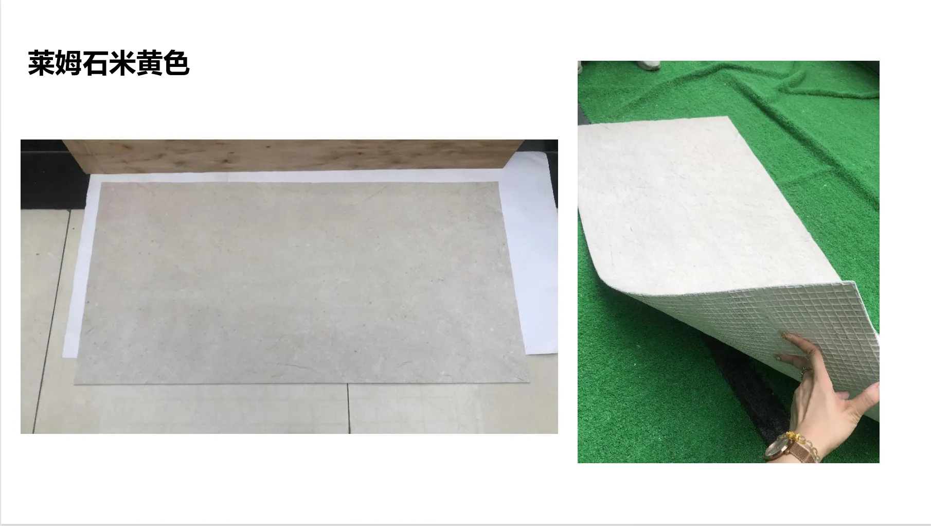
If there's a color that feels like coming home, it's beige limestone. Think of the soft glow of morning light filtering through curtains, or the warmth of a sunlit desert at dusk—that's the essence of lime stone (beige). Real photos of this stone often capture its understated elegance: a kitchen backsplash where the stone's surface is kissed by tiny, irregular veining, like brushstrokes in a watercolor painting. It's not flat or one-dimensional; there are hints of cream, pale taupe, and even the faintest blush, depending on the slab. In a living room, beige limestone floors feel grounding, letting furniture and art take the spotlight without competing. In a bathroom, it softens the space, turning a functional room into a spa-like retreat.
What makes beige limestone so beloved? It's versatile. Pair it with rich woods for a rustic charm, or with sleek metallics for modern sophistication. A real photo might show a restaurant interior where beige limestone walls are paired with dark wooden tables and warm pendant lights—the stone absorbs the light, creating a cozy atmosphere that makes guests linger. It's the kind of color that doesn't shout, but rather hums, "stay a while."
If beige limestone is the comfort of home, travertine (starry green) is the thrill of adventure. This stone belongs to the starry series, and once you see its real photos, you'll understand why—it looks like someone sprinkled stardust across a deep, earthy green canvas. Imagine a feature wall in a hotel lobby: the base color is a rich, forest green, but up close, there are tiny flecks of silver, gold, and even pale blue, like distant stars twinkling in a night sky. It's bold without being overwhelming, dramatic but grounded.
Real photos of starry green travertine often highlight its dynamic personality. One might capture a retail store where the stone lines the walls, turning a simple space into a destination. The green base adds depth, while the "stars" catch the light, making the wall feel alive as you move past it. Designers love it for spaces that need a focal point—think a home office where creativity thrives, or a boutique that wants to feel unique. It's a color that sparks conversation: "Is that really stone? It looks like a galaxy!"
White limestone, like marble veil white, is the quiet achiever of the stone world. It's clean, bright, and endlessly versatile, yet it never feels sterile. Real photos of marble veil white often showcase its subtlety: soft white backgrounds with delicate, wispy veining in light gray or beige, like veils of mist floating across a winter landscape. It's the kind of stone that makes a room feel larger, airier, and infinitely calm.
Walk into a bathroom with marble veil white walls, and you'll instantly feel the serenity. The stone reflects light, making even small spaces feel open, while the veining adds just enough texture to keep it from feeling flat. In a minimalist kitchen, it pairs beautifully with white cabinetry and black hardware, creating a timeless contrast. Real photos might show a spa where marble veil white covers the floors and walls, turning the space into a sanctuary of relaxation. It's a color that transcends trends—classic, pure, and always in style.
Color isn't just about aesthetics; it's about emotion. A designer choosing lime stone (beige) for a family home isn't just picking a material—they're curating warmth and togetherness. Opting for travertine (starry green) in a creative studio? They're fueling inspiration. And marble veil white in a hospital? It's about calm and healing. Real photos don't just show stones—they show how color transforms spaces into experiences.
| Stone Type | Color Personality | Texture Notes | Best For |
|---|---|---|---|
| Lime Stone (Beige) | Warm, inviting, versatile | Soft veining, smooth to slightly textured | Living rooms, kitchens, bedrooms |
| Travertine (Starry Green) | Dramatic, adventurous, unique | Deep base with metallic flecks, medium texture | Feature walls, boutique interiors, creative spaces |
| Marble Veil White | Calm, crisp, timeless | Delicate veining, smooth finish | Bathrooms, spas, minimalist kitchens |
| Wood Grain Board | Earthy, organic, warm | Linear wood-like texture, matte finish | Accent walls, furniture, ceiling panels |
| Fair-Faced Concrete | Industrial, raw, modern | Smooth with subtle pores, cool undertones | Loft apartments, commercial spaces, outdoor patios |
Limestone rarely shines alone—it loves to collaborate. Take wood grain board, for example. Imagine a dining room with lime stone (beige) floors and a wood grain board accent wall. The beige grounds the space, while the wood adds warmth and depth, creating a balance that feels both natural and intentional. Real photos of this pairing often highlight how the two materials complement each other, like old friends sharing a story.
Then there's fair-faced concrete. Its raw, industrial vibe pairs surprisingly well with the softness of marble veil white. A lobby with fair-faced concrete columns and marble veil white walls? It's modern meets timeless, edge meets elegance. The contrast makes both materials pop, proving that color harmony isn't just about matching—it's about balance.
You could read a hundred descriptions of travertine (starry green), but nothing compares to seeing a real photo. A photo captures the way light hits the stone at different times of day, the depth of its color, the tiny details that make each slab one-of-a-kind. It's the difference between hearing about a sunset and watching it paint the sky—you don't just understand it; you feel it.
Designers rely on real photos to make decisions. A picture might reveal that a "beige" limestone has pink undertones that clash with a client's existing decor, or that the starry green in a catalog looks more blue in natural light. Photos are the bridge between imagination and reality, ensuring that the stone chosen isn't just beautiful on paper—it's perfect in person.
At the end of the day, limestone's color variations are more than just shades—they're tools for storytelling. Whether you're drawn to the warmth of lime stone (beige), the drama of travertine (starry green), or the calm of marble veil white, each hue has a role to play in turning a house into a home, a space into a memory. And when paired with materials like wood grain board or fair-faced concrete, the possibilities are endless. So the next time you look at a slab of limestone, take a moment to really see it—not just as a material, but as a chapter in the story of your space.
Recommend Products


