Let's start with the obvious: in the world of architecture and design, presentations aren't just about numbers and blueprints. They're about storytelling. Whether you're pitching a boutique hotel, a corporate headquarters, or a residential complex, the materials you choose—how they look, feel, and interact with light—can make or break a client's vision. And when it comes to materials like limestone, one question always pops up: should you use real photos of the actual stone or rely on stock images?
It's a debate that's divided designers for years. Stock images promise convenience, consistency, and a polished "perfect" look. Real photos, on the other hand, offer authenticity, texture, and a raw, unfiltered glimpse of what the material will truly bring to a space. But which one actually helps you win over clients, avoid misunderstandings, and set realistic expectations? Let's dive in.
Why Lime Stone Matters in Presentations
Before we compare real photos and stock images, let's talk about why limestone itself is such a star player in design. Limestone isn't just a building material—it's a chameleon. From the warm, earthy tones of
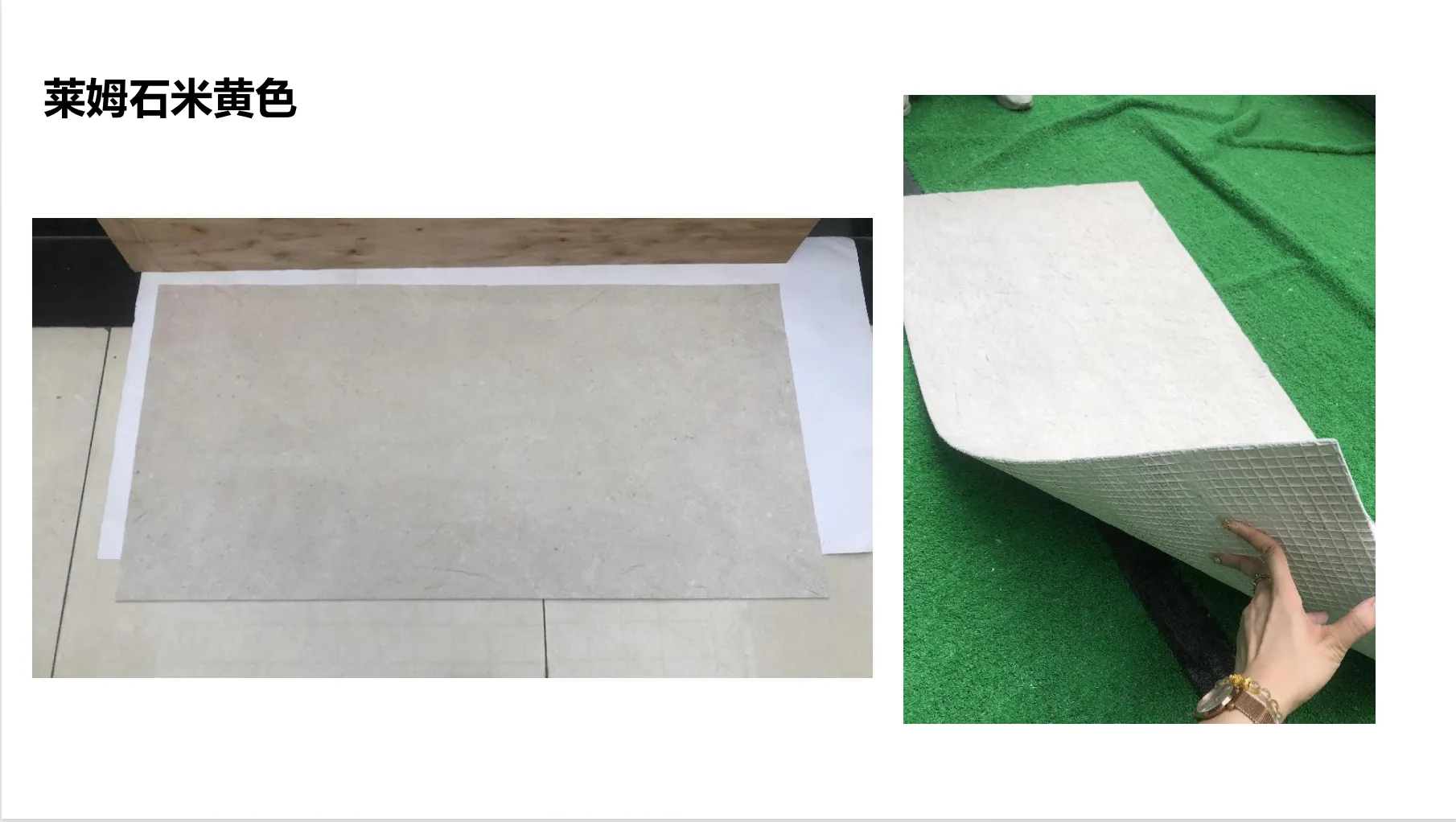
lime stone(beige)
to the dramatic, starry patterns of
travertine (starry green)
, it brings character and versatility to any project. Whether you're aiming for a rustic, natural aesthetic or a sleek, modern vibe, limestone adapts.
But here's the catch: its beauty lies in its imperfections. The subtle veining, the pits and pores, the way it absorbs light at different times of day—these are the details that make limestone unique. And when you're presenting to a client, those details aren't just "nice to have." They're the difference between a client nodding politely and leaning forward, saying, "I can see this in my space."
So, the question isn't just about visuals. It's about trust. Clients want to know that what you're showing them is what they'll actually get. And that's where the choice between real photos and stock images becomes critical.
Let's kick things off with real photos. These are images taken of the actual limestone you plan to use—whether it's a sample slab, a mock-up installation, or a finished project that uses the same material. They're unfiltered, unretouched (well, mostly), and they tell the truth. Here's why they matter:
Texture: Because "Smooth" in a Stock Image Might Mean "Porous" in Reality
Limestone is tactile. Run your hand over
travertine (starry green)
, and you'll feel the slight indentations of the starry pits; run it over
rough granite stone (medium grey)
, and you'll notice the gritty, uneven surface. These textures aren't flaws—they're features. But stock images? They often smooth them out.
I once worked with an interior designer who presented a client with a stock image of "beige limestone" for a kitchen backsplash. The image looked flawless: uniform color, zero pores, a subtle sheen. The client loved it. But when the actual
lime stone(beige)
arrived, it had visible veining and tiny pits (classic for limestone), and the client was disappointed. "This isn't what I saw," they said. The designer had to scramble to explain that the stock image was "idealized," and by then, trust was already frayed.
Real photos capture texture in a way stock images can't. A close-up shot of
travertine (starry green)
shows the depth of those starry patterns—the way some pits are deeper than others, how the color shifts when light hits them. A wide shot of a wall clad in
rock cut stone (dark grey)
reveals how the stones fit together, with slight gaps and irregular edges that add warmth. These details don't just show the material—they let the client
feel
it, even through a screen.
Pro Tip:
When shooting real photos, focus on both macro and micro shots. Close-ups highlight texture (great for material boards), while wide shots show scale (perfect for wall or floor installations). For example, a macro shot of
travertine (starry green)
might zoom in on a single starry pit, while a wide shot could show it installed in a lobby, paired with
fair-faced concrete
for contrast.
Context: Stock Images Live in a Vacuum; Real Photos Show the "Big Picture"
Stock images of limestone often feature a slab floating in a white void, or maybe a generic bathroom with a limestone countertop. They're pretty, but they're context-free. Real photos, though? They show the material in action.
Let's say you're pitching a hotel lobby using
historical pathfinders stone
—a limestone variant inspired by ancient pathways, with a weathered, timeworn look. A stock image might show a close-up of the stone, but a real photo could show it installed on a lobby wall, paired with
foamed aluminium alloy board (vintage silver)
accents and warm lighting. Suddenly, the client isn't just seeing a stone—they're seeing a welcoming space where guests will linger.
Context also matters for problem-solving. Maybe the limestone you're using has a slight color variation (which is normal!). A real photo can show that variation in a finished wall, proving that it adds visual interest rather than looking "uneven." A stock image, stuck in its perfect white void, can't do that. It can't show how the stone interacts with other materials, how it ages, or how it behaves in different lighting. And in presentations, that context is gold.
Trust: Clients Buy What They Can Verify
Here's a hard truth: clients are skeptical. They've been burned before by designers who showed them "perfect" images only to deliver something different. Real photos cut through that skepticism. When you say, "This is the exact
travertine (starry green)
we'll use for your restaurant facade," and you show them a photo of that exact stone installed on a similar project, you're not just selling a material—you're selling reliability.
I spoke to a contractor recently who told me about a commercial project where the client insisted on seeing real photos of every material before signing off. For the exterior cladding, they used
mcm flexible stone
—a lightweight, flexible limestone composite. The contractor took photos of the stone in direct sunlight, in shade, and even after a rainstorm to show how it weathered. The client was so impressed by the transparency that they greenlit the project on the spot. "I didn't have to guess," the client said. "I knew exactly what I was getting."
Stock images, by contrast, feel like a promise without proof. They're generic, and clients know it. When you use them, you're asking the client to take a leap of faith—and in a competitive industry, that's a risk you don't need to take.
The Appeal of Stock Images: Convenience, Consistency, and Cost
Now, let's play devil's advocate. Stock images aren't evil. They have their place, especially for small firms, tight deadlines, or initial concept pitches. Here's why some designers swear by them:
Speed: When You Need a Visual Yesterday
Imagine you're in a last-minute pitch for a retail project. The client wants to see material options by the end of the day, and you haven't received the
travertine (starry orange)
samples yet. What do you do? Stock images to the rescue. With a quick search, you can pull up high-quality images of similar stones, slap them into your presentation, and keep the process moving.
Stock images are also great for mood boards. If you're brainstorming ideas with a client, using a stock image of
marble veil white
alongside
weaving (khaki)
can help set the tone, even if you haven't finalized the exact materials yet. They're a placeholder, a way to say, "This is the direction we're thinking."
Consistency: When You Need All Materials to "Match" in the Presentation
Stock images are shot in controlled environments, with professional lighting and editing. That means you can find images of
lime stone(beige)
,
fair-faced concrete
, and
foamed aluminium alloy board (vintage gold)
that all have the same brightness, contrast, and color balance. This can make your presentation look polished and cohesive—especially if you're working with a mix of materials that haven't been photographed together.
For example, if you're presenting a concept for a boutique hotel and want to show how
bamboo mat board
(a sustainable wood-look limestone) pairs with
stream limestone(dark grey)
, stock images can give you a rough idea of the color palette without having to source and photograph both materials. It's not perfect, but it's a start.
Cost: When Hiring a Photographer Isn't in the Budget
Let's be real: professional photography isn't cheap. Hiring a photographer to shoot material samples, mock-ups, or finished projects can cost hundreds (or thousands) of dollars—money that small firms or independent designers might not have upfront. Stock images, on the other hand, are affordable (or even free, if you use sites like Unsplash). For a startup design studio pitching its first big project, stock images can be a lifeline.
But here's the catch: cheap upfront might mean expensive later. If the client approves a stock image but hates the real material, you could end up with rework costs, delays, or even a lost client. So, while stock images save money in the short term, they can cost you in the long run.
Real Photos vs. Stock Images: A Head-to-Head Comparison
|
Criteria
|
Real Photos of Lime Stone
|
Stock Images of Lime Stone
|
|
Authenticity
|
High: Shows the actual material, flaws and all.
|
Low: Often idealized or generic; may not match the real stone.
|
|
Texture Detail
|
High: Captures pits, veining, and surface irregularities.
|
Low: Often smoothed or retouched to look "perfect."
|
|
Context
|
High: Can show the stone in situ (installed, lit, weathered).
|
Low: Typically isolated on a white background or in generic settings.
|
|
Client Trust
|
High: Builds transparency and credibility.
|
Medium: Clients may question if the image reflects reality.
|
|
Cost
|
High: Requires photography equipment or hiring a pro.
|
Low: Affordable or free; no setup costs.
|
|
Time Investment
|
High: Needs planning (samples, lighting, shooting).
|
Low: Instant download; no setup required.
|
|
Uniqueness
|
High: Shows the specific stone for the project.
|
Low: Generic; other designers may use the same image.
|
When to Use Which: A Practical Guide
So, which one should you choose? The answer, as with most design questions, is: "It depends." Here's a breakdown of scenarios where real photos shine, and where stock images might be acceptable:
Use Real Photos When…
1. The material is unique or high-end.
If you're using
travertine (starry green)
with custom starry patterns,
historical pathfinders stone
with heritage-inspired detailing, or
mcm flexible stone
(which has unique flexibility and installation properties), real photos are non-negotiable. These materials sell on their uniqueness, and stock images can't capture that.
2. You're in the final stages of client approval.
Once you've narrowed down materials and are presenting the "final" design, real photos build confidence. Clients want to see the actual stone that will go into their project, not a generic stand-in.
3. The project has strict aesthetic requirements.
If the client is obsessed with color consistency (or inconsistency!), texture, or lighting effects, real photos are the only way to ensure alignment. For example,
lunar peak silvery
limestone looks dramatically different in warm vs. cool light—real photos taken in the project's actual space can show that.
4. You're working with a skeptical client.
If the client has been burned before or asks a lot of questions about materials, real photos demonstrate transparency. They say, "We have nothing to hide."
Use Stock Images When…
1. You're in the early concept phase.
When you're still brainstorming ideas and presenting mood boards, stock images can help communicate the general vibe (e.g., "We're thinking warm, earthy tones like
lime stone(beige)
"). Just be clear that these are "inspiration" images, not the final material.
2. The material is widely available and consistent.
If you're using a common limestone like
travertine (beige)
with minimal variation, a stock image might suffice—though I'd still recommend pairing it with a physical sample.
3. You're on a shoestring budget and tight timeline.
Small firms or freelance designers might not have the resources to shoot real photos for every pitch. In this case, stock images can work, but be upfront with the client: "This is a representative image—we'll share real photos once we finalize the material."
4. You're supplementing, not replacing, real visuals.
Stock images can work as a "preview," but always follow up with real photos or physical samples. For example, use a stock image of
fair-faced concrete
in your initial pitch, then bring a sample slab to the next meeting.
The Middle Ground: Enhancing Stock Images with Real-World Context
What if you can't shoot real photos but still want to add authenticity to stock images? Get creative. Here are a few hacks:
Add annotations.
If you're using a stock image of
travertine (starry green)
, add text like, "Note: Actual stone will have natural starry pits and slight color variation, as seen in sample."
Pair with physical samples.
A stock image plus a small slab of
lime stone(beige)
gives the client the best of both worlds: a visual reference and a tactile one.
Use stock images of similar projects.
If you can't shoot your own material, find stock images of finished projects that use the same stone. For example, search for "commercial lobby with
mcm flexible stone
" instead of just "
mcm flexible stone slab." This adds context and makes the image more relatable.
Edit mindfully.
If you must retouch a stock image, avoid over-saturating colors or smoothing texture. Instead, adjust brightness/contrast to match the stone's real appearance, and add notes like, "Color adjusted to reflect actual material."
Final Thoughts: Real Photos Win for Trust, but Stock Images Have Their Place
At the end of the day, presentations are about building trust. Clients don't just hire you for your design skills—they hire you because they believe you can deliver on your promises. Real photos of limestone—whether it's
travertine (starry green)
,
historical pathfinders stone
, or
lime stone(beige)
—are proof that you're delivering what you say. They show the material's true character, its flaws and its beauty, and they let clients visualize it in their space.
Stock images, on the other hand, are a tool—useful for speed, convenience, and initial concepts, but risky as the sole visual reference. They're like a dating profile photo: they show the best version, not the real one. And clients deserve the real one.
So, my advice? Invest in real photos whenever possible. Shoot them yourself with a decent camera, hire a pro for big projects, or ask your supplier for high-quality images of the exact batch you're ordering. Your clients will thank you—and your project approval rate will likely go up.
After all, in design, the details matter. And when it comes to limestone, there's no substitute for the real thing.