
Exploring the palettes shaping contemporary architecture and interior design
Color is more than just a visual element in design—it's a language. It whispers moods, sets tones, and transforms spaces from ordinary to unforgettable. In 2025, as architects and designers lean into both innovation and timelessness, marble concrete boards have emerged as a canvas for this colorful dialogue. Once confined to muted grays and beiges, these versatile materials now embrace celestial metallics, earthy gradients, and industrial-chic tones, proving that durability and beauty can coexist in perfect harmony.
What makes marble concrete boards stand out in today's design landscape? Their adaptability. Blending the strength of concrete with the elegance of marble (and often other materials like stone, metal, or even recycled elements), they offer a middle ground between luxury and practicality. Whether you're designing a minimalist apartment, a bustling restaurant, or a sustainable office, the right color can turn a functional surface into a focal point that tells a story. This year, the trends are clear: we're moving beyond "safe" neutrals and embracing hues that reflect nature, technology, and the quiet poetry of everyday life.
If 2024 was about warm earth tones, 2025 is reaching for the stars—literally. Celestial neutrals, inspired by the moon's phases and the night sky, are dominating modern designs, offering a blend of calm sophistication and subtle drama. Leading the charge are the Lunar Peak series: Lunar Peak Silvery , Lunar Peak Golden , and Lunar Peak Black . These aren't your average neutrals—they're infused with a soft metallic sheen that mimics moonlight on water or stardust on stone. Imagine a living room wall clad in Lunar Peak Silvery: its cool, silvery base shimmers gently under natural light, adding depth without overwhelming the space. Pair it with warm wood accents and soft textiles, and you've got a room that feels both modern and cozy, like a quiet evening watching the moon rise.
But why stop at the moon when the stars are so bright? The travertine (starry) subseries is taking this celestial theme further, with travertine (starry blue) emerging as a breakout favorite. Unlike traditional travertine's porous, earthy look, starry blue travertine features tiny, iridescent flecks that catch the light, creating the illusion of a night sky scattered with distant stars. It's a bold choice, but surprisingly versatile. Use it as a backsplash in a kitchen to add a touch of whimsy, or as an accent wall in a bedroom for a serene, almost meditative vibe. Designers love it for its ability to balance bold color with subtlety—those starry flecks don't scream for attention; they invite you to lean in and notice the details.
What's driving this trend? In a world that often feels chaotic, celestial neutrals offer a sense of calm and wonder. They remind us of the vastness of the universe, grounding us even as they lift our gaze upward. Lunar Peak Golden, for example, pairs a warm, honeyed base with golden undertones that evoke sunrise over a mountain range—optimistic, yet grounded. It works beautifully in spaces where you want to encourage connection, like dining rooms or home offices, where the soft glow can make long hours feel a little more magical.
While celestial tones look to the sky, another major trend is rooted firmly in the earth: rammed earth board (gradient) . These boards mimic the layered, weathered look of natural soil and rock, with colors that transition seamlessly from one hue to the next—think soft beiges fading into terracotta, or pale greens melting into warm browns. It's a nod to sustainable design, yes, but more than that, it's a celebration of nature's imperfect beauty. Unlike uniform colors, gradients tell a story of time and change, like the layers of sediment in a riverbed or the way sunlight paints a hillside at different times of day.
Take rammed earth board (gradient c) , for instance. Its palette shifts from a soft, sandy beige at the top to a rich, rusty red at the bottom, mirroring the way soil oxidizes over time. Install it in a hallway, and suddenly the space feels like a walk through a desert canyon at sunset—warm, immersive, and full of life. Or consider rammed earth board (matcha green) , which blends soft sage with deeper emerald, evoking moss-covered stone walls in a forest. It's a color that brings the outdoors in, making even the most urban apartment feel connected to the natural world.
What's appealing about gradient rammed earth boards is their versatility. They work in both rustic and contemporary settings, adding texture without overwhelming. In a minimalist home, a gradient wall can be the only "color" needed, letting furniture and art take center stage. In a bohemian space, it pairs beautifully with patterned textiles and potted plants, creating a layered, lived-in look. And for eco-conscious designers, these boards often use sustainable materials and low-VOC pigments, aligning with the growing demand for greener building practices. It's a trend that proves sustainability doesn't have to mean sacrificing style—in fact, it can enhance it.
Industrial design has been a staple for years, but 2025 is giving it a sophisticated upgrade with fair-faced concrete and vintage metal accents. Fair-faced concrete, with its raw, unpolished finish, is no longer just for warehouses and lofts—it's being embraced in high-end homes and luxury hotels, celebrated for its honesty and texture. Unlike polished concrete, which has a smooth, reflective surface, fair-faced concrete——,,."",,.
To balance concrete's cool, gray tones, designers are pairing it with foamed aluminium alloy boards in vintage silver and vintage gold . These metals have a weathered, almost antique finish—think old brass doorknobs or tarnished silverware—that adds warmth and history to industrial spaces. Imagine a restaurant kitchen where fair-faced concrete countertops meet a backsplash of vintage gold foamed aluminium: the concrete grounds the space, while the gold adds a touch of glamour, creating a vibe that's equal parts "hardworking" and "high-end." It's a contrast that works because both materials feel authentic—no fake finishes, no over-the-top shine, just honest beauty.
Why is this trend resonating now? In a world of mass-produced, "perfect" surfaces, there's a growing hunger for materials that feel real, that show signs of their making. Fair-faced concrete and vintage metals don't hide their age—they wear it proudly, like a well-loved book with dog-eared pages. They also offer endless flexibility: use fair-faced concrete for floors in a home office, then add vintage silver panels to the ceiling for a cohesive look. Or mix and match: a bathroom with a concrete shower wall and a vintage gold mirror frame, proving that industrial and elegant can coexist.
Some trends come and go, but marble is forever—though 2025 is giving it a much-needed modern update with marble concrete board . Traditional marble is stunning but fragile and expensive; marble concrete board solves both problems by combining marble's iconic veining with concrete's durability. The result? A material that looks like it was quarried from the hills of Italy but can withstand the wear and tear of a busy family home or a high-traffic retail space.
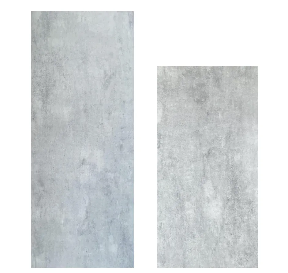
This year, the standout shades in marble concrete board are marble veil white and marble interstellar gray . Marble veil white is pure, crisp, and bright, with delicate, feathery veining in soft gray that mimics the look of a cloud floating across the sky. It's perfect for small spaces, as it reflects light and makes rooms feel larger—think a bathroom with marble veil white walls and a glass shower, creating a spa-like oasis. Marble interstellar gray, on the other hand, is moodier and more dramatic, with deep gray veins swirling through a lighter gray base, like storm clouds gathering over a mountain range. It's a bold choice for a fireplace surround or a kitchen island, adding instant sophistication without feeling old-fashioned.
What's exciting about marble concrete board is how it bridges the gap between past and present. It honors marble's centuries-old legacy as a symbol of luxury, but reimagines it for the 21st century—lighter, more affordable, and easier to install. It's also incredibly versatile: pair marble veil white with black accents for a classic monochrome look, or mix marble interstellar gray with warm woods and plants for a modern organic feel. In a world that often prioritizes the new over the old, this trend reminds us that some things are timeless for a reason—and with a little innovation, they can feel fresh again.
| Trend Category | Key Products | Color Description | Ideal Applications |
|---|---|---|---|
| Celestial Neutrals | Lunar Peak Silvery, Travertine (Starry Blue) | Silvery base with metallic sheen; blue travertine with iridescent star-like flecks | Living room accent walls, bedroom backsplashes, hotel lobbies |
| Earthy Gradients | Rammed Earth Board (Gradient C), Rammed Earth Board (Matcha Green) | Beige-to-rusty red transitions; soft sage-to-emerald green layers | Hallways, dining rooms, sustainable home exteriors |
| Industrial Elegance | Fair-Faced Concrete, Foamed Aluminium Alloy Board (Vintage Gold) | Raw, unpolished gray concrete; weathered gold metal with antique finish | Restaurants, home offices, commercial kitchens |
| Timeless Classics | Marble Concrete Board (Veil White), Marble Concrete Board (Interstellar Gray) | Crisp white with soft gray veining; light gray base with dramatic dark gray swirls | Bathrooms, kitchen countertops, retail storefronts |
With so many stunning options, how do you pick the right color for your project? Start by considering the space's purpose. A bedroom should feel calming, so celestial neutrals like Lunar Peak Silvery or Travertine (Starry Blue) might be ideal. A kitchen, which sees a lot of activity, could benefit from the durability of fair-faced concrete or marble concrete board. For a home office, where focus is key, the earthy gradients of rammed earth board can create a grounding, distraction-free environment.
Lighting is another crucial factor. Natural light will make colors like Lunar Peak Golden appear warmer, while artificial light might enhance the cool tones in Lunar Peak Black. Always test samples in the actual space at different times of day before committing. And don't be afraid to mix trends—pair a gradient rammed earth wall with a marble concrete countertop, or use fair-faced concrete floors with starry blue travertine accents. The best designs are often the ones that blend influences, creating a space that feels uniquely yours.
Finally, remember that color is personal. Trends can inspire, but the most successful spaces are those that reflect the people who use them. If you love bold colors, lean into starry blue travertine. If you prefer quiet elegance, stick with marble veil white. At the end of the day, marble concrete boards are more than just building materials—they're a way to express yourself, to turn a house into a home, or a commercial space into a place that leaves a lasting impression.
As we look at the marble concrete board color trends of 2025, one thing is clear: color is no longer an afterthought in design—it's the storyteller. Whether we're drawn to the celestial calm of Lunar Peak, the earthy warmth of rammed earth gradients, the industrial honesty of fair-faced concrete, or the timeless elegance of reimagined marble, these hues do more than just look good—they evoke emotions, spark memories, and create spaces that feel alive.
In a world that's constantly changing, there's something reassuring about materials that can adapt—concrete that feels luxurious, marble that feels durable, metals that get better with age. And in their colors, we see a reflection of our own desires: to connect with nature, to honor the past, to look toward the future, and to find beauty in the everyday. So as you embark on your next project, don't just choose a color—choose a story. Your space will thank you for it.
Recommend Products


