Let's put this all into practice with a hypothetical example: Ember & Co., a mid-sized clothing brand specializing in sustainable, ethically made apparel. They wanted to redesign their flagship store to reflect their values: quality, sustainability, and warmth. Here's how they used our key materials:
The Entrance:
To make a strong first impression, they chose
marble concrete board for the floor. Its neutral, earthy tones set a calm mood, while the marble veining added a touch of luxury—signaling that "sustainable" doesn't mean "cheap."
The Fitting Rooms:
Walls were clad in
wood grain board, chosen for its soft texture. Customers often feel vulnerable in fitting rooms; the warm, home-like feel of wood helped them relax, leading to longer try-on sessions and more purchases.
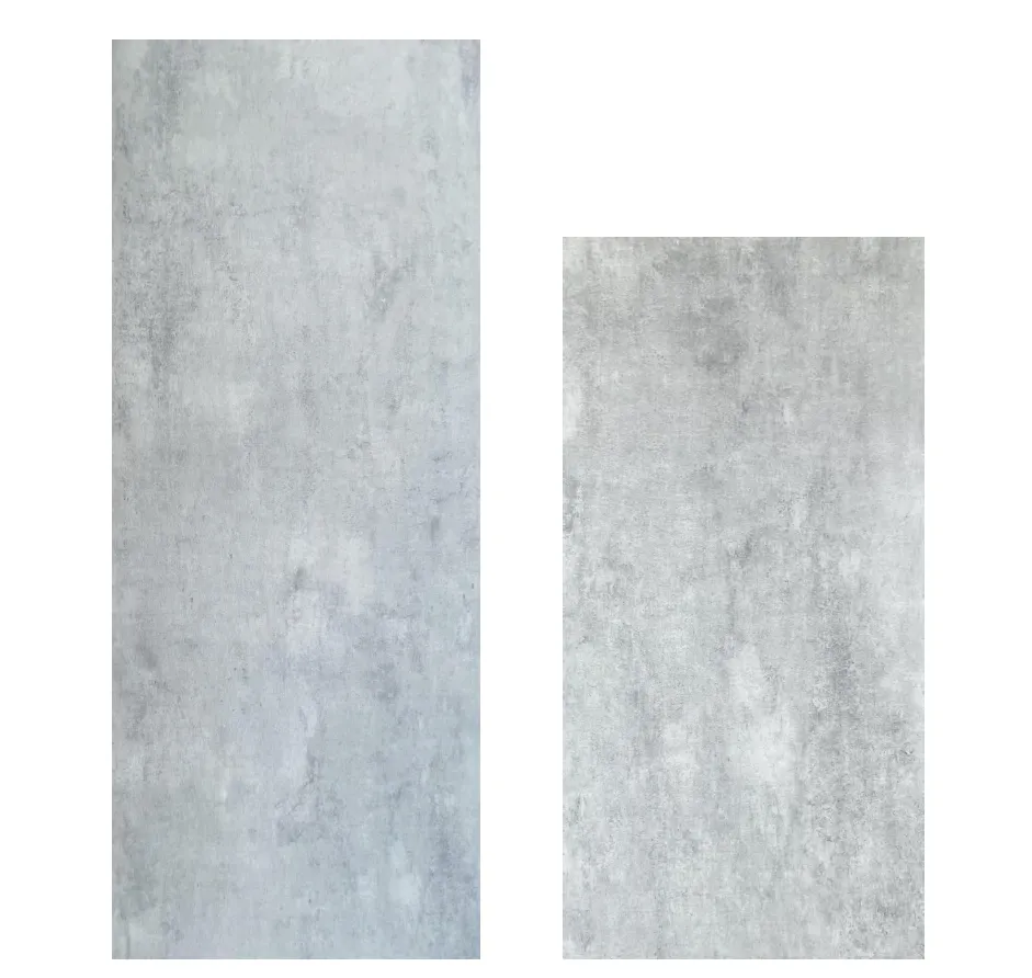
The Main Display Wall:
Behind their best-selling collection, they installed
lunar peak silvery panels. The subtle metallic sheen reflected natural light from the store's large windows, making the clothes look brighter and more vibrant. It also added a modern edge, showing that sustainability can be stylish.
The Cash Wrap Area:
A small accent wall of
travertine (starry green) made the checkout counter feel special. Customers lingered longer, chatting with staff while admiring the "starry" texture—turning a quick transaction into a memorable moment.
The Result:
After the redesign, Ember & Co. saw a 25% increase in foot traffic (thanks to social media photos of the starry green wall) and a 15% boost in average transaction value. Customers reported feeling "more connected" to the brand, with many mentioning the store's "cozy yet upscale" vibe in reviews.