
Space is more than walls and floors—it's a story. The materials we choose write that story, weaving emotion, memory, and mood into every corner. In 2025, the world of design is turning a new page, one that balances the quiet comfort of neutral tones with the spark of bold accents. This year, it's not about choosing sides; it's about harmony. Whether you're crafting a home that feels like a warm hug or a commercial space that sparks conversation, the trends ahead invite you to blend calm and energy, subtlety and statement. Let's dive into the colors shaping 2025, where Marble Stream Stone leads the neutral charge, and Rusty Red and Travertine (Starry Blue) add the bold brushstrokes.
Neutrals are the backbone of design—they create the canvas on which the rest of the story unfolds. In 2025, we're seeing a shift toward neutrals that feel less "blank" and more "breathtaking," rich with texture and depth. These aren't just "beige" or "grey"; they're materials that whisper, not shout, inviting you to slow down and notice the details.
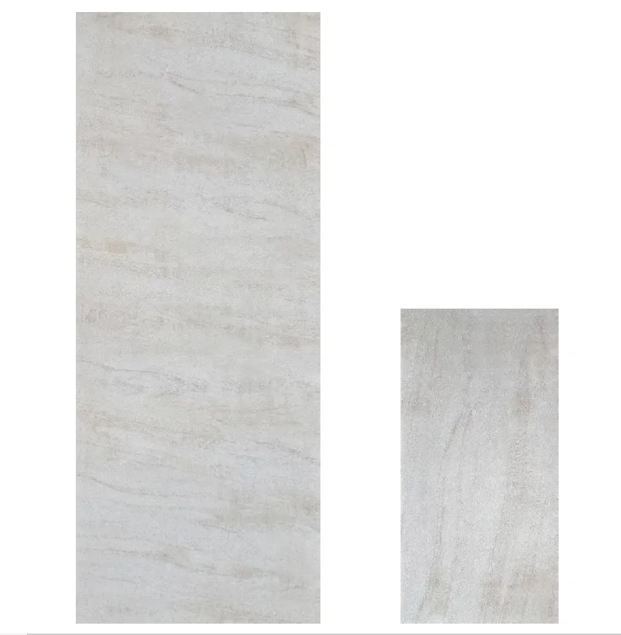
Take Marble Stream Stone , for example. Imagine running your hand over its surface: cool, smooth, with veins that meander like a gentle stream. Its base color is a soft, silvery grey, but look closer, and you'll find hints of taupe and cream, as if the stone itself holds the memory of riverbeds and ancient tides. It's versatile enough to anchor a minimalist living room, where its subtle veining adds interest without distraction, or to line a bathroom, turning a daily routine into a spa-like retreat. Designers are calling it "the quiet luxury"—a material that feels expensive not because it's flashy, but because it's undeniably, authentically beautiful.
Then there's Lunar Peak Silvery , a neutral with a celestial twist. If Marble Stream Stone is a river, Lunar Peak Silvery is moonlight on water. Its finish is soft yet metallic, catching light in a way that shifts throughout the day—cool and calm in the morning, warm and golden-tinged as the sun sets. It's modern without feeling cold, thanks to its slightly porous texture that adds a touch of earthiness. Use it for kitchen countertops, and suddenly, chopping vegetables feels like preparing a meal under the stars. Pair it with wooden accents, and you've got a space that bridges the gap between industrial sleekness and homey warmth.
And let's not overlook Fair-faced Concrete , the underdog of neutrals that's finally getting its moment. This isn't the harsh, utilitarian concrete of parking garages. Fair-faced Concrete in 2025 is warm, with a matte finish that feels almost velvety to the touch. Its color leans toward a soft, oatmeal beige, with tiny specks of aggregate that add visual interest—like holding a handful of sand from a quiet beach. It's raw, honest, and surprisingly cozy. Designers are using it for accent walls in bedrooms, where its texture contrasts beautifully with soft linens, or for dining tables, where it pairs with wooden chairs to create a "rustic modern" vibe that feels lived-in and loved.
If neutrals are the story's setting, bold accents are the plot twists. 2025 isn't about neon or garish hues; it's about accents that feel intentional, like a well-placed exclamation mark in a poem. These colors don't overpower—they elevate, turning a "nice" space into one that makes you pause and say, "Wow, this feels like me."
Rusty Red is leading the charge here. Think of the color of autumn leaves just before they fall—deep, earthy, and full of warmth. It's not a bright, cherry red; it's a red with depth, tinged with brown and orange, like the rust on an old barn door that's seen decades of sunsets. When used as an accent, it adds a layer of coziness that neutrals alone can't match. Imagine a living room with Marble Stream Stone walls and a Rusty Red sofa—suddenly, the space feels like a cabin in the woods, even if it's in the heart of the city. Or a kitchen backsplash in Rusty Red tile, popping against Fair-faced Concrete countertops: it's unexpected, but it works, because the red feels rooted in nature, not artificial.
For those who crave a touch of the extraordinary, Travertine (Starry Blue) is a game-changer. Travertine is known for its porous, almost honeycomb texture, but the "Starry Blue" variant takes it to another level. Its base is a deep, moody blue—think midnight sky—dotted with tiny, iridescent flecks that catch the light like stars. It's bold, but not overwhelming, because the blue is muted, not electric, and the starry flecks add whimsy without chaos. Designers are using it in small doses: a fireplace surround in a bedroom, where it turns a cold corner into a focal point that glows when the fire's lit, or a backsplash in a home office, where the starry pattern sparks creativity. It's the kind of accent that makes guests lean in and say, "What is that? It's stunning."
The magic of 2025's trends lies in how these neutrals and accents play off each other. It's not about choosing one or the other—it's about creating a dance between calm and energy. To help you visualize, here's a breakdown of how to pair the stars of the show:
| Neutral Tone | Bold Accent | Why They Work | Perfect Space |
|---|---|---|---|
| Marble Stream Stone (silvery grey with soft veining) | Rusty Red (earthy, warm red-brown) | The cool grey of the marble balances the heat of the red, creating a space that feels both grounded and inviting. | Living room (marble walls, red sofa, wooden coffee table) |
| Lunar Peak Silvery (cool, metallic silver) | Travertine (Starry Blue) (deep blue with starry flecks) | The silvery sheen of Lunar Peak mimics moonlight, while the starry blue evokes the night sky—cosmic harmony. | Home office (silvery desk, blue accent wall, brass lamp) |
| Fair-faced Concrete (oatmeal beige with aggregate texture) | Rusty Red (warm, earthy red) | The raw, industrial feel of concrete is softened by the red, creating a space that's edgy but not cold. | Kitchen (concrete countertops, red tile backsplash, black hardware) |
At the end of the day, design is about connection. A space that's all neutrals can feel sterile, like a hotel room—nice to visit, but not to live in. A space that's all bold accents can feel chaotic, leaving you feeling drained. But when you blend the two? You get a space that feels like "you." It's the calm of coming home, paired with the excitement of something new. It's the Marble Stream Stone that reminds you to breathe, and the Rusty Red that makes you smile when you walk in the door.
In 2025, we're not just designing spaces—we're designing experiences. Whether you're drawn to the quiet elegance of Lunar Peak Silvery or the bold charm of Travertine (Starry Blue) , remember: the best designs are the ones that tell your story. So go ahead—mix, match, and make it yours. After all, the most beautiful spaces aren't perfect; they're authentic .
As we step into 2025, let's embrace the beauty of balance. Let neutrals ground us, and accents inspire us. Together, they're not just trends—they're the beginning of a new chapter in design, one that's as unique and wonderful as the people who live in the spaces we create.
Recommend Products


