There's a quiet revolution happening in the world of interior and exterior design—one that marries the raw, grounding energy of traditional building materials with the dynamic, expressive spirit of modern art. At the heart of this movement? Rammed earth boards, and in 2025, all eyes are on their gradient color variations. These aren't just building materials; they're storytellers, blending hues like a painter's palette to craft spaces that feel alive, intentional, and deeply connected to nature.
Rammed earth itself is no newcomer. For centuries, civilizations across the globe—from the Great Wall of China to the adobe dwellings of the American Southwest—relied on this simple yet durable mix of soil, clay, sand, and water, compacted layer by layer to form walls that stood the test of time. But in recent years, as designers and homeowners alike crave authenticity in a world of mass-produced surfaces, rammed earth has experienced a renaissance. And now, with the introduction of gradient color technology, it's evolving from a "classic" choice to a "cutting-edge" one.
So why gradients? In a design landscape dominated by stark minimalism and monochromes, gradients offer softness, depth, and a touch of whimsy. They mimic the way light plays on natural landscapes—think the fade of a desert sunset, the blending of mountain shadows at dusk, or the subtle shift of seasons in a forest. They invite the eye to linger, to notice details, to feel a sense of movement in an otherwise static wall or facade. For 2025, as we continue to seek balance between the digital and physical worlds, gradient rammed earth boards are emerging as the perfect bridge: rooted in nature, yet fresh and forward-thinking.
The Rise of Gradient Rammed Earth: More Than Just a Color Choice
To understand why gradient rammed earth boards are stealing the spotlight in 2025, we need to look beyond aesthetics. This trend is tied to three larger shifts in design philosophy: biophilic design, emotional architecture, and sustainable innovation.
Biophilic design—the idea that humans innately seek connection with nature—has been gaining momentum for years, and gradients are its latest expression. Unlike solid colors, which can feel flat or artificial, gradients mirror the imperfection and diversity of the natural world. A wall clad in gradient rammed earth doesn't just *look* like a hillside at dawn; it *feels* like one, triggering that primal sense of calm we get from being outdoors.
Then there's emotional architecture: the recognition that spaces shape how we feel. Designers are no longer just creating "pretty rooms"—they're crafting environments that evoke joy, focus, or relaxation. Gradients excel here because they're inherently dynamic. A soft gradient (say, warm terracotta blending into soft sage) can make a living room feel cozy and inviting, while a bolder shift (deep rust to golden amber) might energize a workspace. They're not one-note; they adapt to the time of day, the light, and even the mood of the people in the room.
And let's not forget sustainability. MCM's rammed earth boards are already celebrated for their eco-friendly credentials—made with natural materials, low in embodied carbon, and often locally sourced. Gradient variations take this a step further by reducing waste: instead of producing multiple solid-color boards for a single project, a gradient series can create a rich, layered look with fewer materials. Plus, their durability means less need for replacement over time, making them a choice that's kind to both the planet and the budget.
Together, these factors have made gradient rammed earth boards the "it" material for 2025—a perfect storm of beauty, purpose, and planet-friendly design.
2025's Standout Gradient Collections: A Closer Look
Not all gradients are created equal. MCM's 2025 lineup offers three distinct gradient series, each with its own personality and purpose. Let's dive into what makes them unique, and how they stack up against other trending materials like
lunar peak golden
or
historical pathfinders stone
.
Gradient B: The Warm Neutrals
Gradient B is the "everyman" of the collection—approachable, versatile, and effortlessly timeless. It starts with a soft, sandy beige (reminiscent of
lime stone(beige)
) and fades gently into a warm, earthy terracotta, with hints of amber and peach in between. Think of it as the color of a desert landscape at sunrise: familiar, comforting, and full of subtle surprises.
What makes Gradient B so popular? It plays well with almost everything. Pair it with
wood grain board
for a rustic-chic kitchen backsplash, or with
fair-faced concrete
for a modern industrial living room. It's neutral enough to act as a backdrop for bold furniture or art, but rich enough to stand on its own as a statement wall. In commercial spaces—like a boutique hotel lobby or a cozy café—it creates an atmosphere of understated luxury, making guests feel welcome without overwhelming them.
Gradient C: The Earthy Cool Tones
If Gradient B is the sunrise, Gradient C is the misty mountain morning. It opens with a pale sage green, deepens into a muted olive, and transitions finally into a soft charcoal—echoing the layered hues of a forest after rain. It's cooler than Gradient B, but never cold; there's a warmth in its depth that keeps it from feeling sterile.
This series is a favorite among designers working on wellness spaces: yoga studios, spas, or home offices where focus and calm are key. The green-to-gray shift has been shown to reduce stress and boost creativity, making it ideal for environments where people need to unwind or concentrate. It also pairs beautifully with metallic accents—try combining it with
foamed aluminium alloy board (vintage gold)
for a touch of glamour, or with
lunar peak silvery
for a sleek, contemporary look.
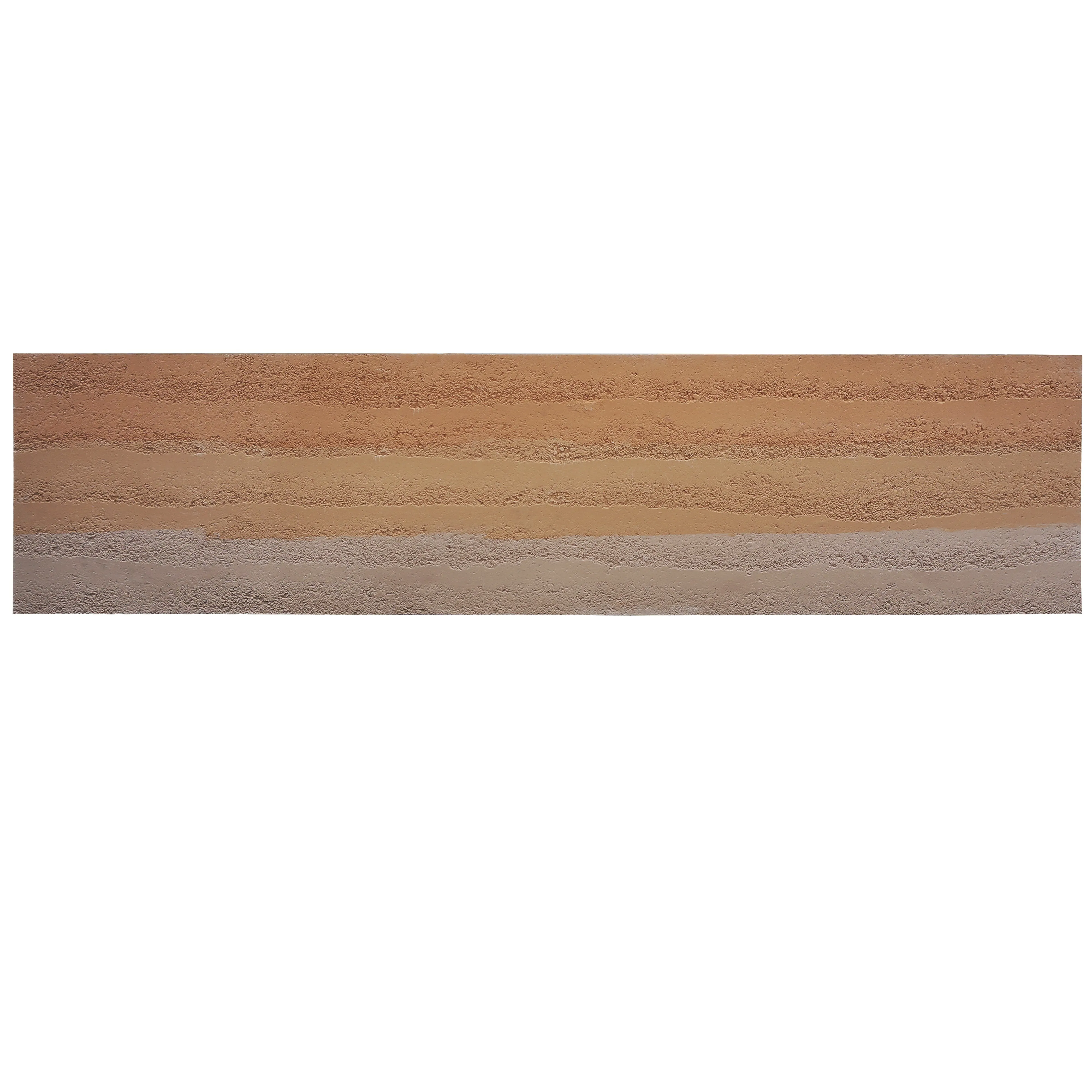
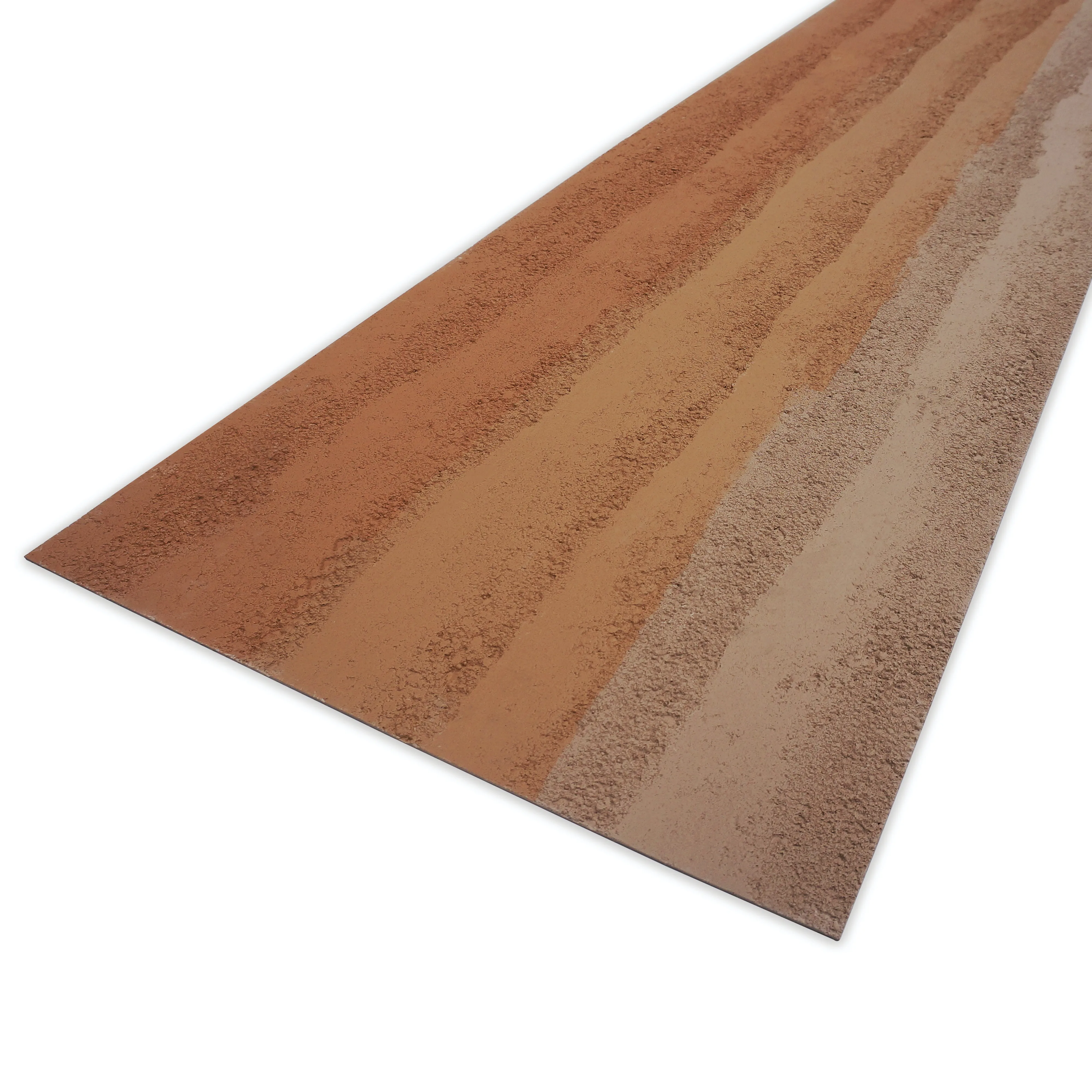
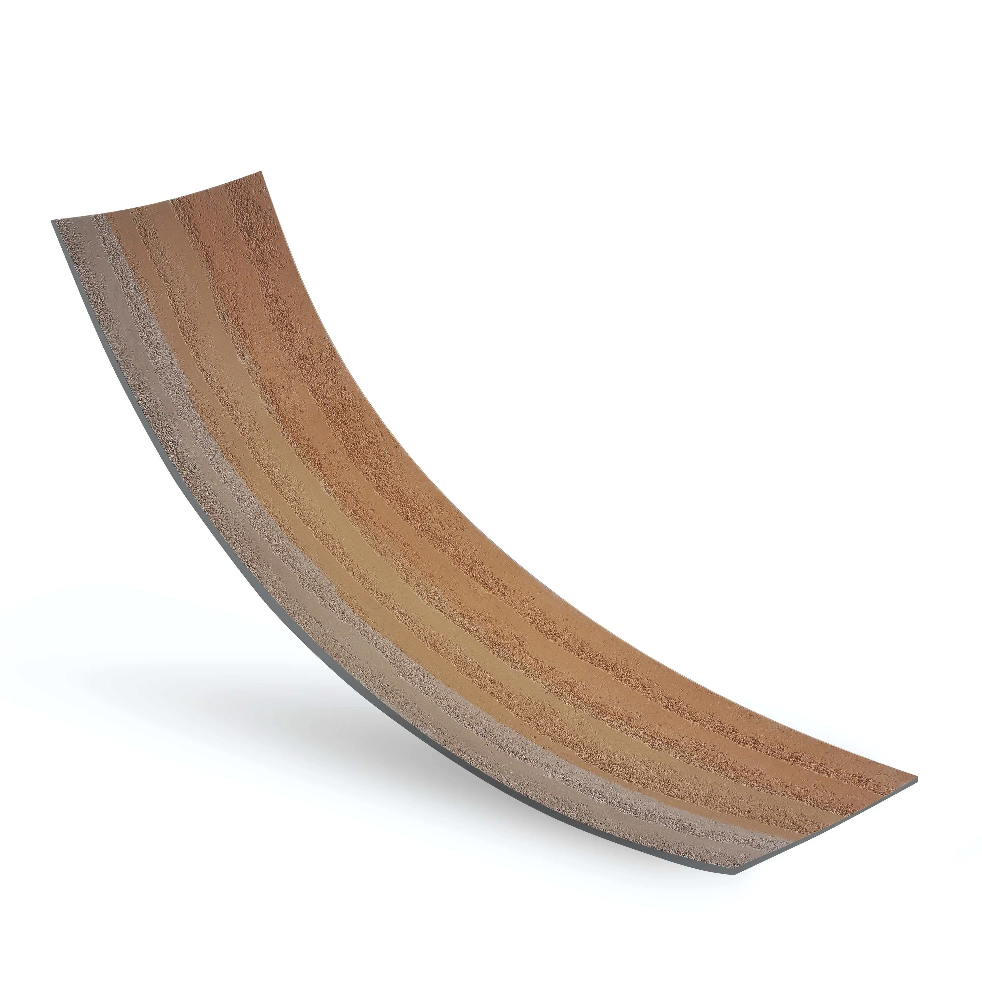
For those who want to push boundaries, there's the aptly named
gradient color rammed earth board
—the most dramatic option in the 2025 lineup. This series isn't afraid to play with contrast: imagine deep rust (a nod to
rusty red
) blending into burnt sienna, then shifting into warm mustard, and finally settling into golden amber. It's bold, unapologetic, and full of personality—perfect for making a statement in high-traffic areas like restaurant facades, retail storefronts, or even a home's accent wall.
The key to pulling off this gradient? Balance. Use it sparingly—say, on a single wall in a dining room—and keep the rest of the space neutral (think white walls, natural wood floors, and minimal decor). Or lean into the drama by pairing it with
boulder slab (vintage black)
for a striking, high-contrast look that feels both modern and ancient. Either way, it's guaranteed to spark conversation.
Case Study: The Gobi Café
A small café in downtown Portland recently used
gradient color rammed earth board
for its exterior facade, and the result is nothing short of transformative. The rust-to-amber gradient mimics the colors of the nearby Gobi Desert-inspired interior (a nod to the café's name), creating a cohesive brand identity that draws pedestrians in. "We wanted something that felt warm and exotic, but not kitschy," says owner Lila Chen. "The gradient board does that—it's like a sunset you can touch. Customers tell us they stop because the building 'looks happy.'"
How Do They Compare? A Side-by-Side Look
To help you choose the right gradient for your project, here's a quick comparison with other trending materials:
|
Material
|
Color Palette
|
Emotional Tone
|
Best For
|
|
Gradient B
|
Beige → Terracotta → Amber
|
Warm, Inviting, Timeless
|
Living Rooms, Bedrooms, Café Interiors
|
|
Gradient C
|
Sage Green → Olive → Charcoal
|
Calm, Focused, Earthy
|
Home Offices, Yoga Studios, Spas
|
|
Gradient Color Rammed Earth Board
|
Rust → Sienna → Mustard → Amber
|
Energetic, Bold, Memorable
|
Accent Walls, Retail Facades, Restaurants
|
|
Lunar Peak Golden
|
Solid Metallic Gold
|
Luxurious, Glamorous
|
High-End Retail, Hotel Lobbies
|
|
Historical Pathfinders Stone
|
Weathered Gray → Brown
|
Nostalgic, Rugged
|
Heritage Buildings, Rustic Homes
|
As the table shows, gradients stand out for their versatility and emotional range. They're not limited to one "vibe"—they can be cozy, calm, or bold, depending on the series. And unlike solid metals or weathered stones, they invite interaction: people can't help but trace the color shifts with their eyes, making the space feel more engaging and alive.
Where to Use Gradient Rammed Earth Boards: Endless Possibilities
Gradient rammed earth boards aren't just for walls—though they shine there. Their flexibility (thanks to MCM's
mcm flexible stone
technology) means they can be used in unexpected places, from countertops to ceiling panels. Here are a few of our favorite applications for 2025:
Exteriors: Curb Appeal with Personality
Exterior walls are where gradient rammed earth boards truly make a statement. Imagine a modern home with a Gradient C facade, its green-to-gray shifts complementing the surrounding trees. Or a boutique storefront clad in Gradient Color Rammed Earth Board, standing out on a busy street without feeling garish. Even small touches—like a gradient accent wall on a porch or a garden retaining wall—can elevate a home's curb appeal from "nice" to "unforgettable."
Interiors: From Cozy Nooks to Grand Spaces
Indoors, the possibilities are endless:
-
Kitchen Backsplashes:
Gradient B paired with
polish concrete
countertops creates a warm, inviting kitchen that feels both modern and homey.
-
Bathroom Walls:
Gradient C adds a spa-like serenity to bathrooms, especially when paired with
marble veil white
fixtures and soft lighting.
-
Fireplace Surrounds:
A Gradient Color Rammed Earth Board surround turns a standard fireplace into a focal point, with the colors shifting subtly as the fire glows.
-
Home Offices:
Gradient C on the wall behind your desk can help reduce eye strain and boost focus—perfect for long workdays.
Commercial Spaces: Making Brands Memorable
Businesses are catching on to the power of gradients, too. A hotel chain might use Gradient B in its lobbies to create a consistent, welcoming brand identity, while a tech startup could opt for Gradient C in its office to foster creativity. Even healthcare spaces are getting in on the trend: hospitals and clinics are using soft gradients to reduce anxiety in patients, replacing stark white walls with colors that feel more like a walk in the park than a visit to the doctor.
Case Study: Serenity Dental Clinic
Dr. Marcus Reed wanted his dental clinic to feel less like a "scary doctor's office" and more like a "calm wellness center." His solution? Cladding the waiting room walls in Gradient C rammed earth boards. "Kids used to cry when they walked in," he says. "Now they point at the walls and say, 'It looks like a forest!' Parents tell us their kids actually *look forward* to coming to the dentist. It's been a game-changer for our practice."
The Future of Gradient Rammed Earth: More Than a Trend
As we look beyond 2025, one thing is clear: gradient rammed earth boards aren't just a passing fad. They're a reflection of a larger shift in design—one that values authenticity, emotion, and sustainability over fleeting trends. They remind us that beauty can be both bold and gentle, modern and timeless, artificial and deeply natural.
So whether you're building a new home, renovating a commercial space, or just looking to add a touch of warmth to a room, consider the gradient. It's more than a color choice; it's a way to bring the magic of nature indoors, one subtle shift at a time. After all, in a world that often feels chaotic, there's something profoundly reassuring about a wall that changes slowly, beautifully, and unapologetically—just like life itself.
As MCM's lead designer, Elena Torres, puts it: "Gradient rammed earth isn't just about what you see. It's about what you feel. And in 2025, we could all use a little more feeling in our spaces."