
There's something almost magical about walking into a room and feeling instantly at ease—or energized, or cozy—all because of the walls. I've always thought of walls as more than just dividers; they're the backdrop to our lives, the silent storytellers of our homes and workspaces. A few years back, I helped a friend redesign her living room, and we spent weeks debating wall materials. She wanted something that felt natural but durable, timeless but not boring. That's when we stumbled upon MS Travertino. If you've ever scrolled through home design blogs or flipped through architecture magazines, you've probably seen it too—those warm, textured surfaces that look like they've been carved from ancient stone, but with a modern twist. Today, I want to dive into the heart of MS Travertino: the battle of light vs. dark tones. We'll look at real photos (because nothing beats seeing it with your own eyes), talk about how each tone transforms a space, and maybe even help you figure out which one speaks to you.
First, let's get the basics out of the way. MS Travertino isn't your average stone. It's part of the MCM (Modified Composite Material) family, specifically mcm flexible stone —a blend of natural minerals and advanced polymers that makes it lightweight, flexible, and surprisingly tough. Think of it as nature's beauty meets modern engineering. And when it comes to tones, the range is stunning: from soft, sunlit beiges to deep, moody blacks, with every shade in between telling its own story. Over the past few months, I've pored over MS Travertino real photos (the kind that make you lean in and squint, trying to feel the texture through the screen) and talked to designers who swear by it. Let's start with the light tones—those that feel like a breath of fresh air.
Light-toned MS Travertino is like a quiet morning in a countryside cottage—gentle, inviting, and full of light. When I first saw travertine (vintage silver) in person, I was struck by how it wasn't just "silver." It had hints of cream and pale gold, with subtle veining that looked like brushstrokes left by a painter's hand. In the real photos I studied, it was used in a small apartment's living room, and you'd never guess the space was under 500 square feet. The light tone reflected the natural light pouring in from the window, making the room feel open and uncluttered. It paired beautifully with a sage green sofa and wooden coffee table—earth tones that complemented, rather than competed with, the wall.
If vintage silver is a quiet morning, travertine (vintage gold) is golden hour at sunset. One real photo that stuck with me was of a bedroom where the walls were clad in this tone. The room had minimal decor—a wooden bed frame, white linens, a few potted plants—but the walls stole the show. The gold wasn't brash or shiny; it was muted, like aged brass, with tiny flecks that caught the light from the bedside lamp. The effect? Cozy without being dark, warm without feeling heavy. A designer friend once told me, "Light gold tones add depth without closing in a space," and this photo proved it. Even at night, with just a reading light, the walls glowed softly, making the room feel like a retreat.
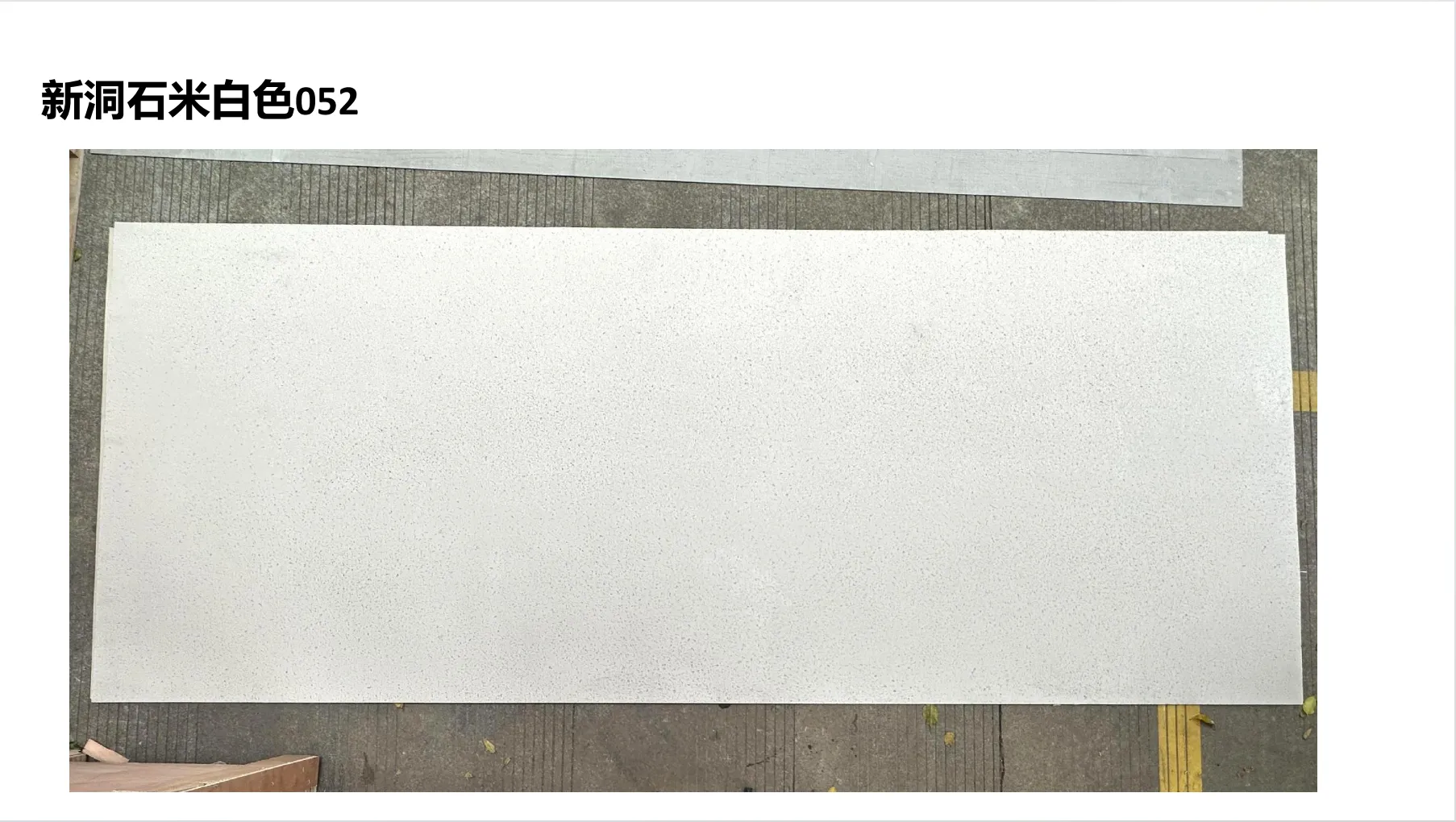
Then there's travertine (beige) —the classic. It's the tone people often default to, and for good reason. In real photos, it's versatile to a fault. I saw it in a home office with black desk furniture and bright blue accent chairs, and it grounded the space without fading into the background. I saw it in a kitchen backsplash, where it complemented white cabinets and stainless steel appliances, adding texture without overwhelming the eye. What I love about light tones is their ability to adapt. They're like a blank canvas that lets your furniture, art, and personality shine through. But don't mistake "light" for "boring." The veining in MS Travertino—those thin, wispy lines of darker beige or gray—adds character. It's subtle, but it's there, and it makes the walls feel alive.
One thing to note about light tones: they're not all the same. travertine (beige) is warmer than vintage silver, which leans cooler. Vintage gold has more depth than plain beige. In real photos, these differences are clear. A dining room with vintage silver walls felt modern and serene, while the same layout with vintage gold felt more traditional and welcoming. It's a reminder that even within "light," there's room to express your style.
Now, let's talk about the dark horses—the tones that make a statement without saying a word. Dark-toned MS Travertino isn't for the faint of heart, but when done right, it's breathtaking. I'll never forget the first time I saw travertine (vintage black) in a real photo. It was a home theater, and the walls were this deep, rich black with faint white veining that looked like constellations. The room was dimly lit with recessed lighting, and the walls absorbed the light just enough to create a sense of immersion—like being in a private cinema, but cozier. What surprised me was how it didn't feel "small." The veining added movement, breaking up the darkness and keeping the space from feeling closed in.
For those who want drama without going full black, dolomitic travertine (dark grey) is a dream. I came across a real photo of a restaurant's bar area clad in this tone, and it was stunning. The walls had a rough, almost chiseled texture that played with the bar's warm pendant lights, casting soft shadows that made the space feel intimate. The dark grey had undertones of blue, which popped when paired with brass fixtures and leather bar stools. It felt upscale but not pretentious—like a place where you could have a casual drink or a fancy dinner, and the walls would fit either mood.
And then there's rusty red —a dark tone with a fiery personality. I saw a real photo of a study where the walls were this deep, earthy red, and it immediately made me think of old libraries and leather armchairs. The room had a large wooden desk, a green reading lamp, and a Persian rug, and the red walls tied everything together, adding warmth and energy. It wasn't a bright, cherry red; it was more like the color of aged terracotta or rusted iron—rich and full of history. One designer I spoke to said, "Dark red travertine is for people who want their walls to tell a story. It's bold, but it's also incredibly grounding."
What I've noticed with dark tones is that they demand attention, but in the best way. They're perfect for spaces where you want to create a mood—whether that's the coziness of a bedroom, the focus of a home office, or the drama of a dining room. But they do require a bit more thought. In real photos, dark-toned MS Travertino often works best with plenty of light sources (think floor lamps, sconces, or even backlighting) to prevent the space from feeling too heavy. And when paired with light-colored furniture or decor, the contrast is striking—like a black canvas with white brushstrokes.
Still on the fence? Let's break it down. The table below compares light and dark MS Travertino tones based on real photos and designer insights:
| Aspect | Light Tones (e.g., Vintage Silver, Beige) | Dark Tones (e.g., Vintage Black, Dark Grey) |
|---|---|---|
| Mood | Airy, calm, open. Feels like a breath of fresh air. | Cozy, dramatic, intimate. Feels like a warm embrace. |
| Space Perception | Makes small rooms feel larger by reflecting light. | Can make large rooms feel more intimate; best with good lighting in small spaces. |
| Best For | Living rooms, kitchens, bathrooms, small apartments. | Bedrooms, home theaters, studies, dining rooms, accent walls. |
| Lighting Needs | Thrives with natural light; works with minimal artificial light. | Benefits from multiple light sources (lamps, sconces) to avoid heaviness. |
| Decor Pairings | Earth tones, pastels, bold accents (e.g., navy, emerald). | Light woods, whites, metallics (brass, gold), jewel tones. |
| Maintenance | Shows dust and smudges slightly more (but MCM's durability makes cleaning easy). | Hides minor imperfections; dust is less visible. |
At the end of the day, choosing between light and dark MS Travertino comes down to two things: your space and your personality. Let me share a quick story. A client of mine, Sarah, was torn between travertine (vintage gold) and dolomitic travertine (dark grey) for her living room. Her space was small, with one large window. She loved the warmth of the gold but was drawn to the drama of the grey. We looked at real photos of both tones in similar-sized rooms, and what sealed the deal was her lifestyle: she had two young kids and a golden retriever, so light-colored walls would show every fingerprint and paw print. The dark grey, she realized, would hide the chaos while still looking stylish. Six months later, she sent me a photo: the walls were dark grey, the sofa was a light beige, and the room was filled with colorful throw pillows and kids' artwork. It was perfect—cozy, lived-in, and uniquely hers.
Another friend, Mark, chose travertine (vintage silver) for his home office. He works from home and wanted a space that felt calm but not boring. The light tone paired with his black desk and plants created a space that felt focused but not sterile. "I used to feel stressed when I walked into my old office with dark walls," he told me. "Now, it's like walking into a breath of fresh air. I get more done, and I actually look forward to sitting down to work."
The point is, there's no "right" choice—only what feels right for you. Light tones aren't just for small rooms, and dark tones aren't just for large ones. It's about how you want to feel in the space, and how the walls will complement the life you live.
Q: Does light MS Travertino show dirt more than dark?
A: In real photos, light tones can show dust or smudges more obviously, but MCM flexible stone is surprisingly easy to clean—just a damp cloth and mild soap. Dark tones hide minor imperfections, but they can show lint or pet hair more. It's a trade-off!
Q: Can I use dark tones in a small bathroom?
A: Absolutely! I've seen real photos of small bathrooms with
vintage black
travertine walls paired with white tiles and a large mirror. The mirror reflects light, and the dark walls add drama without making the space feel cramped.
Q: Are light tones too "basic"?
A: Not at all! The veining and texture in light MS Travertino (like
travertine (beige)
) add plenty of character. In real photos, you'll notice how the natural patterns make each wall unique—no two are exactly alike.
At the end of the day, MS Travertino—whether light or dark—is more than a wall material. It's a way to shape how you experience your home. The light tones whisper "calm" and "openness," while the dark tones shout "cozy" and "dramatic." And thanks to mcm flexible stone technology, you don't have to sacrifice durability for beauty. It's lightweight enough for renters (yes, it can be installed without major renovations!), tough enough for high-traffic areas, and flexible enough to fit curved walls or unique spaces.
If you're still unsure, I'd encourage you to seek out MS Travertino real photos —not just the polished ones on brand websites, but the candid shots from homeowners or designers. Look for photos taken in natural light, at night, with furniture, and without. You'll start to see how each tone behaves in different settings, and which one makes your heart skip a beat.
Whether you choose the sunlit warmth of vintage gold or the moody depth of dark grey, remember: your walls are part of your story. They'll see your morning coffee, your late-night talks, your celebrations, and your quiet moments. Choose the tone that feels like home.
Recommend Products


