
How a Warm, Vibrant Hue is Redefining First Impressions in Commercial Design
Walk down any city street, and your eyes will naturally drift upward—drawn to the facades of the buildings that line the skyline. These aren't just walls; they're stories. A sleek glass tower might whisper innovation, while a brick-clad boutique hums with nostalgia. But what if a facade could shout energy ? What if it could make you pause, smile, and think, "I want to step inside"? That's the magic of Rona Yellow MCM—a material that doesn't just cover a building, but brings it to life.
In the world of commercial architecture, where first impressions can make or break a brand, Rona Yellow MCM stands out as a bold, intentional choice. It's not just about color; it's about crafting an identity. Let's dive into how this golden-hued wonder is transforming facades from forgettable to unforgettable.
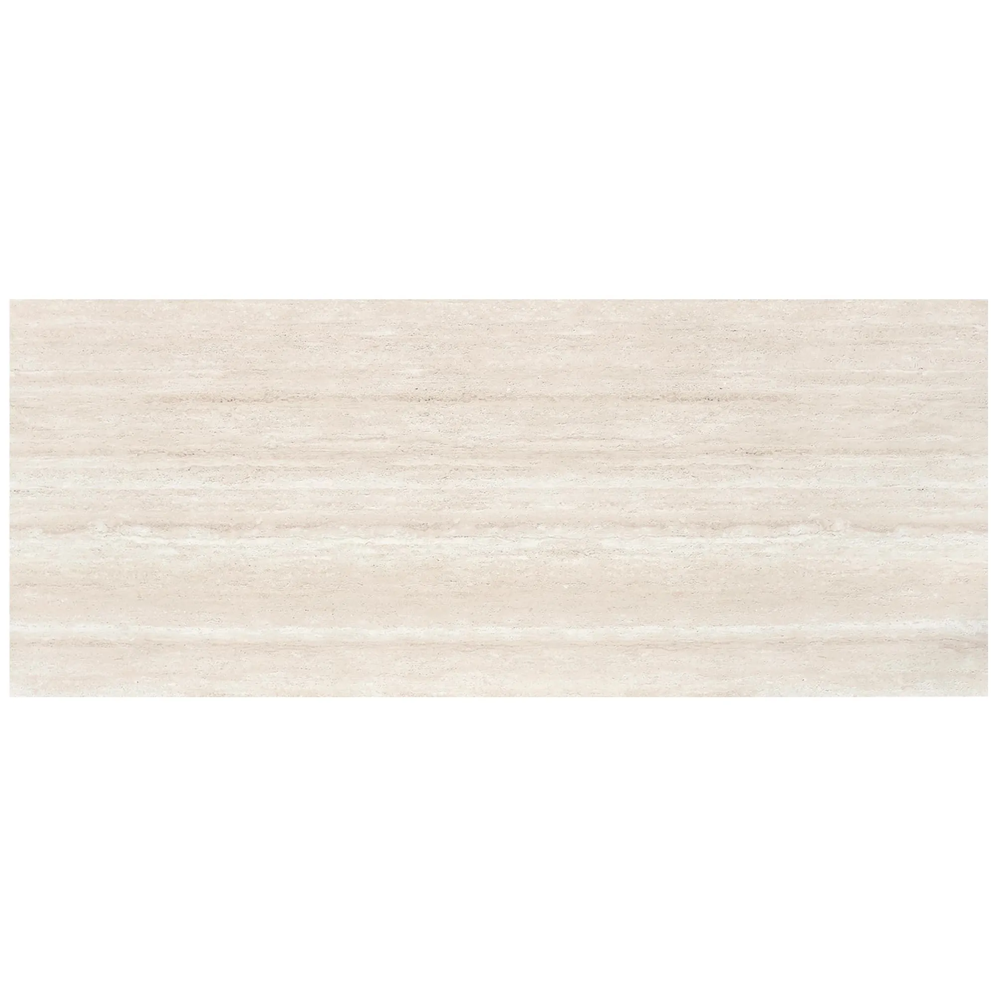
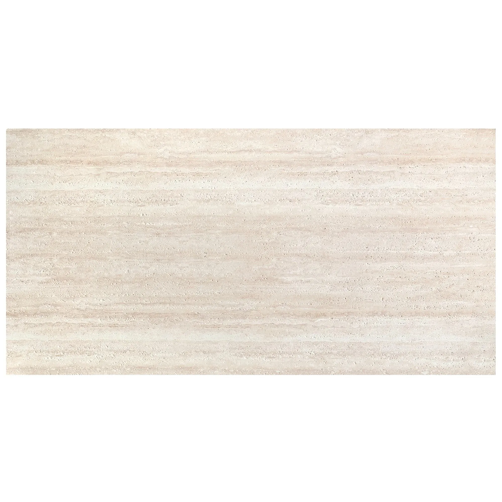
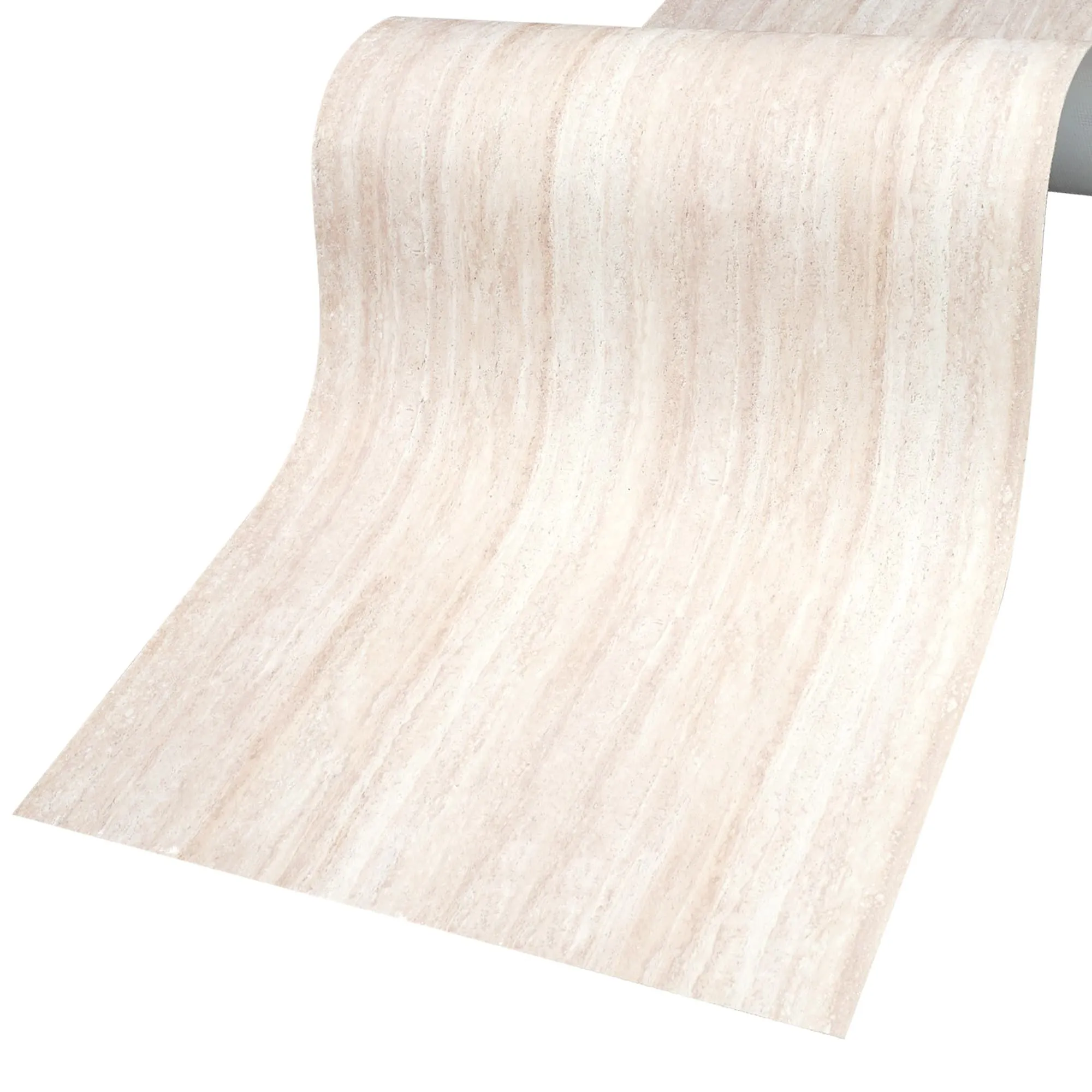
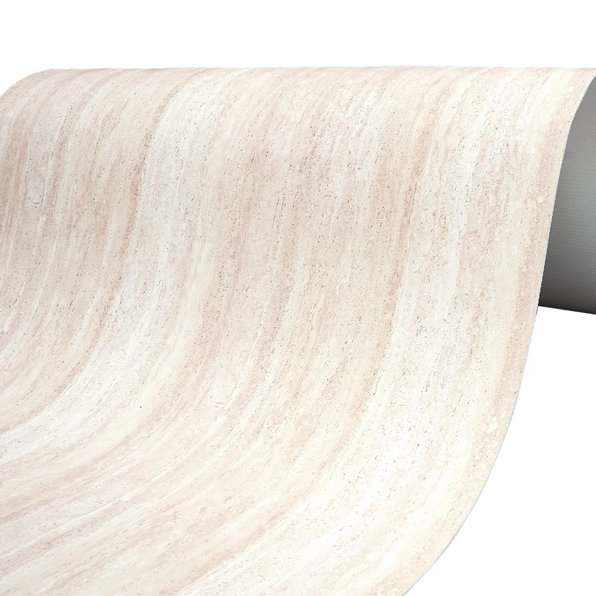
First things first: MCM, or Metal Composite Material, has been a game-changer in construction for years, prized for its lightweight durability and design flexibility. But Rona Yellow MCM takes that foundation and adds a splash of sunshine. Part of the broader MCM flexible stone family, it's crafted by bonding a thin layer of colored mineral composite to a metal core, resulting in a panel that's both strong and surprisingly adaptable.
But what makes Rona Yellow special? Its color, for starters. This isn't your average canary yellow. It's a warm, golden hue with depth—think the glow of honey at sunset, or the soft radiance of aged brass. There's a subtle complexity to it, with undertones that shift slightly under different lighting: brighter and more energetic in direct sunlight, softer and cozier as dusk falls. It's a color that feels alive, not flat.
Color isn't just about aesthetics; it's about emotion. And yellow? It's the ultimate mood booster. Psychologists link yellow to feelings of optimism, creativity, and energy—exactly the vibes you want a commercial space to evoke. Imagine walking past a café with a Rona Yellow facade on a gray morning: suddenly, the day feels a little brighter. That's the power of intentional color choice.
But here's the catch: yellow can be tricky. Go too neon, and it feels jarring; too pale, and it fades into the background. Rona Yellow hits the sweet spot. Its warmth is inviting, not overwhelming, making it versatile enough for everything from a playful retail store to a sophisticated tech office. It says, "We're confident, we're approachable, and we care about how you feel when you walk through our doors."
Sure, Rona Yellow looks great—but it's what's under the surface that makes it a designer favorite. Let's break down its standout features:
A bold color like Rona Yellow doesn't have to go it alone. In fact, its best moments often come when it's paired with complementary materials, creating a facade that's layered, dynamic, and full of personality. Let's explore a few winning combinations:
There's something undeniably striking about pairing warmth with coolness. Fair-faced concrete —with its raw, industrial gray and rough, unpolished texture—acts as the perfect counterpoint to Rona Yellow. Imagine a restaurant facade where the lower half is clad in fair-faced concrete, its neutrality grounding the design, while the upper floors burst with Rona Yellow panels. The result? A balance of edginess and approachability that feels both current and timeless.
For spaces aiming for a more natural, earthy vibe, bamboo mat board is a dream partner. Its woven pattern—soft, tactile, and reminiscent of traditional craftsmanship—adds depth to Rona Yellow's smooth surface. Picture a boutique hotel: Rona Yellow panels wrap around the main entrance, while bamboo mat board lines the walkway leading up to the door. The yellow feels like sunlight filtering through bamboo leaves, turning the facade into a mini retreat from the urban chaos.
Want to lean into color? Pair Rona Yellow with travertine (starry green) —a rich, deep green variant of travertine that's flecked with metallic "stars," like mineral deposits caught in stone. The contrast is electric: yellow's warmth and green's coolness create a nature-inspired palette that feels fresh and lively. Use starry green for accent panels—maybe above windows or along the roofline—and suddenly the building feels like a garden in the sky.
Still unsure how Rona Yellow fits into your design? Let's break down how it stacks up against other popular MCM finishes, so you can see its unique strengths:
| Finish | Color Character | Texture | Best For |
|---|---|---|---|
| Rona Yellow MCM | Warm golden-yellow with depth; shifts with lighting | Smooth with a subtle matte sheen; soft to the touch | Main facade cladding, statement walls, brand-focused spaces |
| Travertine (Starry Green) | Deep forest green with metallic flecks; "starry" effect | Porous, natural stone texture; slightly rough | Accent panels, entryways, nature-themed designs |
| Fair-Faced Concrete | Neutral gray; raw, unpolished appearance | Rough, industrial; visible aggregate and formwork marks | Base layers, contrast walls, modern/industrial aesthetics |
| Bamboo Mat Board | Light tan to golden-brown; organic, earthy tone | Woven, tactile texture; visible bamboo fibers | Canopies, awnings, low-height cladding, natural/bohemian designs |
Still not convinced? Let's paint a few pictures of how Rona Yellow MCM transforms real commercial spaces:
Imagine a cozy corner café in a tree-lined street., its facade was a dull beige brick—nice, but forgettable. Now, it's wrapped in Rona Yellow MCM panels, with bamboo mat board awnings over the windows. The yellow glows in the morning sun, drawing in commuters grabbing coffee; at night, soft spotlights highlight the panels, making the café feel like a lantern in the dark. Locals start calling it "the sunshine spot," and foot traffic triples. That's the power of a facade that feels like a friend.
A sleek tech company wants to stand out in a sea of glass towers. They opt for Rona Yellow MCM on their lobby facade, paired with fair-faced concrete for the upper floors. The yellow signals creativity and forward-thinking, while the concrete keeps it grounded. Employees say the building feels "energizing" when they arrive in the morning, and clients often comment on how memorable the space is. Suddenly, the office isn't just a workplace—it's a brand statement.
A children's clothing store needs to feel fun but not childish. Rona Yellow MCM wraps around the storefront, with travertine (starry green) accents above the display windows. The yellow feels playful, while the starry green adds a touch of whimsy, like a night sky. Kids tug their parents toward the bright facade, and parents love how the store feels welcoming, not overwhelming. Sales spike, and the store becomes a local landmark.
We talked to a few architects and designers who've worked with Rona Yellow, and they shared their top tips for nailing the look:
At the end of the day, commercial facades are about connection. They connect a brand to its customers, a building to its neighborhood, and a moment to a memory. Rona Yellow MCM doesn't just facilitate that connection—it amplifies it. It's a color that says, "We see you, and we want to make you feel good."
So, the next time you're designing a commercial space, ask yourself: What story do I want to tell? If it's one of energy, warmth, and bold confidence, Rona Yellow MCM might just be your perfect narrator.
Recommend Products


