
Minimalist design has long captivated us with its quiet confidence—clean lines, uncluttered spaces, and a "less is more" philosophy that feels like a breath of fresh air in our chaotic world. But even the most thoughtfully curated minimalist rooms can sometimes miss something: warmth. That's where Rusty Red MCM steps in—a material that doesn't just fill a space, but feels like it belongs there, turning cold restraint into cozy intention.
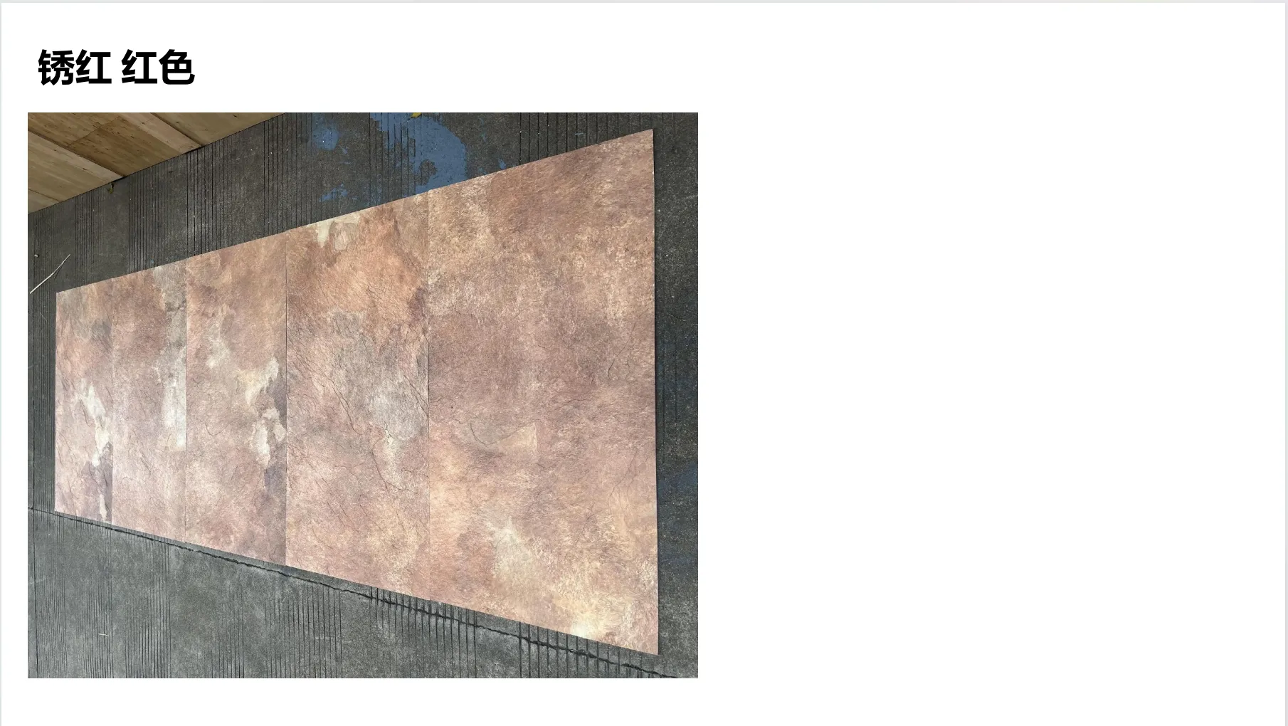
Let's start with that name: "Rusty Red." It's not the bright, jarring red of a stop sign or the artificial crimson of a plastic toy. This is a red with depth—a hue that whispers of aged iron fences, desert sunsets, and terracotta roof tiles baked by years of sunlight. It's earthy, grounded, and surprisingly versatile. Run your hand over a panel of Rusty Red MCM, and you'll notice the texture first: a gentle, matte roughness that mimics the feel of weathered sandstone or hand-hewn clay. There are no harsh, uniform patterns here—just subtle variations in tone, as if each inch tells a story of time and nature.
Designers often talk about "warmth" in vague terms, but with Rusty Red MCM, it's tangible. In a room bathed in natural light, the color softens, leaning into terracotta and burnt sienna; on a gray winter afternoon, it deepens, taking on hints of mahogany and chestnut. It's a color that adapts, but never fades into the background. Unlike stark whites or cool grays, which can make a space feel like a blank canvas waiting to be filled, Rusty Red MCM feels like a canvas that's already holding a memory—of campfires, of autumn leaves, of the quiet comfort of a well-loved home.
Consider the psychology of color: warm tones like rusty red are known to trigger feelings of stability and connection. They remind us of the natural world—of soil beneath our feet, of clay pots holding herbs on a windowsill, of the way sunlight filters through old brick walls. In minimalist design, where every element is intentional, Rusty Red MCM doesn't just add color; it adds meaning . It says, "This space is simple, but it's not empty. It's here for you."
Minimalism thrives on balance, and Rusty Red MCM is a master of harmony. It doesn't demand attention—it complements . Pair it with the right materials, and you create a space that feels both curated and alive. Let's explore two of its most compelling partners: the cool elegance of fair-faced concrete and the metallic sophistication of the Lunar Peak series.
Fair-faced concrete is the poster child of minimalist design—smooth, gray, and unapologetically industrial. It's sleek, modern, and slightly cold, like a blank slate waiting for character. Enter Rusty Red MCM. When you place a Rusty Red accent wall next to fair-faced concrete floors, magic happens. The coolness of the concrete tempers the warmth of the red, preventing the space from feeling too cozy; the red, in turn, softens the concrete's austerity, making it feel less like a factory and more like a home.
Imagine a living room with fair-faced concrete walls and a Rusty Red MCM fireplace surround. The fire crackles, casting orange flickers on the concrete, while the Rusty Red panel glows, reflecting the light. The contrast is striking but not jarring—like a modern sculpture placed in a centuries-old garden. It's minimalism with a heartbeat.
The Lunar Peak series—with its silvery, golden, and black finishes—adds a touch of celestial elegance to minimalist spaces. These panels have a soft metallic sheen, like moonlight on water or starlight on stone. When paired with Rusty Red MCM, they create a dance of textures and tones. Take Lunar Peak golden, for example: its warm, honeyed glow complements Rusty Red's earthiness, evoking images of desert dunes at dusk, where the sand turns gold and the rocks blush red. Lunar Peak silvery, on the other hand, adds a cool, modern edge—like rusted iron meeting polished steel, a nod to both the past and the future.
One designer I spoke with described using Rusty Red MCM and Lunar Peak silvery panels in a downtown café. The exterior walls were clad in Lunar Peak silvery, their smooth surface catching the city lights, while the interior featured Rusty Red MCM banquettes. "It was like bringing the outside in," she said. "The silvery panels felt urban, sleek—but the Rusty Red made customers want to stay, to linger over their coffee. It turned a 'pass through' space into a 'come back' space."
| Material | Texture | Color Palette | Emotional Vibe | Ideal Pairings |
|---|---|---|---|---|
| Rusty Red MCM | Matte, subtly rough, organic variations | Terracotta, burnt sienna, chestnut, mahogany | Warm, grounded, nostalgic | Fair-faced concrete, Lunar Peak silvery/golden, white oak |
| Fair-Faced Concrete | Smooth, cool, uniform | Light gray, charcoal, off-white | Calm, industrial, minimalist | Rusty Red MCM, black steel, light wood |
| Lunar Peak (Golden) | Metallic, slightly reflective, sleek | Soft gold, brass, amber | Luxurious, warm, modern | Rusty Red MCM, dark gray concrete, marble |
| Lunar Peak (Silvery) | Metallic, cool, subtle sheen | Silver, chrome, platinum | Elegant, crisp, futuristic | Rusty Red MCM, white walls, black accents |
Materials are just materials until they're given context. Let's step into three spaces where Rusty Red MCM has transformed minimalist design from "nice to look at" to "nice to live in."
Emma, a graphic designer in Portland, wanted her home to feel "calm but not sterile." Her living room is a study in restraint: white walls, a low-slung gray sofa, a black steel coffee table, and floor-to-ceiling windows letting in Pacific Northwest light. But something was missing—until she added a Rusty Red MCM accent wall behind the sofa.
"Before, the room felt like a hotel lobby," she says. "Beautiful, but I never wanted to curl up with a book there. Now, when the light hits the Rusty Red wall in the morning, it's like the room wakes up. The color makes the gray sofa feel softer, the windows feel cozier. My friends joke that they want to move in—and honestly? I get it. It's not just a wall anymore. It's the reason I look forward to coming home."
Emma paired the Rusty Red wall with Lunar Peak silvery shelves, their cool metallic finish balancing the wall's warmth. On the shelves, she keeps a few well-loved ceramics and a stack of art books—proof that minimalism isn't about having nothing, but about having what matters.
José, owner of Café Sol in Austin, knew he wanted a minimalist vibe for his spot—"something that lets the coffee and the people be the stars." But he also wanted it to feel like a "third home" for his regulars. His solution? Rusty Red MCM on the exterior facade and fair-faced concrete counters inside.
"The exterior was key," José explains. "Austin's full of colorful buildings, but I wanted something that stood out without screaming. The Rusty Red MCM does that. It's warm, inviting—people walk by and think, 'That looks like a place I could stay awhile.' Inside, the concrete counters keep it modern, but the Rusty Red touches—on the backsplash, on the bar stools—make it feel like a hug. We've had customers say they love how 'unpretentious' the space feels, and I think that's the Rusty Red. It's not fancy, but it's real ."
Libraries are sacred spaces for minimalism—they demand focus, calm, and clarity. The new branch of the Seattle Public Library in Capitol Hill took that idea and ran with it: floor-to-ceiling windows, white oak bookshelves, and fair-faced concrete pillars. But to keep it from feeling like a sterile study hall, the architects added Rusty Red MCM panels to the reading nooks.
"We wanted the nooks to feel like little sanctuaries," says Mia, the lead architect. "Students, seniors, anyone looking for a quiet corner—we wanted them to feel wrapped in something warm. The Rusty Red MCM does that. It's not bright enough to distract, but it's present enough to make you feel safe. We've had so many comments: 'I never want to leave this nook!' That's the power of the material. It doesn't just hold the space—it nurtures it."
Behind every great material is great craftsmanship, and Rusty Red MCM is no exception. It's not just "made"—it's crafted , with an eye for both durability and emotion. Let's pull back the curtain on how it comes to life.
The process starts with raw materials: natural pigments sourced from quarries in Italy and Spain, where the earth's crust holds centuries of color. These pigments are blended with modified composite materials (MCM's secret sauce) to create a mixture that's both lightweight and strong—perfect for walls, facades, and furniture.
Then comes the texture. Using 3D printing technology (part of MCM's innovative 3D Printing Series), craftsmen can mimic the irregularities of natural stone or weathered wood with stunning precision. "We don't want it to look perfect," says Carlos, a materials engineer at MCM's workshop in Barcelona. "Perfection feels cold. We add tiny variations—here a slightly deeper groove, there a hint of lighter pigment—to make it feel like it was shaped by nature, not a machine. That's where the warmth lives: in the 'imperfections.'"
Finally, the color is tested under every kind of light—morning sun, afternoon shade, artificial bulbs—to ensure it retains its depth. "A color that looks great in a factory might look flat in a home," Carlos explains. "We want Rusty Red to feel alive, no matter where it is. That means tweaking the pigment blend until it reacts to light like a living thing."
At its core, minimalist design is about intentionality. It asks: What do we truly need? What adds value, and what distracts? Rusty Red MCM answers that question by adding something intangible but essential: emotional resonance. It's not about filling space—it's about enriching it.
Think about the last time you walked into a space that felt "right." Chances are, it wasn't just the layout or the furniture. It was the materials—the way the light hit the walls, the texture under your hands, the colors that made you breathe a little deeper. That's the power of Rusty Red MCM. It doesn't just look good; it feels good. It turns "a room" into "your room."
In a world that often values speed and efficiency over warmth and connection, materials like Rusty Red MCM are a reminder that design matters. It matters how our homes, our cafés, our libraries make us feel. It matters that we create spaces that don't just serve a function, but nourish our souls.
Rusty Red MCM isn't a trend. It's a response—a recognition that minimalism doesn't have to mean coldness, that "less is more" can also mean "more heart." It's a material that understands the beauty of restraint but also the necessity of warmth. It's for the designer who wants to create spaces that last, for the homeowner who wants to feel at peace, for anyone who believes that the best things in life are both simple and soulful.
So the next time you're dreaming of a minimalist space, remember: it's not about stripping away everything. It's about keeping what matters. And sometimes, what matters most is a little rusty red warmth.
Recommend Products


