
Step into a world where every surface tells a story—a world where design isn't just about aesthetics, but about creating harmony, emotion, and connection. For architects and interior designers, the quest for cohesion is often the difference between a space that feels disjointed and one that feels intentionally crafted, like a well-composed symphony. At the heart of this quest lies the art of material selection and color coordination, and few combinations strike the balance between boldness and elegance quite like Slate Portoro paired with gold accents. When brought to life through MCM's custom pigmentation process, these elements become more than materials—they become the language of cohesive design.
In this article, we'll dive into the rich, velvety depths of Slate Portoro, explore how gold accents warm and elevate its intensity, and uncover how MCM's custom pigmentation technology turns design visions into tangible, cohesive realities. We'll also shine a light on complementary materials like MCM flexible stone, the expansive MCM big slab board series, and the ethereal travertine (starry blue), showing how each piece fits into the puzzle of a unified space. Whether you're designing a luxury hotel lobby, a high-end residential interior, or a commercial space that demands both style and substance, this journey through color, texture, and innovation will inspire you to think differently about what's possible.
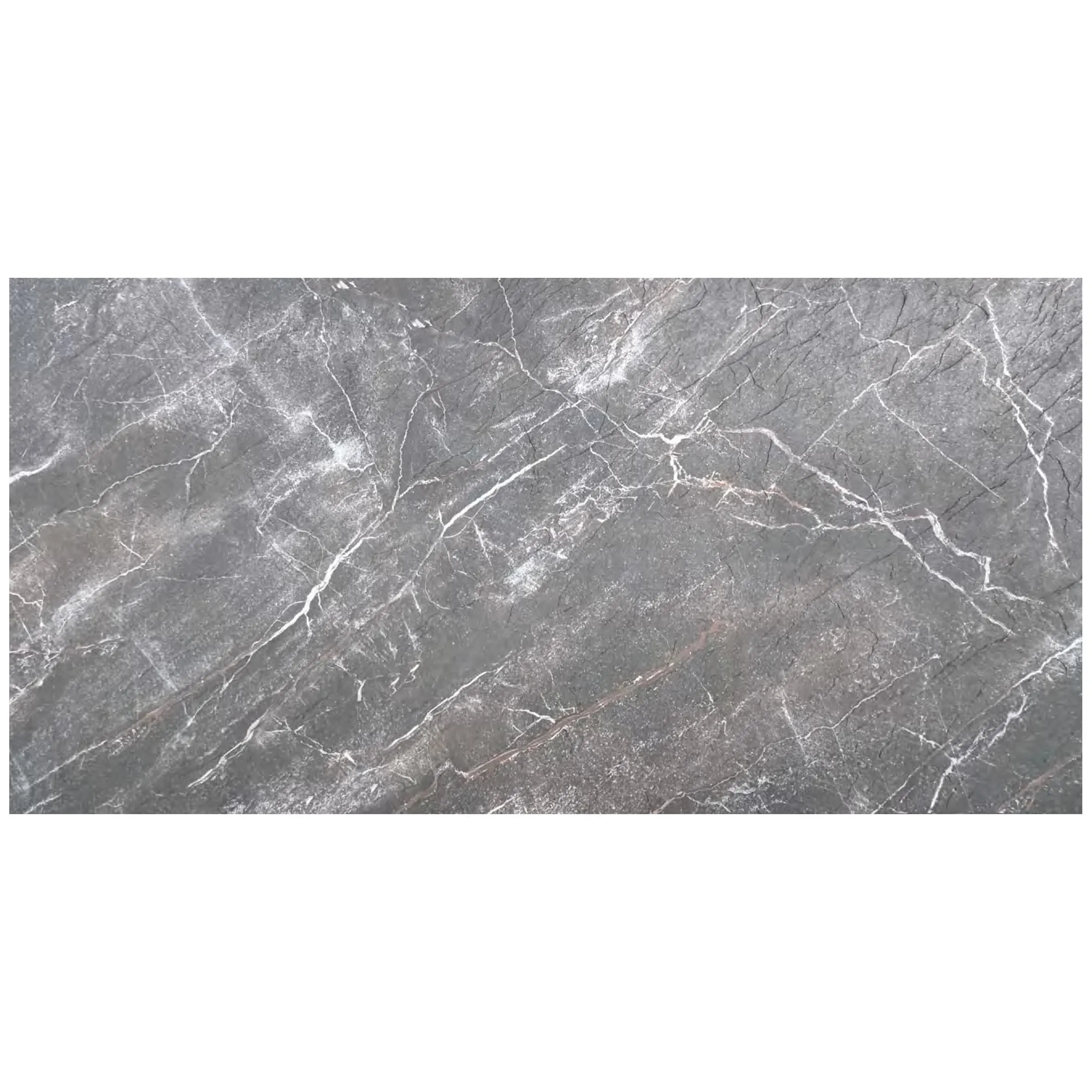
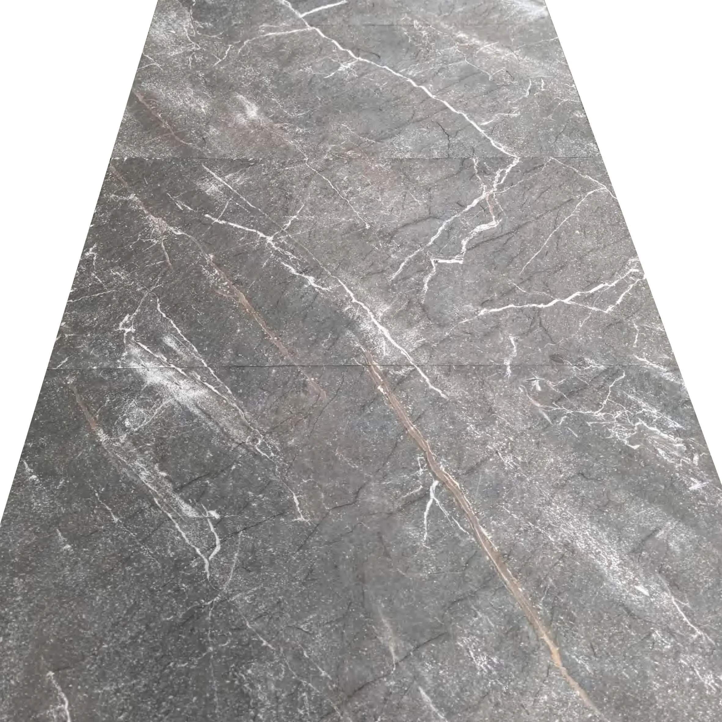
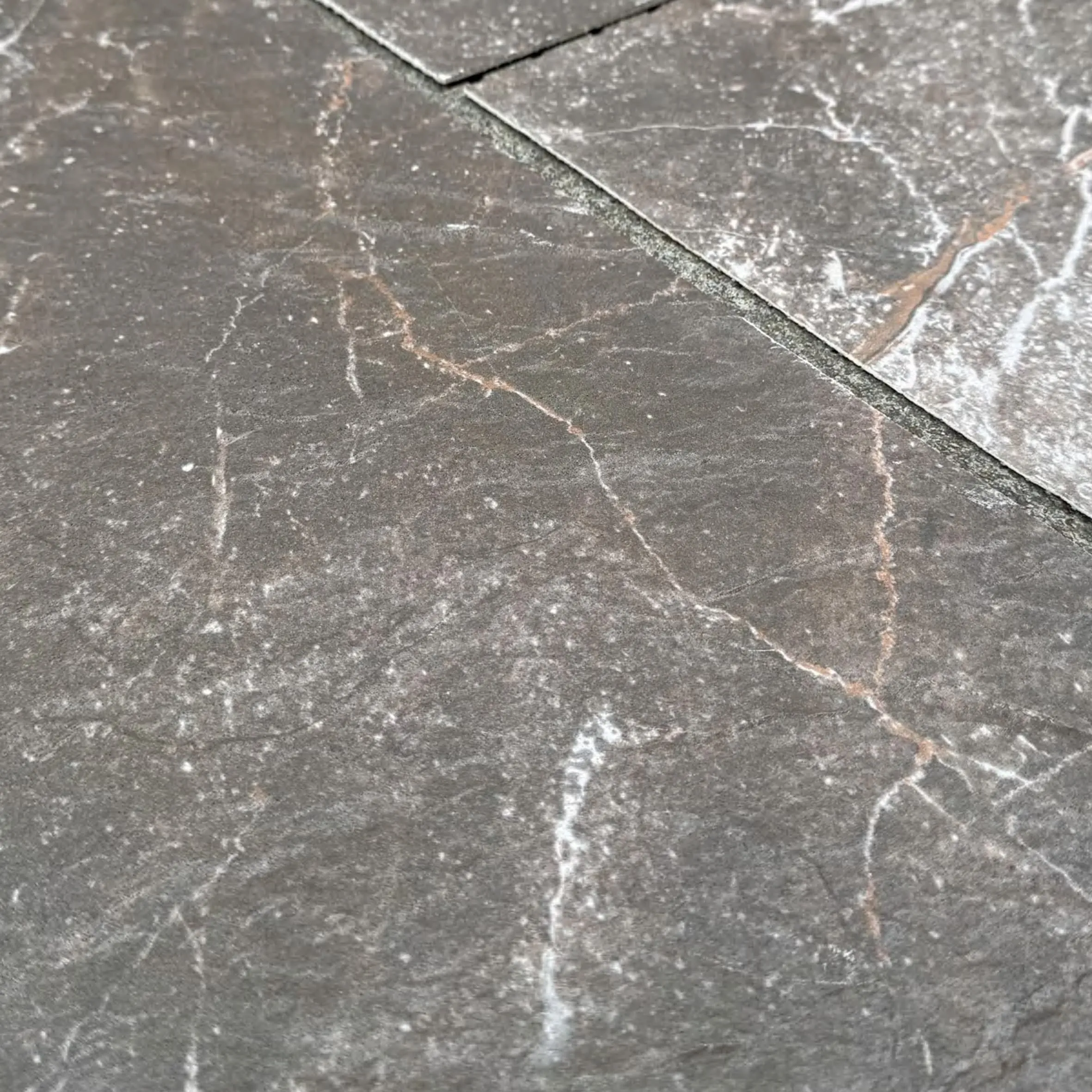
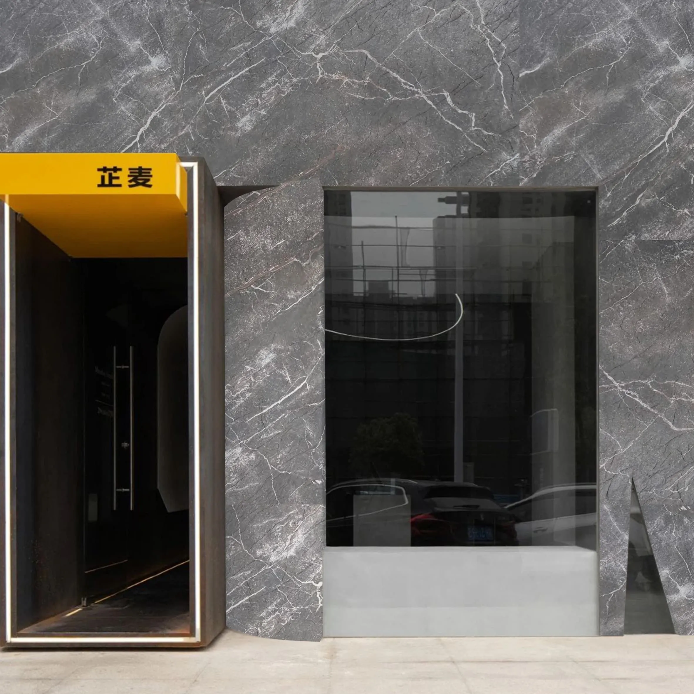
If cohesive design is a story, Slate Portoro is the opening chapter—bold, memorable, and full of depth. Imagine running your hand over a surface that feels both ancient and modern: deep, inky blacks interwoven with striking gold veining, creating a pattern that's as unique as a fingerprint. That's Slate Portoro. Unlike generic black stones that can feel flat or lifeless, Slate Portoro has personality—it demands attention without overwhelming, making it the perfect anchor for spaces that aim to be both sophisticated and inviting.
What sets Slate Portoro apart is its versatility. In polished finishes, it exudes luxury, reflecting light to create a sense of opulence that's ideal for high-end lobbies or statement walls. In a honed or matte finish, it takes on a more understated elegance, with a velvety texture that invites touch and feels grounded, making it perfect for residential floors or boutique retail spaces. Its color palette—rich blacks with warm gold or copper veining—acts as a neutral with a twist, pairing seamlessly with both cool tones (like grays and blues) and warm hues (like creams and terracottas), which is why designers often turn to it as the foundation of their color schemes.
But Slate Portoro isn't just about aesthetics; it's about durability, too. As part of MCM's lineup, it's engineered to withstand the rigors of high-traffic areas, from busy hotel corridors to bustling restaurant floors, without losing its luster. This combination of beauty and resilience is what makes it a favorite among designers who refuse to compromise on either form or function.
If Slate Portoro is the foundation, gold accents are the warmth that brings the space to life. Gold has long been associated with luxury, but in the context of cohesive design, it's less about excess and more about balance. When paired with Slate Portoro's deep blacks and gold veining, gold accents create a dialogue—a visual echo that ties the design together. Think of it as a conversation between the stone's natural veining and intentional design elements, where each reinforces the other.
These accents can take many forms: thin metallic strips inlaid into Slate Portoro slabs, gold-pigmented grout lines that frame the stone, or even hardware and fixtures that pick up the gold tones. In MCM's custom pigmentation process, gold isn't just an afterthought—it's integrated into the material itself. For example, a Slate Portoro panel might feature custom-pigmented gold highlights that match the veining, creating a seamless flow that feels intentional, not accidental. This level of precision is what sets MCM apart; instead of relying on generic gold accents, designers can work with MCM to create a custom shade of gold—whether it's a soft champagne, a rich brass, or a bold copper—that complements the specific undertones of their Slate Portoro selection.
The result? A space that feels curated. Walk into a room where Slate Portoro floors meet a wall clad in MCM's big slab board series, accented with gold-pigmented trim, and you'll notice how the eye moves effortlessly from one surface to the next. There are no jarring transitions, no mismatched tones—just a sense of flow that makes the space feel larger, more intentional, and infinitely more inviting. Gold accents don't just add luxury; they add logic, turning a collection of materials into a cohesive narrative.
At the heart of this cohesive design journey is MCM's custom pigmentation technology. For designers, one of the biggest challenges is ensuring color consistency across materials—especially when working with natural stones, which can vary from batch to batch. MCM eliminates this headache by offering custom pigmentation that's precise, consistent, and tailored to the designer's vision. Whether you need 500 square feet of Slate Portoro with a specific gold undertone or a batch of MCM flexible stone panels in a custom shade of blue, MCM's process ensures that every piece matches, down to the last detail.
But how does it work? MCM's pigmentation process starts with a conversation. Designers share their vision—swatches, mood boards, even inspiration from nature or art—and MCM's team of color specialists creates a custom pigment formula. This formula is then tested on the chosen material (whether it's Slate Portoro, MCM flexible stone, or a big slab board) to ensure it meets the designer's expectations for color, texture, and durability. Once approved, the pigment is integrated into the material during production, ensuring that the color runs through the material, not just on the surface. This means that even if the material is scratched or chipped, the color remains consistent—a critical detail for high-traffic spaces.
The benefits of this process are clear: designers get exactly the color they want, with none of the guesswork. For a project that pairs Slate Portoro with travertine (starry blue), for example, MCM can custom-pigment the travertine's starry pattern to include hints of the same gold found in Slate Portoro's veining, creating a subtle connection that ties the two materials together. Or, for a space using MCM's big slab board series, custom pigmentation can ensure that the slabs match the exact shade of a client's brand color, turning a commercial space into a brand experience.
In short, MCM's custom pigmentation isn't just about color—it's about control. Control over the design narrative, control over consistency, and control over the final result. And in cohesive design, control is everything.
While Slate Portoro and big slabs make bold statements, cohesive design often requires materials that can adapt to the space's unique contours—and that's where MCM flexible stone shines. MCM flexible stone is exactly what it sounds like: a lightweight, durable stone material that can bend and curve, making it ideal for rounded walls, columns, or custom furniture pieces. But what truly makes it a star in cohesive design is how it integrates with MCM's custom pigmentation process.
Imagine a curved reception desk in a hotel lobby. The main countertop is a large Slate Portoro slab with gold accents, and the curved front is clad in MCM flexible stone—custom-pigmented to match the Slate Portoro's black base with subtle gold flecks. From a distance, the desk looks like a single, seamless piece; up close, the texture of the flexible stone adds depth, while the color ties it to the countertop. This is the power of MCM flexible stone: it allows designers to extend their color palette beyond flat surfaces, ensuring that every angle of the space feels cohesive.
But flexibility doesn't mean sacrificing durability. MCM flexible stone is engineered to withstand moisture, heat, and impact, making it suitable for both interior and exterior use. It's also lightweight, which reduces installation time and costs—a win for both designers and contractors. Whether it's wrapping a column in a restaurant, creating a curved accent wall in a residential living room, or cladding an outdoor patio, MCM flexible stone brings versatility without compromising on the cohesive vision.
For spaces that demand grandeur, the MCM big slab board series is a game-changer. These large-format slabs—often measuring up to 120x240cm—minimize grout lines, creating a seamless, modern look that's perfect for feature walls, floors, or countertops. But beyond their size, what makes them essential for cohesive design is their compatibility with MCM's custom pigmentation and Slate Portoro's aesthetic.
Imagine a corporate office lobby where one wall is clad in MCM big slab boards—custom-pigmented to a deep charcoal gray with gold undertones—paired with Slate Portoro flooring. The large slabs create a sense of continuity, while the charcoal and gold echo the Slate Portoro's black and gold palette, tying the two materials together. The result is a space that feels both expansive and intimate, where the eye isn't distracted by busy grout lines but instead drawn to the intentional color and texture choices.
The big slab board series also offers designers the freedom to play with scale. In a small space, large slabs can make the room feel bigger by reducing visual clutter; in a large space, they can anchor the design, preventing it from feeling too sparse. And with MCM's custom pigmentation, the slabs can be color-matched to other materials in the space, from the Slate Portoro floors to the travertine (starry blue) accent wall, ensuring that even the largest surfaces contribute to the cohesive narrative.
No cohesive design is complete without a touch of contrast—and travertine (starry blue) is the perfect foil to Slate Portoro's boldness. Travertine is known for its porous, organic texture, but MCM's starry blue variant takes it a step further: tiny, iridescent flecks embedded in the stone catch the light, creating the illusion of a starry night sky. It's a material that adds depth and whimsy, without overwhelming the space.
When paired with Slate Portoro and gold accents, travertine (starry blue) creates a dynamic trio. The deep blue of the travertine complements Slate Portoro's black, while the starry flecks can be custom-pigmented to include hints of gold—echoing the gold accents and Slate Portoro's veining. For example, in a hotel suite, Slate Portoro might be used for the bathroom floors, travertine (starry blue) for the shower walls (custom-pigmented with gold stars), and gold fixtures to tie it all together. The result is a space that feels layered, with each material contributing to the overall story.
Travertine (starry blue) is also surprisingly versatile. It works in both modern and traditional settings, adding a touch of nature to sleek, contemporary spaces and a modern edge to more classic designs. And like all MCM materials, it's durable and easy to maintain, making it suitable for high-moisture areas like bathrooms or kitchens, as well as living spaces.
For designers who love the contrast between raw and refined, fair-faced concrete is the perfect addition to a cohesive design featuring Slate Portoro and gold accents. Fair-faced concrete—also known as architectural concrete—has a raw, industrial texture that balances the luxury of Slate Portoro, creating a space that feels both grounded and elevated. And with MCM's custom pigmentation, even concrete can be part of the cohesive color palette.
Imagine a restaurant where the bar is clad in fair-faced concrete—custom-pigmented to a warm gray with subtle gold undertones—paired with Slate Portoro countertops and gold bar stools. The concrete's rough texture contrasts with the stone's smooth finish, while the gray and gold tie back to the Slate Portoro's palette. It's a combination that feels intentional: the concrete adds edge, the Slate Portoro adds luxury, and the gold accents add warmth, creating a space that's inviting yet sophisticated.
Fair-faced concrete also offers practical benefits: it's durable, fire-resistant, and easy to clean, making it ideal for commercial spaces. And because MCM can custom-pigment it to match almost any shade, it can be integrated into virtually any design scheme. Whether it's used for walls, floors, or furniture, fair-faced concrete adds a layer of authenticity to the space—a reminder that cohesive design isn't just about beauty, but about balance, too.
| Material | Color Profile | Texture | Best Use | Custom Pigmentation Options |
|---|---|---|---|---|
| Slate Portoro | Deep black with gold/copper veining | Smooth (polished) or velvety (honed) | Floors, countertops, feature walls | Custom veining intensity, gold undertones |
| Travertine (Starry Blue) | Deep blue with iridescent starry flecks | Porous, organic with subtle texture | Accent walls, shower walls, backsplashes | Custom star color (gold, silver, copper) |
| Fair-Faced Concrete | Gray, beige, or custom-pigmented tones | Raw, industrial with visible aggregate | Walls, countertops, outdoor cladding | Full color customization, aggregate exposure |
To truly understand the impact of MCM's custom pigmentation and material lineup, let's walk through a hypothetical case study: a luxury boutique hotel in Dubai, where the design brief called for a space that felt both opulent and welcoming, with a cohesive color palette that reflected the city's blend of tradition and modernity.
The designer's vision centered on Slate Portoro as the foundation, drawn to its boldness and ability to anchor the space. To warm it up, they wanted gold accents that echoed the desert sun, and to add depth, they chose travertine (starry blue) for accent walls, inspired by Dubai's night sky. The challenge? Ensuring that all these elements worked together seamlessly, across multiple floors and spaces.
Working with MCM, the designer started with custom-pigmenting the Slate Portoro: the veining was intensified to a rich, warm gold, rather than the standard copper, to better reflect the desert theme. The MCM big slab board series was then pigmented to a deep charcoal gray with subtle gold undertones, used for the lobby's feature wall and reception desk. For the guest room bathrooms, MCM flexible stone was employed—custom-pigmented to match the Slate Portoro's black base with tiny gold flecks—to wrap the curved shower walls, creating a sense of luxury in a small space.
Travertine (starry blue) was used for the hotel's restaurant accent wall, with the starry flecks custom-pigmented to gold, tying it to the Slate Portoro and big slab boards. Finally, fair-faced concrete—pigmented to a warm beige with gold aggregate—was used for the outdoor terrace floors, balancing the opulence of the interior with a raw, earthy texture.
The result? A hotel where every space feels connected, from the lobby to the guest rooms to the terrace. Guests move through the space without feeling jarred by mismatched colors or textures; instead, they experience a cohesive narrative that tells the story of Dubai—bold, luxurious, and deeply rooted in its environment. It's a testament to the power of MCM's custom pigmentation and material versatility: when design is intentional, every material becomes a chapter in the same story.
At the end of the day, cohesive design isn't just about matching colors—it's about creating a space that feels intentional, where every material, texture, and accent has a purpose. Slate Portoro, with its bold elegance, and gold accents, with their warm glow, are more than just materials; they're the starting point of a conversation. And MCM's custom pigmentation process, paired with versatile materials like MCM flexible stone, the big slab board series, and travertine (starry blue), ensures that this conversation flows seamlessly, from the largest slab to the smallest accent.
For designers, this means the freedom to dream bigger—to create spaces that are not just beautiful, but meaningful. It means no longer compromising on color or texture, because MCM can bring any vision to life. And for clients, it means spaces that feel like home—whether that home is a luxury hotel, a corporate office, or a residential retreat—because they're designed with intention, cohesion, and heart.
So the next time you're embarking on a design project, remember: cohesion isn't about playing it safe. It's about telling a story—one where Slate Portoro is the opening line, gold accents are the warmth, and MCM's custom pigmentation is the pen that writes it all together. After all, the best designs aren't just seen—they're felt.
Recommend Products


