
Step into a room where the walls seem to breathe—where the stone isn't just a surface, but a storyteller. Maybe it's the soft glow of a hearth made from something that looks like stardust frozen in stone, or the cool, calm sweep of a countertop that shifts from gray to silver as the light changes. For too long, when we thought of statement stones like Slate Portoro, our minds defaulted to bold blacks and opulent golds—the classics. But today, the world of architectural surfaces is buzzing with new hues, each with its own personality, crafted to turn spaces into experiences. Let's wander beyond the familiar and discover the unexpected shades of Slate Portoro, and the equally captivating companions that share its stage.
Slate Portoro has long been the quiet protagonist of luxury design. Its signature deep black base, threaded with veins of gold that glint like sunlight on water, has adorned palaces, penthouses, and boutique hotels for decades. It's a color story of contrast—drama and warmth, power and elegance. But what if we told you that this stone, once confined to a narrow palette, now whispers in softer tones, roars in vibrant starry hues, and even mimics the quiet grandeur of ancient earth?
Thanks to innovations like MCM's flexible stone technology, Slate Portoro (and its kin) now come in shades that nod to nature's most fleeting moments: the silver of a moonlit lake, the blue of a twilight sky, the earthy red of a desert at dawn. These aren't just "colors"—they're emotions. A soft gray might cradle a bedroom in calm; a star-speckled blue could turn a home office into a space for daydreaming; a warm taupe might make a kitchen feel like a hug.
Designer Insight: "Clients used to ask for 'the usual black and gold'—safe, timeless. Now, they're saying, 'I want this room to feel like a forest at dusk' or 'a beach at sunrise.' That's where these new shades shine. They're not just materials; they're translators of mood." — Maria Gonzalez, interior designer specializing in residential spaces.
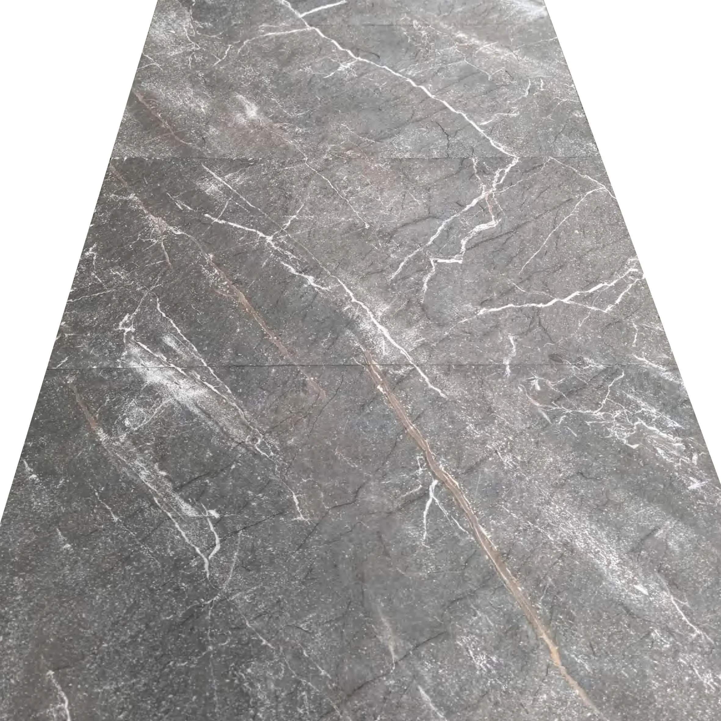
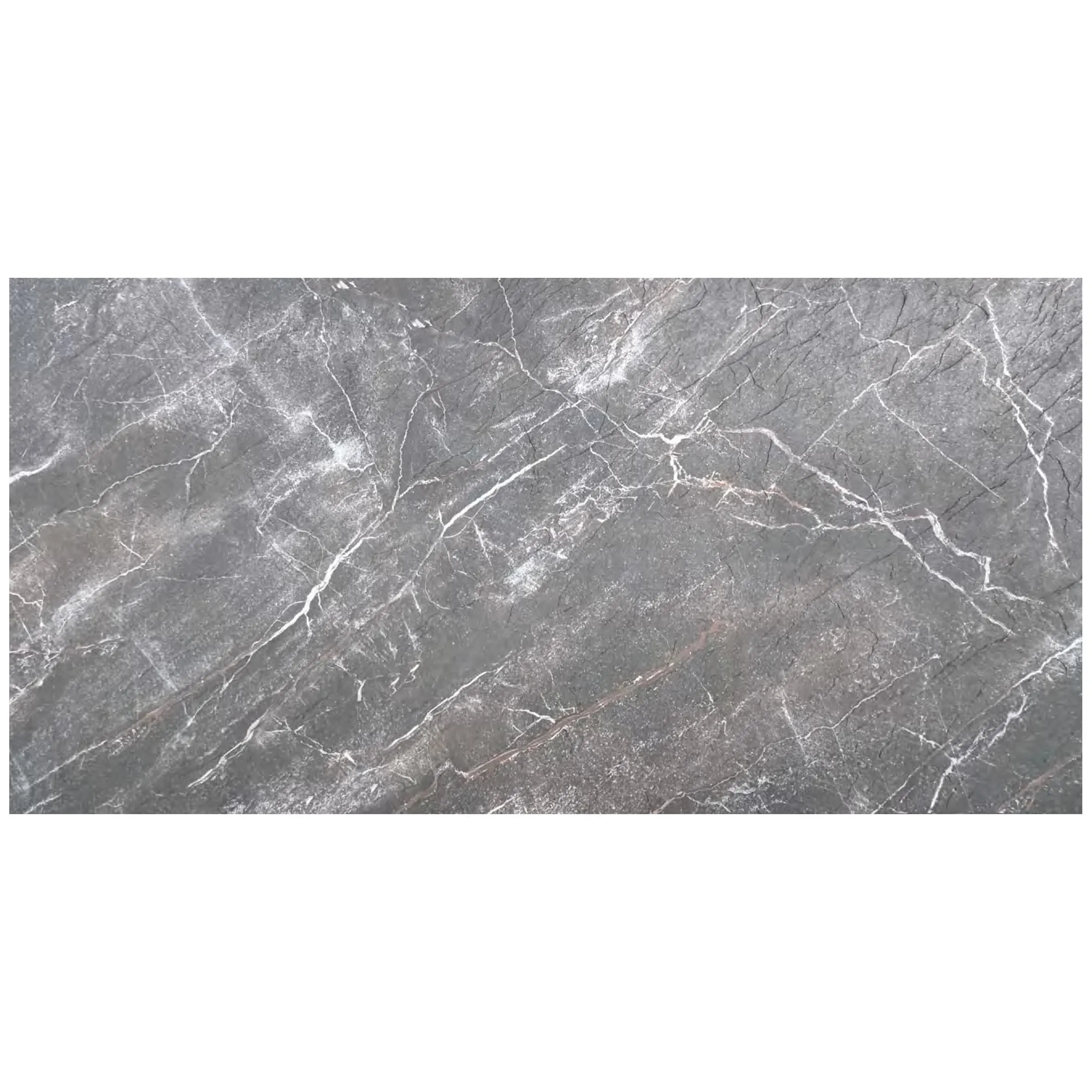
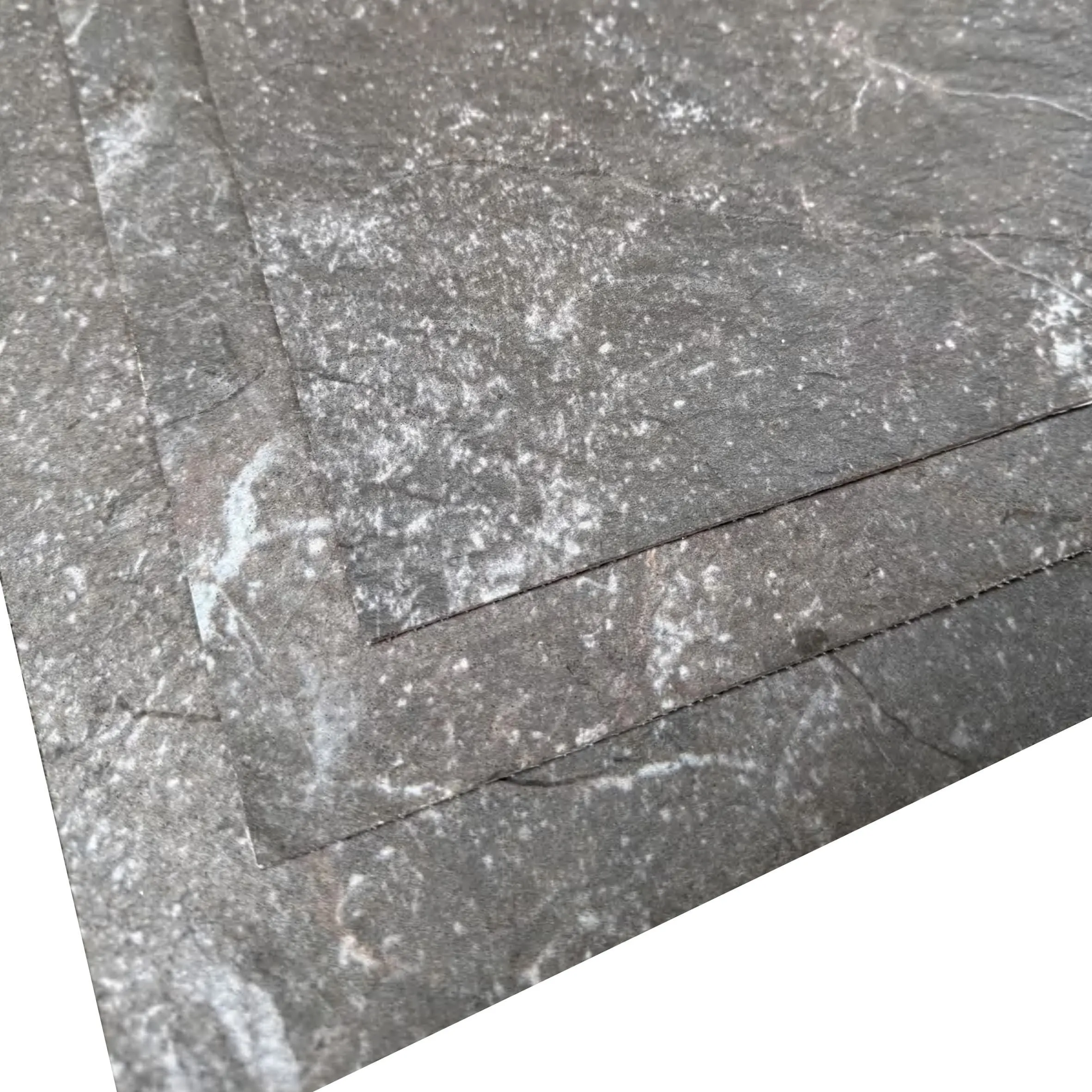
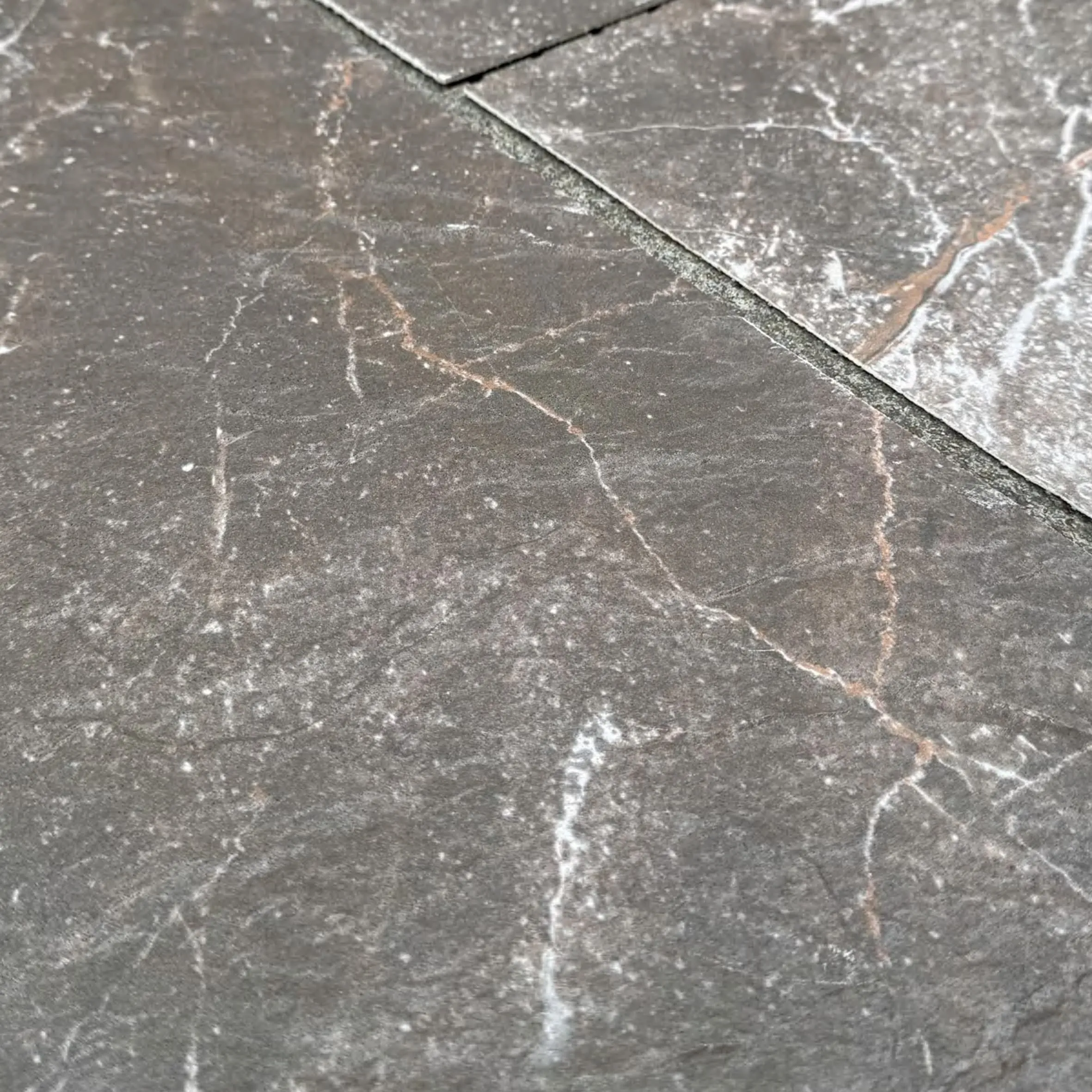
Let's start with the quiet rebels—the silvers and grays that redefine understated luxury. Lunar Peak Silvery is one such game-changer. Imagine Slate Portoro's density, but softened into a cool, misty silver with faint charcoal veins. It's the color of a mountain at dawn, before the sun hits, when the world is still holding its breath. Designers love it for open-concept living rooms, where it pairs with warm woods and soft textiles to create a space that feels both modern and grounded.
Then there are the "starry" variants, like Travertine (Starry Blue) . If Slate Portoro's classic gold veins are sunlight, these are the night sky—deep blue bases dotted with tiny, iridescent flecks that catch the light like distant stars. Picture a restaurant wall clad in this stone: as the evening dims, the "stars" twinkle, turning a meal into an experience. It's whimsical without being childish, bold without overwhelming—a reminder that design can have a sense of wonder.
For those who crave earthier tones, Rust Mosaic Stone is a revelation. Think of the color of aged terracotta, mixed with hints of burnt sienna and soft brown, arranged in intricate mosaic patterns. It's the stone equivalent of a well-loved leather jacket—warm, lived-in, and full of character. Use it in a hallway or as a backsplash, and suddenly, every step feels like a walk through a sunlit village square.
| Color Name | Base Material | Undertones & Features | Ideal Space | Mood Evoked |
|---|---|---|---|---|
| Slate Portoro (Vintage Silver) | Slate | Cool silver base with thin charcoal veins; matte finish | Home office, bedroom | Calm, focused, sophisticated |
| Travertine (Starry Blue) | Travertine | Deep blue with iridescent "star" flecks; semi-polished | Restaurant, home theater | Dreamy, creative, intimate |
| Lunar Peak Golden | MCM Flexible Stone | Warm gold with cream undertones; soft sheen | Living room, dining area | Welcoming, luxurious, timeless |
| Rust Mosaic Stone | Mosaic Composite | Aged terracotta with burnt sienna accents; textured | Hallway, kitchen backsplash | Nostalgic, earthy, vibrant |
| Travertine (Starry Red) | Travertine | Deep red base with copper "stars"; bold finish | Accent wall, fireplace | Passionate, energetic, dramatic |
What makes these colors possible? It starts with MCM flexible stone —a technology that marries the durability of natural stone with the versatility of modern materials. Traditional stone is heavy, rigid, and limited by what nature provides. MCM's process, however, allows for precision: adding pigments that mimic natural minerals, embedding tiny glass flecks for "starry" effects, or layering textures to create depth. It's like painting with stone—artisans can tweak a hue by a hair, ensuring it matches the exact mood a designer wants to evoke.
Take Foamed Aluminium Alloy Board (Vintage Silver) , for example. It's not Slate Portoro, but a sibling in the MCM family, and it shares that same spirit of reinvention. Lightweight yet strong, its vintage silver finish has the patina of an heirloom—like a silver spoon passed down through generations, with subtle scratches and a soft glow that no brand-new material can replicate. It's perfect for exterior cladding, where it weathers gracefully, telling the story of the building as it ages.
Fun Fact: The "starry" travertine series gets its sparkle from recycled glass particles, making it both beautiful and eco-friendly. MCM estimates that over 500 kg of glass waste is repurposed into these stones each year—proof that luxury can have a conscience.
At the end of the day, picking a stone color isn't just about trends—it's about how you want to feel in a space. Do you want to wake up to the calm of Slate Veil White , with its soft, cloud-like patterns? Or come home to the warmth of Golden Travertine (White Golden) , which feels like sunlight trapped in stone? Maybe you're drawn to the drama of Granite Nero Margiua , a deep black with silver veins that's bold but never harsh.
Designers often mix and match these shades to create layers. A kitchen might have Concrete Board (Light Grey) countertops for a modern base, paired with a backsplash of Travertine (Starry Orange) for a pop of energy. A bathroom could feature Rammed Earth Board (Matcha Green) walls—earthy and grounding—with Marble Veil White floors that add brightness. The possibilities are endless, because these stones aren't just "colors"—they're building blocks of emotion.
As we look ahead, it's clear that the world of architectural surfaces is getting more creative, more personal, and more connected to the natural world. Slate Portoro, once a one-note wonder, now leads a chorus of colors that speak to who we are and how we want to live. Whether it's the nostalgia of vintage silver, the whimsy of starry blue, or the comfort of earthy rust, these shades remind us that our homes and workspaces don't just look good—they feel good.
So the next time you're designing a space, dare to ask: "What if it wasn't black and gold?" Maybe the answer will be a stone that makes you pause, smile, and think, "Yes—this is exactly how I want to feel." After all, the best design isn't about following rules. It's about telling your story—one shade at a time.
Recommend Products


