
Walk into a modern café, a sleek office lobby, or a high-end retail store today, and you'll notice something subtle but powerful: the materials around you are no longer just "background." They're storytellers. In 2025, commercial spaces are ditching cold minimalism for warmth, authenticity, and connection—and at the heart of this shift lies a material that's been quietly stealing the spotlight: Slate Portoro. More than just a stone, it's a bridge between nature's raw beauty and the refined needs of contemporary design. Let's dive into why Slate Portoro is becoming the go-to choice for designers, and how it's shaping the spaces we live, work, and gather in.
Remember when commercial interiors were all about shiny surfaces and stark lines? Those days are fading. Post-pandemic, people crave spaces that feel "lived-in," not clinical. We want to run our hands over a countertop and feel texture, not just see it. We want walls that breathe, not just divide. This is the era of "tactile luxury"—a design philosophy that prioritizes materials with depth, history, and sensory appeal. And Slate Portoro? It's the poster child for this movement.
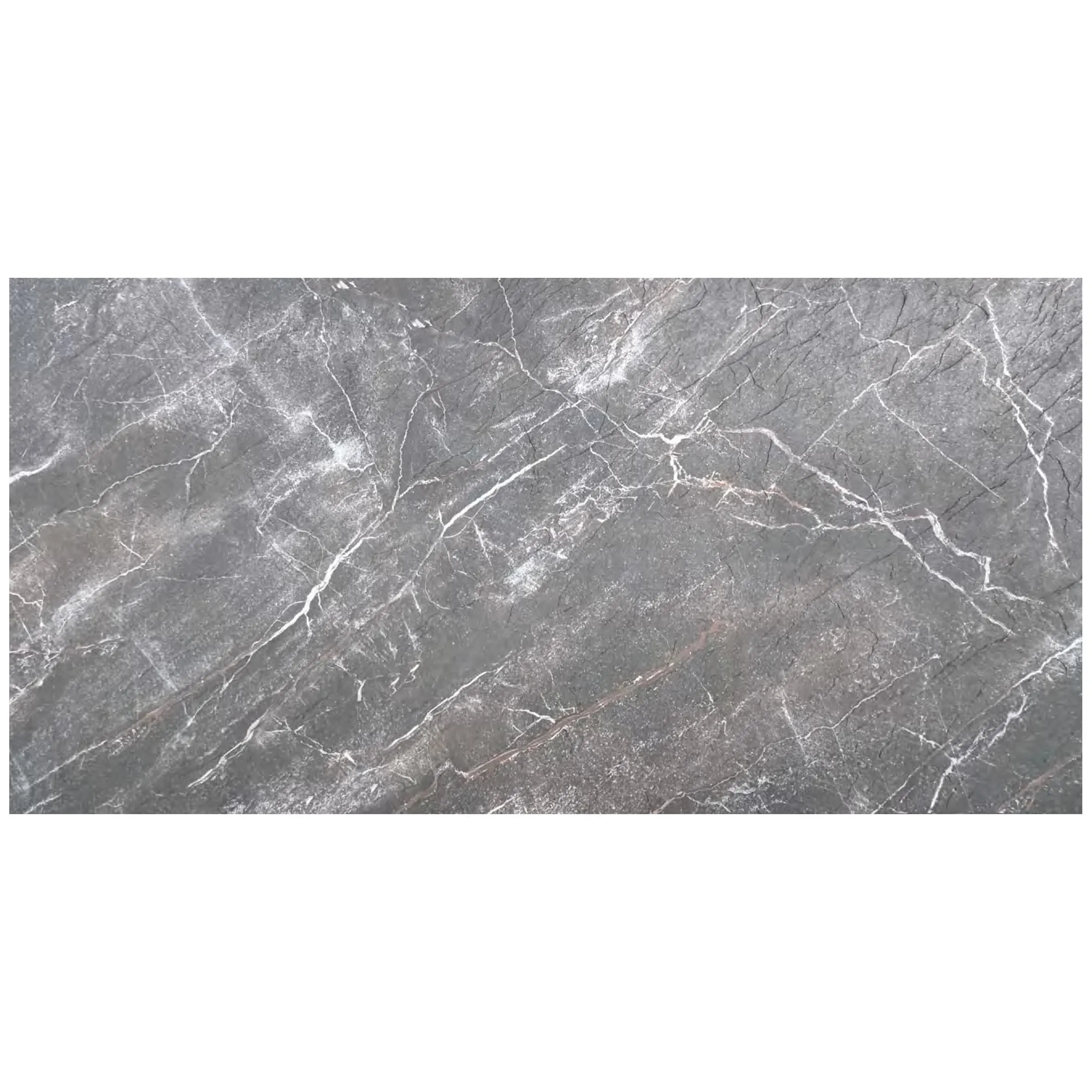
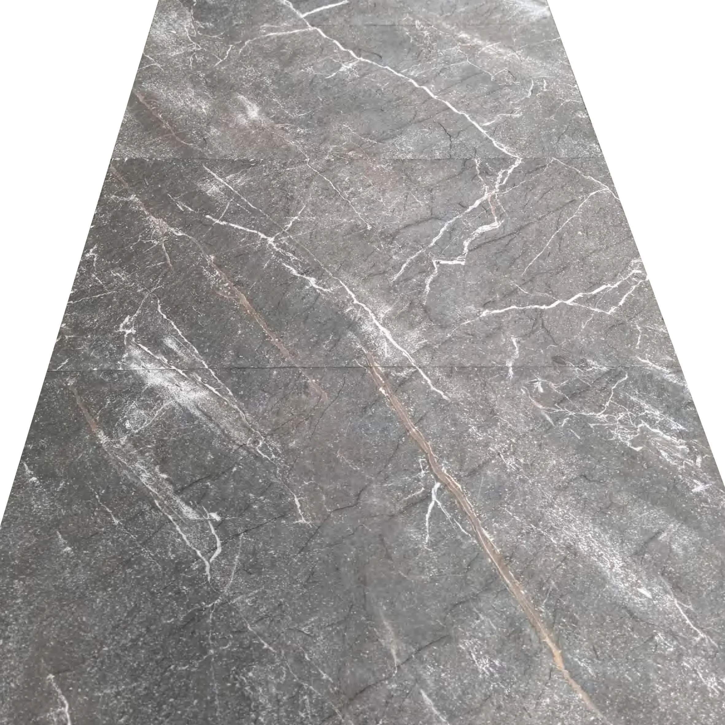
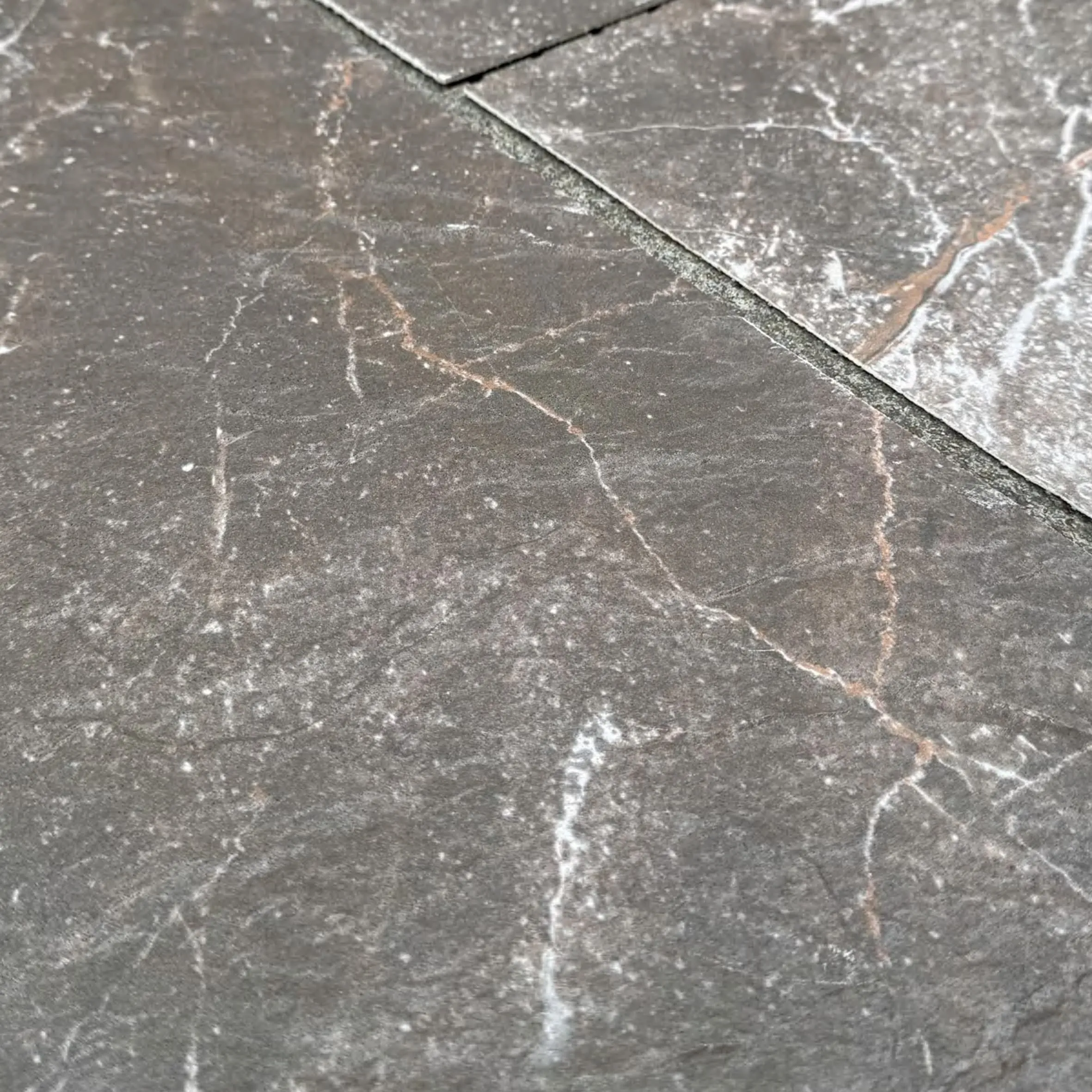
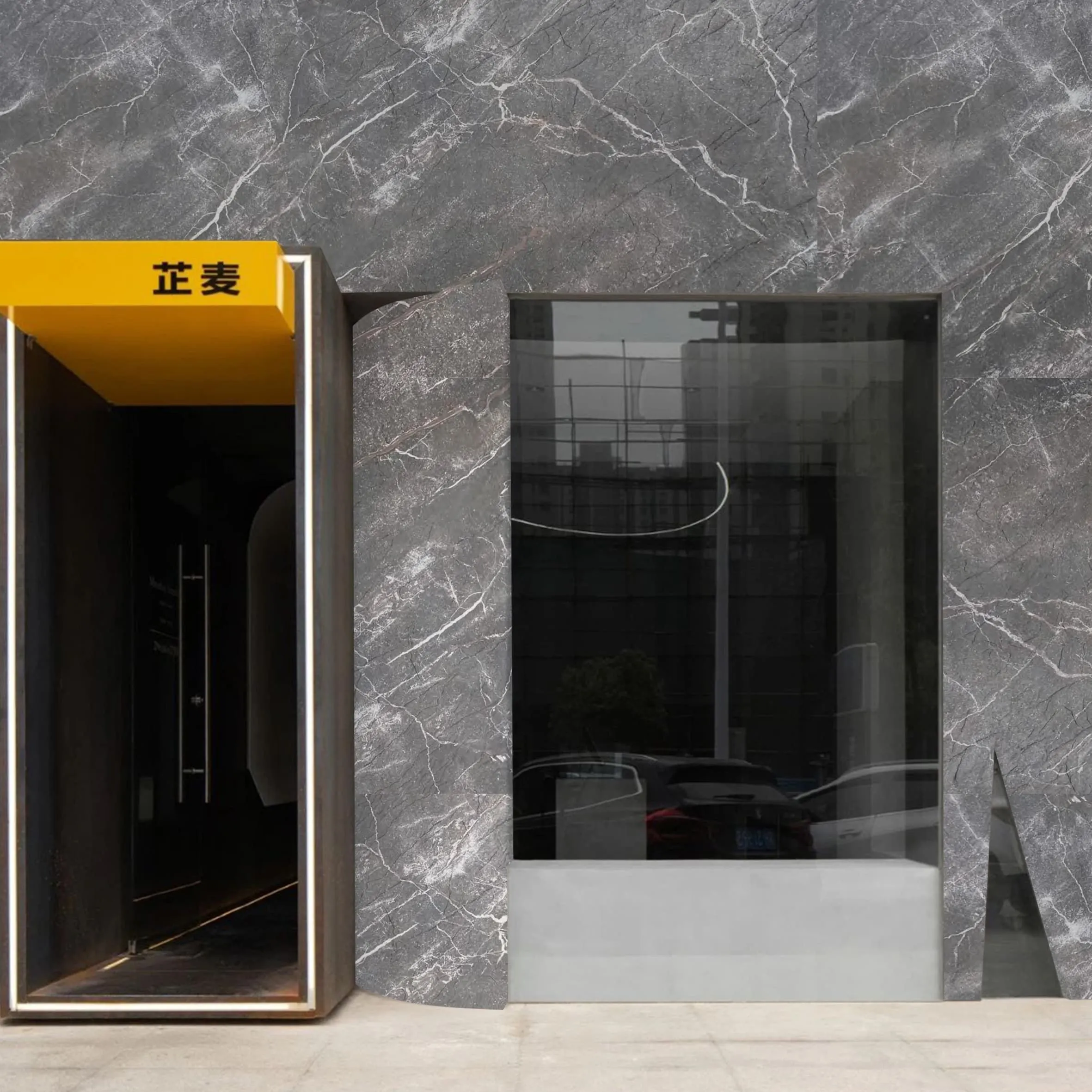
What makes Slate Portoro stand out? It's all in the details. Unlike uniform engineered stones, Slate Portoro carries the marks of its journey: deep, inky black backgrounds swirled with gold and white veins that look like constellations frozen in stone. No two slabs are identical—each has its own "personality," a quality that designers are leaning into to create spaces that feel unique and memorable. "Clients don't want 'cookie-cutter' anymore," says Maria Gonzalez, a senior interior designer at a leading NYC firm. "They want their café or office to feel like a story, not a template. Slate Portoro writes that story in every vein."
Case in Point: A boutique coffee chain in Seattle recently revamped its flagship location, swapping sleek marble countertops for Slate Portoro. "We noticed customers were lingering longer," says the chain's creative director. "They'd run their fingers over the surface while waiting for their latte, or take photos of the way the morning light hits those gold veins. It's become part of the experience—not just something to look at, but something to connect with."
Before we dive into how to use Slate Portoro, let's get to know it better. Quarried from select regions in Italy (a country renowned for its stone craftsmanship), Slate Portoro is a type of metamorphic rock formed over millions of years under intense heat and pressure. This slow, natural process gives it unmatched durability—scratch-resistant, heat-resistant, and built to withstand the heavy foot traffic of commercial spaces. But it's not just tough; it's surprisingly adaptable.
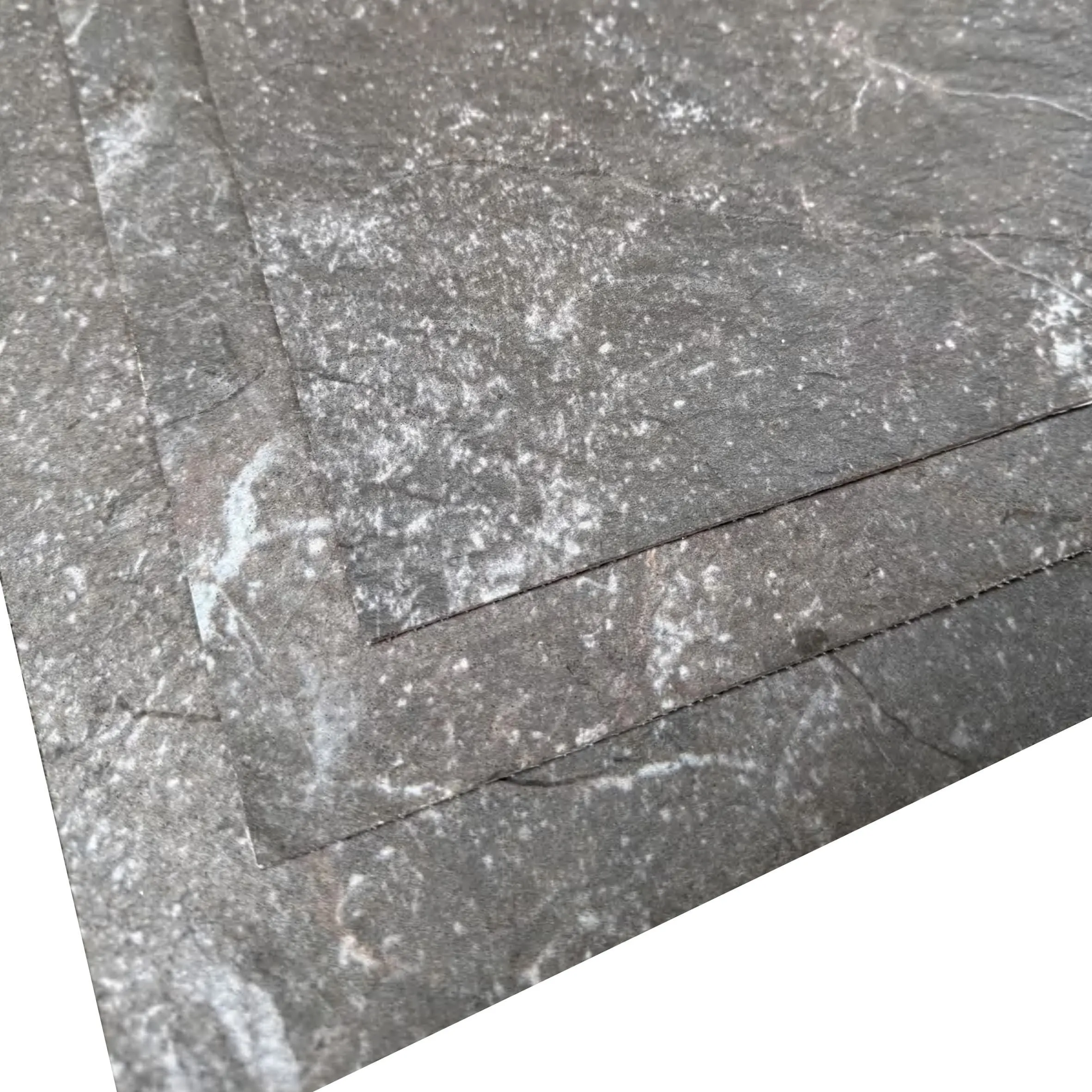
Designers love that Slate Portoro plays well with both bold and understated palettes. Its deep black base acts as a neutral, letting accent colors (think warm woods, terracotta, or soft greens) pop. The gold veins add a touch of luxury without feeling flashy—perfect for spaces that want to feel upscale but not intimidating. And when it comes to finishes? Slate Portoro shines in any form: honed for a matte, earthy look, polished for a glossy, dramatic statement, or even brushed for a weathered, industrial edge.
Luxury is great, but in commercial design, practicality reigns. Slate Portoro checks that box, too. Unlike porous stones like marble, it's relatively low-maintenance—resistant to stains from coffee spills, wine splatters, or office ink. A quick wipe with a mild cleaner is usually all it takes to keep it looking fresh. For high-traffic areas like hotel lobbies or retail floors, this durability is a game-changer. "We used Slate Portoro for a restaurant floor last year," says Gonzalez. "Six months in, with daily foot traffic and the occasional dropped plate, it still looks brand new. That's the kind of reliability clients dream of."
Great design is rarely about a single material—it's about how materials dance together. Slate Portoro is a natural collaborator, playing well with everything from warm woods to industrial metals. Let's explore some standout pairings that are trending in 2025, featuring a few materials that are making waves alongside Slate Portoro:
| Material Pairing | What It Adds | Best For | Mood Created |
|---|---|---|---|
| Slate Portoro + Fair-faced Concrete | Raw, industrial edge with organic warmth | Tech offices, art galleries | Bold yet grounded—think "urban sanctuary" |
| Slate Portoro + Wood Grain Board | Softness and texture; balances stone's weight | Cafés, boutique hotels, co-working spaces | Cozy sophistication—like a cabin in the city |
| Slate Portoro + Marble Interstellar Gray | Contrast of dark and light; depth of veining | High-end retail, luxury lobbies | Timeless elegance—old-world meets modern |
| Slate Portoro + Foamed Aluminium Alloy Board (Vintage Silver) | Metallic sheen; industrial-chic contrast | Restaurants, cocktail bars, tech showrooms | Edgy yet refined—like a speakeasy with a twist |
Take the Slate Portoro + Wood Grain Board combo, for example. In a recent project, a co-working space in Austin paired Slate Portoro desk tops with Wood Grain Board paneling on the walls. The result? A space that feels both professional and cozy. "Members tell us it's easier to focus here," says the space's manager. "The wood softens the stone, so it doesn't feel 'cold' like a traditional office. It's like working in a friend's stylish home office."
"Slate Portoro is a chameleon. Pair it with concrete, and it's industrial. Pair it with wood, and it's rustic-luxe. That versatility is why it's everywhere in 2025. Designers aren't just choosing materials—they're choosing moods, and Slate Portoro can do them all." — James Chen, material specialist at a global stone supplier.
Let's get specific: where exactly is Slate Portoro making the biggest impact in 2025? The answer is everywhere—but here are three key commercial spaces where it's truly shining:
In the age of social media, restaurants know: a space that's "photo-worthy" is a space that's profitable. Slate Portoro is becoming a star in this arena, thanks to its dramatic visual appeal. Imagine a sushi bar with a Slate Portoro counter—each plate of sashimi placed on that inky background looks like a work of art. Or a cocktail lounge with a Slate Portoro feature wall, where the gold veins glow under dim lighting, turning every sip into a moment.
But it's not just about photos. Slate Portoro also enhances the dining experience by absorbing sound. Unlike hard, reflective surfaces that make a restaurant feel noisy, its porous texture softens echoes, creating a more intimate atmosphere. "We used Slate Portoro for the walls in our new tapas bar," says a Barcelona-based restaurateur. "Guests say they can actually hear each other talk, even on busy nights. And the waitstaff? They love how easy it is to clean—no more stained walls from splashed wine!"
First impressions matter, especially in business. In 2025, office lobbies are moving beyond generic reception desks and potted plants—they're becoming "brand ambassadors." Slate Portoro is helping companies make a statement here, whether it's a tech startup going for "edgy luxury" or a law firm aiming for "timeless professionalism."
One Fortune 500 company recently installed a 20-foot Slate Portoro feature wall in its Chicago lobby, etched with the company's mission statement in gold lettering. "It's more than a wall—it's a declaration," says the company's facilities director. "Clients walk in, and you can see their eyes light up. It sets the tone: 'We care about quality, detail, and legacy.'"
Retailers are fighting for attention in a world of online shopping, and Slate Portoro is helping them win. Today's shoppers don't just want to buy—they want to "experience" a brand. A high-end clothing store in Paris recently lined its fitting rooms with Slate Portoro walls and Wood Grain Board benches, creating a space that feels like a luxury dressing room, not just a cubicle. "Sales associates say customers are spending 20% more time in fitting rooms," the store's manager notes. "They feel pampered, and that translates to more confident purchases."
Even in fast-fashion spaces, Slate Portoro is making an impact. A popular clothing chain used Slate Portoro for its checkout counters, pairing it with Foamed Aluminium Alloy Board (Vintage Silver) for a "modern industrial" vibe. "It elevates the space without alienating our younger customers," says the chain's design lead. "It says, 'We care about style—even down to the counter you place your credit card on.'"
Slate Portoro isn't just riding trends—it's setting them. Let's break down the key design directions for 2025 and how Slate Portoro fits in:
Goodbye, all-white everything. 2025 is seeing a shift toward rich, moody hues—think deep greens, terracottas, and yes, inky blacks. Slate Portoro's black-and-gold palette aligns perfectly with this trend, offering a way to go dark without feeling gloomy. "Black can be intimidating, but Slate Portoro's gold veins add warmth," explains color expert Lisa Wong. "It's like a night sky with stars—dark, but never cold."
Pair Slate Portoro with warm accents (think mustard yellow cushions or amber pendant lights) for a cozy vibe, or with cool grays (like Marble Interstellar Gray) for a sleek, contemporary look. Either way, it's a color story that feels current and timeless all at once.
Smooth, shiny surfaces are out; layered textures are in. 2025 is all about mixing materials that play off each other—rough with smooth, matte with glossy. Slate Portoro, with its naturally varied surface, is the perfect partner here. For example, a hotel lobby might pair a polished Slate Portoro reception desk with a rough-hewn Fair-faced Concrete wall. The contrast creates visual interest, drawing the eye and making the space feel dynamic.
"We're seeing a lot of 'textural storytelling,'" says Gonzalez. "A Slate Portoro floor with a honed finish (matte, slightly rough) paired with a polished Slate Portoro accent wall (shiny, reflective) creates depth. It's like the stone is 'talking' to itself—and to the people in the room."
2025 isn't just about how spaces look—it's about how they're made. Sustainability is no longer a "nice-to-have" in commercial design; it's a dealbreaker. And here's the good news: Slate Portoro is surprisingly eco-friendly, especially when sourced responsibly.
Unlike synthetic materials that rely on fossil fuels, Slate Portoro is a natural stone, quarried with minimal environmental impact when done right. Many quarries now use solar-powered equipment and water-recycling systems, and Slate Portoro's longevity means less waste over time (no need to replace it every 5-10 years like some engineered materials). "Clients ask about sustainability upfront now," says Chen. "We're able to tell them: 'Slate Portoro is a material that lasts centuries, not decades. It's an investment in the planet, too.'"
Plus, Slate Portoro pairs beautifully with other sustainable materials, like reclaimed Wood Grain Board or recycled Foamed Aluminium Alloy Board, letting designers create spaces that are both luxurious and green. "It's the best of both worlds," says Gonzalez. "You don't have to sacrifice style for sustainability anymore."
So, is Slate Portoro just a "trend," or is it here to stay? Designers and experts agree: it's the latter. "Trends come and go, but quality and authenticity never go out of style," says Wong. "Slate Portoro has both. It's a material with history—formed over millions of years—and it's adapting to the needs of today. That's not a trend—that's a legacy."
Looking ahead, we'll likely see Slate Portoro branching out into new applications: outdoor commercial spaces (think hotel patios or restaurant terraces), custom furniture (Slate Portoro coffee tables, anyone?), and even art installations. "The only limit is creativity," says Gonzalez. "I've had clients ask for Slate Portoro fireplace surrounds, bathroom vanities, even ceiling panels. It's a material that keeps surprising me."
At the end of the day, Slate Portoro is more than a stone. It's a reminder that in a world of screens and shortcuts, we still crave connection—to nature, to history, and to each other. It's in the way a parent and child trace the gold veins on a café counter, or a team of coworkers pauses to admire the lobby wall before a big meeting. These small moments, made possible by materials like Slate Portoro, are what turn "spaces" into "places."
So, the next time you walk into a commercial space and feel that subtle pull—the sense that this place is "different"—take a closer look. Chances are, Slate Portoro is there, quietly telling a story. And in 2025, that story is all about warmth, authenticity, and the beauty of the imperfectly perfect.
Recommend Products


