
Interior design is more than just arranging furniture or picking paint colors—it's about crafting spaces that tell a story. Every material, from the softness of a wool rug to the coolness of stone, contributes to that narrative. And if there's one material that knows how to command attention while whispering elegance, it's Slate Portoro. With its deep, moody base and striking veins of gold, this stone isn't just a surface; it's a conversation starter, a focal point, and a timeless choice for anyone looking to infuse their home with both drama and warmth. Let's dive into how Slate Portoro can transform your spaces, from accent walls that take center stage to backsplashes that turn everyday routines into moments of beauty.
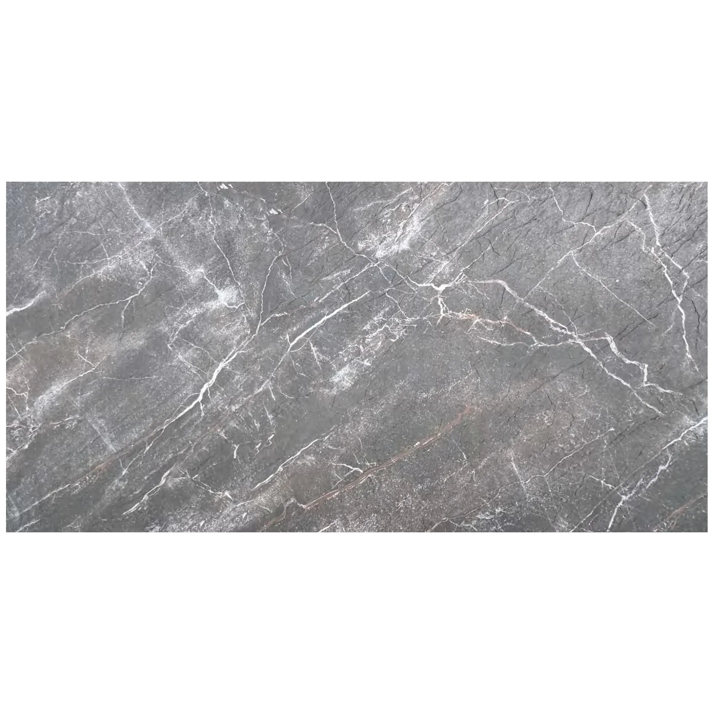
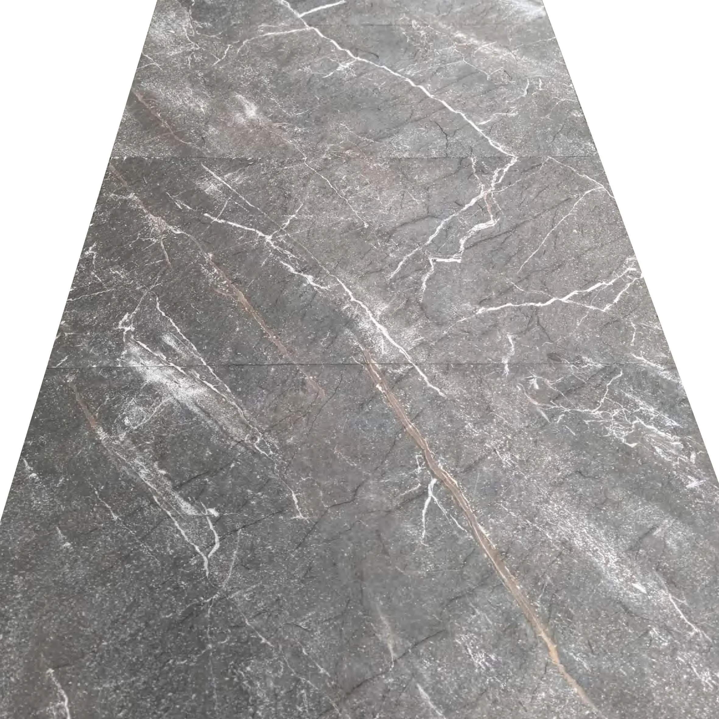
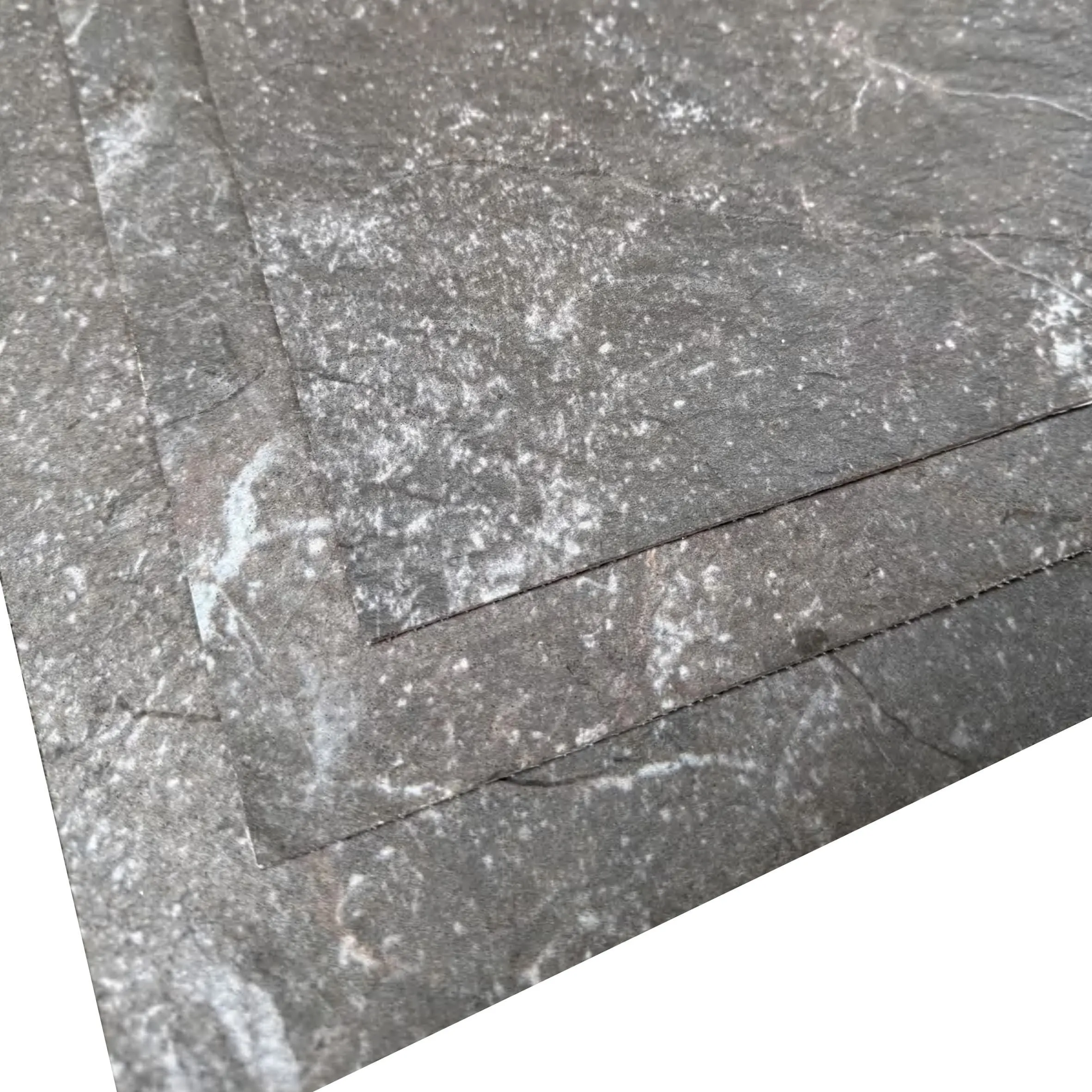
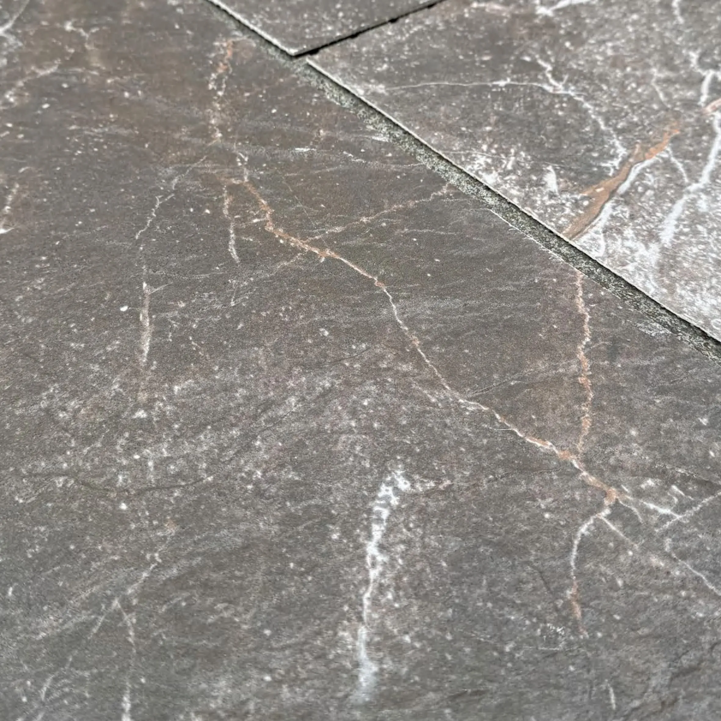
First things first: Let's get to know the star of the show. Slate Portoro is a type of natural stone that hails from the quarries of Italy, a country renowned for producing some of the world's most coveted building materials. What sets it apart? Picture a canvas of deep, inky black—so dark it almost feels like a night sky—interrupted by swaths of golden veins that twist and turn like rivers of liquid sunlight. Unlike some stones that lean into uniformity, Slate Portoro (embraces) its natural variations: no two slabs are exactly alike. One might have thin, delicate gold streaks; another could feature bold, wide veins that look like brushstrokes from a master painter. This uniqueness is part of its charm—your Slate Portoro accent wall or backsplash won't just be "a stone wall"; it'll be your stone wall, with a personality all its own.
Texture-wise, Slate Portoro is versatile. It can be polished to a high shine, which makes those gold veins pop even more under artificial or natural light, or left with a matte finish for a softer, more understated look. Either way, its surface has a smoothness that feels luxurious to the touch, yet there's an underlying depth—tiny pits and grooves from its formation—that remind you it's a product of the earth, not a factory. It's this balance of refinement and raw natural beauty that makes Slate Portoro such a standout in interior design.
So, what kind of vibe does Slate Portoro bring to a room? Think "old-world elegance meets modern edge." Its dark base adds drama, but the gold veins keep it from feeling heavy or gloomy. Instead, they inject warmth, making even the boldest Slate Portoro installation feel inviting. It's a material that works in both classic and contemporary spaces: pair it with (carved) wooden furniture and crystal chandeliers for a traditional, opulent look, or with sleek, minimalist lines and neutral tones for something more modern and edgy. It's also surprisingly adaptable across styles—whether you're into industrial chic, coastal calm, or bohemian warmth, Slate Portoro can find a place.
One of the most magical things about Slate Portoro is how it interacts with light. In a room with large windows, the gold veins catch the sun during the day, casting subtle, shifting patterns across the floor. At night, under warm pendant lights or recessed lighting, the stone takes on a cozy, intimate glow, turning a living room into a retreat or a bathroom into a spa-like oasis. It's a material that changes with the hours, keeping your space feeling dynamic and alive.
Accent walls are the perfect way to use Slate Portoro—they let you go bold without overwhelming the entire space. Here are some ideas for different rooms in your home:
The living room is where we gather, unwind, and connect, so why not give it a focal point that sparks joy? A Slate Portoro accent wall behind your sofa instantly elevates the space. Imagine sinking into a plush, cream-colored sofa after a long day, your eyes drawn to the wall behind you: deep black stone with gold veins that catch the light from your floor lamp. It's a backdrop that makes even casual movie nights feel a little special. To keep the room from feeling too dark, balance the Slate Portoro with light-colored furniture—think off-white armchairs, a light wood coffee table, and soft, textured throw pillows in warm neutrals or muted blues. Add a large mirror on the opposite wall to reflect the stone's beauty and make the room feel more spacious.
Who says bedrooms have to be all pastels and softness? A Slate Portoro accent wall behind your bed can turn your sleeping space into a sanctuary of understated luxury. Pair it with linen bedding in ivory or light gray, and add warmth with wooden nightstands and a jute rug. The contrast between the dark stone and the soft textiles creates a cozy, cocoon-like feel—perfect for unwinding. For a touch of romance, install sconces on either side of the bed with warm, dimmable bulbs; when you turn them on, the light will dance along the gold veins, making the wall feel like it's glowing. Pro tip: Keep the rest of the walls a soft, neutral color (like warm beige or light gray) to let the Slate Portoro shine without overwhelming the room.
Working from home? Your office should inspire you, not bore you. A Slate Portoro accent wall behind your desk can do just that. The stone's bold pattern stimulates the mind, while its grounding dark color helps keep distractions at bay. Pair it with a sleek, modern desk in white or light wood, and add pops of color with desk accessories—think a blue ceramic mug, a green potted plant, or a yellow notebook. Hang floating shelves above the desk to display books and personal mementos; the contrast between the stone, the shelves, and your items will create visual interest that keeps you motivated. And when you need a break, just glance up at the wall—those gold veins might just spark your next big idea.
Backsplashes are often overlooked, but they're the unsung heroes of kitchen and bathroom design. They protect walls from splashes and spills, sure, but they also add personality and style. Slate Portoro makes for a backsplash that's equal parts functional and beautiful—here's how to use it:
The kitchen is the heart of the home, and a Slate Portoro backsplash can make it beat a little louder. Imagine cooking breakfast, sunlight streaming in through the window, and glancing up to see your stone backsplash: dark, rich, and full of character. It pairs beautifully with white or light gray cabinetry, which makes the gold veins stand out even more. Add gold or brass hardware—drawer pulls, faucet, pendant lights—to echo the veins in the stone, creating a cohesive look. For a modern twist, mix in subway tiles in a neutral color (like white or light gray) alongside the Slate Portoro, using the stone as an accent strip or a focal point behind the stove. It's a design that says "I care about style, but I also need my kitchen to work for me."
Bathrooms are where we start and end our days, so why not make them feel like a mini spa? A Slate Portoro backsplash (or even a full accent wall) in the bathroom adds instant luxury. Use it behind the vanity, paired with a white marble countertop and a sleek, wall-mounted faucet. The dark stone contrasts beautifully with white towels and chrome fixtures, creating a clean, sophisticated look. For a more playful vibe, mix Slate Portoro with mosaic tiles in a complementary color—think small, glossy tiles in soft blue or green—to add texture and depth. And don't forget lighting: install LED strips under the vanity mirror to illuminate the stone, making your morning routine feel like a trip to a high-end spa.
One of the best things about Slate Portoro is how well it plays with others. While it can certainly stand alone, pairing it with other materials can elevate your design even further. Here are some of our favorite combinations:
| Material | Color Palette | Texture | Best For | Design Vibe |
|---|---|---|---|---|
| Slate Portoro | Deep black with gold veins | Smooth (polished or matte) | Accent walls, backsplashes | Bold, elegant, timeless |
| Marble Veil White | Crisp white with soft gray veins | Ultra-smooth, polished | Countertops, adjacent walls | Bright, airy, sophisticated |
| Travertine (Starry Blue) | Soft blue with subtle "starry" flecks | Matte, porous with natural pits | Complementary accent walls, shower surrounds | Calm, dreamy, coastal-inspired |
| Muretto Stone (Beige) | Warm beige with earthy undertones | Rough-hewn, textured | Floors, fireplace surrounds | Cozy, rustic, grounded |
| Fair-Faced Concrete | Gray with subtle variations | Raw, industrial, matte | Ceilings, adjacent walls | Modern, edgy, minimalist |
Marble Veil White is the perfect counterpart to Slate Portoro. Its crisp, white base with soft gray veins creates a striking contrast with Slate Portoro's dark drama. Use Marble Veil White for countertops or as an adjacent wall, and let Slate Portoro take the spotlight as the accent wall. The combination is classic and sophisticated, like a black-tie event—elegant, timeless, and never out of style. Imagine a kitchen with Slate Portoro backsplash and Marble Veil White countertops: it's a look that feels both luxurious and approachable, perfect for hosting dinner parties or enjoying quiet family meals.
For a pop of color that doesn't clash, try pairing Slate Portoro with Travertine (Starry Blue). This stone features a soft blue base with tiny, iridescent flecks that look like stars in the night sky—hence the name. The cool blue complements the warm gold in Slate Portoro, creating a balanced, harmonious look. Use Travertine (Starry Blue) as a border around your Slate Portoro accent wall, or mix the two in a mosaic backsplash for a playful, artistic touch. It's a combination that works especially well in coastal homes or spaces where you want to evoke a sense of calm and wonder.
If you're drawn to earthy, organic design, Muretto Stone (Beige) is the perfect partner for Slate Portoro. This stone has a soft, sandy beige color with a rough-hewn texture that adds warmth and texture to any space. Pair Slate Portoro with Muretto Stone (Beige) in a living room: use Slate Portoro for the accent wall and Muretto Stone for the fireplace surround or floor. The contrast between the smooth, dark stone and the rough, light stone creates a cozy, grounded vibe that feels like a cabin in the woods—if that cabin were designed by a high-end interior designer. It's a look that says "I value comfort, but I don't skimp on style."
For a more modern, industrial look, pair Slate Portoro with Fair-Faced Concrete. This material has a raw, unfinished quality—think gray, with subtle variations in tone and tiny air bubbles that add character. When combined with Slate Portoro, it creates a bold, edgy aesthetic that's perfect for urban lofts or modern homes. Use Fair-Faced Concrete for the ceiling or adjacent walls, and let Slate Portoro be the star on the accent wall. Add metal accents (like black steel shelves or brass light fixtures) to tie the look together. It's a design that feels fresh, contemporary, and unapologetically cool.
Like any natural stone, Slate Portoro needs a little love to stay looking its best. But don't worry—it's not high-maintenance. Here are some simple tips:
With a little care, your Slate Portoro accent wall or backsplash will look just as beautiful in 10 years as it does today—proof that good design is an investment, not just an expense.
At the end of the day, interior design is about creating spaces that feel like "you." And Slate Portoro, with its bold beauty and timeless elegance, is a material that lets you tell your story with confidence. Whether you use it as an accent wall in your living room, a backsplash in your kitchen, or pair it with other materials like Marble Veil White or Travertine (Starry Blue), it's a choice that says you value both style and substance. It's a stone that doesn't just decorate your home—it transforms it, turning ordinary spaces into extraordinary ones.
So, if you're ready to add a touch of drama, a dash of luxury, and a whole lot of personality to your home, consider Slate Portoro. It's more than just a material—it's a statement. And in a world of cookie-cutter design, that's a beautiful thing.
Recommend Products


