
In the world of commercial design, every material tells a story. From the sleek lines of a boutique facade to the warm textures of a café interior, the surfaces we choose don't just fill space—they shape how customers perceive a brand. They're silent brand ambassadors, conveying personality, values, and identity without a single word. Today, we're diving into a material that's been turning heads in the design community: Slate Sunnye. More than just a surface, it's a canvas for creativity, offering a spectrum of colors and customizable options that let brands craft spaces as unique as their stories. Let's explore how Slate Sunnye is redefining branded commercial projects, one shade at a time.
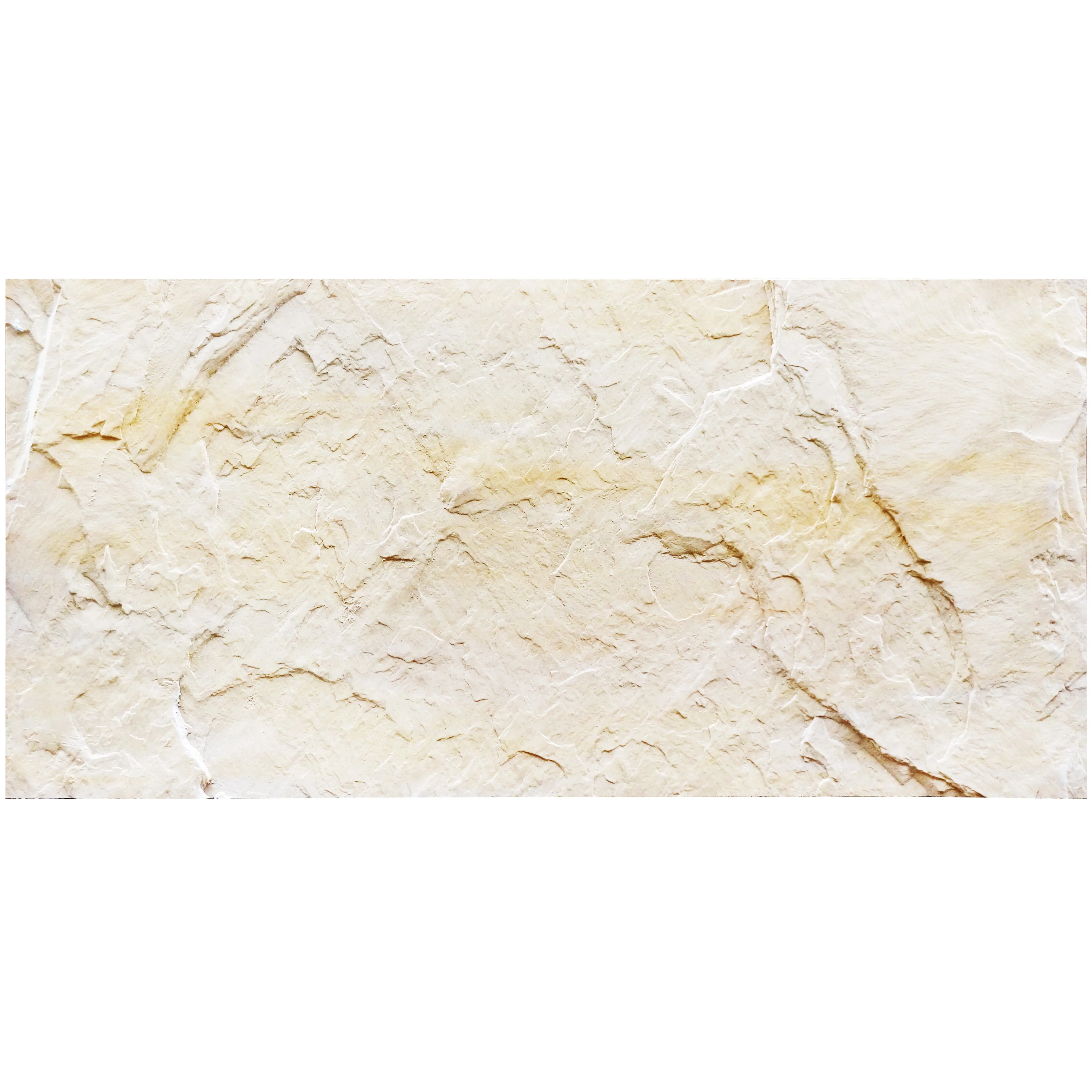
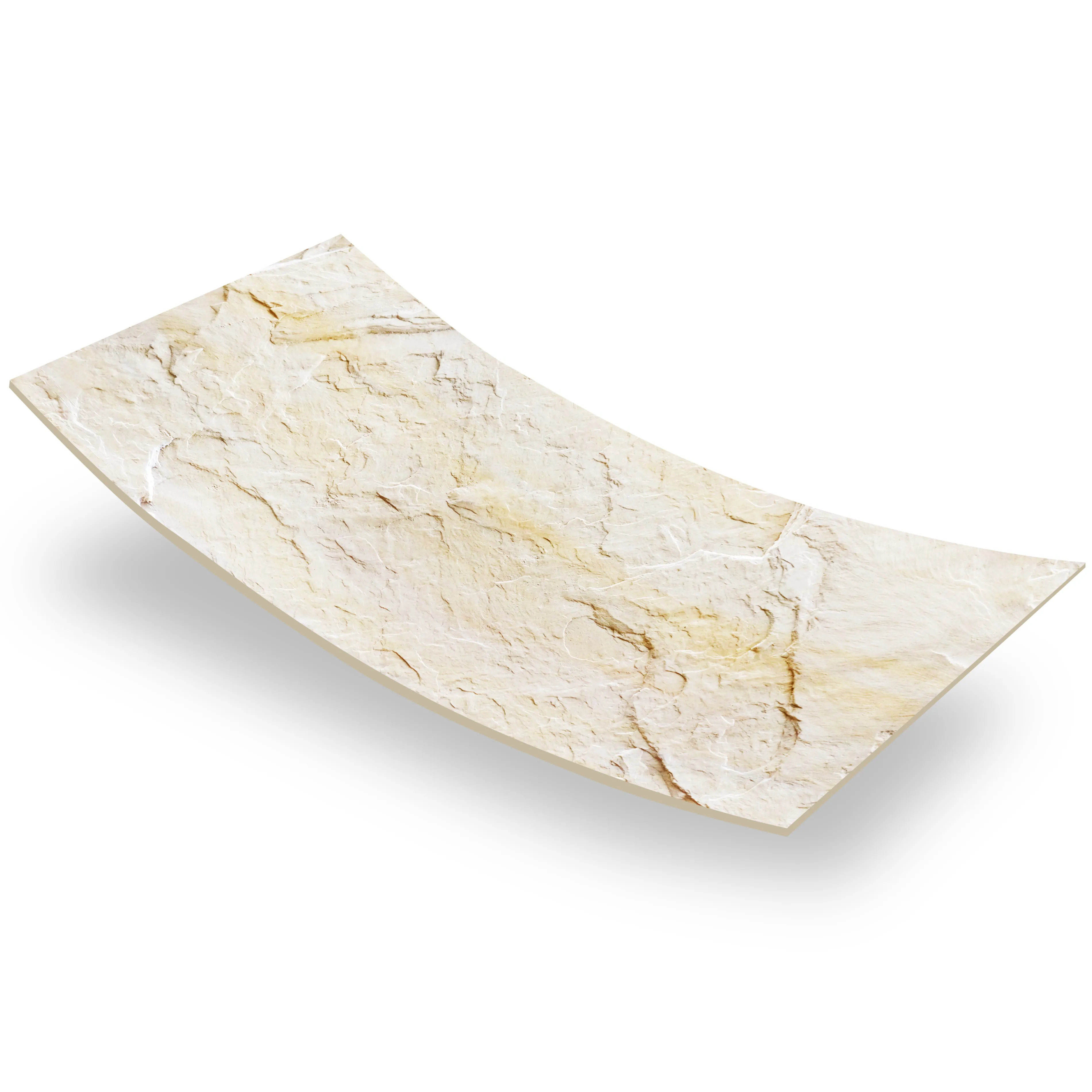
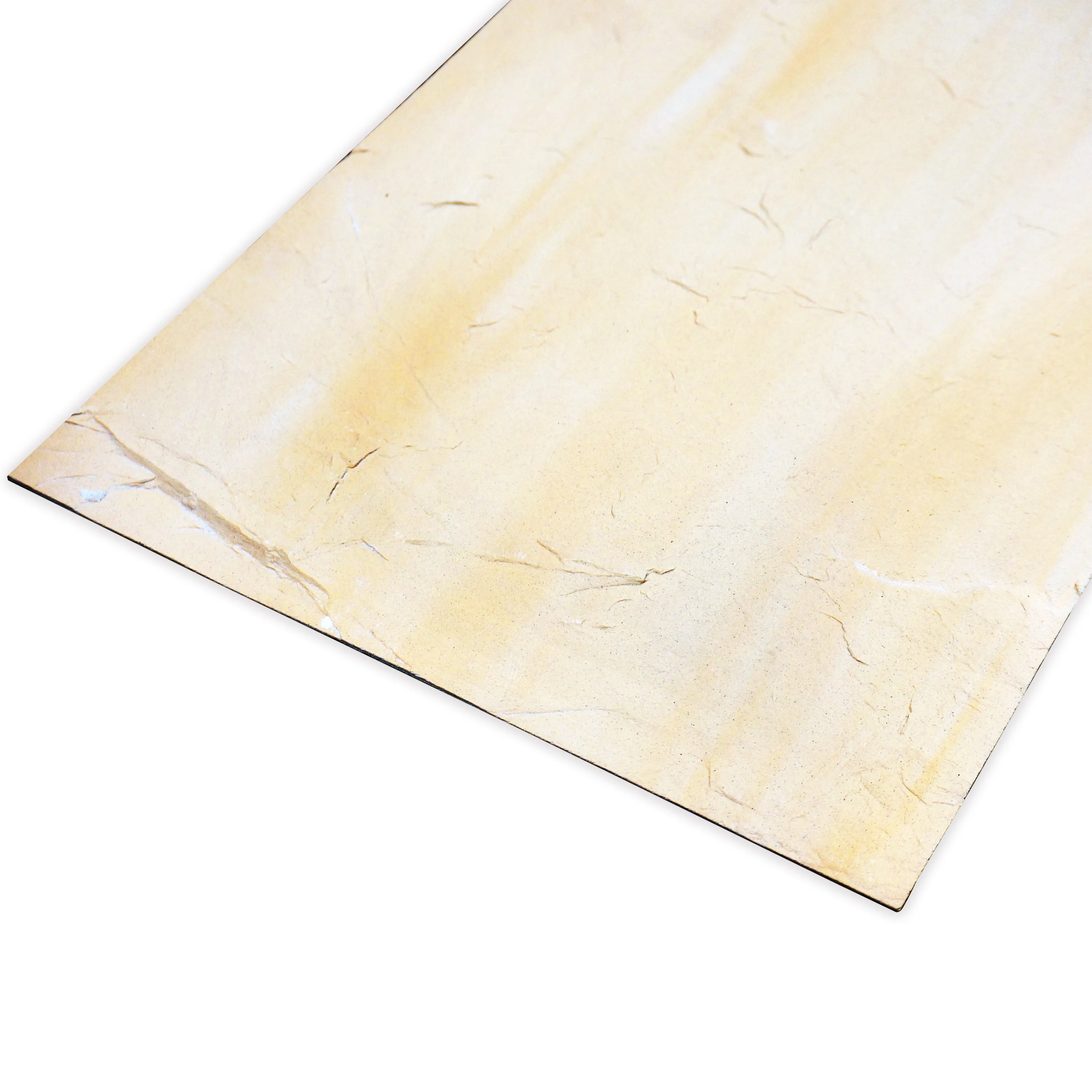
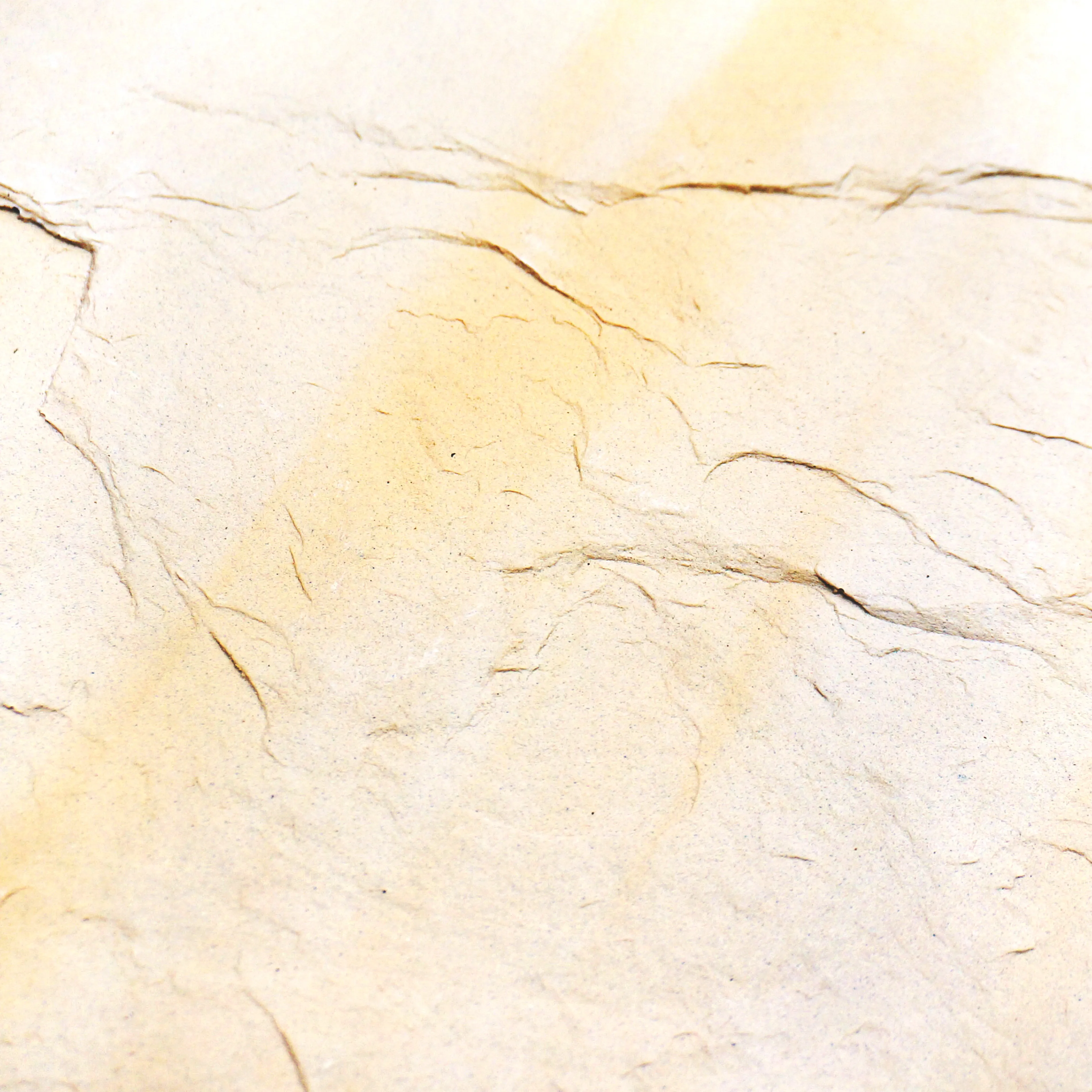
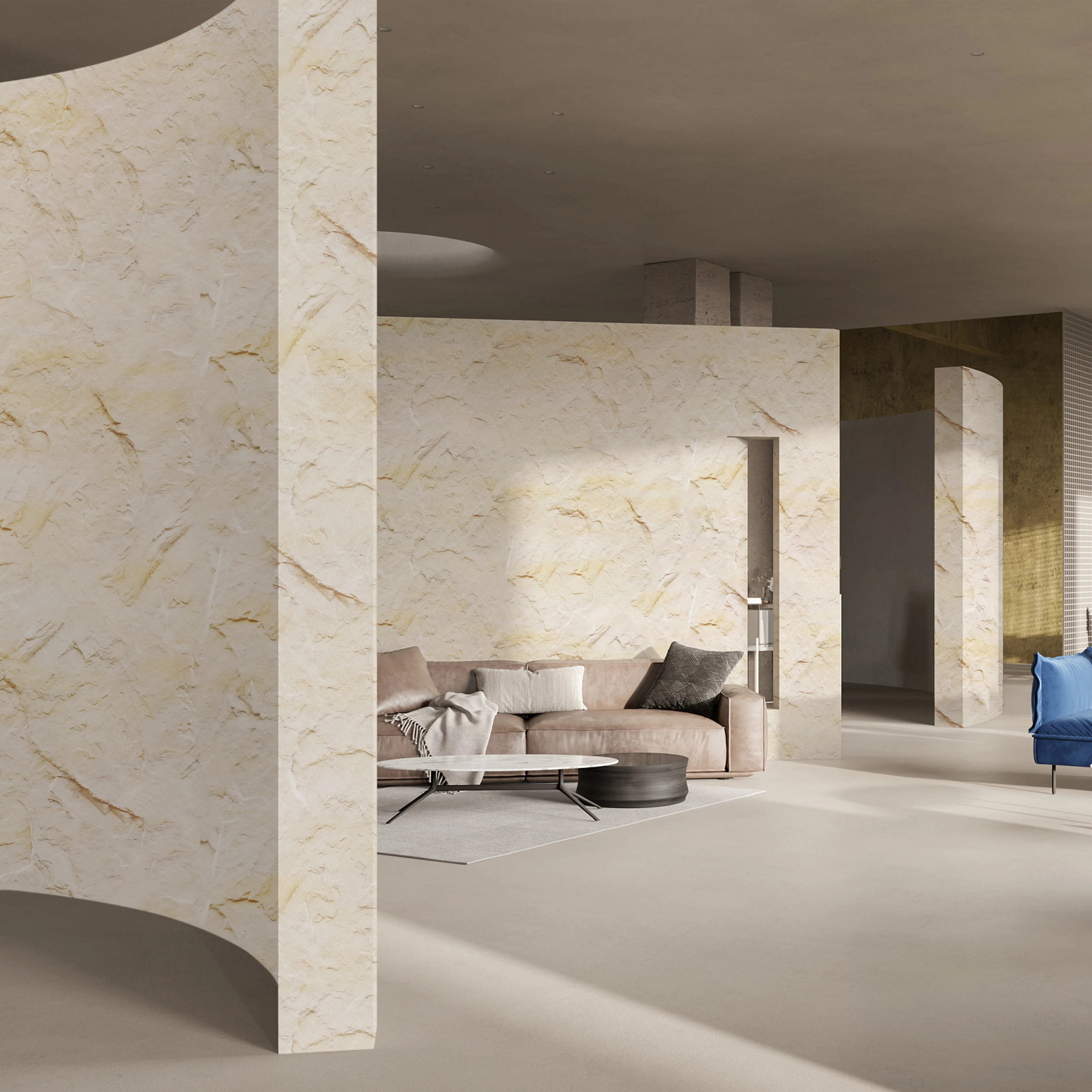
Slate Sunnye isn't your average natural stone. It's a harmonious blend of durability and artistry, quarried from select deposits where mineral-rich layers have been forged over millennia. What sets it apart? Its texture—subtly layered, with hints of warmth that catch the light like sunlight filtering through tree leaves. Run a hand over it, and you'll feel the gentle grit of nature's craftsmanship, a tactile experience that invites connection. Unlike cold, sterile surfaces, Slate Sunnye feels alive, as if it carries the weight of time while embracing the energy of the present.
But its true magic lies in its versatility. While some materials lock designers into rigid color palettes, Slate Sunnye bends to vision. Whether a brand craves bold drama or soft subtlety, this stone adapts—making it a favorite for projects where branding isn't just about logos, but about creating an immersive world.
At the heart of Slate Sunnye's appeal is its color range—a curated selection of tones that span the spectrum from earthy neutrals to unexpected accents. Let's break down the core shades, and how they can align with different brand personalities:
| Slate Sunnye Shade | Undertones & Vibe | Brand Personality Fit | Complementary Material Pairing |
|---|---|---|---|
| Slate Sunnye (Warm Beige) | Honeyed undertones, soft as morning light | Approachable, welcoming, family-friendly brands (cafés, community spaces) | Wood grain board (adds organic warmth) |
| Slate Sunnye (Mid-Grey) | Sophisticated, with subtle blue-gray hints | Modern, minimalist, tech-forward brands (startups, co-working spaces) | Fair-faced concrete (enhances industrial-chic edge) |
| Slate Sunnye (Terracotta) | Vibrant yet grounded, like desert clay at sunset | Bold, artisanal, culturally rich brands (boutiques, heritage restaurants) | Travertine (starry blue) (adds a pop of contrasting depth) |
| Slate Sunnye (Charcoal) | Deep, moody, with flickers of silver | Luxury, exclusivity, high-end brands (designer stores, premium hotels) | Marble veil white (creates striking light-dark contrast) |
But what if your brand's color story isn't on this list? That's where Slate Sunnye truly shines: customization. Thanks to advanced staining and sealing techniques, designers can tweak existing shades or create entirely new ones. Imagine a wellness brand wanting to echo the calm of a forest—Slate Sunnye can be custom-blended to a soft sage green, its natural texture now carrying the serenity of moss-covered stones. Or a youth-focused tech company craving energy? A vibrant coral hue, infused with the stone's inherent warmth, turns a lobby into a space that feels dynamic and alive.
The key here is control. With Slate Sunnye, brands aren't limited to "off-the-shelf" options. They can dial in the exact shade that matches their logo, their mission, or even the emotion they want customers to feel when they walk through the door.
Great design isn't about a single star material—it's about harmony. Slate Sunnye plays well with others, making it easy to build layered, cohesive spaces that tell a unified brand story. Let's explore a few materials that pair beautifully with it, and how they enhance its impact:
Fair-faced concrete is the epitome of understated elegance—raw, unpolished, and full of industrial charm. When paired with Slate Sunnye, it creates a juxtaposition that feels both grounded and forward-thinking. Picture a co-working space: Slate Sunnye (Mid-Grey) walls serve as a warm backdrop, while fair-faced concrete floors add a sleek, professional edge. The combination says, "We value creativity, but we mean business." It's a balance that appeals to brands aiming for "approachable sophistication."
There's something inherently comforting about wood, and wood grain board—with its replicated natural patterns—amplifies that warmth. When used alongside Slate Sunnye (Warm Beige), it creates a space that feels like a cozy retreat. Think of a farm-to-table restaurant: Slate Sunnye tabletops, with their earthy texture, pair with wood grain board paneling on the walls. The result? A space that whispers "authenticity" and "connection to nature"—perfect for brands built on transparency and quality.
For brands working with tight budgets or weight restrictions (think retail kiosks or pop-up shops), MCM flexible stone is a game-changer. Lightweight yet durable, it mimics the look of natural stone without the heaviness. Pair it with Slate Sunnye accents—say, a Slate Sunnye (Terracotta) feature wall with MCM flexible stone in a matching hue on the ceiling—and you get a cohesive look that's easy to install and transport. It's proof that brand consistency doesn't have to come with a steep price tag.
Sometimes, a brand needs a "wow" moment—a focal point that lingers in customers' memories. Travertine (Starry Blue) delivers just that, with its deep, celestial hue and subtle crystalline flecks that sparkle like stars. When used sparingly with Slate Sunnye (Charcoal), it creates a sense of luxury and intrigue. Imagine a high-end boutique: Slate Sunnye (Charcoal) display shelves frame a travertine (starry blue) accent wall behind the cash register. The contrast is bold but not overwhelming, turning a functional space into a photo-worthy backdrop that customers will share on social media—free brand exposure, driven by design.
Slate Sunnye's versatility makes it a star in nearly every commercial setting. Let's take a look at how different industries are using it to elevate their brand presence:
A sustainable fashion brand wanted to convey "timelessness" and "connection to the earth." They chose Slate Sunnye (Warm Beige) for their storefront facade, its soft, sunlit tones evoking a sense of warmth and longevity. Inside, wood grain board fixtures complement the stone, while accent walls in travertine (starry orange) add pops of energy—mirroring the brand's mix of classic designs and bold, seasonal pieces. The result? A space that feels both rooted and fresh, just like the clothing it sells.
A boutique hotel in a coastal town aimed to capture "beachside serenity with a touch of luxury." Slate Sunnye (Charcoal) was used for the lobby fireplace surround, its deep color grounding the space, while fair-faced concrete floors keep things modern. The hotel's signature color—pale blue—was custom-mixed into Slate Sunnye for accent panels behind the reception desk, tying the design to the brand's logo. Guests often comment on how the space "feels like a calm, upscale retreat," a direct reflection of the hotel's promise.
A craft brewery wanted to balance "rustic charm" with "modern innovation." Slate Sunnye (Terracotta) was chosen for the bar front, its warm, earthy tone nodding to traditional brewing roots. The brewery's logo, which features a gear (symbolizing innovation), inspired the use of MCM flexible stone in a sleek metallic finish for the ceiling panels. The combination? A space that feels both cozy (inviting patrons to stay awhile) and cutting-edge (showcasing the brewery's experimental side).
So, what makes Slate Sunnye stand out in a crowded market of commercial materials? Let's break it down:
Commercial spaces are high-traffic zones—think scuffing, spills, and constant use. Slate Sunnye is up to the task. Its dense composition resists scratches and stains, and it holds up beautifully to moisture (making it ideal for kitchens, bathrooms, or outdoor patios). Unlike some trendy materials that fade or wear thin over time, Slate Sunnye ages gracefully, developing a richer patina that adds character—perfect for brands in it for the long haul.
Today's consumers care about the planet, and brands are taking notice. Slate Sunnye is quarried using eco-conscious practices, with minimal waste and a focus on reforestation of quarry sites. It's also locally sourced in many regions, reducing carbon footprints from transportation. For brands that prioritize sustainability, this isn't just a "nice-to-have"—it's a selling point, allowing them to walk the walk of their environmental values.
At the end of the day, the best brands are the ones that make us feel something. Slate Sunnye excels here. Its texture invites touch, its color evokes emotion, and its versatility lets brands craft spaces that feel personal. A customer might forget a logo, but they'll remember the way a Slate Sunnye wall felt warm under their hand, or how the light hit its surface and made the room glow. Those are the moments that turn first-time visitors into loyal patrons.
Branded commercial projects are about more than aesthetics—they're about creating spaces that embody who you are and what you stand for. Slate Sunnye isn't just a material; it's a partner in that journey. With its rich color palette, endless customization options, and ability to play well with other materials like fair-faced concrete and wood grain board, it gives brands the freedom to build worlds that resonate deeply with customers.
Whether you're designing a boutique, a restaurant, or a corporate headquarters, remember this: the surfaces you choose are part of your brand's voice. Slate Sunnye doesn't just speak—it sings, in a tone that's warm, authentic, and uniquely yours. So why settle for ordinary when you can have a material that turns your brand's story into something tangible, something felt, something unforgettable?
Slate Sunnye isn't just about color. It's about creating spaces that matter. And in the world of branded commercial design, that's everything.
Recommend Products


