
Walk into any memorable brand space—a boutique hotel lobby, a flagship retail store, or a cutting-edge tech office—and you'll notice something immediately: the materials don't just fill the space; they speak . They whisper the brand's values, shout its personality, and linger in the minds of anyone who steps through the door. In a world where first impressions are measured in seconds, the choice of building materials has become as critical to brand identity as a logo or a tagline. And at the heart of this material revolution lies color customization—because a brand's palette isn't just a set of hues; it's the emotional language it uses to connect with the world. Enter MCM technology: a game-changer that marries artistry with engineering, turning ordinary surfaces into storytellers. Today, we're diving into how Starmoon Stone , a crown jewel of MCM's lineup, and other innovative materials like lunar peak silvery and foamed aluminium alloy board (vintage silver) are helping brands craft spaces that feel less like "buildings" and more like extensions of their soul.
Let's start with the obvious: color affects mood. A soft beige might calm a hospital waiting room; a bold red could energize a gym. But for brands, color is deeper—it's recognition . Think of Tiffany's robin's egg blue or Coca-Cola's crimson: these colors aren't arbitrary. They're coded into our brains, triggering instant associations with trust, joy, or nostalgia. When a brand's physical space mirrors this color identity, it doesn't just "look good"—it reinforces the brand's promise, turning customers into loyalists.
But here's the challenge: traditional building materials often limit this vision. Natural stone, for example, is stunning but comes in fixed shades. Ceramic tiles offer more color options but lack texture. Enter MCM technology —short for Modified Composite Material—a breakthrough that blends polymer resins, mineral powders, and advanced manufacturing to create panels that are lightweight, durable, and infinitely customizable . Unlike natural stone, MCM materials like Starmoon Stone can be engineered to match a brand's exact Pantone code, down to the undertones. Want a wall that shifts from "starry green" at dawn to "starry blue" at dusk? MCM makes it possible. Need a texture that mimics the roughness of desert sand but in your brand's signature terracotta? Done. It's not just about color—it's about control. And in a market where differentiation is key, control is everything.
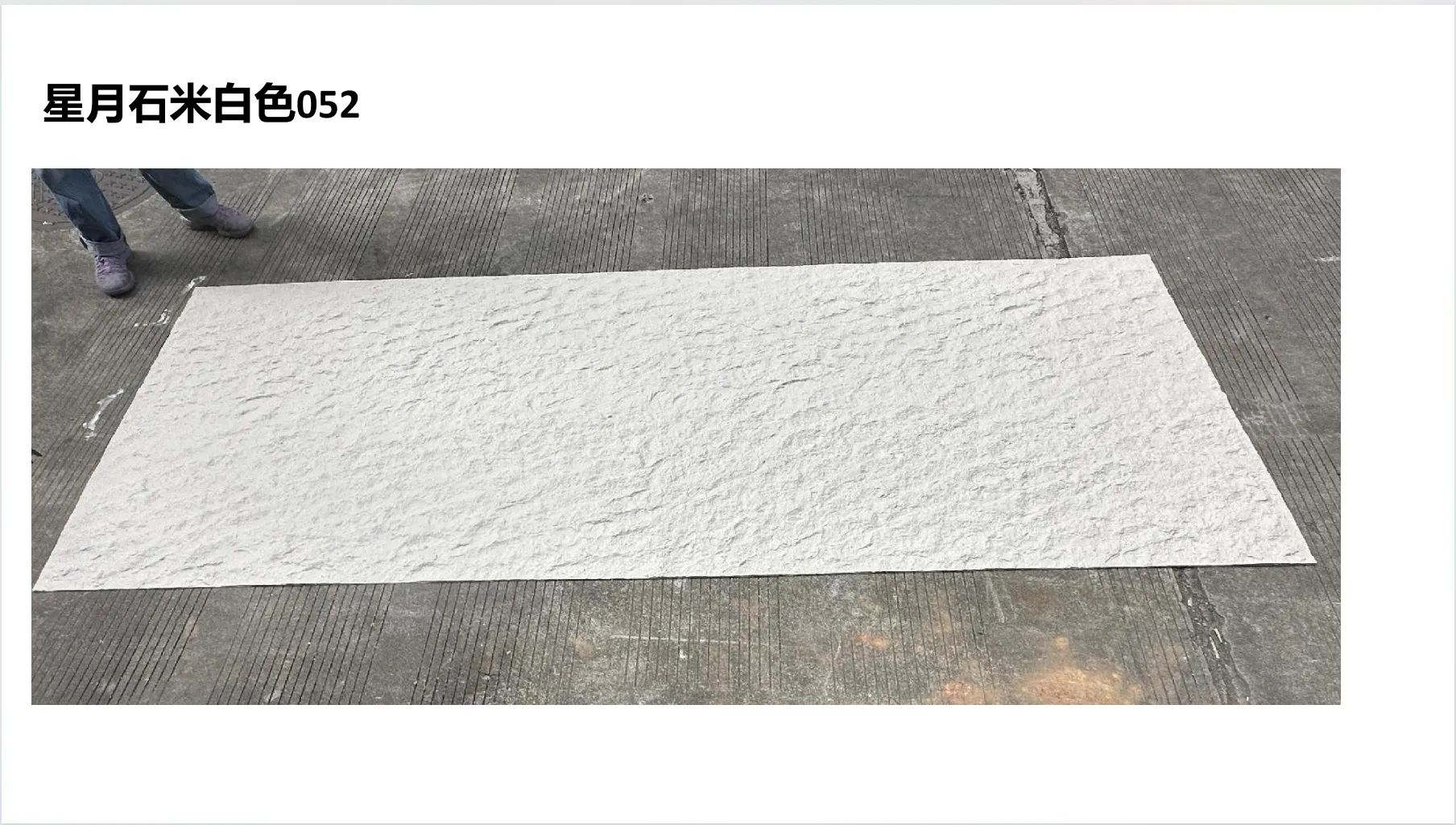
If MCM technology is the canvas, Starmoon Stone is the masterpiece. Designed to capture the magic of a night sky, this series is more than a panel—it's a light show. Run your hand over its surface, and you'll feel a subtle, stippled texture, like fine sand mixed with microscopic crystals. Step back, and under natural light, those crystals catch the sun, creating a "starry" effect that shifts as you move. It's not glittery or gaudy; it's luminous —like looking up at the Milky Way on a clear night.
But what truly sets Starmoon Stone apart is its color versatility. The "starry" lineup alone includes travertine (starry green) , travertine (starry red) , travertine (starry orange) , and travertine (starry blue) —each with a base hue swirled with iridescent particles that reflect light differently. Imagine a yoga studio with walls clad in starry blue Starmoon Stone: as flow through poses, the panels shimmer like a twilight sky, aligning with the brand's focus on "inner peace." Or a children's museum using starry orange to spark curiosity, turning a wall into a "galaxy" that kids (and adults) can't resist touching.
Take the example of "Cielo Café," a fictional brand built around the theme of "cosmic comfort." Their logo features a crescent moon and stars, with a color palette of deep indigo and soft gold. To bring this to life, they chose Starmoon Stone in starry blue for their main accent wall, pairing it with lunar peak golden trim (more on that later). The result? A space where customers don't just "grab coffee"—they feel like they're dining under the stars. Reviews rave about the "magical vibe," and social media is flooded with photos of the wall at sunset, when the starry particles glow like embers. That's the power of color customization: it turns a café into an experience.
Starmoon Stone may steal the spotlight, but MCM's lineup is a symphony of options, each designed to match different brand aesthetics. Let's take a closer look at three standout series and how they're shaping brand spaces:
| Series Name | Material Type | Key Color Variants | Aesthetic Vibe | Brand Match |
|---|---|---|---|---|
| Starmoon Stone | Modified Composite with Crystalline Particles | Starry Green, Starry Red, Starry Blue, Starry Orange | Celestial, Whimsical, Light-Catching | Boutiques, Cafés, Children's Spaces, Wellness Brands |
| Lunar Peak | Mineral-Reinforced Composite | Silvery, Golden, Black | Lunar-Inspired, Sleek, Textured (Like Moon Craters) | Tech Offices, Museums, Luxury Hotels |
| Foamed Aluminium Alloy Board | Aluminium Alloy with Foam Core | Vintage Silver, Vintage Gold, Gold | Industrial-Chic, Metallic, Warm or Cool Sheen | Breweries, Retail Stores, Co-Working Spaces |
| Travertine (Vintage Series) | Composite Travertine Blend | Vintage Silver, Vintage Gold, Vintage Black | Timeless, Rustic-Luxe, Weathered Charm | Heritage Brands, Wine Bars, Art Galleries |
Lunar Peak Silvery : If Starmoon is the night sky, Lunar Peak is the moon itself. The silvery variant, in particular, is a study in subtlety. Its surface is etched with tiny, crater-like indentations that mimic the moon's pockmarked texture, while the color shifts from a cool, mercury-like sheen in direct light to a soft, pearlescent glow in shadow. It's the perfect choice for brands aiming for "quiet luxury"—think a high-end watch store or a minimalist tech firm. One example is "Aether," a smart home company that used Lunar Peak Silvery for their flagship store walls. The panels' moonlit texture aligns with their brand tagline, "Bringing the Future Home," creating a space that feels both cutting-edge and comforting—like living in a home built for astronauts.
Foamed Aluminium Alloy Board (Vintage Silver) : For brands that lean into industrial or retro aesthetics, this series is a dream. Unlike polished aluminum, the vintage silver finish has a soft, brushed texture with hints of warmth—like an old camera or a classic car bumper. It's durable enough for exterior cladding but refined enough for interior accents. Take "Rustic & Co.," a furniture brand that specializes in reclaimed wood pieces. Their showroom features a foamed aluminium alloy board (vintage silver) facade, paired with reclaimed oak shelves. The contrast of the cool metal and warm wood tells their brand story: "old-world craftsmanship, modern durability." Customers often comment on how the facade "feels like a hug from the past," turning casual browsers into buyers.
Travertine (Vintage Gold) : Travertine is a classic, but MCM's vintage gold variant gives it a modern twist. Natural travertine has warm, earthy tones, but the vintage gold treatment amplifies this with a subtle metallic overlay, like sunlight hitting ancient stone. It's rich without being ostentatious—ideal for brands that want to evoke heritage. "Heritage Books," a independent bookstore chain, used travertine (vintage gold) for their checkout counters. The warm, golden hue complements their leather-bound book displays, creating a space that feels like a "library from a bygone era," as one customer put it. It's not just a counter; it's a nod to the brand's mission: "Preserving Stories, One Book at a Time."
So, how does a brand turn a color idea into a physical wall? MCM technology simplifies the process, blending art and science in five key steps:
1. Mood Board Collaboration : It starts with a conversation. Designers and brand managers share the brand's mood board—photos, fabric swatches, even lipstick samples (yes, really!) that capture the desired color and texture. For Starmoon Stone, this might include images of starry skies, forest glades (for starry green), or sunsets (for starry orange).
2. Material Sampling : MCM manufacturers create small, 6x6 inch samples using the brand's color data. These aren't just "painted"—they're made with the same composite formula as the final panels, so the texture and light reflection are accurate. For example, if a brand wants "starry green" with more iridescence, the sample can be adjusted by tweaking the size of the crystalline particles.
3. On-Site Testing : Samples are then tested in the actual space, under different lighting conditions. A "starry blue" that looks perfect in a design studio might appear too dark under fluorescent lights, so adjustments are made. This step is critical—lighting changes everything.
4. Production & Quality Control : Once approved, the panels are mass-produced using MCM's 3D printing or molding technology, ensuring consistency across every piece. Each panel is checked for color accuracy, texture, and durability.
5. Installation & Storytelling : Finally, the panels are installed. But MCM's lightweight design (about 1/5 the weight of natural stone) makes installation quick and easy, minimizing downtime for brands. And here's the bonus: the process itself becomes part of the brand story. "Our walls were custom-made to match our journey," a brand might say, turning the material into a talking point.
Let's be real: brands don't just care about looks—they care about longevity. A stunning wall that fades in sunlight or chips in rain isn't worth the investment. MCM materials solve this with a trifecta of benefits:
Lightweight & Strong : MCM panels weigh 4-6 kg per square meter, compared to natural stone's 25-30 kg. This reduces structural load, making them ideal for high-rises or retrofits. But don't let the weight fool you—they're scratch-resistant and impact-proof, standing up to busy retail floors or high-traffic lobbies.
Weather-Resistant : Whether it's scorching desert sun, freezing snow, or coastal salt spray, MCM panels hold their color and texture. Starmoon Stone's starry particles, for example, are sealed with a UV-resistant coating, ensuring the "starry" effect doesn't fade over time.
Sustainable : Brands today are prioritizing green building materials, and MCM delivers. The manufacturing process uses recycled mineral powders, and the panels are 100% recyclable. Plus, their lightweight nature reduces transportation emissions—a win for both brands and the planet.
As brands compete for attention in a noisy world, the "material story" will only grow more important. It's no longer enough to "have a nice space"—brands need spaces that resonate , that make customers think, "I've never felt this way before." MCM technology, with its focus on color customization and sensory texture, is leading this charge.
Imagine a luxury car dealership using lunar peak black for their walls, the deep, cratered texture mirroring the sleekness of their vehicles. Or a eco-friendly skincare brand using rammed earth board (matcha green) to evoke organic, natural ingredients. These aren't just materials—they're extensions of the brand's promise.
At the end of the day, Starmoon Stone and MCM's other series are more than building materials. They're tools for connection. They turn walls into storytellers, colors into emotions, and spaces into memories. And in a world where brands are fighting for relevance, that's the ultimate competitive edge: not just being seen, but being felt .
So, what's your brand's color story? With MCM technology, the answer is limited only by your imagination. And that's the beauty of it: in the world of MCM, every brand can build a space that's uniquely, unapologetically theirs .
Recommend Products


