
How MCM's versatile materials turn brand identities into tangible, tactile spaces
Walk into a Starbucks, and you're greeted by warm wood tones, earthy greens, and soft lighting that wraps around you like a familiar hug. Step into a Tesla showroom, and it's all sleek grays, cool whites, and metallic accents that scream "innovation." These aren't accidents. Every surface, color, and texture is a deliberate choice to tell a brand's story. But what if your brand's story is bolder? What if it craves a color that's not just "orange," but "the exact shade of a desert sunset with flecks of gold that look like falling stars"? That's where MCM comes in—and Starry Orange Travertine is leading the charge.
In a world where customers crave authenticity, generic building materials fall flat. Brands need surfaces that don't just exist in their spaces—they need surfaces that represent them. Enter MCM (Modified Composite Material), a game-changer in the world of interior design. Lightweight, flexible, and infinitely customizable, MCM materials like MCM flexible stone and the Starry Orange Travertine series are redefining how brands translate their identities into physical form. Let's dive into how this vibrant material, paired with MCM's custom color magic, is turning ordinary interiors into brand experiences.
Before we get lost in the starry allure of orange travertine, let's talk about the backbone: MCM itself. Short for Modified Composite Material, MCM is a blend of natural minerals, polymers, and fibers that marries the best of nature and technology. Think of it as the design world's Swiss Army knife—light enough to install on curved walls, durable enough to withstand high-traffic areas, and versatile enough to mimic everything from rough-hewn stone to polished marble. And at the heart of its appeal? MCM flexible stone, a variant that bends without breaking, opening up a world of installation possibilities (hello, wave panels and semicircle boards) that rigid materials like traditional stone can't touch.
But MCM isn't just about flexibility—it's about personality . With a portfolio spanning everything from the industrial edge of fair-faced concrete to the luxury of marble stream stone, MCM doesn't just offer materials; it offers choices . And for brands, choices mean control. Control over color, texture, and finish. Control over how customers perceive their space. Control over turning a wall into a canvas for their brand's story.
Let's zoom in on the star of the show: Starry Orange Travertine. Picture this: a base of sunlit orange, not too bright to feel overwhelming, but warm enough to evoke memories of summer afternoons. Now, sprinkle across it tiny flecks of gold, amber, and even hints of red—so small they're almost like stardust, but when the light hits them, they catch and sparkle, as if someone scattered a handful of constellations across the surface. That's the "starry" effect, and it's not just visually stunning—it's emotionally resonant. Orange is a color of energy, creativity, and warmth; the starry flecks add depth, turning a flat surface into something dynamic, something that changes as you move around it.
But Starry Orange Travertine isn't a one-trick pony. It's part of a broader travertine family that includes Starry Red, Starry Blue, and Starry Green—each with its own celestial twist. For brands with a bold color palette, this range is a dream. Imagine a juice bar with a Starry Red Travertine countertop, its crimson base and starry gold flecks mirroring the brand's "vibrant, fresh, and joyful" mission. Or a tech startup using Starry Blue Travertine in their lobby, the cool blue base with silver stars aligning with their "innovative, out-of-this-world" brand persona.
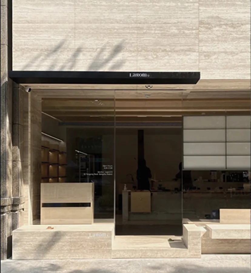
What makes Starry Orange stand out, though, is its versatility. It pairs beautifully with neutrals (think Lunar Peak Silvery walls for a modern contrast) or other warm tones (hello, Foamed Aluminium Alloy Board in vintage gold for a luxe, layered look). It works in high-traffic areas like restaurant facades and low-key spots like hotel lounge accent walls. And because it's MCM, it's built to last—no fading, no chipping, just that same starry glow for years to come.
Here's the thing: most brands don't fit into a "standard color chart." Maybe your brand's signature color is "Rona Yellow," a soft, buttery shade that's been in your logo since 1992. Or perhaps it's "Cloud-Dragon," a moody gray with subtle blue undertones that represents your brand's "calm strength." Whatever it is, MCM gets it: your color isn't just a hex code—it's part of your identity. That's why custom color matching isn't an afterthought for MCM; it's a promise.
How does it work? Let's say you're a boutique hotel chain with a brand color palette centered around "Golden Faith," a warm gold that feels both luxurious and approachable. You want your lobby walls to feature this exact gold, but you don't want something as cold as metal or as fragile as real gold leaf. MCM's solution? A custom batch of Lunar Peak Golden, tweaked to match "Golden Faith" down to the last hue. Lunar Peak, a fan favorite in the MCM lineup, already offers Silvery, Golden, and Black variants—metallic-inspired finishes that mimic the sheen of moonlight on stone. But with custom color matching, it becomes yours . The result? Walls that don't just look like your brand—they are your brand.
And it's not just about solid colors. The starry effect in Starry Orange Travertine? That can be customized too. Want more "stars" for a more dramatic look? Done. Prefer the flecks in a specific shade (say, your brand's accent color, "Starry Red")? Consider it handled. MCM's 3D printing series even lets you add texture patterns—like wood grain or linear travertine—to further align with your brand's aesthetic. It's design without limits.
Starry Orange Travertine and Lunar Peak are just the tip of the iceberg. MCM offers a range of series that thrive with custom color matching. Here's a snapshot of the most popular options for brands craving that perfect hue:
| Series Name | Signature Vibe | Custom Color Potential | Best For Brands That Want To... |
|---|---|---|---|
| Starry Travertine (Orange, Red, Blue, etc.) | Celestial, warm, dynamic | Adjust base color (orange, red, blue) and star fleck density/color | Evoke energy and creativity (cafés, co-working spaces, kids' brands) |
| Lunar Peak (Silvery, Golden, Black) | Metallic, sleek, modern | Tweak metallic sheen (matte vs. glossy) and base tone (cool silver, warm gold) | Project luxury or innovation (tech offices, high-end retail, boutique hotels) |
| Foamed Aluminium Alloy Board (Vintage Silver, Gold, etc.) | Industrial-chic, retro, bold | Customize vintage patina (more/less "wear") and base metal color (brass, copper, nickel) | Nail that "retro-modern" aesthetic (brewpubs, fashion boutiques, art galleries) |
| Rammed Earth Board (Gradient, Matcha Green, etc.) | Earthy, organic, grounding | Blend custom gradient colors (sunset oranges to terracotta reds) or solid earth tones | Emphasize sustainability or connection to nature (eco-brands, wellness centers, farm-to-table restaurants) |
| Fair-Faced Concrete | Minimalist, raw, industrial | Adjust gray tone (warm "cement" gray vs. cool "steel" gray) and aggregate visibility | Keep it sleek and modern (tech startups, minimalist retail, contemporary art spaces) |
Let's put this all into context with a real-world scenario. Meet "Sunny Side Up," a local café chain known for its bright, cheerful vibe and signature "sunrise latte" (topped with orange foam, naturally). Their brand colors? A warm "sunrise orange" and "cloud white," with accents of "wheat gold." When they opened their new flagship location, they wanted the interior to feel like a "hug in a cup"—cozy, energetic, and unapologetically Sunny .
The design team initially struggled to find a wall material that matched their "sunrise orange." Traditional terracotta was too dull; painted drywall felt cheap; real stone was too heavy for their second-floor space. Then they discovered MCM's Starry Orange Travertine. After a quick chat with MCM's color team, they adjusted the base orange to match their brand's exact "sunrise" shade and added wheat gold flecks (instead of the standard amber) to tie in their accent color. The result? A feature wall behind the counter that shimmers like a sunrise frozen in time. Customers often snap photos of it, tagging #SunnySideVibes—and the café's social media engagement spiked 30% post-opening.
But they didn't stop there. To balance the warmth, they paired the Starry Orange wall with Lunar Peak Silvery panels on the ceiling (custom-matched to their "cloud white" logo) and Foamed Aluminium Alloy Board (vintage gold) for the shelving, creating a space that's cohesive, Instagram-worthy, and 100% Sunny Side Up.
Custom colors and stunning aesthetics are great, but let's talk practicality. Brands don't just want their spaces to look good—they want them to last , and they want to feel good about their environmental impact. MCM checks both boxes.
First, durability. MCM flexible stone and other MCM materials are built to withstand the chaos of real life. They're water-resistant (perfect for restaurants and bathrooms), scratch-resistant (hello, high-traffic retail), and fade-resistant (so that Starry Orange stays starry, even in direct sunlight). Unlike real stone, which can crack under pressure, MCM bends and adapts—ideal for quirky installations like wave panels or curved walls.
Then there's sustainability. MCM is a champion of green building materials. It uses recycled content, requires less energy to produce than traditional stone, and is 100% recyclable at the end of its life. For brands prioritizing eco-friendly practices (and let's face it, most consumers do these days), MCM isn't just a design choice—it's a values choice. It says, "We care about the planet, and we care about the quality of the spaces we create."
Ready to turn your brand's color palette into a tangible space? The process is simpler than you might think. Start by sharing your brand's color codes (Pantone, RGB, whatever you've got) with MCM's design team. They'll create physical samples—yes, actual swatches you can touch and hold—to ensure the color is perfect. Once you sign off, they'll manufacture the material (in as little as 2–3 weeks for standard orders) and ship it to your location. Installation is a breeze, too—MCM's lightweight nature means it can be applied to most surfaces with minimal prep, saving time and labor costs.
And if you're stuck for inspiration? MCM's portfolio is full of ideas. Want to mix textures? Pair rough granite stone (medium grey) with polished Starry Orange Travertine for contrast. Craving something futuristic? Try 3D art concrete board with a custom gradient color. The only limit is your brand's imagination.
At the end of the day, interiors are more than just walls and floors—they're the first impression customers have of your brand. They're where memories are made, where purchases are decided, where loyalty is built. Starry Orange Travertine and MCM's custom color magic don't just decorate spaces—they elevate them. They turn "a nice wall" into "a conversation starter," "a generic café" into "a destination," and "a brand" into "an experience."
So whether you're a startup with a bold color palette, a heritage brand updating your look, or a hospitality group craving that "wow" factor, MCM has your back. With materials that flex, colors that match, and a commitment to quality and sustainability, it's time to let your brand's true colors shine—one starry, stunning surface at a time.
Recommend Products


