
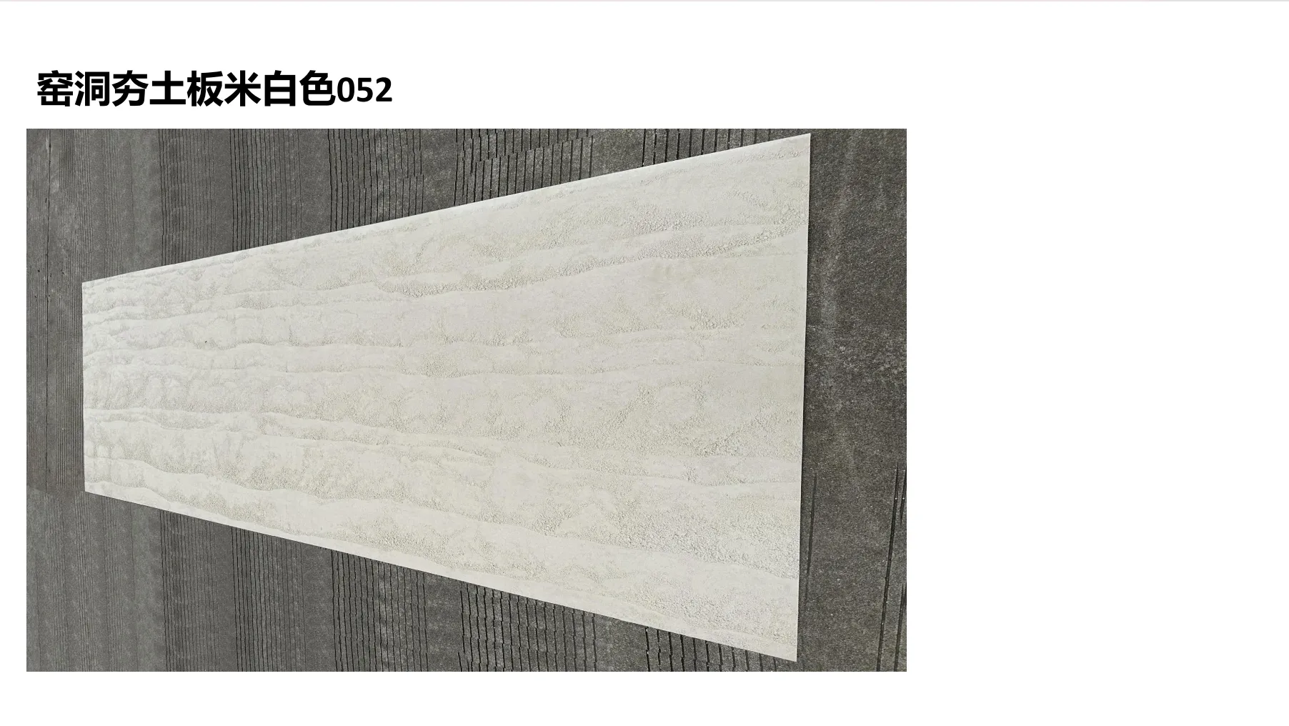
There's a moment we've all experienced: walking into a room and feeling an immediate, unspoken connection to the space. Maybe it's the way light plays on the walls, or how the texture under your fingertips feels like a memory. In 2025, that "feeling" is being shaped by a material that's equal parts art and architecture: gradient color rammed earth boards. These aren't just building materials—they're stories told in layers of color, texture, and light. Blending the raw warmth of traditional rammed earth with modern design sensibilities, they turn walls, facades, and surfaces into living, breathing landscapes. Today, we're diving into five standout designs that are redefining what "natural" looks like in homes, offices, and public spaces. From soft, silvery transitions that mimic moonlit peaks to bold, starry hues that evoke midnight skies, these gradients are proof that the most memorable spaces aren't just designed—they're felt.
Picture standing at the base of a snow-capped range as the sun dips below the horizon. The peaks, once glowing gold, fade to a soft silver, while the lower slopes warm into honeyed taupe. That's the story behind Lunar Haze —a gradient that borrows its soul from Lunar Peak Silvery, one of this year's most sought-after finishes. It's not just about color; it's about capturing the fleeting beauty of transition, when day surrenders to night and stone feels almost alive with light.
The magic here is in the blend: starting at the top with a muted, moonlit silver (think polished aluminum touched by frost), the gradient melts into warm taupe (the color of sun-baked earth) before ending in a whisper of amber at the base. It's subtle—no harsh lines, just a flow that feels as natural as a sunset. In morning light, the silver leans cooler, almost blue-tinged; by evening, the amber warms up, turning the wall into a cozy, glowing backdrop.
Texture: Smooth but not flat. Run your hand over it, and you'll feel the faint, organic grain of rammed earth—tiny ridges and valleys that catch light and shadow, making the gradient shift as you move. It's polished enough for modern spaces but retains that "handmade" warmth that synthetic materials can't replicate.
Imagine waking up to this behind your bed: the silvery top mimicking morning light, the taupe warming the room as the day goes on. It's serene without being sterile—perfect for turning your bedroom into a retreat.
Pair it with black metal fixtures and potted olive trees, and suddenly the lobby feels like a mountain lodge with a modern edge. Guests won't just check in—they'll pause, stare, and maybe even snap a photo.
Need focus? The soft gradient is easy on the eyes, reducing visual clutter while still adding enough interest to keep creativity flowing. It's the kind of wall that makes even spreadsheets feel a little more inspiring.
Lunar Haze succeeds because it's versatile. It plays well with minimalism (pair it with white linens and sleek furniture) but also holds its own against boho or rustic decor (think woven rugs and wooden accents). It's a gradient that doesn't demand attention—it invites it, quietly, like a well-told secret.
What if you could bottle the feeling of standing on a bridge, looking down at a river that's reflecting the stars? Starry River Blue does just that. Inspired by Travertine (starry blue)—a finish known for its tiny, glittering flecks—this gradient is a love letter to dark, dreamy nights. It's bold, yes, but not overwhelming; the blue here is deep but soft, like ink diluted with water, and the "stars" (microscopic mineral deposits in the travertine) catch light, turning the wall into a galaxy you can reach out and touch.
Start at the bottom with a rich, moody indigo (the color of the ocean at midnight), then watch as it lightens into sky blue (the hue of dawn just before the sun rises). But the real star? The travertine's natural "starry" texture—tiny, iridescent flecks that look like distant galaxies scattered across the gradient. In low light, they glow like embers; in bright light, they twinkle, making the wall feel dynamic, almost alive.
Texture: Slightly porous, with the classic travertine "pockmark" texture (though refined, so it's not rough). Those tiny holes are what give it depth—they trap light, making the blue feel deeper in some spots, lighter in others. It's tactile, inviting you to lean in and examine the details, like a kid staring at the night sky and picking out constellations.
Turn movie night into an immersive experience. With the lights down, the indigo base feels like a theater curtain, while the starry flecks mimic the night sky. It's cinema meets planetarium.
Imagine sipping coffee under a ceiling that looks like a midnight river. Paired with warm pendant lights, it turns a small café into a cozy, otherworldly spot—perfect for lingering over lattes and daydreams.
Yes, bathrooms! The travertine is sealed, so moisture isn't an issue. Picture a shower with this gradient behind the tiles—stepping in feels like stepping into a moonlit stream.
Starry River Blue isn't just pretty—it's memorable. Guests will ask, "Is that real stone?" "How did they get the stars in there?" It turns a plain wall into a talking point, proving that bold color doesn't have to mean loud. Sometimes, the most striking spaces are the ones that make you feel like you've stepped into a dream.
Walk through a bamboo forest at sunrise, and you'll understand Bamboo Mist . The leaves, heavy with dew, glow in chartreuse and sage, while the trunks fade into warm beige, blurred by mist. This gradient borrows from Bamboo Mat Board, a texture that's been trending for its woven, organic feel, but elevates it with color that feels fresh and alive. It's nature, but make it modern—no kitschy "tropical" vibes, just the quiet elegance of a forest waking up.
Start at the top with a soft sage green (the color of new bamboo shoots), then drift into mint (dew on leaves) before settling into warm sand beige (the color of sunlit earth) at the bottom. It's a gradient that breathes—cool enough to calm, warm enough to comfort. In rooms with lots of natural light, the green pops; in shadier spots, the beige takes center stage, making the space feel grounded.
Texture: Think of a bamboo mat that's been pressed into stone. The surface has gentle, linear grooves—like the lines of bamboo stalks—running horizontally across the gradient. It's smooth to the touch but has visual texture, adding depth without overwhelming. Run your finger along the grooves, and you'll swear you can feel the "grain" of the bamboo.
Give your kitchen a natural focal point. Pair Bamboo Mist with white cabinetry and wooden countertops, and suddenly, chopping veggies feels like cooking in a forest clearing.
Imagine downward dogging in front of this gradient. The green calms the mind, the beige grounds the body—it's the perfect backdrop for mindfulness.
Sunrooms are all about bringing the outdoors in, and Bamboo Mist takes that to the next level. With floor-to-ceiling windows, the gradient blends with the actual greenery outside, making the room feel like an extension of the garden.
Green can be tricky—too bright, and it feels trendy; too muted, and it fades. Bamboo Mist hits the sweet spot. It works with boho, Scandinavian, and even industrial styles (pair it with black metal and concrete floors for an edgy-natural mix). And unlike fads that come and go, this gradient feels rooted in something eternal: the quiet beauty of a forest at dawn.
Industrial design gets a bad rap for being cold—all steel and gray, no soul. Concrete Dawn is here to change that. Inspired by fair-faced concrete (a finish prized for its raw, unpolished look), this gradient marries the toughness of industrial style with the warmth of a sunrise. Think of an old factory wall, weathered by time, suddenly bathed in the first light of day: the concrete gray softens, blushing into peach and gold. It's industrial, yes—but with a heart.
The gradient starts with the cool, ashy gray of fair-faced concrete (think the color of wet stone on a rainy day), then melts into a soft blush peach (the hue of dawn breaking over city rooftops) before ending in a whisper of gold at the base. It's unexpected—gray and peach shouldn't work, but they do. The contrast is subtle, not jarring; it's like finding a flower growing through concrete—proof that beauty thrives in the unlikeliest places.
Texture: Raw and honest. This isn't polished concrete—it's got character. You'll see faint trowel marks, tiny air bubbles, and the occasional "imperfection" that makes it feel handcrafted. It's rough enough to add edge but smooth enough to run your hand over without catching. In direct light, the texture casts shadows, making the gradient look like it's moving.
Pair with leather sofas, exposed brick, and Edison bulbs. The gradient softens the hard edges, turning a "cold" industrial space into something that feels like home.
Make a statement without being stuffy. Concrete Dawn says "we're modern and bold" but also "we care about making you feel welcome." Perfect for creative agencies or tech startups.
Yes, it's durable enough for the outdoors! Imagine grilling with friends, with this gradient behind you—gray in the shade, peach glowing in the sunset. It turns a simple patio into an Instagram-worthy spot.
Concrete Dawn is for the rule-breakers—the ones who love industrial style but don't want to sacrifice warmth. It proves that "natural" doesn't have to mean "rustic." Sometimes, the most natural thing is embracing contrast: the rough and the soft, the gray and the peach, the old and the new. In a world of sameness, that's a powerful statement.
Last but never least, Earthen Sunset is for those who want their walls to roar. Inspired by the gradient color rammed earth board itself—this design is unapologetically bold, channeling the drama of a desert sunset where the sky turns from rusty red to molten gold. It's not subtle, but it's deeply satisfying—like standing at the edge of the world and watching the sky catch fire. This is for spaces that want to make a statement: "Here, we live boldly."
Start at the top with a rich, earthy rust (the color of oxidized iron, warm and deep), then melt into terracotta (think sun-baked clay pots in a Mediterranean village) before exploding into golden amber at the base (like liquid honey in sunlight). It's a gradient that demands attention, but it's never garish—thanks to the earthy undertones that ground it. In morning light, the red leans cooler, almost burgundy; by evening, the amber takes over, turning the wall into a furnace of warmth.
Texture: Rough-hewn and tactile. This is rammed earth in its most authentic form—you can see the layers of soil and pigment, pressed together by hand. It's gritty, with a matte finish that soaks up light, making the colors feel deeper and more intense. Run your hand over it, and you'll feel the history—the same texture that has defined homes for centuries, now reimagined with modern color.
Make your restaurant impossible to miss. Earthen Sunset turns the exterior into a beacon—people will stop, take photos, and wonder what's inside (spoiler: the food better be as good as the walls).
Frame your fire with a gradient that matches its heat. The rust and amber echo the flames, turning a simple fireplace into the heart of the home.
Turn your garden into a desert oasis. Pair with cacti, succulents, and string lights, and suddenly, your backyard feels like a Moroccan riad—exotic, warm, and full of life.
Bold color can be scary, but Earthen Sunset pulls it off because it's rooted in nature. Deserts don't apologize for their sunsets—they own them. This gradient does the same. It's for people who want their spaces to reflect their passion, their energy, their refusal to blend in. In a world that often plays it safe, that's a beautiful thing.
As we wrap up, it's clear that gradient color rammed earth boards are more than a trend—they're a movement. In a time when so much of our lives feels digital and disconnected, these designs pull us back to the physical world: the feel of texture under our hands, the way light shifts across a gradient, the emotion of color that flows like a story. Whether you're drawn to the quiet elegance of Lunar Haze, the starry drama of Starry River Blue, or the bold fire of Earthen Sunset, these boards remind us that the best spaces aren't just built—they're lived in, loved, and remembered.
So, what will your story be? Will your walls whisper of moonlit peaks, or roar of desert sunsets? Whatever you choose, remember: in 2025, the most beautiful spaces aren't designed for the eyes. They're designed for the heart.
Recommend Products


