
If you've ever walked into a space and felt instantly at home, or paused to stare at a wall that seemed to tell a story, chances are travertino had a hand in it. This timeless stone, with its porous texture and organic charm, has been a favorite of designers and homeowners for decades. But here's the thing: travertino isn't just "that beige stone" anymore. These days, it's a chameleon, shifting from warm neutrals to bold statement shades, from vintage metallics to cosmic-inspired hues. Let's dive into the world of travertino color variations—where tradition meets innovation, and every shade has a personality of its own.
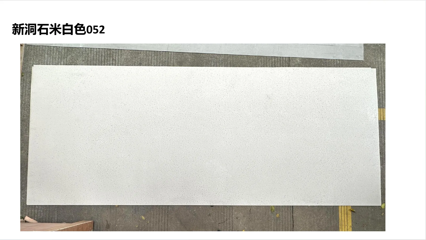
Let's start with the OG—beige travertino. It's the color that comes to mind when someone says "travertino," and for good reason. Picture a sunlit kitchen with countertops that look like they've been kissed by desert sands, or a bathroom floor that feels warm underfoot even on chilly mornings. Beige travertino isn't just a color; it's a feeling. Its earthy undertones—sometimes leaning pink, sometimes golden—create a sense of calm that's hard to replicate. What makes it so versatile? Those subtle, feathery veins that run through the stone, each one unique, like a fingerprint. No two slabs are identical, which means your space gets a one-of-a-kind look without trying too hard.
Then there's ivory travertino—beige's softer, more refined cousin. If beige is a cozy cabin, ivory is a sunlit coastal cottage. It has a lighter base, with undertones that dance between warm cream and pale gold. Ivory travertino shines in spaces where you want brightness without starkness. Think: a living room with large windows, where the stone walls reflect natural light and make the room feel airy. Or a bedroom with ivory travertino accents, paired with soft linens and wooden furniture—pure serenity. Designers love it for its ability to make small spaces feel larger, and it pairs beautifully with just about anything: dark wood, black metal, even pops of color like sage green or terracotta.
But don't mistake these classics for boring. Modern beige and ivory travertino often come with updated finishes—think honed (matte) surfaces that hide fingerprints better than polished stone, or brushed textures that add a subtle grip, perfect for floors. And while they're timeless, they play well with trends too. Pair beige travertino with a sleek, minimalist kitchen for a "less is more" vibe, or mix ivory with bohemian decor for a look that's both grounded and free-spirited. These neutrals aren't just backdrops; they're the foundation on which great design is built.
Now, let's talk about the rebels of the travertino family: the vintage metallics. If classic neutrals are the comfort food of design, these are the gourmet dishes—rich, unexpected, and full of character. Take travertine (vintage silver), for example. It's travertino, but with a twist: a cool, silvery sheen that looks like it's been weathered by time and touched by moonlight. Imagine an accent wall in a modern loft, where the silver tones catch the light and add depth to an otherwise monochromatic space. Or a restaurant bar top that feels both industrial and luxurious, pairing perfectly with black leather stools and Edison bulbs. What's striking about vintage silver is its duality—it can feel edgy or elegant, depending on the setting. Run your hand over it, and you'll notice a texture that's slightly rough, like a stone that's seen the world, which only adds to its charm.
Then there's travertine (vintage gold)—the warm, glamorous sibling. If vintage silver is a moonlit night, vintage gold is a sunset over the Mediterranean. It has a soft, brushed metallic finish that's never too flashy—more "old-world luxury" than "glitzy showroom." I've seen it used in hotel lobbies, where a feature wall of vintage gold travertino welcomes guests with a sense of opulence that feels approachable. It's also stunning in residential spaces: picture a home office with a vintage gold travertino desk, paired with dark wood and green plants—a space that feels productive yet indulgent. What's clever about these vintage metallics is how they blend the natural beauty of travertino with a hint of modernity. They're not painted or coated; the metallic effect comes from a special treatment that enhances the stone's natural minerals, giving it that aged, lived-in look without sacrificing durability.
And let's not forget vintage black travertino—though not a metallic, it's part of this "vintage" family, with a deep, moody hue that feels both mysterious and sophisticated. It's perfect for creating contrast: a black travertino fireplace in a white-walled living room, or a backsplash in a kitchen with white cabinetry. The key here is balance—too much black can feel heavy, but used sparingly, it adds drama and depth. Together, these vintage tones prove that travertino can be both a traditional choice and a bold statement, all at once.
If vintage metallics are about aged elegance, the starry series is about wonder. Imagine looking up at the night sky and seeing stars scattered across a deep, dark canvas—that's the magic of travertine (starry green). This isn't your average green stone; it has a rich, forest-green base, and embedded within it are tiny flecks of lighter minerals that catch the light like distant stars. It's otherworldly, almost surreal, and it's become a favorite for designers who want to make a statement. I visited a boutique hotel in Barcelona last year where the lobby featured a starry green travertino wall behind the reception desk, and it was like walking into a planetarium. Guests would stop mid-conversation to stare at it, pointing out "constellations" in the stone. It's not just a wall—it's an experience.
Starry red travertino takes that drama up a notch. Picture a deep, terracotta-red base with gold and silver flecks that shimmer when the light hits them. It's bold, unapologetic, and perfect for spaces that want to stand out. I've seen it used in restaurants with a Mediterranean theme, where a starry red accent wall pairs with olive green banquettes and wooden tables, evoking the warmth of a Tuscan sunset. It's also surprisingly versatile—use it sparingly, like in a powder room with white fixtures, and it becomes a playful pop of color. Use it on a larger scale, like a commercial space or a statement staircase, and it becomes a work of art. What's amazing is how the starry effect is created: during the stone's formation, minerals like iron and manganese crystallize, creating those tiny, sparkling flecks. It's nature's own light show.
And let's not overlook the other starry shades: starry orange, starry blue, starry orange. Starry orange is like a desert dawn, with a warm, amber base and flecks that look like embers. Starry blue is cool and calming, like a midnight ocean with bioluminescent plankton. These colors aren't for the faint of heart, but that's the point. They're for the dreamers—the designers who want a space to tell a story, to spark conversation. I once worked with a homeowner who wanted their home theater to feel like a private planetarium; we used starry blue travertino on the walls, paired with dim lighting, and let's just say movie nights there are never just about the film.
So, why does all this color variation matter? Because color isn't just about aesthetics—it's about emotion, about function, about creating a space that works for you. Let's break it down. Take a small bathroom, for example. If you use a light ivory travertino on the walls and floor, it will feel larger and brighter, making those early-morning routines a little easier. Swap that for starry red, and suddenly the space feels bold and energizing—great for a guest bathroom that wants to make an impression, but maybe not ideal for a relaxing soak. In a commercial setting, like a coffee shop, beige travertino might create a cozy, "third place" vibe that makes customers stay longer, while vintage silver could appeal to a younger, more trend-focused crowd.
Lighting also plays a huge role in how these colors read. Beige travertino that looks golden in morning sunlight might take on a pinkish hue in the evening, thanks to warm overhead lights. Vintage gold, on the other hand, glows under soft, yellow lighting but can look more muted under cool, blue-toned LEDs. That's why it's always a good idea to take a sample of the stone home and test it in different lighting—you'll be surprised how much it can change. I once had a client who fell in love with a slab of starry green travertino in the showroom, under bright fluorescent lights, but when we installed it in their dining room (which had warm pendant lights), the green deepened, and the flecks seemed to glow more intensely. They ended up loving it even more—it was like the stone adapted to their space, not the other way around.
Another thing to consider is pairing travertino with other materials. Beige travertino and wood are a match made in heaven—think a wooden dining table on a beige travertino floor, creating a warm, rustic look. Vintage silver travertino pairs beautifully with concrete and steel, perfect for an industrial-chic loft. Starry red? Try it with black marble accents for a bold, high-contrast look, or with neutral textiles to let the stone be the star. The key is balance—you don't want to overwhelm a space with too many textures or colors, but when done right, the combination can be magic.
| Color | Undertones | Texture & Finish | Ideal Design Style |
|---|---|---|---|
| Beige Travertino | Warm (golden, pink, or earthy) | Smooth with subtle, feathery veining; honed or polished | Rustic, traditional, coastal |
| Ivory Travertino | Cool to warm (cream, pale gold) | Light, airy with fine veining; often honed for softness | Minimalist, Scandinavian, bohemian |
| Travertine (Vintage Silver) | Cool (silver, gray) | Weathered, slightly rough texture; brushed metallic finish | Industrial, modern, edgy |
| Travertine (Vintage Gold) | Warm (gold, brass) | Soft, brushed metallic finish; subtle grain | Luxury, mid-century modern, art deco |
| Travertine (Starry Red) | Warm (terracotta, amber) | Deep base with sparkling mineral flecks; matte or satin | Statement walls, eclectic, maximalist |
| Travertine (Starry Green) | Cool (forest green, teal) | Dark base with bright, star-like flecks; textured surface | Contemporary, cosmic, high-end commercial |
As designers push boundaries and homeowners crave spaces that feel personal, travertino color variations will only get more creative. We're already seeing innovations—like gradient travertino, which shifts from one hue to another, or travertino mixed with other materials (think: travertino and glass flecks for a modern twist). And let's not forget sustainability. Many of these new color treatments use eco-friendly processes, ensuring that we can enjoy these beautiful stones without harming the planet. It's exciting to think about where travertino will go next—maybe we'll see iridescent shades, or color-changing travertino that shifts with temperature or light. The possibilities are endless.
But no matter how many new colors emerge, the heart of travertino will always be its authenticity. It's a natural stone, formed over millions of years, with imperfections that make it perfect. Whether you choose a classic beige, a vintage metallic, or a starry statement shade, you're bringing a piece of the earth into your space—one that will age gracefully, tell stories, and adapt to your life. That's the beauty of travertino: it's not just a material. It's a companion.
So, the next time you're planning a design project, don't just think "stone"—think travertino. Think about the feeling you want to create, the stories you want to tell, and let the colors guide you. From beige to ivory, from silver to starry green—there's a travertino shade out there that's perfect for you. And who knows? Maybe you'll be the one to start a new trend, proving that even the oldest stones can teach us something new about beauty.
Recommend Products


