
Walk into a high-end boutique hotel lobby, and your eyes might drift to a wall that seems to hold the weight of both modern boldness and timeless elegance. It's not just stone—it's a story. Deep, inky black stretches across the surface, interrupted by veins of gold that twist and turn like rivers of liquid sunlight. Run your hand over it, and you'll feel a texture that's smooth yet subtly tactile, cool to the touch but warming the space with its presence. That, more often than not, is Slate Portoro. A material that doesn't just decorate; it commands attention, sparks conversation, and turns ordinary rooms into experiences.
In the world of architectural and interior design, where choices range from the understated (think fair-faced concrete) to the opulent (like marble interstellar gray), Slate Portoro stands out as a statement maker. It's the kind of stone that designers reach for when they want to balance drama with sophistication, edge with warmth. But what exactly is Slate Portoro? Where does it come from, and what makes it so coveted? Let's dive in.
Slate Portoro isn't your average stone. Unlike common options like lime stone (beige) or even the more textured gobi panel, it's a specific variant of slate—a metamorphic rock formed from sedimentary deposits over millions of years. Its name hints at its roots: "Portoro" evokes the classic Portoro marble, known for its striking black-and-gold veining, but Slate Portoro carves its own path with a slate base that adds depth and durability marble often lacks.
Geologically, Slate Portoro forms when clay-rich sediments are subjected to intense heat and pressure, transforming into dense, fine-grained slate. What makes it unique is the presence of mineral impurities—iron oxides and sulfides—that create those iconic golden veins. These veins aren't just random; they're like geological fingerprints, each slab telling a story of the earth's slow, patient artistry. No two pieces are identical, which is part of its allure. You're not just installing stone; you're bringing a one-of-a-kind piece of the planet into your space.
While exact quarries are often guarded secrets (to protect the stone's exclusivity), Slate Portoro is typically sourced from regions with rich slate deposits, where the geological conditions align to produce that signature black-and-gold contrast. Miners and craftsmen treat each block with reverence, knowing they're extracting something far more valuable than raw material—they're extracting a legacy.
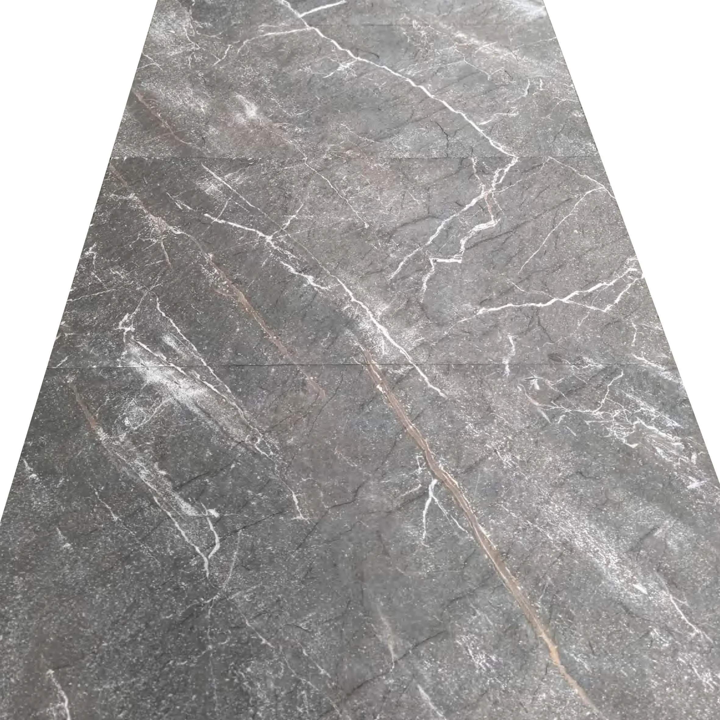
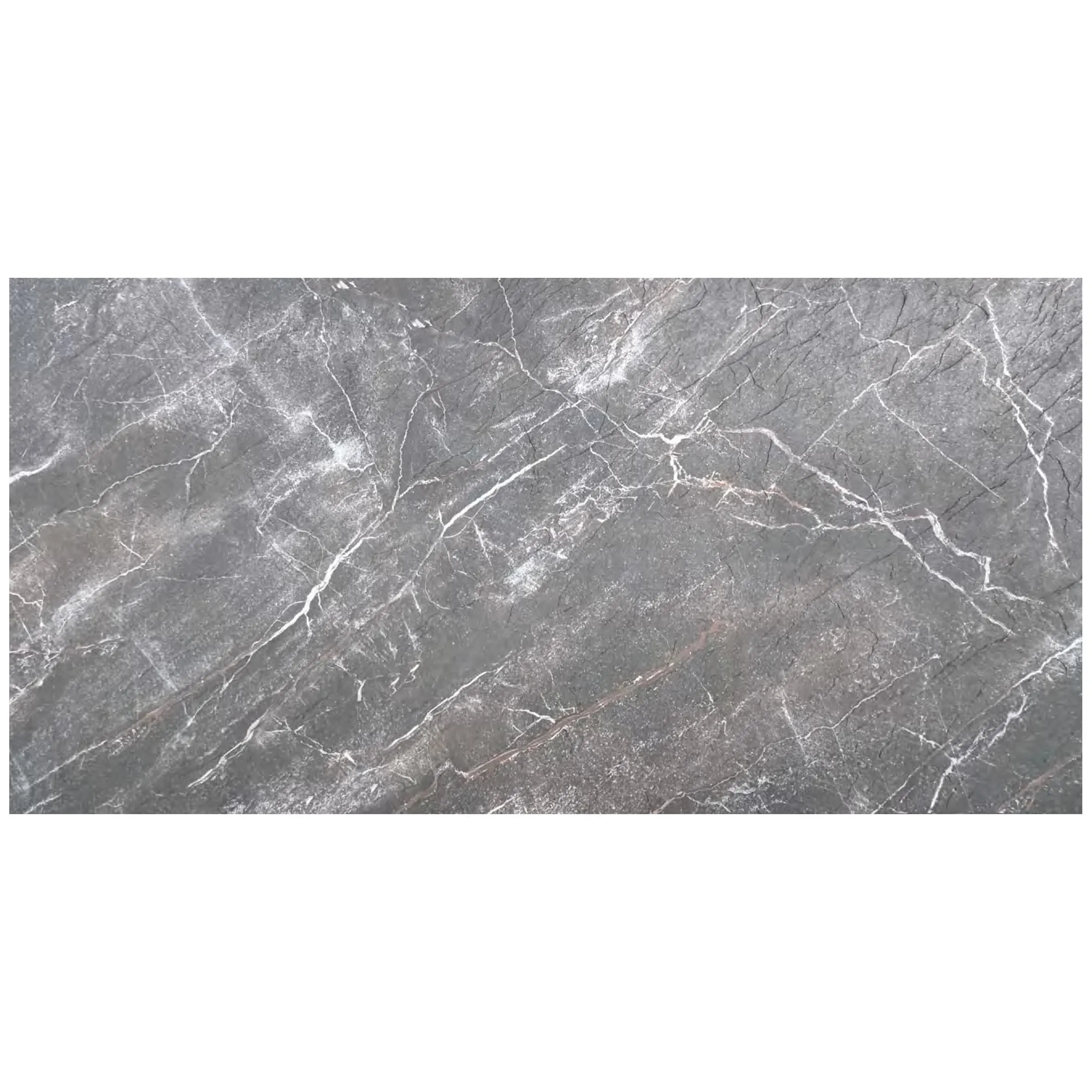
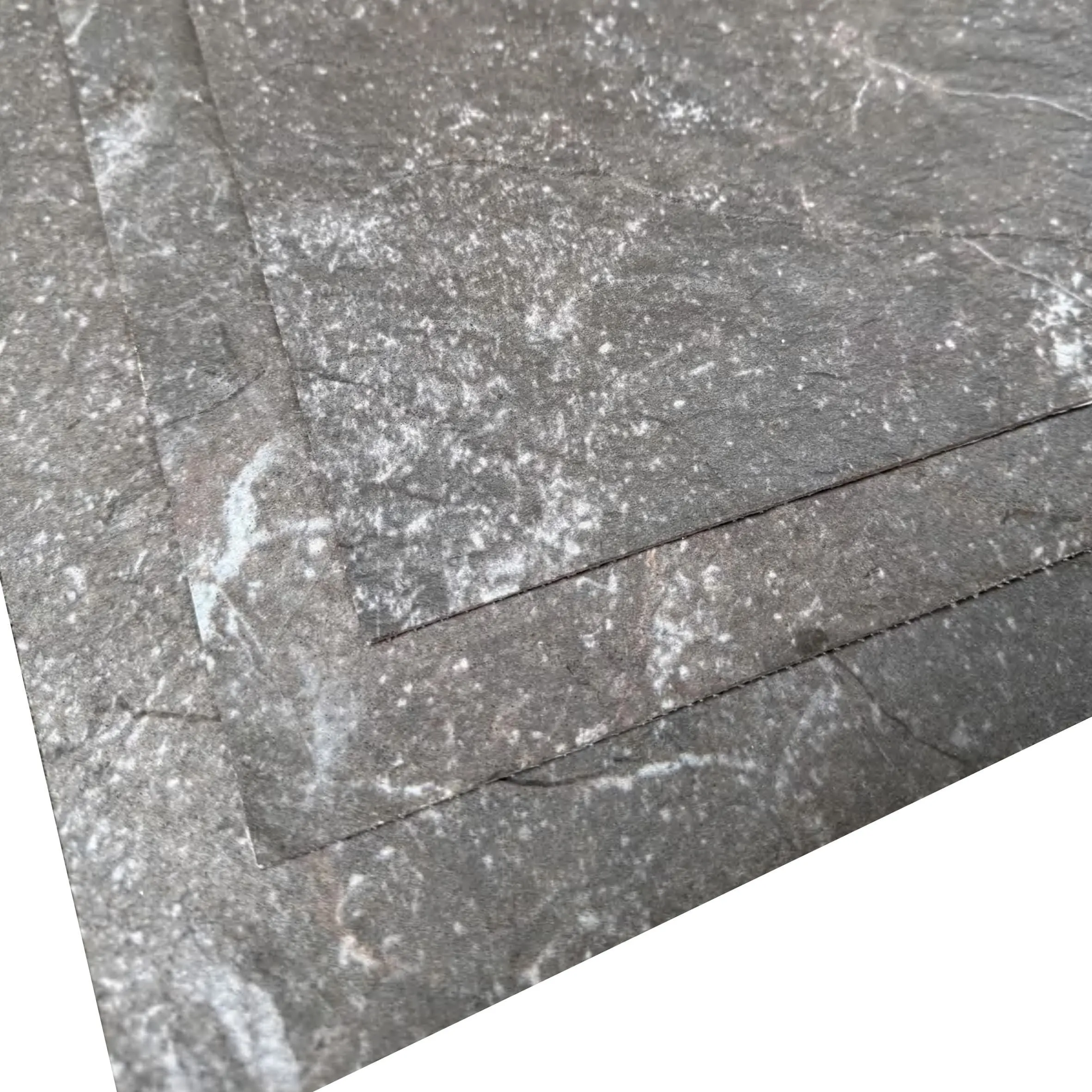
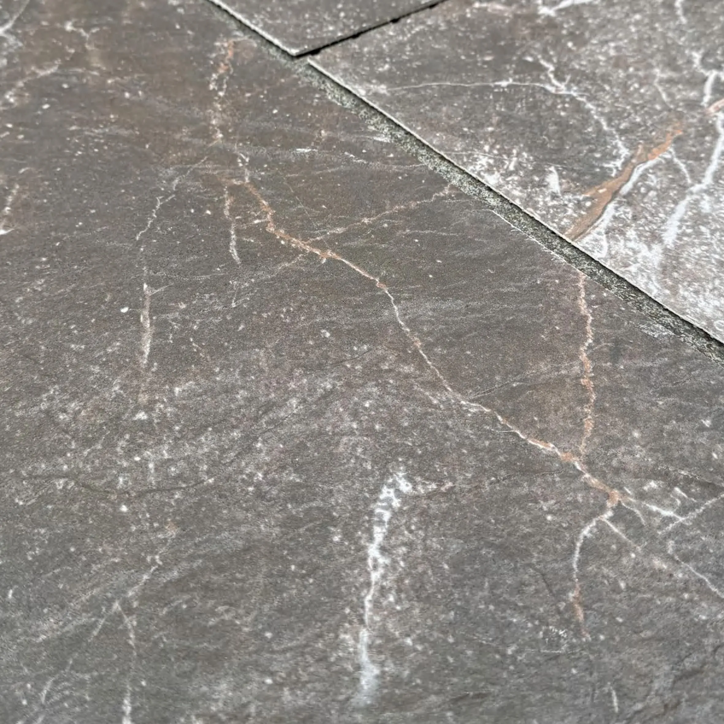
Let's talk about the look . If you've ever seen Slate Portoro in person, you know it's not subtle. Its base is a deep, velvety black—darker than slate portoro's cousin, slate veil white, and more uniform than the speckled chaos of gravel omani stone. But it's the veins that steal the show: thick, irregular streaks of gold, sometimes brassy, sometimes coppery, that cut through the black like lightning frozen in time. It's bold, but not garish. Think of it as a tuxedo for walls—formal, refined, and impossible to ignore.
Texture plays a role too. Unlike the polished sheen of marble veil white or the rough-hewn feel of boulder slab (vintage black), Slate Portoro often sits in the sweet spot between polished and matte. A honed finish brings out the depth of the black while keeping the gold veins soft and diffused, making it ideal for spaces where you want warmth without glare. A polished finish, on the other hand, amps up the drama: the black becomes a mirror, reflecting light, while the gold veins shimmer like they've been dusted with glitter. It's a choice between "cozy luxury" and "red-carpet opulence."
Then there's the versatility. Slate Portoro works as well in a minimalist apartment as it does in a grand ballroom. Pair it with white walls and sleek furniture, and it becomes a modern masterpiece. Mix it with wood accents and warm lighting, and it leans into old-world charm. Even in smaller doses—a backsplash in a kitchen, a fireplace surround in a living room—it becomes the focal point, turning everyday spaces into something special.
Design is about more than sight, and Slate Portoro delivers on every sense. Run your palm across a slab, and you'll notice it's cooler than wood grain board or bamboo mat board, but not unpleasantly so—it's a refreshing contrast, especially in warmer climates. The surface, even when polished, has a slight grip, a reminder that this is natural stone, not synthetic. It doesn't feel cold or industrial like foamed aluminium alloy board (vintage silver); instead, it feels grounded, connected to the earth.
Lighting transforms it, too. In harsh, direct light, the gold veins glow, making the stone feel dynamic, almost alive. In soft, indirect light, the black deepens, and the veins become subtle whispers, adding mystery. At night, under warm bulbs, it takes on a romantic quality—think of a restaurant wall lined with Slate Portoro, where the stone seems to cradle the light, making every dinner feel intimate.
Even sound interacts with it differently than, say, polished concrete. Slate Portoro's density absorbs noise, softening echoes in large rooms. Stand in a hallway clad with it, and your voice won't bounce; it hangs in the air, warm and clear. It's a small detail, but one that designers love—it turns spaces into havens of calm, even in busy environments.
To truly appreciate Slate Portoro, it helps to see how it compares to other popular stones. Let's put it side by side with a few peers:
| Stone Variant | Color & Veining | Texture | Best For | Durability |
|---|---|---|---|---|
| Slate Portoro | Deep black with bold gold veins | Smooth, honed or polished; slight tactile grip | Feature walls, countertops, high-end interiors | High (resistant to scratches, stains, heat) |
| Slate Veil White | Crisp white with soft gray veining | Matte, subtle texture | Bright, airy spaces; modern kitchens | High, but more prone to visible stains than Portoro |
| Granite Portoro | Black with gold flecks (not veins) | Speckled, granular | Countertops, outdoor use | Very high (most scratch-resistant) |
| Marble Portoro | Black with gold veins (softer than slate) | Ultra-smooth, polished | Luxury accents, historic restorations | Medium (prone to etching, requires sealing) |
What stands out? Slate Portoro bridges the gap between durability and beauty. It has the drama of Marble Portoro but without the high maintenance. It's more refined than Granite Portoro, with veins that tell a story rather than flecks that feel random. And compared to Slate Veil White, it offers a moodiness that can't be replicated—perfect for spaces where you want to make a statement without shouting.
Slate Portoro isn't just for show—it's surprisingly versatile. Here are some of the most stunning ways designers use it:
In homes, Slate Portoro often takes center stage. Imagine a master bathroom where a Slate Portoro accent wall frames a freestanding tub. The black stone contrasts with white marble stream stone countertops, and the gold veins echo the warm brass fixtures. It's indulgent but not overwhelming—like a private spa in your own home.
Living rooms love it too. A fireplace clad in Slate Portoro becomes the heart of the space, especially when paired with wooden beams and soft, neutral furniture. The stone anchors the room, making even large, open layouts feel cozy. For the bold, a full accent wall behind a TV adds depth without competing with the screen—the black background makes colors pop, while the gold veins add visual interest during movie intermissions.
Kitchens? Absolutely. While some might shy away from black countertops (fearing stains), Slate Portoro's density and sealability make it practical. Paired with white cabinetry and gold hardware, it's a timeless look that feels both modern and classic. Unlike linear travertine (claybank), which can feel busy, Slate Portoro's veins are bold but balanced, adding personality without clutter.
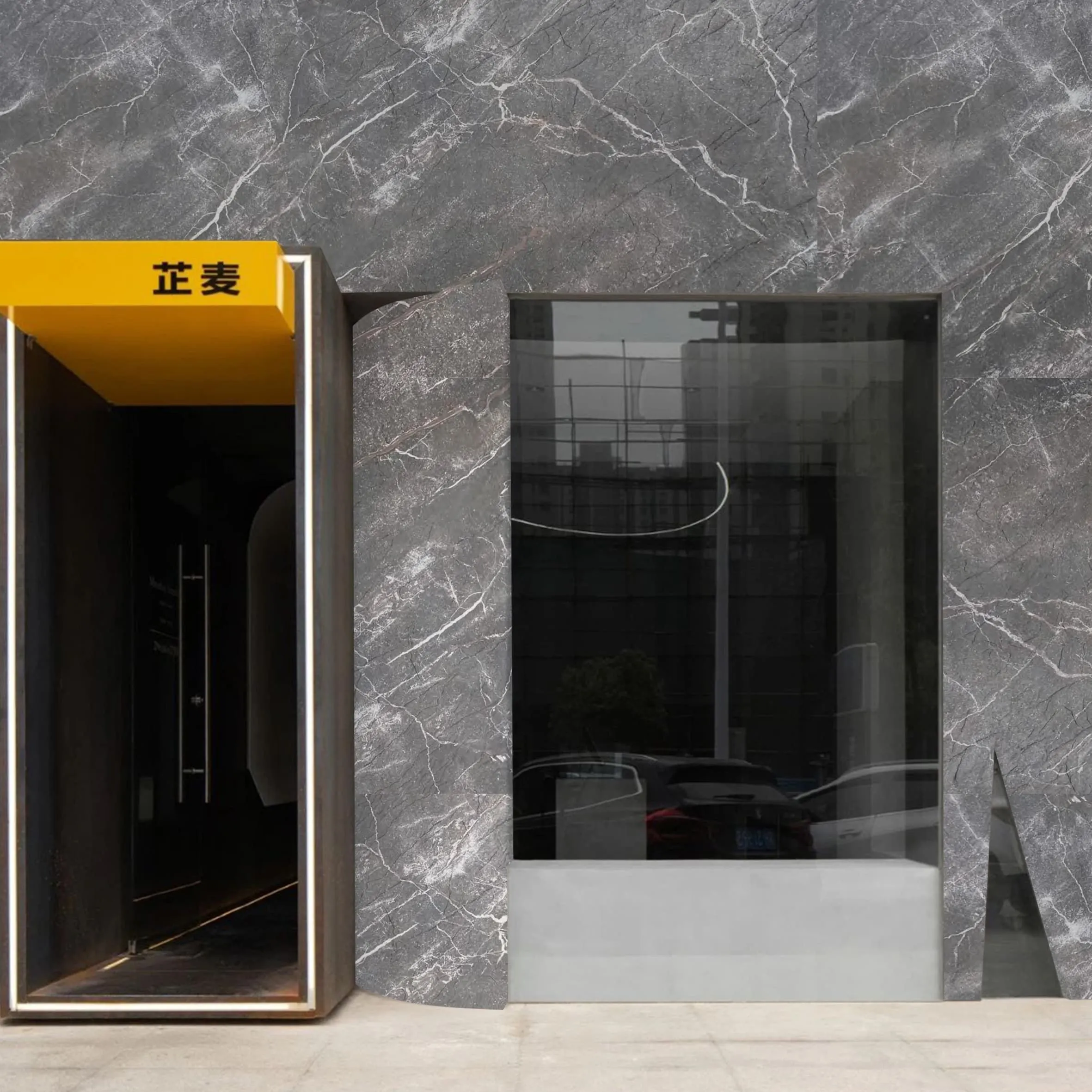
In commercial settings, Slate Portoro is a favorite for luxury brands. High-end boutiques use it for checkout counters or feature walls, signaling exclusivity. Hotels line lobbies with it, creating first impressions that say "welcome to something special." Even restaurants and bars lean on it—imagine a sushi bar with a Slate Portoro counter, where the stone's elegance underscores the precision of the cuisine.
Office spaces, too, are embracing it. In executive suites or meeting rooms, Slate Portoro walls convey authority and sophistication without feeling stuffy. It's a step up from the utilitarian feel of epoch stone or century stone, adding a human touch to corporate environments.
While not as common as rugged options like boulder slab or historical pathfinders stone, Slate Portoro can work outdoors in covered or sheltered areas. A patio bar top, protected from the elements, becomes a conversation piece. Or a fountain surround, where the black stone makes the water look crystal clear, and the gold veins catch the sunlight as droplets fall.
Ask any designer what draws them to Slate Portoro, and you'll get a chorus of reasons. For starters, it's a chameleon. Pair it with industrial elements like foamed aluminium alloy board (gold), and it feels edgy. Mix it with traditional wood line accents, and it becomes classic. Even with bohemian touches like woven (khaki) textiles, it holds its own, grounding the chaos with its presence.
Durability is another win. Unlike delicate options such as marble veil white, Slate Portoro can handle daily wear and tear. It resists scratches better than dolomitic travertine (dark grey) and stains better than red travertine, making it a practical choice for high-traffic areas. Designers hate recommending materials that look great but fail quickly—Slate Portoro delivers on both beauty and longevity.
Then there's the emotional factor. In a world of mass-produced, cookie-cutter designs, Slate Portoro is authentically unique. Each slab has its own pattern, its own quirks. It tells a story, and people connect with stories. A homeowner isn't just choosing stone—they're choosing a piece of the earth, a conversation starter, a legacy. It's why Slate Portoro often becomes a focal point of family photos, a backdrop to life's moments.
Like any natural stone, Slate Portoro needs a little love to stay looking its best. But don't worry—it's not as high-maintenance as marble. Here's how to care for it:
With these simple steps, Slate Portoro will age gracefully, developing a patina that only adds to its character. Unlike synthetic materials that fade or peel, it will grow more beautiful over time, a testament to its quality.
Design trends come and go. One year, everyone's obsessed with lunar peak silvery; the next, it's all about relic rammed earth board. But Slate Portoro? It's timeless. Its black-and-gold palette has been coveted for centuries—think of ancient Egyptian artifacts or Renaissance paintings—and it still feels fresh today. It doesn't chase trends; it sets them.
Even as minimalism and neutral palettes dominate, Slate Portoro offers a way to add color and personality without clashing. It's bold, but not trendy. It's luxurious, but not flashy. It's the kind of stone that will still look stunning in 50 years, when today's "it" materials have faded from memory.
Slate Portoro isn't just a building material. It's a storyteller, a mood setter, a piece of the earth's art. It's for the homeowner who wants their space to feel intentional, the designer who craves both beauty and function, the business owner who wants to make a lasting impression.
Next time you encounter it—whether in a hotel lobby, a friend's home, or a boutique—take a moment to really see it. Trace the gold veins with your eyes, feel the cool surface, let the black depth wrap around you. It's stone, yes, but it's also magic. And in a world that often feels rushed and synthetic, that magic is more valuable than ever.
Slate Portoro doesn't just decorate spaces. It transforms them. It turns houses into homes, lobbies into experiences, and ordinary moments into memories. And that, perhaps, is its greatest luxury of all.
Recommend Products


