
Walk into any successful commercial space—a boutique hotel lobby, a trendy café, or a cutting-edge tech office—and you'll notice something immediately: the materials don't just fill the room; they speak . They whisper the brand's personality, shout its values, and linger in the minds of visitors long after they leave. In a world where first impressions are measured in seconds, the right material can turn a generic space into a memorable brand experience. That's where White Wood MCM comes in. More than just a cladding solution, it's a canvas for color, texture, and storytelling—especially when paired with the versatility of MCM technology. Let's dive into how this material is redefining how brands craft their visual identities, one custom hue at a time.
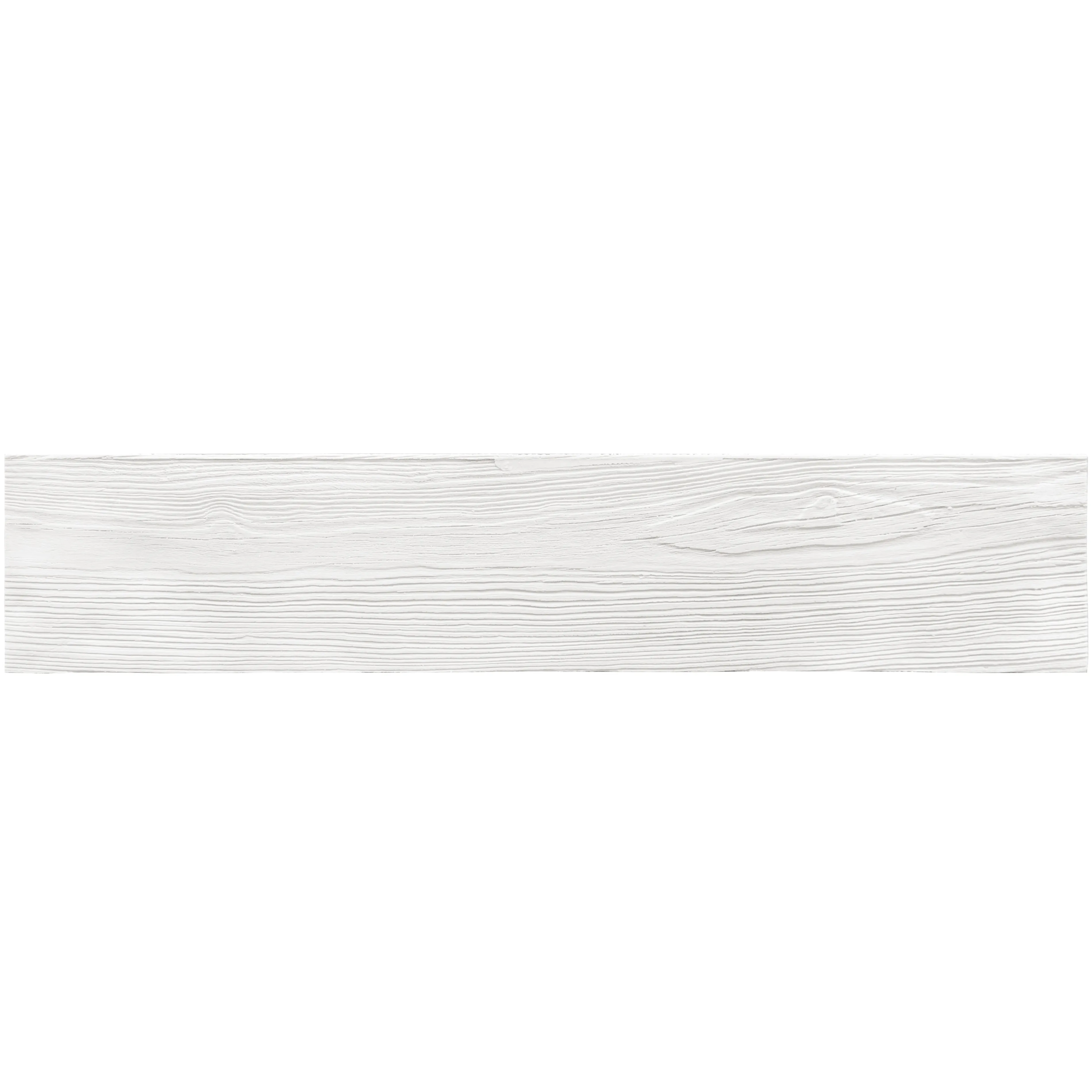
Before we get into the fun stuff—colors, aesthetics, and brand vibes—let's ground ourselves. MCM, or Metal Composite Material, has been a workhorse in commercial construction for years, loved for its durability, lightweight nature, and design flexibility. But White Wood MCM takes that a step further. Imagine the warm, organic feel of wood grain (think weathered oak, sun-bleached pine, or rich teak) fused with the strength of MCM. It's not just a "wood-look" material; it's wood reimagined —resistant to scratches, moisture, and fading, yet so authentic in texture that you'll find yourself reaching out to touch it, half-expecting splinters (don't worry, there are none).
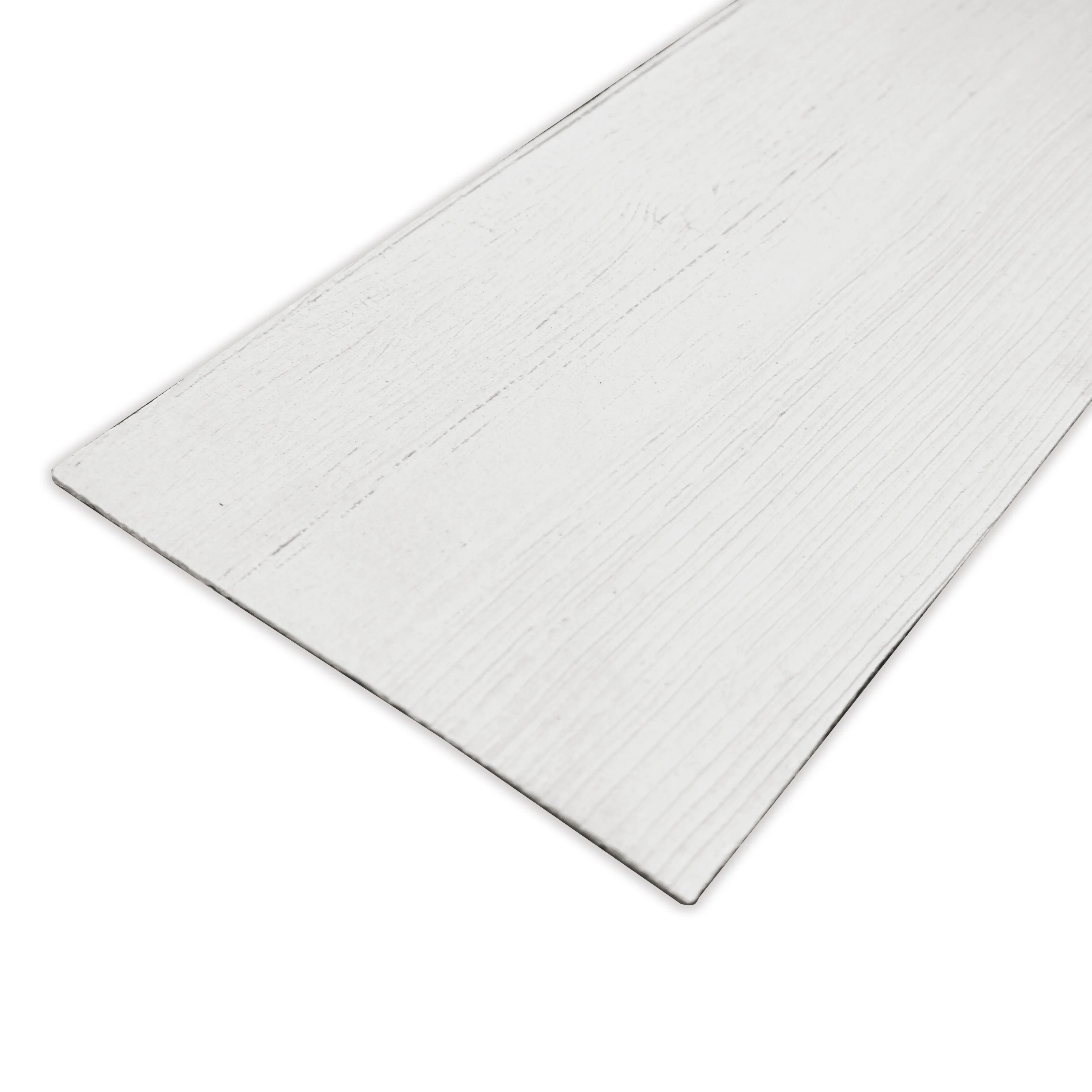
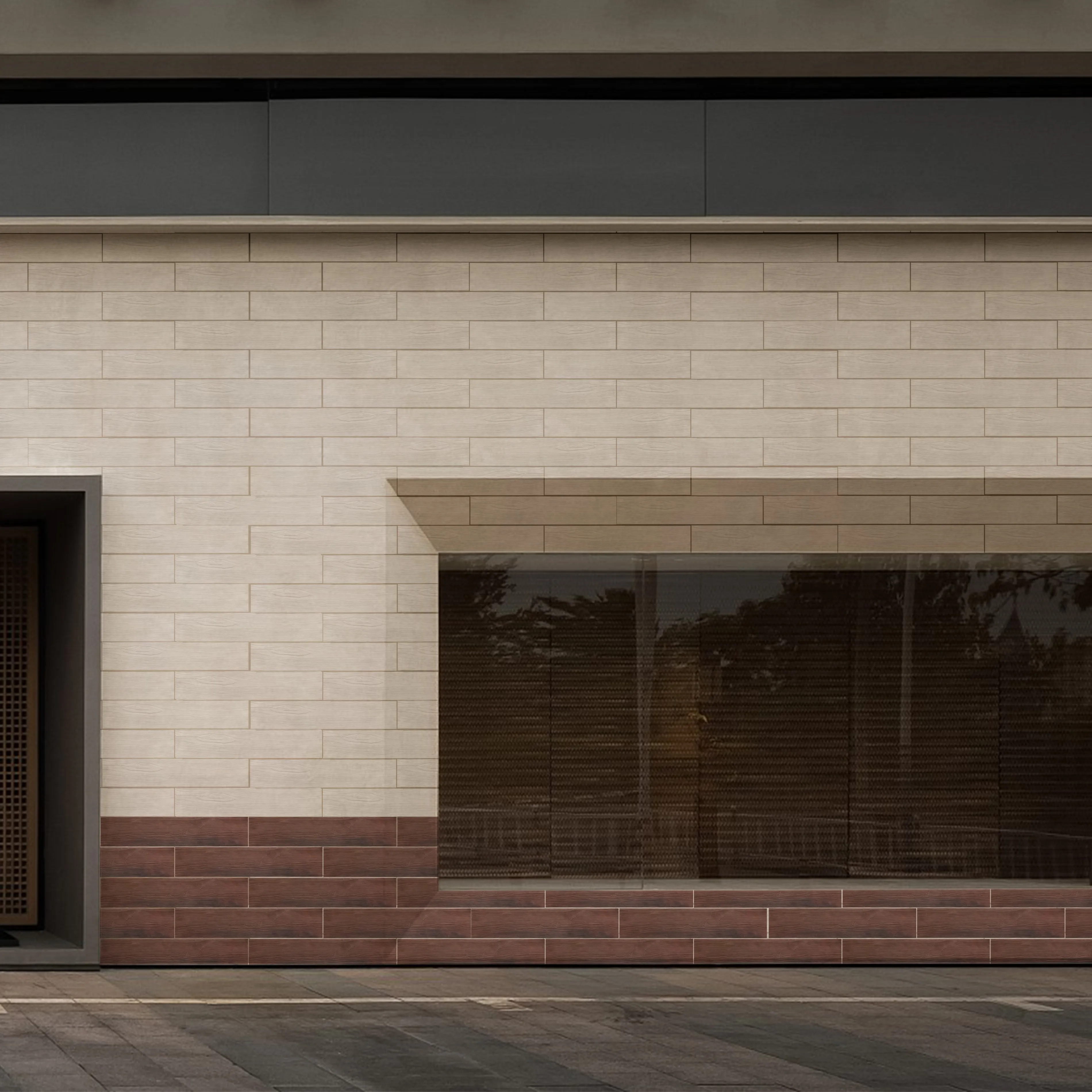
At its core, White Wood MCM starts with a wood grain board base—think of it as the foundation of the material's personality. The "white" in the name isn't a strict rule, though; it's a nod to its chameleon-like ability to adapt. This base can be tinted, stained, or finished in almost any shade, making it a blank slate for brands that refuse to be boxed into off-the-shelf colors. And because it's MCM, it's thin and lightweight, which means it can be used on everything from accent walls and ceilings to furniture and even retail display units—no heavy structural support required.
Here's the thing about brand aesthetics: they're specific . A yoga studio that prides itself on calm might crave soft, earthy beiges and muted greens. A startup disrupting the tech world might lean into bold, futuristic grays and metallics. A luxury fashion brand? They might want something that feels both timeless and exclusive—maybe a custom off-white with subtle gold undertones, or a warm ivory that shifts slightly under different lighting. Generic "wood tones" just won't cut it.
White Wood MCM's superpower is its ability to meet these specific needs. Let's say a brand's signature color is a particular shade of terracotta—something they've spent years refining for their logo, packaging, and marketing materials. With traditional wood cladding, matching that exact hue would be a nightmare (wood stains are unpredictable, and natural wood varies in color from plank to plank). But with White Wood MCM, the process is precise. Manufacturers can color-match to Pantone codes, RAL colors, or even a physical sample (like a swatch of the brand's fabric or a chip from their store signage). The result? A wall or surface that doesn't just "complement" the brand's color palette—it is the color palette, unified and intentional.
And it's not just solid colors. Brands can play with gradients, too. Imagine a café chain that wants to evoke the feeling of a sunrise—starting with soft pink at the ceiling, fading into warm orange, then settling into a gentle yellow at eye level. White Wood MCM can do that. Or a hotel lobby that uses a custom "weathered" finish, where the color deepens in the grain and lightens on the edges, mimicking the look of wood that's been kissed by sun and rain for decades. These aren't just design choices; they're emotional triggers. They make spaces feel lived-in, intentional, and uniquely brand-aligned .
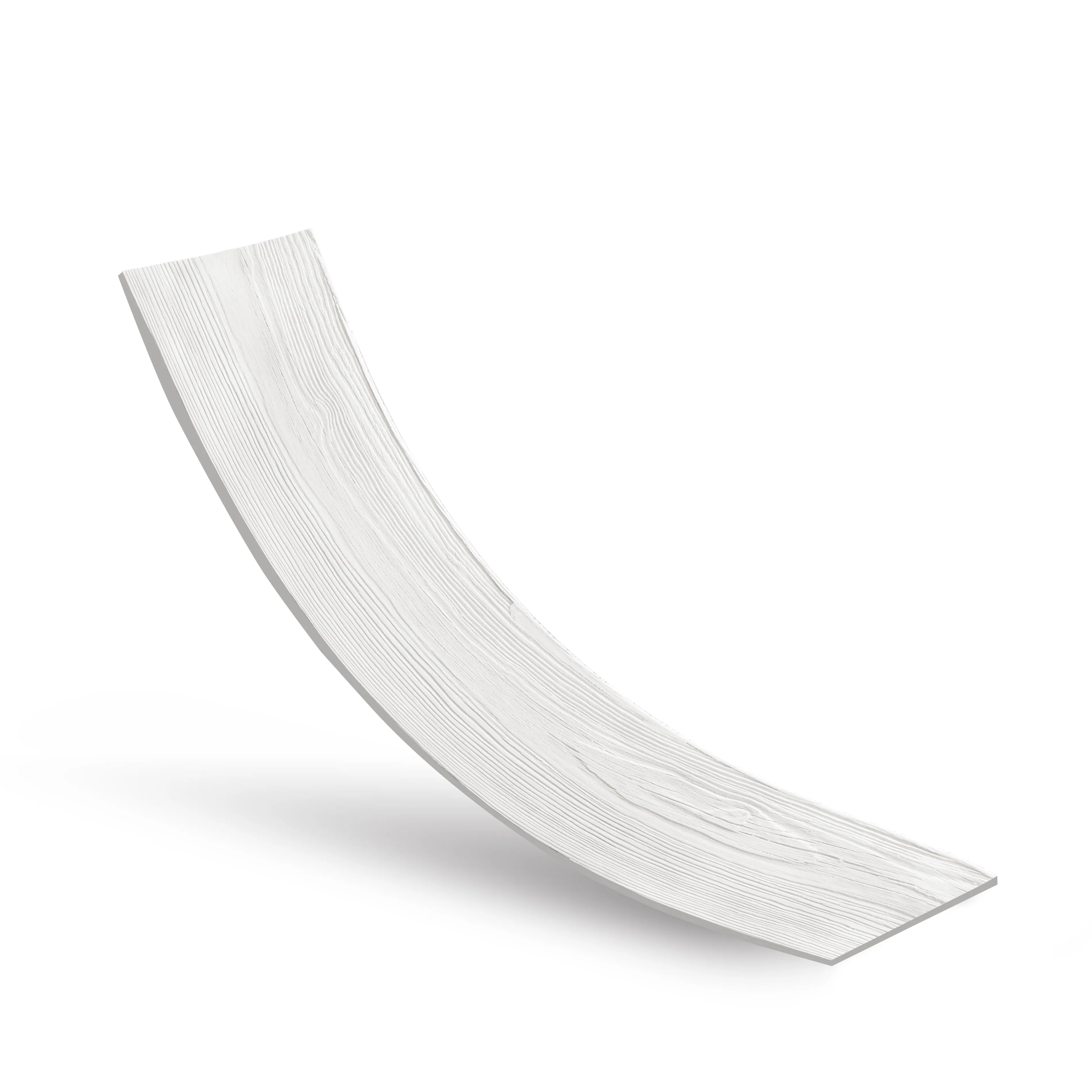
You might be wondering: What makes White Wood MCM so flexible (literally and figuratively) compared to other wood-look materials? The answer lies in mcm flexible stone technology. Traditional stone or wood cladding is rigid—you're stuck with flat panels or pre-cut shapes. But MCM flexible stone is, as the name suggests, bendable. It can curve around columns, wrap over arches, or even be formed into 3D shapes. When paired with White Wood MCM's color customization, this flexibility opens up a world of design possibilities.
Take, for example, a boutique hotel with a circular lobby. Instead of using flat, rectangular wood panels that would feel clunky and break up the flow, they could use White Wood MCM with a custom "driftwood gray" finish, curved to follow the room's architecture. The result? A space that feels cohesive, organic, and instantly memorable. Or a retail store that wants to create a focal wall with a wave-like texture—mcm flexible stone makes that possible, with the added bonus of matching the brand's signature blue color. It's design without limits, and brands are eating it up.
Let's get practical. How do brands actually use White Wood MCM's color customization to tell their story? Let's walk through a few hypothetical (but totally realistic) examples.
Meet "Hearth," a café brand that prides itself on "home away from home" vibes. Their aesthetic is warm, inviting, and slightly rustic—think exposed brick, soft lighting, and mismatched vintage mugs. Their brand colors are a warm beige (almost like latte foam) and a deep, earthy brown (like freshly ground coffee). For their new flagship location, they wanted an accent wall behind the counter that felt like a big, cozy hug.
Solution: White Wood MCM with a custom "cinnamon latte" finish—a warm beige base with subtle brown wood grain undertones. To add texture, they paired it with weaving (beige) panels on the adjacent wall—soft, tactile, and perfectly complementing the wood's warmth. The result? A space that feels like your favorite armchair, in wall form. Customers linger longer, take more photos, and—most importantly—associate Hearth with that feeling of comfort.
Now, "Nexus," a tech company focused on AI and innovation. Their brand is all about "the future, simplified"—clean lines, minimalism, and a color palette of cool grays, silvers, and touches of electric blue. Their new office needed to feel sleek but not sterile—they wanted to avoid the "cold lab" vibe that plagues so many tech spaces.
Solution: White Wood MCM in a custom "pale smoke" gray—a light, almost blue-tinged gray with a subtle wood grain that adds warmth without feeling traditional. They paired this with epoch stone accents (a smooth, polished stone-look MCM) in a deeper charcoal gray. The contrast is striking: the wood grain softens the sharpness of the stone, while the gray tones keep everything feeling modern. Employees report feeling more creative in the space, and clients? They walk in and immediately think, "These guys are forward-thinking."
"Serene," a high-end spa brand, built its reputation on "timeless luxury." Their aesthetic is understated elegance—think marble, soft lighting, and a color palette of whites, creams, and golds. For their new location, they wanted a reception area that felt both grand and calming, avoiding the "sterile hotel lobby" feel.
Solution: White Wood MCM in a custom "ivory pearl" finish—a warm white with the faintest hint of gold in the wood grain, almost like sunlight hitting mother-of-pearl. They contrasted this with fair-faced concrete floors (raw, unpolished concrete that adds texture without overwhelming the space) and gold accents in the furniture. The result? A space that feels luxurious but not flashy—exactly what Serene's clients expect when they shell out for a day of pampering.
Of course, White Wood MCM isn't the only player in the game. Let's break down how it stacks up against other popular materials when it comes to customization and brand alignment. Think of this as your cheat sheet for picking the right material for your vibe:
| Material | Color Customization Level | Texture Authenticity | Best For Brands That Want... |
|---|---|---|---|
| White Wood MCM | High (Pantone-matched, gradients, custom stains) | Very high (authentic wood grain, tactile feel) | Warmth + durability; organic yet polished vibes |
| Fair-Faced Concrete | Medium (limited to gray tones, can be tinted subtly) | High (raw, industrial texture) | Minimalism, rawness, modern industrial edge |
| MCM Flexible Stone | Medium-High (stone-like colors, can mimic marble/granite) | High (realistic stone texture, including veining) | Elegance, luxury, or natural/earthy aesthetics |
| Epoch Stone | Medium (sleek, uniform colors—grays, blacks, whites) | Low (smooth, consistent finish) | Futuristic, high-tech, ultra-clean lines |
| Weaving (Beige) | Low (fixed woven texture, limited color range) | Very high (soft, textile-like feel) | Warmth, coziness, bohemian or artisanal vibes |
See the pattern? White Wood MCM sits in that sweet spot where warmth meets versatility. It's not as limited as weaving (beige) in color, not as cold as epoch stone, and more dynamic than fair-faced concrete. For brands that want to balance personality with practicality, it's hard to beat.
Let's be real: commercial spaces take a beating. Coffee spills, scuff marks from rolling chairs, sunlight streaming through windows day in and day out—if your material can't handle that, what's the point? White Wood MCM checks this box, too. Because it's MCM, it's resistant to moisture (no warping in humid lobbies!), UV rays (no fading in sunlit retail spaces!), and impact (no panic attacks when a delivery guy bumps a cart into the wall!).
And the color? It's not just painted on. The pigments are integrated into the material during manufacturing, so even if it does get scratched (which is rare), the color underneath matches the surface. No ugly white scars, no need for frequent touch-ups. For brands that want their spaces to look as good on day 1,000 as they did on day 1, this is a game-changer.
You might be thinking, "This all sounds great, but is anyone actually doing this?" The answer is a resounding yes. Let's shout out a few real-world examples (with names changed to protect the innocent… and the brands that haven't given us permission to name them).
A national restaurant chain known for its farm-to-table concept recently revamped its locations with White Wood MCM in a custom "wheat field" gold—warm, golden-yellow with subtle wood grain that evokes sunlit barns and harvest seasons. They paired it with mcm flexible stone in a "river rock" gray for the bar fronts, creating a space that feels both rustic and refined. Sales are up, and customers rave about the "homey yet upscale" vibe.
A high-end furniture retailer used White Wood MCM in a custom "midnight oak" finish—deep, rich black with brown undertones—for their in-store display walls. The dark color makes their furniture (which is mostly light-colored) pop, and the wood grain adds warmth that prevents the space from feeling like a cold art gallery. Instagram posts of the store have gone viral, with comments like, "I need that wall in my house."
At the end of the day, White Wood MCM color customization isn't just about picking a pretty color. It's about storytelling . Brands don't just sell products or services—they sell experiences, emotions, and identities. The materials they choose for their spaces are a critical part of that story. A generic, off-the-shelf material tells a generic story: "We didn't care enough to invest in something unique." But White Wood MCM? It tells a story of intention: "We thought about you. We designed this space to make you feel something. We are here , and we want you to remember us."
So, whether you're designing a cozy café, a sleek tech office, or a luxury boutique, don't sleep on the power of color and texture. White Wood MCM—paired with mcm flexible stone, wood grain board, or even a little weaving (beige) for texture—might just be the material that turns your brand's vision into a space people can't stop talking about. After all, in a world of noise, the spaces that make us feel something are the ones that last.
And isn't that the point of it all?
Recommend Products


