
Choosing exterior cladding for a building is more than just picking a material—it's about shaping the face of a space, one that will greet visitors, withstand the elements, and reflect the vision of its creator for decades. Yet for many clients, this process starts with a frustrating hurdle: how do you truly know what a material will look like once it's on your walls, when all you have are glossy catalog images or generic descriptions? This is especially true for materials like limestone, where subtlety is its strength—and its downfall when misrepresented. Today, we're diving into why real photos of limestone (and other cladding materials) aren't just nice-to-haves, but essential tools for making confident, inspired decisions.
Let's start with a scenario we've all lived through, in one form or another: You're sitting in a meeting with your architect, flipping through a binder of cladding options. They point to a page labeled "Lime Stone (Beige)" and describe it as "warm, earthy, with natural veining and a matte finish." Sounds perfect, right? But then you ask to see it in person, and they hand over a 4x4 inch sample. It's beige, sure, but under the office lights, it looks almost yellow. The "natural veining" is so faint you can barely make it out. When you press for more, they say, "Don't worry—the full installation will look better." Cue the sinking feeling: How do you invest in thousands of square feet of a material you've only seen in a tiny sample and a paragraph?
This is the reality for too many clients. Cladding materials are sold with vague terms—"rustic," "modern," "organic"—that mean different things to different people. A "matte finish" on limestone could range from smooth-as-sandpaper to slightly textured, depending on the quarry and finishing process. "Natural veining" might be delicate, spiderweb-like lines or bold, chocolate-hued streaks. Without context, these words are just noise. And when the material finally arrives on-site, the mismatch between expectation and reality can lead to costly delays, rework, or even regret over a choice that feels "off" but you can't quite articulate why.
Worse, stock photos—those polished, airbrushed images in catalogs—often do more harm than good. They're shot in ideal lighting, with filters that enhance color, and cropped to hide imperfections. A catalog might show "Lime Stone (Beige)" as a uniform, buttery tone, but in reality, the stone could have patches of cream, hints of gray, or even tiny fossilized shells (a charming quirk, but one you'd want to anticipate). Without real photos—unfiltered, unedited shots of the material in actual installations—you're essentially buying a mystery box for your building's exterior.
Real photos of limestone (and other cladding materials) change the game. They're not just marketing tools—they're windows into the material's true character. Let's break down why they matter, starting with the details that make or break a cladding choice.
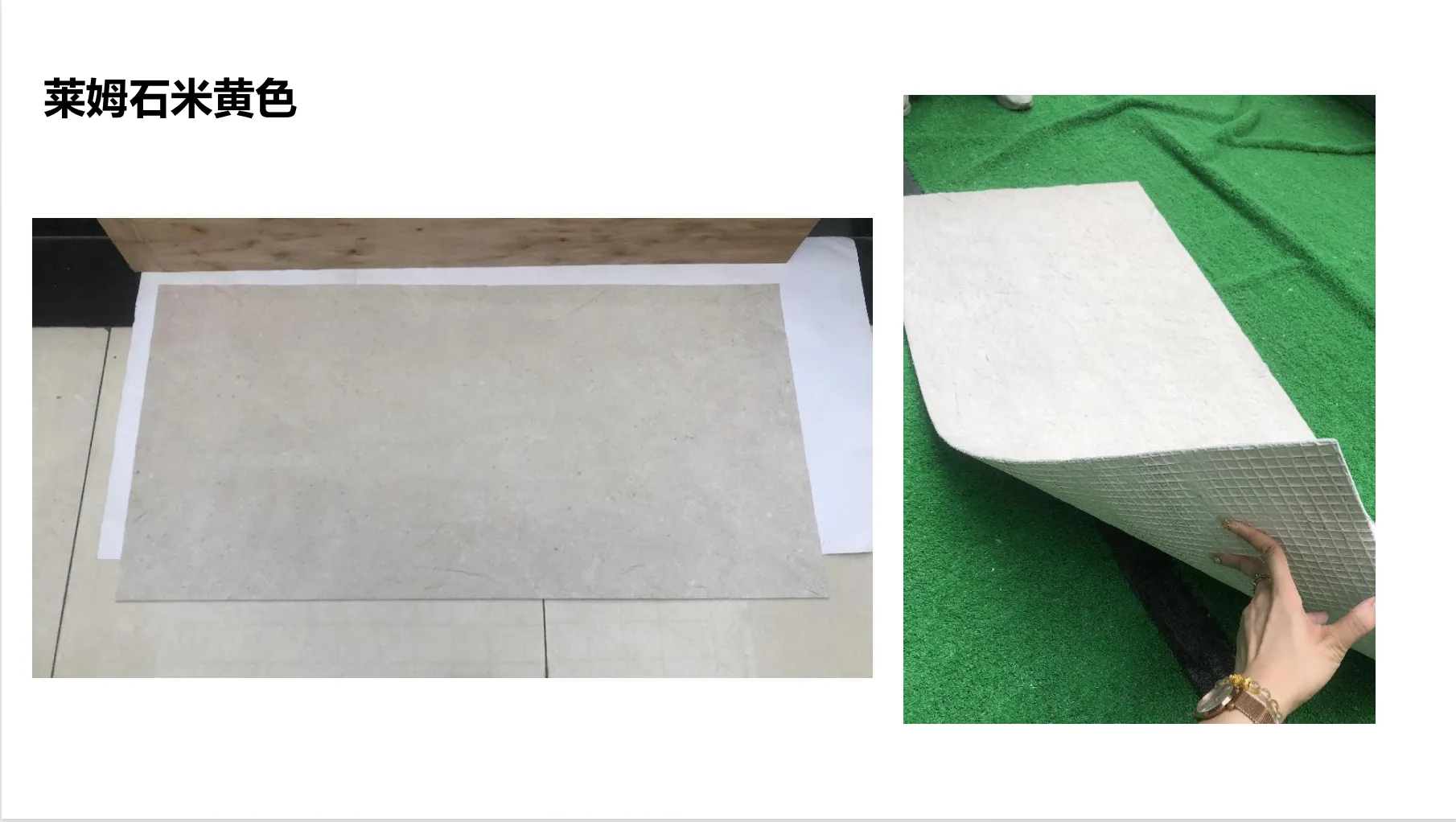
Limestone's beauty lies in its texture. Run your hand over a well-cut limestone slab, and you might feel the gentle rasp of its surface, the slight indentations where water once flowed through its pores, or the crisp edge of a chiseled finish. These tactile qualities are what turn a wall into a presence —but they're invisible in a 4x4 sample or a catalog photo.
Real photos, though, capture texture in a way words never could. A close-up shot of "Lime Stone (Beige)" might reveal tiny pits that catch the light, creating a subtle play of shadow and shine. Another angle could show how the stone's surface weathers—whether it smooths over time or retains its rough-hewn charm. For clients, this isn't just about aesthetics; it's about functionality. A highly textured limestone might be ideal for a rural cottage, adding warmth and character, but a smoother finish could be better for a sleek urban facade, where cleaning and maintenance matter more. Real photos let you see that difference, not just imagine it.
This is true for other materials, too. Take MCM Flexible Stone , a popular choice for modern exteriors. Its selling point is its flexibility—able to bend around curves or wrap columns— but that flexibility comes with a unique texture: a blend of stone particles and resin that feels both solid and supple. A generic photo might make it look like any other stone panel, but a real photo? It shows the way the material creases slightly at the edges, or how light catches its micro-rough surface, giving it depth that flat stock images miss.
Color is the first thing we notice about a material, but it's also the most deceptive. Lighting, time of day, even the surrounding landscape can shift how a color reads. A "Lime Stone (Beige)" that looks warm and golden under midday sun might take on a soft gray cast at dusk, or pick up green undertones if planted next to evergreen shrubs. Catalog photos, shot under controlled studio lights, rarely show this range—and that's a problem.
Real photos, taken on actual job sites, in different weather and lighting conditions, tell the full story. Imagine scrolling through a gallery of "Lime Stone (Beige)" installations: one photo shows it at dawn, when the stone glows pinkish; another at high noon, where it's bright and crisp; a third in the rain, when its pores darken slightly, deepening the beige to a rich taupe. Suddenly, you're not just choosing "beige"—you're choosing a material that evolves with the day, adding life to your building's exterior. That's the kind of nuance clients crave, and only real photos can deliver it.
Here's a common mistake: judging a cladding material based solely on a small sample. A 6x6 inch piece of limestone might look uniform and subtle, but when multiplied across a 20-foot wall, those "subtle" veins or color variations can create a bold, almost chaotic pattern—or, conversely, blend into a soothing, cohesive whole. Without seeing the material at scale, it's impossible to predict how it will read from the street.
Real photos solve this by showing the material in context. A wide-angle shot of a limestone-clad office building, for example, reveals how the stone's natural variations repeat across the facade, creating rhythm without monotony. A close-up of the same installation might zoom in on a section where two panels meet, showing how the installer handled seams—details that matter for both aesthetics and durability. For clients, this sense of scale turns abstract choices into concrete (pun intended) visions: "Yes, that's how it will look on my building."
A cladding material doesn't exist in a vacuum—it interacts with its surroundings. A "Lime Stone (Beige)" that looks stunning on a sunlit suburban home might feel out of place on a shaded urban alleyway, or clash with a neighboring brick building. Real photos, taken in the context of their final homes, show these relationships.
Consider a project where "Lime Stone (Beige)" was paired with dark metal accents and large windows. A real photo captures how the stone's warmth balances the coolness of the metal, how the windows reflect the sky and soften the stone's texture. Another photo might show the same limestone in a coastal setting, where salt air has lightly weathered its surface, giving it a timeworn charm. These are the stories that make a material feel like part of a larger narrative—not just a surface, but a character in the space.
Choosing cladding is stressful. It's a significant investment, and once installed, it's not easy to change. Real photos don't just inform—they reassure . They turn uncertainty into confidence, and second-guessing into clarity. Here's how:
Clients rarely choose cladding in a vacuum—they're weighing options. Maybe you're torn between "Lime Stone (Beige)" and Bamboo Mat Board , a sustainable, textured alternative that brings organic warmth. On paper, they both sound "natural," but how do they look side by side? A catalog might show limestone as "earthy" and bamboo mat board as "rustic," but real photos let you compare their textures, colors, and vibes directly.
For example, a real photo of bamboo mat board might highlight its woven, grid-like pattern—delicate, with visible gaps between the bamboo strips that let light filter through. A real photo of limestone beige, by contrast, shows a denser, more solid surface, with veining that meanders like a river. Suddenly, the choice becomes clearer: bamboo mat board feels light and airy, perfect for a beach house, while limestone beige feels grounded and timeless, better suited for a historic renovation. Real photos turn abstract comparisons into visual ones—and visual decisions are easier to stand by.
| Material | Texture (via Real Photos) | Color Range (via Real Photos) | Best For |
|---|---|---|---|
| Lime Stone (Beige) | Matte, with subtle pitting and natural veining; surface ranges from smooth to lightly chiseled. | Warm beige base with variations: cream, soft gray, occasional golden or taupe undertones; shifts with lighting (warmer at noon, cooler at dusk). | Historic renovations, classic homes, commercial buildings aiming for timelessness. |
| Fair-Faced Concrete | Industrial, with visible formwork lines and tiny air bubbles; cool, almost metallic sheen in sunlight. | Gray base (light to medium), with subtle color inconsistencies from aggregate exposure; can take on blue or green tints in overcast weather. | Modernist homes, warehouses, art galleries prioritizing sleek, unadorned aesthetics. |
Clients don't just buy materials—they buy trust. A supplier who provides real, unedited photos of their limestone (warts and all) is sending a message: "This is what you'll get." That transparency builds confidence. It says, "We're not hiding anything—no surprises, no bait-and-switch."
On the flip side, a supplier who only offers stock photos or refuses to share job-site images? That raises red flags. Clients start to wonder: "What are they hiding?" Maybe the limestone is more porous than advertised, or the color is patchier in bulk. Real photos eliminate that doubt. They let clients see the material's flaws (and yes, even "flaws" like uneven veining can be beautiful) and decide if they align with their vision.
There's a special kind of regret that comes with cladding choices gone wrong: "I thought it would look like the catalog!" Real photos slash that risk. When clients can point to a photo and say, "That's exactly what I want," they're far less likely to feel disappointed later. It's the difference between ordering a meal based on a menu description and ordering it after seeing a photo of the dish—one leaves room for imagination (and disappointment), the other sets clear expectations.
Take a client who chose "Lime Stone (Beige)" after seeing real photos of a similar project. When the panels arrived, they matched the photos: the same warm beige, the same subtle veining, the same matte finish. No surprises, no panic calls to the supplier—just relief, and excitement to see the vision come to life. That peace of mind? Priceless.
Let's put this into practice with a real-world example. A few years back, a client approached us to renovate a historic downtown restaurant, aiming for a "rustic-chic" vibe. They had their heart set on limestone, but were nervous about committing without seeing it in action. Their architect had recommended "Lime Stone (Beige)," but the client kept hesitating—they'd been burned before by a "natural stone" that arrived looking nothing like the sample.
We shared a gallery of real photos: not just close-ups of the stone, but full shots of a recent installation at a boutique hotel. The photos showed the limestone in morning light (golden), at noon (bright and crisp), and at sunset (tinged with pink). They highlighted the stone's texture—how it had been lightly bush-hammered to add grip, creating tiny indentations that caught rainwater and made the surface glisten. They even included photos of the stone next to wood accents and brass fixtures, showing how it complemented warm metals.
The client's reaction? "That's it. That's the one." They could see how the limestone would pair with their restaurant's reclaimed wood tables and pendant lights. They could visualize how it would age gracefully, developing a patina over time. And when the stone was installed, they told us, "It looks exactly like the photos. We didn't have to second-guess a thing."
Compare that to another project we heard about, where a client chose "Fair-Faced Concrete" based solely on a catalog image. The catalog showed a smooth, uniform gray surface—modern and sleek. But the real concrete, when installed, had visible formwork seams and air bubbles that the catalog had airbrushed out. The client hated it, calling it "too industrial." If they'd seen real photos of the concrete in situ—seams, bubbles, and all—they might have opted for a different finish, or chosen limestone instead. Real photos don't just sell materials; they prevent costly mistakes.
While we've focused on limestone, the truth is, real photos matter for every cladding material. Take MCM Flexible Stone , for instance. Its flexibility is a game-changer for curved walls or complex geometries, but that flexibility comes with a unique texture—think of crushed stone particles suspended in a resin matrix, creating a surface that's both stone-like and slightly rubbery. A real photo shows how this texture catches light, or how it bends without cracking, making it easier for clients to trust its performance.
Or Bamboo Mat Board , which relies on its woven pattern for visual interest. A real photo can show the density of the weave—are the bamboo strips tight or loose?—or how the material ages (does it fade in direct sun? Does it darken with moisture?). These details aren't just aesthetic; they're practical. A client in a rainy climate might need to know if bamboo mat board's weave holds water, or if it's treated to resist rot—real photos of installations in similar climates can answer those questions without a single technical spec.
Even materials with bold, statement-making looks—like "Travertine (Starry Green)," with its speckled, galaxy-like pattern—benefit from real photos. A catalog might make those "stars" look uniform, but a real photo shows their randomness, their size variation, how they cluster in some areas and spread thin in others. For a client wanting a one-of-a-kind facade, that randomness is part of the appeal—but they need to see it to love it.
Choosing exterior cladding is about more than picking a material—it's about choosing a story, a feeling, a first impression that will last for decades. And stories aren't told through catalog descriptions or tiny samples. They're told through real photos: unfiltered, unpolished, honest snapshots of materials in the wild.
For clients considering limestone (or any cladding material), real photos are the bridge between "I think this might work" and "I know this is right." They show texture you can almost feel, colors that shift with the light, and scale that makes the abstract concrete. They build trust, simplify comparisons, and turn regret into pride.
So the next time you're evaluating cladding options, ask for real photos. Not the glossy catalog shots, but the ones taken on job sites, in messy work boots, with the sun in their eyes. Those are the photos that will help you see—not just the material, but the future of your space. And isn't that what it's all about?
Recommend Products


