
Choosing the right materials for a space is like picking the perfect outfit—it's not just about what looks good, but how it makes you feel. For designers and homeowners alike, wood grain board has long been a go-to for its ability to infuse warmth, texture, and character into any room. But with so many color options available, from soft blondes to deep ebony, finding the one that aligns with your project's design palette can feel overwhelming. Let's walk through the world of wood grain board colors, exploring how each shade tells a story, pairs with other materials, and transforms spaces into something truly personal.
Wood grain board, whether natural or engineered, draws its charm from the diversity of its hues. Each color carries undertones—subtle hints of yellow, red, gray, or brown—that influence how it interacts with light and other elements in a room. Think of it as a conversation: a light wood with golden undertones might whisper "sunny mornings," while a dark wood with gray undertones could growl "cozy winter evenings." Let's break down the spectrum into categories that make it easier to navigate.
Light wood grain tones—think pale oaks, ash, or maple—are the chameleons of design. Their soft, almost white-to-cream bases with subtle golden or pink undertones make small rooms feel larger and dark spaces feel brighter. Walk into a kitchen where light wood grain cabinets wrap around the space, their honeyed tones bouncing sunlight off fair-faced concrete countertops below—it's calm, it's bright, it feels like home. These shades thrive in Scandinavian, coastal, or minimalist styles, where "less is more" reigns supreme.
A favorite in this category is the
Medium wood grain colors—walnut, teak, or oak with amber or chestnut hues—strike a balance between light and dark. They're the comfort food of design: familiar, inviting, and easy to love. Imagine a living room with
These tones work wonders in rustic, mid-century modern, or bohemian spaces. They have enough warmth to make a room feel cozy but enough restraint to avoid feeling heavy. A pro tip: pair medium wood with metallic accents like brass or copper—their subtle shine elevates the wood's earthiness, creating a look that's both timeless and a little luxe. For a more modern twist, mix in lunar peak silvery accessories—think lamp bases or picture frames. The silvery metallic adds a cool contrast to the wood's warmth, balancing the space perfectly.
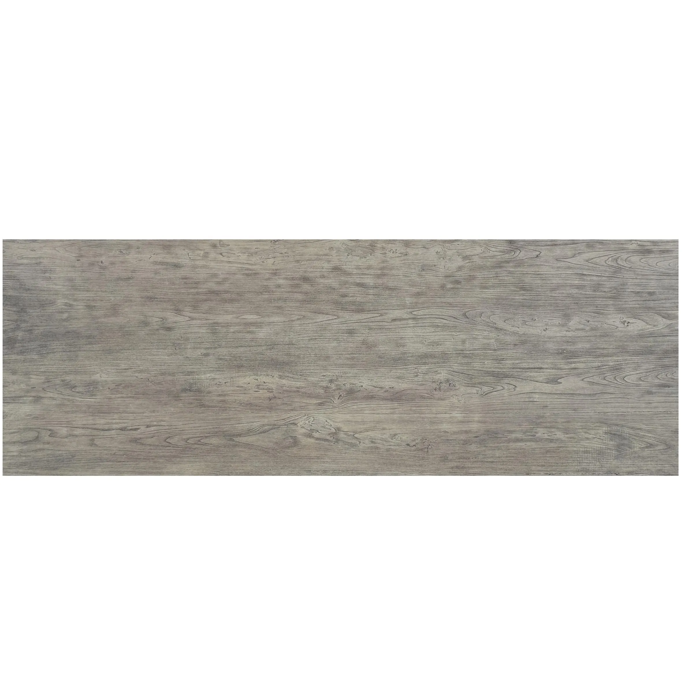
Dark wood grain tones—ebony, wenge, or espresso—are for those who love bold statements. They add drama, depth, and a touch of mystery to any room. A dining room with
Another standout in this category is
Wood grain board isn't limited to traditional stains. Today, finishes like whitewashing, gray-washing, or even two-tone designs offer endless possibilities. A
Gray-washed wood, on the other hand, leans modern. Its cool, ashy undertones complement minimalist spaces, especially when paired with fair-faced concrete floors and black metal fixtures. It's a favorite in urban apartments, where it adds texture without introducing too much color, letting art and furniture take the spotlight.
To help you visualize how these colors work in real-world projects, here's a breakdown of popular wood grain board options, their undertones, and the materials they pair best with:
| Wood Grain Color | Undertones | Best Design Styles | Complementary Materials |
|---|---|---|---|
| Natural Ash (Light Blonde) | Golden, Pink | Scandinavian, Minimalist | Travertine (beige), White Linen, Navy Accents |
| Walnut (Medium Brown) | Amber, Chestnut | Mid-Century Modern, Rustic | Bamboo Mat Board, Brass Fixtures, Cream Textiles |
| Smoked Oak (Dark Gray-Brown) | Smoky, Charcoal | Industrial, Modern | Fair-Faced Concrete, Lunar Peak Silvery, Slate Blue |
| Whitewashed Pine | Cool White, Gray | Coastal, Farmhouse | Rattan, Seafoam Green, Driftwood |
When choosing a color, consider the room's lighting, too. Natural light will bring out the warmth in medium and light woods, while artificial light (especially LED) can make dark woods appear cooler. Test samples in the space at different times of day to see how the color shifts—it's a small step that can save you from costly mistakes later.
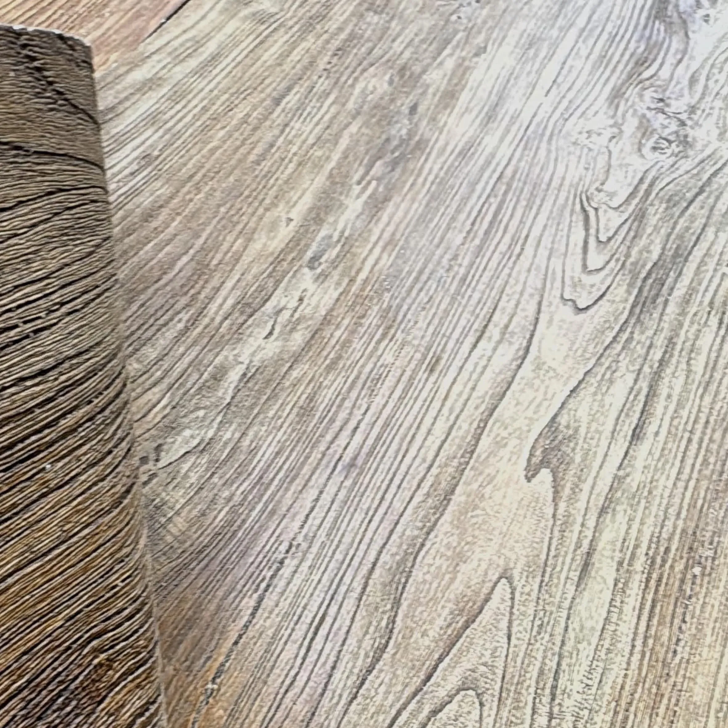
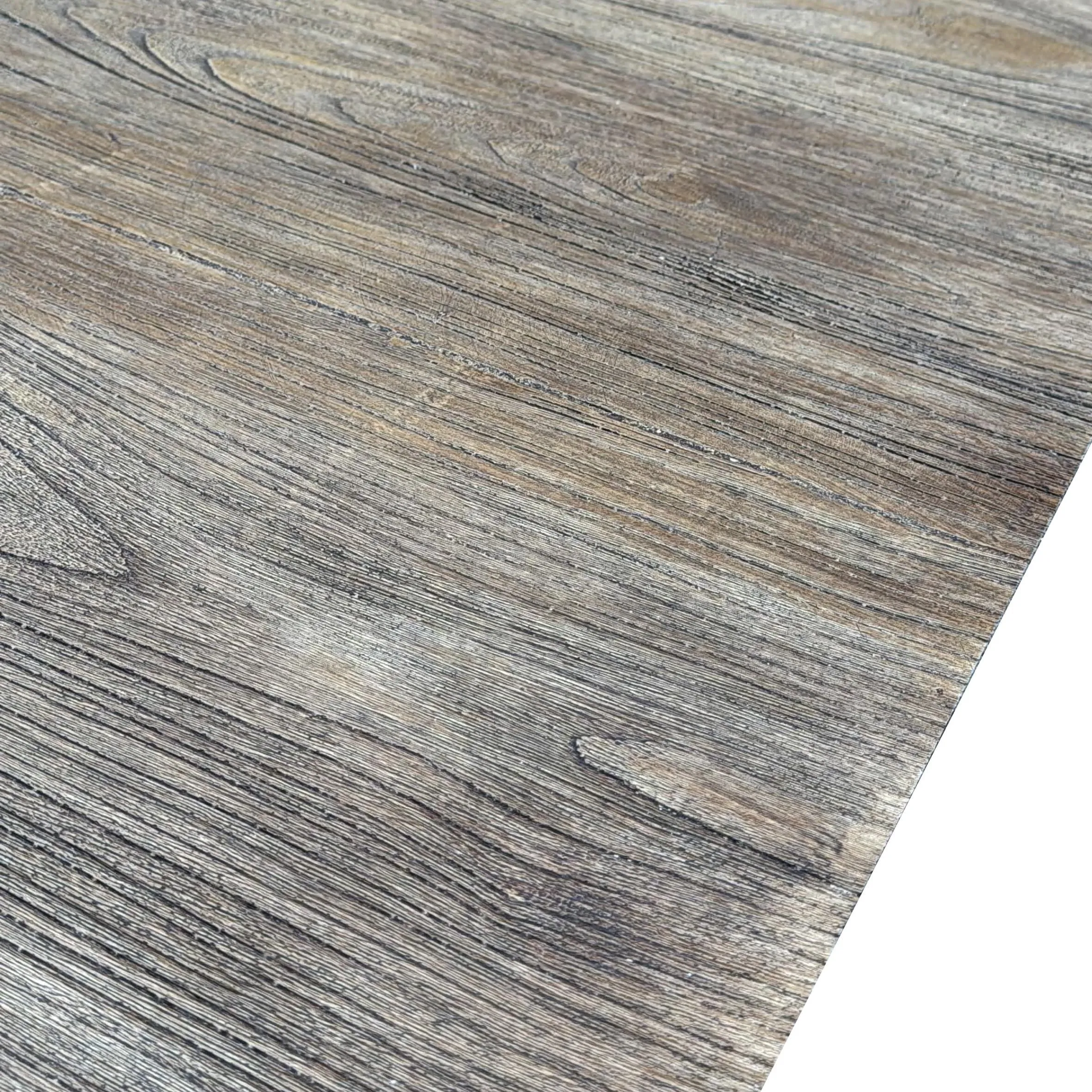
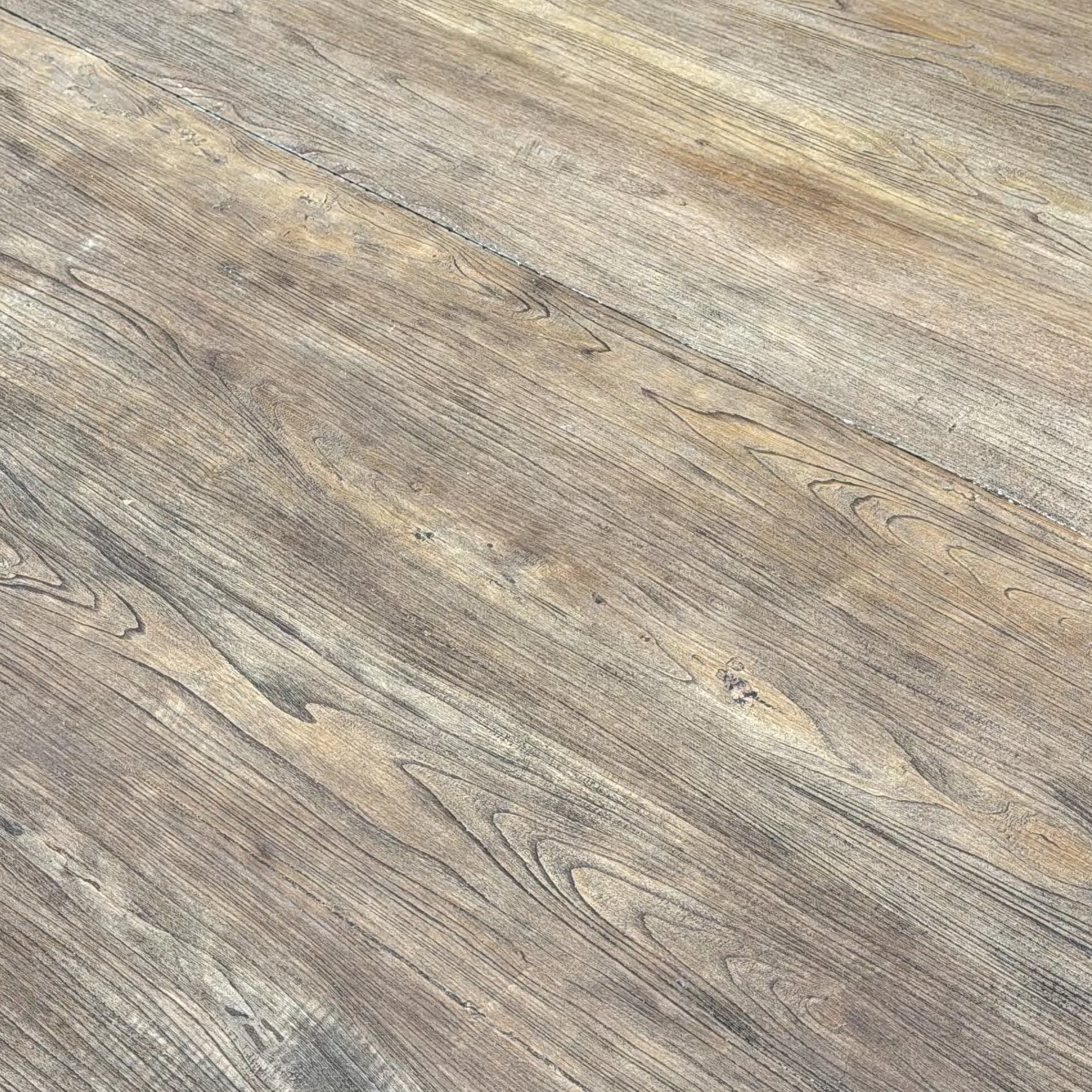
What makes wood grain board truly special isn't just its color—it's the texture. The way light catches the grain, the subtle knots and imperfections, the way it ages over time, gaining character with every scratch and patina. A
Don't be afraid to mix textures, either. Pair a smooth, light wood grain board with bamboo mat board —the bamboo's woven pattern adds visual interest, while the wood's smoothness keeps the space from feeling too busy. Or layer dark wood grain with travertine (beige) —the stone's pitted surface and the wood's tight grain create a dynamic interplay of rough and smooth that feels organic and intentional.
At the end of the day, choosing a wood grain board color is about more than trends—it's about creating a space that reflects who you are. Whether you opt for the light, airy feel of natural ash, the warm comfort of walnut, or the bold drama of smoked oak, the right color will make your space feel like an extension of yourself.
So take your time. Touch the samples, hold them up to your walls, imagine how they'll look at sunrise and sunset. Pair them with other materials— travertine (beige) for warmth, fair-faced concrete for edge, lunar peak silvery for shine—and see which combination makes your heart skip a beat. Because when wood grain board is chosen with care, it doesn't just decorate a space—it tells a story. And isn't that what great design is all about?
Recommend Products


