
Picture this: You're an architect wrapping up the design for a boutique hotel's lobby. The client fell in love with the warm, earthy vibe of woven (khaki) MCM panels—their textured threads, the way they catch the light, that subtle interplay of beige and taupe that feels both modern and inviting. You ordered physical samples months ago, and they looked perfect under your office lights. But when the first batch of MCM big slab board series panels arrived on-site, something was off. The khaki hue leaned more brown than taupe, and under the lobby's natural skylights, the texture seemed to swallow the color entirely. The client is frustrated, the contractor is pressing for a decision, and you're left wondering: How did we get here?
If you've worked in architecture or construction, this scenario might hit close to home. Color consistency—the ability of a material to maintain uniform hue, tone, and saturation across a project—is the unsung hero of cohesive design. And when it comes to MCM (Modified Composite Material) products—from MCM flexible stone to large-format slabs—getting that consistency right can make or break a space. But here's the problem: Traditional methods of comparing colors—relying on physical swatches, memory, or generic product photos—often fall short. Enter woven real photos: high-resolution, meticulously captured images that showcase MCM panels in their true color and texture, under controlled lighting conditions. They're not just pictures; they're a bridge between the designer's vision and the final build. Let's dive into why they matter, how they work, and why they're becoming indispensable for anyone specifying MCM materials.
Let's start with the basics: Why does color consistency matter so much for MCM products? Unlike paint or wallpaper, which can be mixed on-site to adjust for discrepancies, MCM panels are manufactured in batches. Each batch might have slight variations due to raw material sourcing, production temperatures, or even the angle of the sun during curing (yes, even indoor manufacturing can be influenced by natural light). For small projects, these differences might be negligible. But for large-scale builds—think a hotel facade wrapped in woven (grey) panels or a shopping mall interior using MCM big slab board series —inconsistencies become glaring.
Take fair-faced concrete , for example. Its raw, industrial look relies on uniformity; a single panel with a pinkish tint can disrupt the entire "raw elegance" vibe. The same goes for woven MCM panels: their appeal lies in their texture and color harmony. A woven (khaki) panel that's too light in one batch and too dark in another can make a wall look patchy, like a quilt with mismatched squares. Clients notice this. Architects lose credibility. And contractors end up stuck in the middle, fielding calls about "defective" materials that were technically within manufacturing tolerances.
Beyond aesthetics, there's the practical side. Many clients have strict brand guidelines—think a coffee chain that requires all locations to use a specific shade of warm brown. Deviating from that color can dilute brand identity. Or consider heritage projects, where MCM panels might be used to replicate the look of aged stone; even a slight color shift can make the new construction feel disjointed from the historic surroundings.
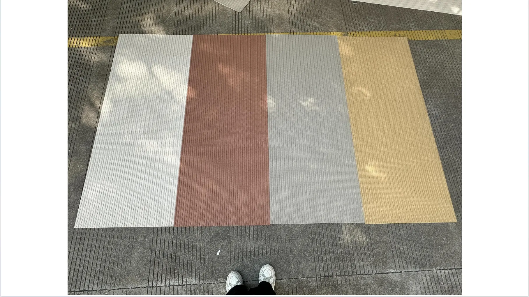
Let's clarify: Woven real photos aren't stock images or filtered product shots. They're specialized photographs taken of actual MCM panels—specifically, those with woven textures like woven (khaki) , woven (grey) , or woven (beige) —using high-resolution cameras, calibrated lighting, and color-matching software. The goal? To capture the panel's true color and texture in a way that mimics real-world conditions.
Here's how they're made: Professional photographers set up panels in a controlled studio with three lighting scenarios: 5000K daylight (to mimic natural sunlit spaces), 3000K warm incandescent (think hotel lobbies or restaurants), and 6500K cool fluorescent (common in offices or retail). Each panel is photographed from multiple angles—head-on to show overall color, at a 45-degree tilt to highlight texture, and even close-ups of the weave itself to capture thread thickness and spacing. The images are then color-calibrated using tools like X-Rite spectrophotometers to ensure the on-screen color matches the physical panel down to the RGB values. The result? A photo that doesn't just "look like" the panel—it is the panel, in digital form.
But why "woven" specifically? Woven MCM panels are uniquely challenging when it comes to color perception. Their thread-based texture creates micro-shadows and highlights; a woven (grey) panel might appear darker in areas where threads overlap and lighter where they're spaced apart. Generic photos often flatten this depth, making it hard to predict how the color will behave at scale. Woven real photos, by contrast, preserve that dimensionality, so you can see exactly how the color shifts with texture.
Before woven real photos, the industry relied on three main methods to check color consistency. Let's break down why each falls short:
The result? Miscommunication, delays, and costly rework. In one survey by the Construction Specifications Institute, 23% of project delays were linked to material discrepancies—many of which could be traced back to color or texture mismatches. Woven real photos aim to fix this by giving everyone—architects, contractors, clients—a single, unfiltered reference point.
Let's circle back to that hotel lobby scenario. Imagine instead that, before finalizing the woven (khaki) panels, you'd had access to woven real photos. These images would have shown the panel under three lighting conditions: daylight (to mimic the skylights), warm incandescent (for the lobby's pendant lights), and cool fluorescent (for the adjacent hallway). You'd have zoomed in to see how the khaki threads interact—whether the weave was tight enough to maintain color consistency across a large slab or loose enough to create unwanted shadow patterns. You could have shared these photos with the client, who could then visualize exactly how the panels would look in their space. No more "but it looked different in the office" surprises.
Here's how woven real photos address the key pain points:
Take MCM flexible stone as another example. Its flexibility makes it ideal for curved surfaces—think a restaurant's circular bar wrapped in stone-look panels. But flexibility can also lead to color variation if the material stretches or compresses during installation. Woven real photos of flexible stone panels show not just the base color but how the texture distorts (or maintains) that color when bent. A designer can see, for instance, if a woven (grey) flexible panel lightens when curved around a radius—critical info for ensuring the bar doesn't end up with patchy color.
Let's look at a real-world example. In 2023, a boutique café in Portland, Oregon, wanted to revamp its interior with woven (grey) MCM panels and fair-faced concrete accents. The designer, Maya, had specified woven (grey) for the feature wall behind the counter—a cool, neutral tone that would complement the concrete's raw texture. The first physical sample arrived, and under Maya's office lights, it looked perfect: a soft, medium grey with subtle blue undertones.
But the client, a coffee enthusiast with a keen eye for detail, was based in Seattle and couldn't visit the office. Maya sent photos of the swatch via email, but the client kept saying, "It looks more blue than grey in these pictures." Frustrated, Maya turned to the manufacturer's woven real photos. She downloaded images of the woven (grey) panel under daylight (mimicking the café's large windows) and warm incandescent (like the pendant lights above the counter). She shared these with the client, who immediately responded: "That's it! The daylight photo shows the grey I imagined—the blue undertones only come through in the warm light, which is exactly what we want."
When the panels arrived, they matched the woven real photos perfectly. The client was thrilled, and Maya avoided costly delays. "I'll never specify MCM without woven real photos again," she later said. "They turned a potential disaster into a smooth process."
You'll spend less time arguing over "perceived" color differences and more time refining your vision. Woven real photos let you present options to clients with confidence, knowing the images reflect reality. They also help you communicate with contractors—no more "I thought it would look like this" misunderstandings.
You'll avoid rework. If a batch of MCM big slab board series panels arrives and the color doesn't match the woven real photos, you can flag it before installation. This saves time, labor, and the headache of tearing out already installed panels.
You'll get the space you envisioned. Woven real photos let you "see" the final result before construction begins, reducing anxiety and ensuring alignment with the designer's pitch. No more surprises on move-in day.
Woven real photos are powerful, but they're not a silver bullet. Here's what to keep in mind:
Best practice? Combine woven real photos with physical samples. Use the photos to narrow down options, compare batches, and align stakeholders. Then use physical samples to confirm texture, durability, and how the color behaves in the project's actual lighting.
As MCM materials grow in popularity—thanks to their durability, flexibility, and sustainability—demand for reliable color comparison tools will only increase. Woven real photos are just the start: Some manufacturers are experimenting with 360-degree virtual swatches, where you can rotate a digital panel and see it from every angle, or AR apps that let you "place" a woven real photo of a woven (khaki) panel directly into a project rendering. Imagine holding your phone up to a wall and seeing exactly how the panel will look in that space, in real time.
But even with these advancements, the core value of woven real photos remains: They bridge the gap between intention and execution. They let designers, contractors, and clients speak the same language—one based on actual, verifiable color, not guesswork or wishful thinking.
Going back to that hotel lobby: With woven real photos, the architect could have compared the woven (khaki) panels under the lobby's skylight conditions before production. The client would have signed off on the color, the contractor would have known exactly what to expect, and the lobby would have opened on time, with that warm, earthy vibe intact. No stress, no delays, no "almost right."
Color consistency is the backbone of great design, and MCM materials—with their endless textures and finishes—deserve a comparison tool that does them justice. Woven real photos aren't just images; they're confidence. They're the assurance that the vision you sketched on paper, the swatch you fell in love with, the panel you specified—will look exactly like that when the project is done. And in a industry where details matter, that's priceless.
So the next time you're specifying woven (khaki) , woven (grey) , or any MCM product, ask for the woven real photos. Your client will thank you. Your contractor will thank you. And most importantly, your design will shine—exactly as you imagined it.
Recommend Products


