
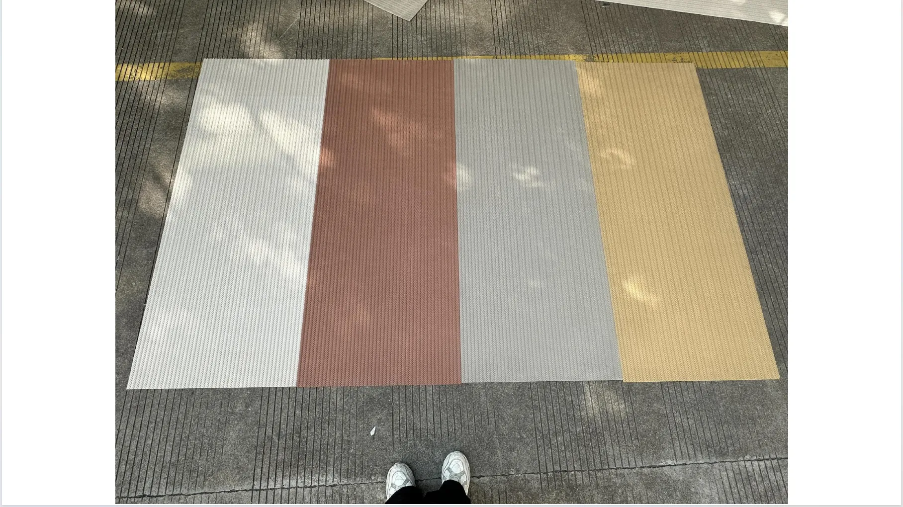
In the world of architecture and interior design, there's a quiet truth that seasoned professionals know well: the difference between a good project and a unforgettable one often lies in the materials. Not just their quality, but their authenticity—the way a fabric's weave tells a story, or a stone's texture carries the weight of time. Yet, in an era where digital renderings and stock photos dominate initial design conversations, how do we bridge the gap between the screen and the real thing? This is where COLORIA's woven real photos step in—not as mere images, but as windows into the soul of materials. Today, we're diving into what makes these photos so transformative, focusing on the artistry behind capturing weaving (khaki), weaving (jacinth), weaving (grey), and weaving (beige) in all their textured glory, and why they've become indispensable for designers worldwide.
Let's start with the basics: "woven real photos" aren't just pretty pictures of fabric. They're a commitment to truth. Unlike generic stock images—often over-lit, oversaturated, or stripped of context—COLORIA's woven real photos are taken in controlled, natural settings that mimic how the material would actually appear in a home, office, or public space. Think of it this way: if you've ever ordered a sofa online based on a glossy catalog photo, only to have it arrive looking washed out or overly vibrant, you know the frustration of misrepresented materials. Woven real photos eliminate that guesswork. They capture the way light plays on a khaki weave at 3 PM, the subtle variations in thread thickness that give jacinth its depth, the way grey weaving softens a room at dusk, and how beige weaving warms up a space on a cloudy day. These photos don't just show color—they show character.
But why "woven" specifically? Weaving is one of humanity's oldest crafts, a language of threads that's been used to tell stories, mark status, and create comfort for millennia. In modern design, woven materials add layers of warmth and texture that cold, smooth surfaces can't replicate. A woven wall panel in a hotel lobby isn't just a backdrop—it's a tactile invitation to touch, to feel, to connect. And to design with that kind of intention, you need more than a flat image. You need to see the way the threads intersect, the slight irregularities that make each piece unique, the way the material ages and interacts with its environment. That's the promise of woven real photos: they bring the material to life, even before it's installed.
Walk into COLORIA's studio in Milan, and you'll notice something different right away: there are no generic backdrops or harsh studio lights. Instead, the space is filled with natural light streaming through skylights, samples of weaving (khaki), jacinth, grey, and beige draped over wooden frames, and a team of photographers and material experts huddled around a camera, debating the perfect angle. "We don't just shoot photos here," says Elena Rossi, COLORIA's lead photographer, who's been with the company for over a decade. "We capture stories. Each weave has a personality, and our job is to make sure that personality shines through, unfiltered."
This philosophy guides every step of the process, from sourcing the materials to pressing the shutter. COLORIA's team doesn't rely on mass-produced fabrics; they work directly with artisanal weavers in regions like Marrakech, Oaxaca, and Kyoto, where traditional techniques are still alive. For the khaki weaving collection, for example, they partnered with a family-run workshop in Morocco that's been using handlooms for three generations. The result? A weave with a slightly uneven texture—threads that thicken and thin in places—that feels lived-in, not machine-made. When Elena and her team photographed it, they didn't smooth out those "imperfections." Instead, they celebrated them, using soft northern light to highlight the weave's earthy, sun-baked hue and the way the threads catch the light like sand in a desert wind.
Let's pull back the curtain and talk about the process. Shooting woven real photos is equal parts science and intuition. For each color variant—khaki, jacinth, grey, beige—the team at COLORIA tailors their approach to highlight what makes that weave special.
Take weaving (khaki), for instance. Khaki is a color that walks a fine line: too warm, and it reads as dull; too cool, and it loses its earthy charm. To capture its true essence, Elena's team sets up their shoot during "golden hour"—that soft, golden light just after sunrise. They drape the khaki weave over a textured wooden plank (replicating a common installation surface) and position the camera at a 45-degree angle, low enough to catch the weave's shadow play. "Khaki is all about subtlety," Elena explains. "In harsh midday light, it flattens out. But in golden hour, you can see the depth—the way some threads are a touch more olive, others lean into taupe. It's like looking at a landscape from a distance: the more you stare, the more details emerge."
Weaving (jacinth), on the other hand, demands boldness. Jacinth—a rich, reddish-orange hue reminiscent of autumn leaves or a setting sun—has a vibrancy that can easily tip into garishness if overexposed. To avoid that, the team uses diffused light, often shooting near a north-facing window to soften the intensity. They also focus on close-ups of the weave's pattern, highlighting how the threads crisscross to create a dynamic, almost rhythmic texture. "Jacinth is emotional," Marco says. "It's the color of warmth, of energy. We want designers to look at the photo and think, 'This will make a restaurant feel inviting,' or 'This will turn a home office into a space that sparks creativity.'"
Weaving (grey) might seem like the "neutral" of the bunch, but Elena and her team argue it's the most versatile—and thus, the trickiest to capture. "Grey isn't just one color," Elena laughs. "It's a spectrum. There's the cool, steely grey that works in a minimalist office, and the warm, greige (grey + beige) that feels cozy in a bedroom. To do it justice, we shoot the same grey weave in three different lighting scenarios: morning (cool), afternoon (warm), and evening (soft, blue-tinged). That way, designers can see how it will adapt to their project's unique light conditions." They also zoom in on the weave's density—some grey weaves are tight and structured, others are loose and airy—so clients can visualize how it will absorb sound, filter light, or add depth to a wall.
Finally, weaving (beige): the quiet workhorse of interior design. Beige weaves are beloved for their ability to complement almost any color palette, but that versatility can make them feel "boring" in photos if not handled carefully. COLORIA's solution? Focus on texture over color. "Beige's magic is in its feel," Marco explains. "Is it a loose, linen-like weave that feels breezy? Or a tight, cotton blend that's durable enough for high-traffic areas? We shoot the beige weave with a macro lens to capture the individual threads—some thick, some thin—and we always include a hand in the frame (wearing plain, neutral gloves) gently touching the material. It's a small detail, but it reminds viewers that this isn't just a color swatch; it's something you'll interact with every day."
So, what happens after these photos are taken? They become tools—powerful ones. Let's meet Sarah, an interior designer in Chicago who specializes in boutique hotels. Last year, she was tasked with redesigning a 1920s hotel lobby, aiming for a vibe that was "timeless but not stuffy." She'd narrowed down her material choices, but something was missing. "I'd been looking at stock photos of beige and grey weaves for weeks, but they all felt… flat," she recalls. "Then I stumbled on COLORIA's woven real photos, and suddenly, everything clicked."
Sarah was drawn to the weaving (beige) photo first. "It wasn't just a solid block of beige—it had depth. I could see the way the threads overlapped, creating tiny shadows that would add warmth to the lobby's high ceilings. Then I noticed the weaving (grey) photo, and how the texture was tighter, more structured. I realized: the beige could soften the seating areas, while the grey could line the accent walls, creating a balance of cozy and sophisticated." She printed out the photos, taped them to her mood board, and when she presented to the client, they immediately "got it." "The photos made the materials tangible," Sarah says. "Instead of saying, 'Trust me, this will look good,' I could point and say, 'See how the beige weave catches the light from the lobby's chandeliers? That's the glow we want guests to feel when they walk in.'"
Architects, too, rely on these photos when specifying materials for large-scale projects. Take a recent hospital renovation in Seattle, where the design team wanted to use woven panels in patient rooms to create a calming environment. "Hospitals need materials that are not only aesthetically pleasing but also easy to clean and durable," explains Raj, the project's lead architect. "We were torn between a jacinth weave (for warmth) and a khaki weave (for serenity). COLORIA's real photos let us compare them side by side, in the same lighting. The jacinth was beautiful, but in the photo, we noticed how its bold color might feel overwhelming in a small patient room. The khaki, though? Its muted tone and organic texture felt like a quiet reassurance—exactly what we wanted."
To help you visualize the unique personalities of each weave, here's a breakdown of COLORIA's most popular woven options, based on their real photos:
| Weave Color | Texture Notes | Ideal Application | Emotional Vibe |
|---|---|---|---|
| Weaving (Khaki) | Loose, slightly irregular weave with threads in varying earth tones (taupe, olive, sand). Soft to the touch, with a "worn-in" feel. | Residential living rooms, boutique hotels, cafes aiming for a rustic, bohemian vibe. | Grounding, serene—like a walk through a sunlit forest. |
| Weaving (Jacinth) | Medium-tight weave with a glossy thread running through warmer, matte threads. Creates a subtle sheen when hit by light. | Restaurant accent walls, home offices, retail spaces wanting to evoke energy and warmth. | Inviting, passionate—like a cozy fire on a winter evening. |
| Weaving (Grey) | Variable density (tight to loose); cool to warm undertones. Some variants have a slight ribbing for added texture. | Corporate offices, minimalist homes, modern art galleries—versatile enough for almost any space. | Balanced, sophisticated—like a well-tailored suit that never goes out of style. |
| Weaving (Beige) | Light, airy weave with a mix of thick and thin threads. Often has a slight linen-like slub (small bumps) for character. | Bedrooms, nurseries, sunrooms—spaces where comfort and calm are key. | Nurturing, timeless—like a favorite childhood blanket that feels like home. |
While woven materials are a cornerstone of COLORIA's real photo collection, the philosophy extends far beyond fabric. Take flexible stone, for example—a lightweight, durable alternative to natural stone that's revolutionizing exterior cladding. "Flexible stone has all the beauty of traditional stone but with none of the weight or installation hassle," Marco explains. "But to convince architects to switch from the real thing, they need to see that the texture, the color variation, the 'imperfections' are all there. So we shoot flexible stone samples in the same way we shoot weaves: in natural light, at different angles, close enough to see the pits and veins that make it look authentic."
The result? Architects who once hesitated to specify flexible stone now use COLORIA's real photos to show clients that yes, this material will look just as stunning on their building's facade as natural travertine or marble—without the risk of cracking or the high cost of transportation. It's a testament to the power of real photos: they don't just sell materials; they build trust.
In a world where "good enough" often passes for "great," COLORIA's woven real photos are raising the bar. They're not just a service—they're a statement that materials deserve to be seen, understood, and celebrated for what they truly are. Designers no longer have to apologize for "surprises" when materials arrive; clients no longer have to cross their fingers and hope for the best. Instead, everyone is on the same page, united by a shared vision of authenticity.
As Sarah, the Chicago designer, puts it: "COLORIA's woven real photos don't just save me time—they make me a better designer. They let me tell a more honest story to my clients, and they help me fall in love with the materials I'm specifying, over and over again. At the end of the day, design is about creating spaces that feel real. How can we do that if we're starting with fake photos?"
So, what's next for woven real photos? Elena and Marco hint at new technologies—like 360-degree interactive photos that let designers "touch" the weave virtually, or augmented reality tools that overlay the weave onto a client's actual space in real time. But at the core, they say, the mission will always stay the same: to capture materials as they are, not as we wish they were.
Whether you're an architect designing a skyscraper, a homeowner revamping a living room, or a designer curating a brand's aesthetic, remember this: the materials you choose are more than just building blocks. They're storytellers. And with COLORIA's woven real photos, those stories are finally being told—truthfully, beautifully, and unapologetically.
Recommend Products


