
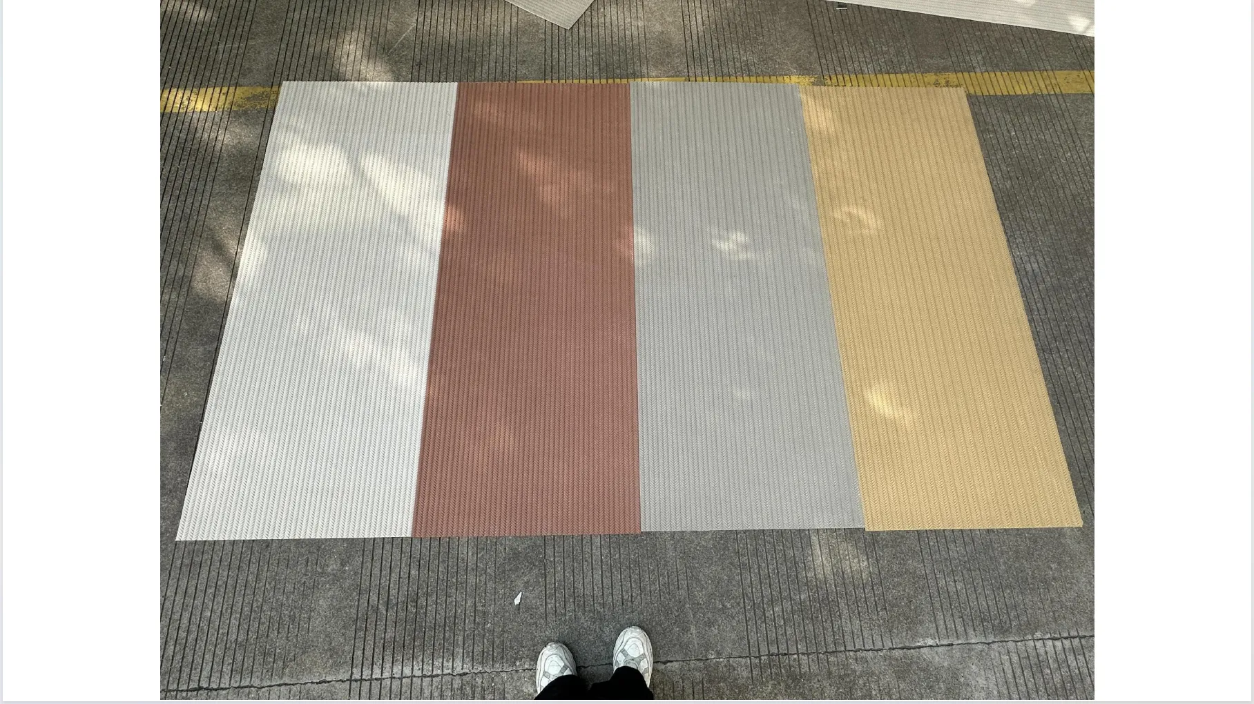
Choosing the right building material is like picking a character for your space—it shapes the mood, tells a story, and lingers in every glance. For architects, designers, and homeowners alike, visuals are the first step in that journey. But here's the dilemma: when exploring MCM's diverse range—from the earthy warmth of rammed earth board (gradient) to the futuristic sheen of foamed aluminium alloy board (vintage silver) —should you trust the raw honesty of woven real photos or the polished allure of renderings? Let's dive in.
There's a reason why a single touch of weaving (khaki) can change a designer's mind. Real photos capture what renderings often can't: the lived-in, breathing quality of materials. They're not just images—they're invitations to experience texture, light, and imperfection in a way that feels tangible, even through a screen.
Take travertine (starry blue) , for example. A real photo of this stone, bathed in afternoon sunlight, reveals more than just its deep blue base. You'll notice how the "starry" flecks catch the light like scattered constellations, how the natural pores and veins create a pattern that's unique to each slab. It's not perfect—and that's the point. Those tiny irregularities are what make a space feel human, not machine-made. A rendering might smooth out those pores, but a real photo celebrates them, whispering, "This is what it will actually look like when you run your hand over it."
Then there's rammed earth board (gradient) , a material that thrives on variation. Real photos showcase the subtle shift from soft terracotta to warm amber, the way the color deepens in creases and lightens on edges. No two gradient boards are identical; a real photo captures that uniqueness, helping designers plan for harmony in diversity. Imagine a client hesitating between two colorways—until they see a real photo of the gradient in their project's natural light. Suddenly, the decision feels easy because they're not just seeing a color swatch; they're seeing a promise of how the material will age, interact with the environment, and evolve over time.
Lighting, too, is a real photo's secret weapon. Weaving (khaki) in morning light has a soft, golden hue; in evening, it takes on a cozier, muted tone. A real photo taken at different times of day tells that story, while a rendering might lock the material into a single, static light setting. For commercial spaces—restaurants, hotels, retail stores—this matters. A café owner choosing weaving (khaki) for their walls needs to know how it will feel during breakfast rushes and intimate dinner services. Real photos don't just show the material; they show its mood .
But let's not dismiss renderings entirely. They're the ultimate "what if" tool, especially in the early stages of design. Renderings let you experiment without limits, which is invaluable when you're trying to visualize how foamed aluminium alloy board (vintage silver) might look on a 50-story facade, or how mcm flexible stone could curve around a circular lobby.
Consider a designer working on a remote project in Dubai, tasked with selecting materials for a luxury villa. They can't fly in samples of every travertine (starry blue) or foamed aluminium alloy board (vintage silver) —but a rendering can place those materials into the exact context of the villa's architecture, adjusting for the region's intense sunlight and desert landscape. Renderings allow for customization: want to see the vintage silver alloy with a matte finish instead of glossy? A few clicks, and the rendering updates. Need to test how the material pairs with floor-to-ceiling windows? Renderings make it possible, saving time and money on physical prototypes.
Renderings also excel at presenting a "best-case scenario." For clients who crave precision—say, a tech company wanting a sleek, uniform look for their headquarters—renderings can showcase mcm flexible stone as a seamless, flawless surface. They eliminate the anxiety of "what if it looks different in real life?" by offering a controlled, idealized vision. This isn't deception; it's inspiration. Renderings spark creativity, letting designers dream up bold combinations they might not have considered with real photos alone.
| Aspect | Woven Real Photos | Renderings |
|---|---|---|
| Authenticity | ★★★★★ Captures flaws, variation, and real-world texture—no filters. | ★★★☆☆ Idealized but can feel "perfect" to a fault; lacks organic imperfection. |
| Texture Representation | ★★★★★ Shows every bump, weave, and pore—you can almost feel it. | ★★★★☆ Can simulate texture but misses subtle tactile details (e.g., the give of weaving (khaki) ). |
| Color Accuracy | ★★★★☆ Depends on lighting, but reflects real-world variation. | ★★★★★ Can match exact Pantone codes, ideal for brand consistency. |
| Customization Flexibility | ★★☆☆☆ Limited—you can only photograph what exists. | ★★★★★ Adjust colors, finishes, and contexts in minutes. |
| Emotional Resonance | ★★★★★ Evokes "this is real" trust; connects on a sensory level. | ★★★☆☆ Inspires excitement but may leave clients wondering, "Will it really look like that?" |
So, which should you lean on? The answer depends on where you are in the design journey and what you need to communicate.
Use real photos when… You're in the final stages of material selection, and clients need to trust what they're investing in. For tactile materials like weaving (khaki) or travertine (starry blue) , real photos bridge the gap between "I see it" and "I believe it." They're also non-negotiable for marketing materials aimed at homeowners—people who care about how a material will feel in their daily lives, not just how it looks on paper.
Use renderings when… You're brainstorming, pitching bold ideas, or working with custom designs. For example, if a client wants foamed aluminium alloy board (vintage silver) in a geometric pattern never done before, a rendering can bring that vision to life before a single panel is manufactured. Renderings also shine when presenting to stakeholders who need to see the "big picture"—like investors visualizing a hotel facade or city planners approving a public space design.
Here's the truth: the best projects don't choose one over the other—they use both. A rendering might first catch a client's eye, showing rammed earth board (gradient) as the centerpiece of their home's exterior. Then, real photos of the gradient in different lights and angles seal the deal, proving that the rendering's beauty isn't just a fantasy. Together, they create a narrative: "Here's the dream; here's how we'll make it real."
For MCM products, this synergy is especially powerful. Take travertine (starry blue) : a rendering could place it in a modern kitchen, highlighting its starry pattern against white cabinetry. Then, real photos of the same travertine in a completed kitchen—with coffee mugs, natural light, and the patina of daily use—turn that rendering into a relatable, lived-in story. Clients don't just buy materials; they buy the promise of a life in the space those materials create. Real photos and renderings together make that promise feel both exciting and achievable.
At the end of the day, whether you're drawn to the raw honesty of woven real photos or the polished potential of renderings, what matters most is connection. Real photos connect through authenticity; renderings connect through inspiration. Both have a role to play in helping us build spaces that feel not just designed, but lived in .
So, the next time you're scrolling through MCM's catalog, pause on a real photo of weaving (khaki) or travertine (starry blue) . Notice the way the light hits it, the tiny variations in color, the texture that makes you want to reach out and touch the screen. Then, look at a rendering of foamed aluminium alloy board (vintage silver) on a sleek facade. Let yourself dream a little. Both are tools, but together, they're a conversation—one that ends with a space that feels uniquely, wonderfully yours.
Recommend Products


